David Drazil's Blog
August 8, 2025
How to Draw Repeating Elements in Perfect Perspective (Without a Ruler!)
Most architecture and design students freeze when it comes to drawing repeating elements in perspective.
Columns. Arches. Facades. We intuitively know they should shrink with distance… but how do you actually draw that — especially without a ruler?
Good news: architects have a beautifully simple trick.
In this tutorial, you’ll learn how to repeat elements accurately in perspective using nothing but diagonals — no grid, no ruler, no stress.
👇 Download the FREE Printable Worksheets from this video 👇
Click here to download the free, printable worksheets from the video The Challenge of Repeating Elements in PerspectiveWhen you're drawing something like a row of columns or electric poles, the first two are easy. Your brain gets lazy. You "eyeball" the third, fourth, and fifth. Suddenly the depth feels off, and your sketch looks amateur.
What’s causing that?
Foreshortening. It’s the visual phenomenon that makes equal distances appear shorter as they recede into the distance. It’s what makes perspective drawing tricky — and what throws off your intuition.
Without a method, guessing just isn’t reliable. That’s where the diagonal trick comes in.
Let’s say you’re repeating a square or rectangle along a surface. Here's the basic move:
1. Draw your first shape — could be a square or rectangle.
2. Find the center using diagonals from corner to corner.
3. Use that center point to align your next shape in depth.
4. Repeat the process — connect a corner through the midpoint to find where the next shape should go.
This works in both 2D and full perspective. Instead of guessing, you're using simple geometry to accurately space your elements — even freehand.
In the video, I show two real-world examples using the same method:
- A series of electric poles receding into the distance
- A building facade with repeating arches
Both start with one or two known anchor points, and we use diagonals to accurately place the rest — in full perspective.
Even when I intentionally tried to “eyeball” the midpoint, I got it wrong. But with the diagonal method, I placed 7 poles in a row, freehand, with shockingly accurate spacing.
This technique simplifies one of the most intimidating parts of perspective drawing — repeating modular elements.
No complex vanishing point setup. No measurement tools. Just pure logic, geometry, and a bit of patience.
It’s ideal for beginners in architecture, design, and urban sketching — especially those working in analog or digital tools like Procreate or Morpholio Trace.
May 15, 2024
Clipping Mask vs. Layer Mask in Procreate
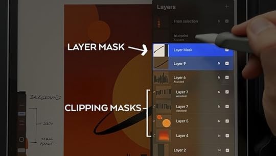 If you’re new(-ish) to Procreate and you’re confused about masking - what is it for and when to use different types of mask - this article is for you!
 The other day I was teaching a full-day Procreate workshop for interior designers at Ambience Academy here in Prague, Czech Republic
One of the concepts for non-destructive workflow (aka when you can change your mind later and create variations without a headache)
that we discussed and used a lot is about MASKING in digital sketching.
And because I couldn't really work without it but at the same time it isn't the easiest technique to adopt, I want to elaborate on it here with you as well.
LAYER MASKS
Layer masks allow you to change what's visible in a layer without erasing or deleting (and therefore losing!) pixels.
A layer mask is added and attached to a single layer so that you can "hide" parts of the layer in it.
In a layer mask, you use generally just two colors:
black color - to hide parts of the layer
white color - to reveal those parts again
By using a lower opacity brush, you can also create nice and easy fade outs or gradients.
If you ever change your mind about the hidden parts, you can reveal them back at any time (unlike with erasing) by drawing with white color in the mask.
CLIPPING MASKS
Clipping masks are separate layers that are taking shape after the layer directly under them.
Example: Just like in the animation above, you can use a layer with a circle to quickly crop your phototexture to a circular shape (the top phototexture layer becomes a clipping mask referring to the circle layer beneath).
The advantage is that you still keep both layers separate and also you can move the clipping mask independently from the layer below.
ALPHA LOCKThere’s also a third option - an Alpha lock. I don’t personally use it because it is destructive (it doesn’t allow for changes later on).
By enabling Alpha lack on a layer, you’re locked to draw just over the existing contents of that layer.
Example: You have a filled circle drawn in your layer and you want to add shading to it to make it look like a sphere. An Alpha lock will allow you to draw to add shading just within the boundaries of the circle and not outside.
However, you’ll overdraw the pixels of the circle and therefore change the layer in a destructive way, without the option of removing or changing the shading effect later.
Does this sound too technical? Would you appreciate video demonstration with an option to ask questions and get feedback?
If you need to quickly learn almost everything Procreate has to offer but you’re short on time,
join me for a beginner-friendly Procreate Workshop for Architects and Designers!
In just 2-hour video workshop with bite-sized lessons, you will:
get a quick start to Procreate,
create our own canvas template,
learn all the key functionalities,
create a beautiful warmup illustration together
learn how to work non-destructively and to scale (using both metric and imperial system)!
master 2D and isometric grids (to draw to scale even free-hand) and effective use of drawing assistance, quick shapes & stabilization
set up preferences, shortcuts, and learn hidden useful features that many people miss
and more!
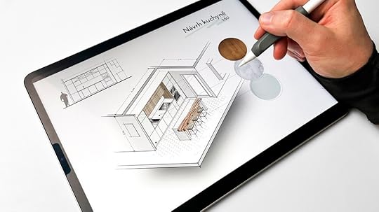
What you're getting with the Procreate Workshop:
a 2-hour recorded training divided into bite-sized lessons
life-time, unlimited access to all the content
Procreate color palette and images/textures we'll work with
my custom Procreate Sketching Brushes for FREE (separately sold for $30 USD)
Learn more ABOUT the PROCREATE WORKSHOP HEREOctober 12, 2022
How To Draw Guggenheim Museum (NYC) in Perspective
The Guggenheim Museum in New York City is an architectural masterpiece designed by the famous American architect Frank Lloyd Wright. First opened in 1939, this building looks like a white ribbon rolled into a cylindrical shape from the street.
Despite the aesthetic Babylonian-temple-inspired design, this work of art gave the builders headaches during the construction stage. They had to develop new constructive methods and used 3 types of concrete for the different stages of the project.
This video below shows the full perspective drawing process as close to real-time as possible so that you can grab your own pen or pencil, follow along and draw with me.
In this tutorial, we’ll roughly follow a 6-step process taken from one of the tutorials in my third book Draw Like an Artist: 100 Buildings & Architectural Forms.
Drawing Tip
You can download a related book page with extra worksheet and reference image here.
Step 1: Setting Up a Perspective ViewFirst of all, we start with a pencil to set up the perspective view and the basic composition structure.
Draw a horizon line in the lower third of your canvas and position your main vertical line roughly in the left third of your page. That is the edge of the imaginary smaller box on the left.

Estimate the orthogonal converging to the right vanishing point.
Draw two bounding boxes for the main rounded volumes of the museum as shown on the step 01 from the book tutorial.
At this point, pay attention to the proportions of the two boxes in terms of their height, width, and depth, as well as their mutual relationship. You might need to adjust the proportions as you go. This is when the reference image comes in handy as you go back and forth to replicate what you see.

Draw a human figure to anchor the scale of the sketch
Step 2 : Drawing Building OutlineOnce the imaginary boxes are sketched out, it is now much easier to draw the main outlines of the building.
To begin, start with the lower third of the volume with a common plinth where the other two volumes sit. Then move on to the main rounded volume of the museum and divide it with 3 horizontal gaps, and create stripes that cut into the volume.

Pay attention to the angle of the conical shape and thickness of the 4 discs.
Keep in mind the proportions of the 4 discs. The top one has the biggest thickness and straight vertical edge around, while the 3 layers beneath it have more angled edges.
Drawing TipWork on all parts at the same time
I have a habit of jumping around from one part of the drawing to another. This ensues that I am not bogged down into just one detail of the drawing while completely ignoring the rest. This way, the sketch gets developed in a more coherent way.
Step 3 : Fill in the Smaller ShapesUse the established lines to draw new elements by comparing their position and alignment with each other.
Double-check different touchpoints of the building’s parts. At this point, you need to trust your own eyes by visual measuring the proportion lines and make sure you are still on the right track.
This process will get easier and easier for you through practice. The more you draw, the more you can relate to the new lines and objects you’re adding to the composition.

Fill in the smaller details and add some context once the main building outline is completed.
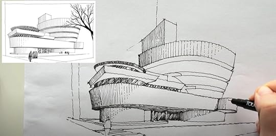
Step 4: Tracing with InkCongrats, you have just gone through the hardest part! Now, it’s time to trace the drawing with single confident lines to create the final line work.
I’m using my touch file liners, but feel free to use your own favorite tools. If you’re interested to learn all the tools I use, I have shared them in this article: My Essential Drawing Tools. Check them out!

Gently erase the pencil drawing beneath once the ink has dried out.
Step 5: Add Texture and ShadingMoving forward, we’ll be adding textures and shading to add more contrast and elasticity, as well as supporting the illusion of three dimensional space.
You can use simple techniques like hatching, crosshatching, pattern, pointillism and similar techniques. In my beginner’s course, I cover them in details n how to add suggestive textures to the windows facade and the surroundings.

Use hatching to suggest the texture of the building.
For example, if you have observed how most windows look during the day, they seem pretty dark with bits of reflections. This can be suggested and simplified through simple hatching with the while stripes to mimic light reflections.
Use solid to dashed and dotted lines to suggest the light source.
Final Step: Adding ContextThis is the step where we add human figures and vegetations to suggest the surrounding context.
Add more people to the composition far away from the viewer around the entrance. Simply render them as silhouettes since they’re quite a distance away.
To add more contrast to the drawing, I’m using a brush pen to render the recessed parts or the divisions of the rotunda in black.
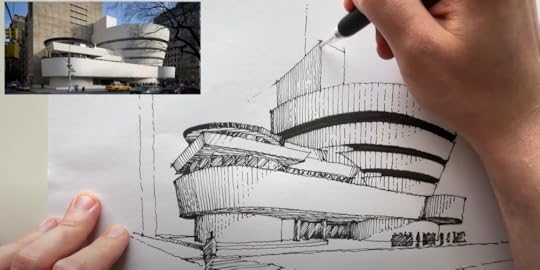
You can also add one more layer of pencil shades to soften the shading.
For final touches, you can post-process your drawing digitally, or paint it in watercolor.

Guggenheim Museum New York in watercolor.
I have prepared a PDF worksheet that can guide you through the step-by-step if you want to draw along with me. In this PDF guide, there is a worksheet and a reference image that will make the whole process a whole lot easier. Have fun sketching!
Download free worksheetSave this pin for future reference! 👇

September 12, 2022
7 Quick Tips To Improve Architectural Perspective Sketches [Free Worksheet]
Almost every architectural sketch or drawing is based on lines. The lines are used not only for contours, but also for guidelines, constructional lines, shading, hatching, and texturing—pretty much everything in a drawing.
You’ll find out that most of these lines are simply straight and are sometimes very long. That’s why it’s a great idea to practice drawing confident long, straight lines.
To achieve confidence in long straight lines, I suggest the following:
First, draw with your whole your arm, start the movement from your shoulder, and avoid bending your wrist.
Second, look and focus on the endpoint of a line you’re drawing.
This will help to naturally guide your hand to where you’re looking.
The use of different line weights— thicknesses of pen strokes—serves well for defining depth planes, for better clarity, and for creating emphasis and contrast in a drawing.
To use different line weights to support the illusion of depth, use thicker strokes in the foreground—depicting elements close to the viewer—and thinner lines in the background, such as trees, mountains, or cityscape in the distance.

Notice how the line weight varies between the vegetation in the background and the building in the foreground.
Tip #3: Start with imaginary bounding boxesBefore diving into details, set your main volumes in perspective by drawing imaginary bounding boxes surrounding the main volumes.
These simple boxes help ensure that your perspective view is correct and prepares you to draw more defined volumes and details inside.
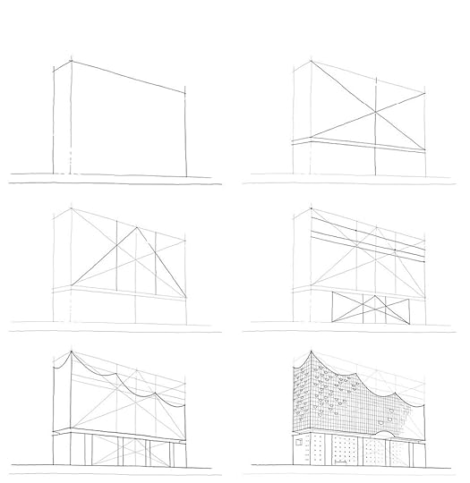
Complexity made simple when using the bounding box technique.
Tip #4 : Use cross-hatching for shading
Hatching is commonly used to add textures or shading. Cross-hatching is the same, just applied in two or more layers on top of each other.
Each new layer should have a different direction from the previous one. In that way, you can achieve very gradual darkening of big are - as, which can create illusions of soft shading.
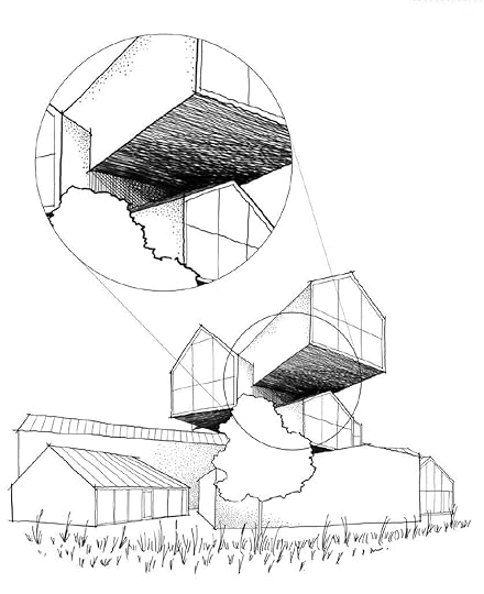
Use cross-hatching to play with light and shadow.
Tip #5: Divide objects into equal segmentsCross sections and divisions of objects into equal segments help us both with constructing more complex geometries as well as presenting them in a more understandable way.
These basic divisions will help your objects look correctly and with the right proportions, especially in perspective views.

Use this tip to keep your drawing in proportion.
BONUS: Tip #6 & #7Want to get 2 more bonus tips?
There are two more bonus tips about drawing organic forms in perspective. It is included together with the other five in a free downloadable & printable PDF Guide!

You can click the button below to download the PDF guide.
DOWNLOAD FREE PDF GUIDE HEREHave fun sketching. Cheers!
Save this pin for future reference! 👇
August 29, 2022
Behind The Scenes: The Making of an Online Course with Domestika
If you’ve never heard of Domestika before, it’s like a behemoth of a course-creation factory. Currently, it is the fastest-growing online course platform and marketplace for creatives, with millions of fans worldwide, publishing hundreds of new courses every year.
BUT there is also something that makes it special and different from most other similar platforms.
Curious? Here’s how it’s different…
First of all, Domestika very carefully curates the content as well as the teacher roster. Teachers can be only invited to the platform.
Second, teams at Domestika produce their courses themselves - in-house - in 4 different studios across the world, to ensure the highest content & production quality possible.

Main Shooting Set | Filming studios in Madrid, Spain.
What’s It Like To Be A TeacherI received an invitation from an acquisition manager back in mid-November 2021. That is also when you - as a teacher - get to discuss the details of your contract as well as the payment - the advance fee (we will talk more about that later).
I have been a solo creator for 4 years now and I’ve been used to do everything by myself. That being said, to produce an online course, I would be the only one who does everything - planning, scripting, lighting, shooting, recording b-roll, editing, publishing, and marketing (solo-creators wear a lot of hats).
But working with Domestika is a totally different experience!
As a teacher, you work very closely with a core team of :
Content curator
Production manager
Filmmaker
Assistant filmmaker
To be honest, it is kind of a big deal to work with these specialized professionals who assist you in producing your online course!
You can certainly tell that Domestika invests a lot of effort and money into their teachers before they even start producing the course.

After the first point of contact, we spent the first few months coming up with the topic, developing the curriculum, and final structure of the course content. At the same time, we write bullet points or scripts for the talking, and final project, finetuning everything, and prepare all the additional material that students can download in the course.
In my case, it’s a lot of illustrations, diagrams, printable worksheets for practicing as well as my full library of hand-sketched Photoshop brushes that we use in the final project.
When I first arrived, I was in awe as the shooting set is pretty much like a small movie production!
The studio set includes :
multiple cameras (usually 3-4, the over-head camera is shooting even in 6k resolution so they can crop the footage as they need in editing)
professional lighting
professional sound
A production team - production manager, filmmaker & assistant filmmaker (there are more people coming in and out, but these 3 are all there during the whole shoot)
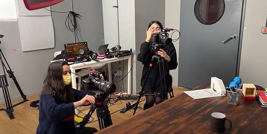
The production team members behind the scene.
How Long Does The Filming Take?To answer that, let me share a funny story with my mom:
I was talking to her on the phone and telling her about the trip to Madrid to film the online course.
I remember she asked, how long is the course gonna be eventually?
I said, well, it should be around 2-3 hours in the end.
And she goes, so what are you gonna be doing there the whole week?
Have the same doubt? I hear you, let me explain…
My course is called Architectural Drawing: From Paper to Photoshop. So basically, the first half of the course is focused on analog hand-drawing techniques and putting your ideas on paper.
While the other half is all about going digital and taking those hand-drawn sketches to another level by post-processing them and creating your own visual style in Photoshop - and this is the part that is recorded in the screencast room.
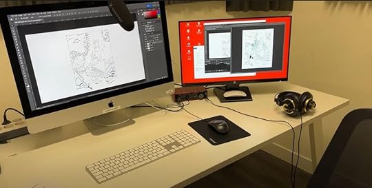
Recording in the screencast room.
During the filming week, we spent the first 3 days shooting the course content in the studio sets. This includes shooting the trailer, all the video lessons, b-roll (secondary footage for visual support), photoshoots and extra filming for the social media team. Then I spent the next 2 days in the screencast room recording the whole digital part of the course.
The production week, in my experience, was 5 full jam-packed days, Monday through Friday, of intensive (and exciting) work.
How Teachers Are Paid?Of course, I’m not allowed to discuss any exact amounts, but I can tell that there are 3 types of payments that teachers can be eligible for (as of the beginning of 2022):
Advance fee: Usually, within a month from the production phase being over, teachers get paid the advance fee that were agreed on in the beginning when discussing the contract. Once the course is published and students start enrolling, teachers are basically earning back their advance fee.
Royalties: Once the course earns the amount of the advance, teachers start to get paid royalties from any new enrollments.
Affiliates: Some teachers are eligible to become Domestika affiliate partners. As an affiliate partner, I can recommend other people’s courses on the platform and when someone makes a purchase through my unique affiliate link, I get a small percentage from the sale without any extra costs to the students.
Basically, I am rewarded for recommending Domestika courses and bringing more people to the platform. To try this in action, you can check out the selection of most popular Domestika courses related to architecture and drawing here :
Most Popular Domestika courses about architecture & drawing
The WORST part? This is gonna sound silly but... quite at the beginning, you as a teacher are asked to submit reference photos for the set - for the builder team to take inspiration from when custom building the shooting sets.
And there’s one more thing you need to submit - your wardrobe (2 different outfits to be specific) to make sure it fits nicely together with the set. Also, it’s important to make sure there’s enough contrast so that you don’t blend in with the background, and the outfit doesn’t include any small patterns that would cause trouble to the cameras (like moiré).
Going clothes shopping after almost 2 years of the pandemic, when I didn’t have anything solid that I could wear, was the worst for me.
But the BEST part?
Honestly, it is the whole production week in Madrid and the people I got to work with.
Because I’m based in Prague, Czech Republic, the closest studio for me was in Madrid, Spain. And Domestika generously covers the airfare & other travel expenses for teachers as well as the hotel and partly even the food.
Moreover, the team was super professional, very committed to the process, and working hard to make the best possible course and actually to make me look good.
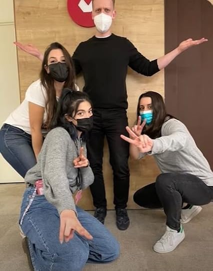
Me and the production team (from left: Fernanda, Violeta, Allison).
Hands down this is such a fantastic, fantastic experience! Very grateful for it!
Now that you know almost everything about the process here’s the final result - watch the trailer below:
… and of course, if you are a designer, architect, illustrator, or hobby sketcher, this online course has been CREATED FOR YOU.
I shared all the ins and outs of my process for putting your ideas on paper in perspective, improving their composition, bringing them to life in Photoshop.
Interested? Click the button below to learn more.
learn more about MY DOMESTIKA course
I’ll see you in the next one. Cheers!
Save this pin for future reference! 👇
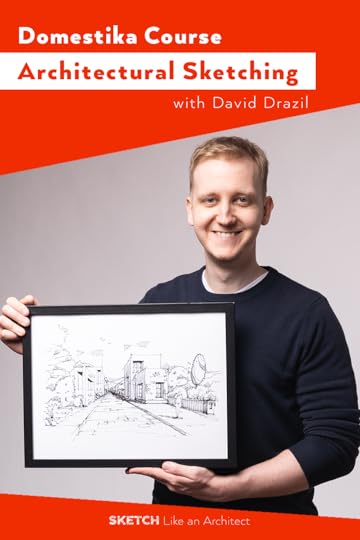
Behind The Scenes: The Making Of An Online Course with Domestika
If you’ve never heard of Domestika before, it’s like a behemoth of a course-creation factory. Currently, it is the fastest-growing online course platform and marketplace for creatives, with millions of fans worldwide, publishing hundreds of new courses every year.
BUT there is also something that makes it special and different from most other similar platforms.
Curious? Here’s how it’s different…
First of all, Domestika very carefully curates the content as well as the teacher roster. Teachers can be only invited to the platform.
Second, teams at Domestika produce their courses themselves - in-house - in 4 different studios across the world, to ensure the highest content & production quality possible.

Main Shooting Set | Filming studios in Madrid, Spain.
What’s It Like To Be A TeacherI received an invitation from an acquisition manager back in mid-November 2021. That is also when you - as a teacher - get to discuss the details of your contract as well as the payment - the advance fee (we will talk more about that later).
I have been a solo creator for 4 years now and I’ve been used to do everything by myself. That being said, to produce an online course, I would be the only one who does everything - planning, scripting, lighting, shooting, recording b-roll, editing, publishing, and marketing (solo-creators wear a lot of hats).
But working with Domestika is a totally different experience!
As a teacher, you work very closely with a core team of :
Content curator
Production manager
Filmmaker
Assistant filmmaker
To be honest, it is kind of a big deal to work with these specialized professionals who assist you in producing your online course!
You can certainly tell that Domestika invests a lot of effort and money into their teachers before they even start producing the course.

After the first point of contact, we spent the first few months coming up with the topic, developing the curriculum, and final structure of the course content. At the same time, we write bullet points or scripts for the talking, and final project, finetuning everything, and prepare all the additional material that students can download in the course.
In my case, it’s a lot of illustrations, diagrams, printable worksheets for practicing as well as my full library of hand-sketched Photoshop brushes that we use in the final project.
When I first arrived, I was in awe as the shooting set is pretty much like a small movie production!
The studio set includes :
multiple cameras (usually 3-4, the over-head camera is shooting even in 6k resolution so they can crop the footage as they need in editing)
professional lighting
professional sound
A production team - production manager, filmmaker & assistant filmmaker (there are more people coming in and out, but these 3 are all there during the whole shoot)

The production team members behind the scene.
How Long Does The Filming Take?To answer that, let me share a funny story with my mom:
I was talking to her on the phone and telling her about the trip to Madrid to film the online course.
I remember she asked, how long is the course gonna be eventually?
I said, well, it should be around 2-3 hours in the end.
And she goes, so what are you gonna be doing there the whole week?
Have the same doubt? I hear you, let me explain…
My course is called Architectural Drawing: From Paper to Photoshop. So basically, the first half of the course is focused on analog hand-drawing techniques and putting your ideas on paper.
While the other half is all about going digital and taking those hand-drawn sketches to another level by post-processing them and creating your own visual style in Photoshop - and this is the part that is recorded in the screencast room.

Recording in the screencast room.
During the filming week, we spent the first 3 days shooting the course content in the studio sets. This includes shooting the trailer, all the video lessons, b-roll (secondary footage for visual support), photoshoots and extra filming for the social media team. Then I spent the next 2 days in the screencast room recording the whole digital part of the course.
The production week, in my experience, was 5 full jam-packed days, Monday through Friday, of intensive (and exciting) work.
How Teachers Are Paid?Of course, I’m not allowed to discuss any exact amounts, but I can tell that there are 3 types of payments that teachers can be eligible for (as of the beginning of 2022):
Advance fee: Usually, within a month from the production phase being over, teachers get paid the advance fee that were agreed on in the beginning when discussing the contract. Once the course is published and students start enrolling, teachers are basically earning back their advance fee.
Royalties: Once the course earns the amount of the advance, teachers start to get paid royalties from any new enrollments.
Affiliates: Some teachers are eligible to become Domestika affiliate partners. As an affiliate partner, I can recommend other people’s courses on the platform and when someone makes a purchase through my unique affiliate link, I get a small percentage from the sale without any extra costs to the students.
Basically, I am rewarded for recommending Domestika courses and bringing more people to the platform. To try this in action, you can check out the selection of most popular Domestika courses related to architecture and drawing here :
Most Popular Domestika courses about architecture & drawing
The WORST part? This is gonna sound silly but... quite at the beginning, you as a teacher are asked to submit reference photos for the set - for the builder team to take inspiration from when custom building the shooting sets.
And there’s one more thing you need to submit - your wardrobe (2 different outfits to be specific) to make sure it fits nicely together with the set. Also, it’s important to make sure there’s enough contrast so that you don’t blend in with the background, and the outfit doesn’t include any small patterns that would cause trouble to the cameras (like moiré).
Going clothes shopping after almost 2 years of the pandemic, when I didn’t have anything solid that I could wear, was the worst for me.
But the BEST part?
Honestly, it is the whole production week in Madrid and the people I got to work with.
Because I’m based in Prague, Czech Republic, the closest studio for me was in Madrid, Spain. And Domestika generously covers the airfare & other travel expenses for teachers as well as the hotel and partly even the food.
Moreover, the team was super professional, very committed to the process, and working hard to make the best possible course and actually to make me look good.

Me and the production team (from left: Fernanda, Violeta, Allison).
Hands down this is such a fantastic, fantastic experience! Very grateful for it!
Now that you know almost everything about the process here’s the final result - watch the trailer below:
… and of course, if you are a designer, architect, illustrator, or hobby sketcher, this online course has been CREATED FOR YOU.
I shared all the ins and outs of my process for putting your ideas on paper in perspective, improving their composition, bringing them to life in Photoshop.
Interested? Click the button below to learn more.
learn more about MY DOMESTIKA course
I’ll see you in the next one. Cheers!
Save this pin for future reference! 👇

August 17, 2022
Draw Famous Building: Heydar Aliyev Centre in 5 Easy Steps
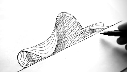
Heydar Aliyev Center is a cultural center located in Baku, Azerbaijan, designed by famous architect Zaha Hadid. From the exterior view, there is a large skin forming the roof and sweeping side walls. Making it looks like a light handkerchief just landed on the floor.
To draw this organic form building, most beginners would find it difficult to keep the proportion right. So in this article, I am sharing all the tools and techniques I used to draw this building in cca 30 minutes. Let’s get started!
Tools I UsedThis time, I am drawing on a plain office paper (80g/m2). Here is a list of tools I will be using:
A mechanical pencil
A few fine liners (tip thicknesses 0.1, 0.3, 0.8)
A grey brush marker
Note that these tools are NOT MANDATORY, you can replace them with similar tools if you don’t have the same. I get asked A LOT about the tools I am using, therefore I have shared all the details in another article, click here to read more.
My favourite sketching tools Step 1: Defining The ProportionThe bounding box technique is common when it comes to drawing complex organic forms. It maps out the shape of the object and ensures the correct aspect ratio.
To start, draw a horizontal line as a ground line. Then, using your pencil as the measurement guide, draw a rectangle with a 1:1.75 proportion. This step is crucial as it defines the proportion of the building in our drawing.
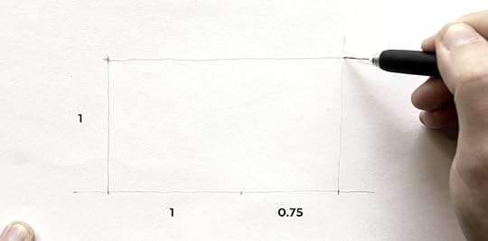
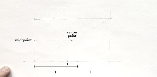
Next, I am drawing a few guidelines and marking the mid-points to help define the building outline :
draw the diagonals of the rectangle to locate its center point, and subsequently the mid points of the sides
unit 1 measurements from both sides on the ground line
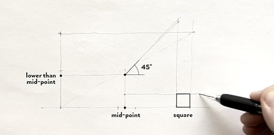
Use the existing points to define more guidelines for the building’s silhouette as show on the image below.
At the end of this step, you will get an underlying structure looking like this :
 Step 2: Drawing the building’s outline
Draw the main leading curves by connecting the points as shown below.

Add outlining curves of the lower volume on the right hand side.
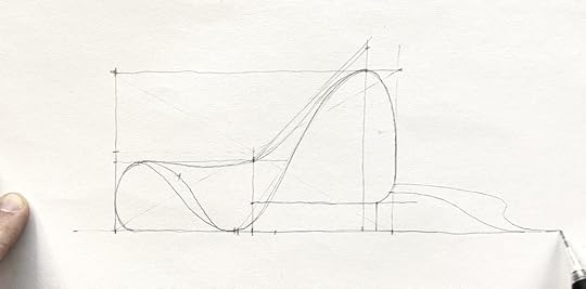
Add secondary curves which are basically interpolations in between the main leading curves.
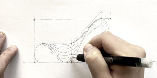 Step 3: Trace With Ink
 Good news, you just went through the hardest part! You have completed the outline of the Heydar Aliyev Center in proportion. Now, grab your fine liner and trace the outline.
HERE’S A PRO TIP for you to have a cleaner line art: draw the long curve by dividing it into several portions, instead of drawing it all at once.
Draw the contour lines in between the curves on the building surfaces. To show more depth, you can apply different line weights on the contour lines.
Once you have the outline traced, erase the guidelines and pencil drawing underneath.
 Step 4: Adding Details
Next, to draw the glazing, divide the glazed surfaces with horizontal and vertical lines as shown below.
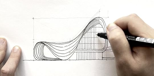
There are two ways how to add a better sense of depth and plasticity to our drawing. First, use different lineweights to emphasize the leading curves and they way they overlap. The closer the geometry is to the viewer, the thicker line it should carry.
Secondly, add shading to the volume. For that, you can either use :
a pencil for line hatching and rendering, or
a grey brush marker.
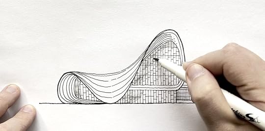
Simply mimic the building curve to cast a shadow on the glazed surfaces. And then … Voila! The final outcome looks something like this :

Complex organic forms look intimidating but with the correct technique, drawing it can become so much easier.
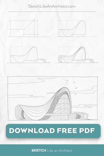
Now, draw your own version of this! And to make it easier for you to start, I’ve prepared a step-by-step tutorial and printable worksheet in PDF.
Download it by CLICKING HERE or below: 👉 CLICK HERE TO DOWNLOAD YOUR FREE PDF GUIDE 👈Save this pin for future reference! 👇
August 3, 2022
Draw Famous Building : Heydar Aliyev Centre in 5 Easy Steps
 Introduction : Heydar Aliyev Center
Heydar Aliyev Center is a cultural center located in Baku, Azerbaijan, designed by famous architect Zaha Hadid. From the exterior view, there is a large skin forming the roof and sweeping side walls. Making it looks like a light handkerchief just landed on the floor.
To draw this organic form building, most beginners would find it difficult to keep the proportion right. So in this article, I am sharing all the tools and techniques I used to draw this building in cca 30 minutes. Let’s get started!
Tools I UsedThis time, I am drawing on a plain office paper (80g/m2). Here is a list of tools I will be using:
A mechanical pencil
A few fine liners (tip thicknesses 0.1, 0.3, 0.8)
A grey brush marker
Note that these tools are NOT MANDATORY, you can replace them with similar tools if you don’t have the same. I get asked A LOT about the tools I am using, therefore I have shared all the details in another article, click here to read more.
My favourite sketching tools Step 1: Defining The ProportionThe bounding box technique is common when it comes to drawing complex organic forms. It maps out the shape of the object and ensures the correct aspect ratio.
To start, draw a horizontal line as a ground line. Then, using your pencil as the measurement guide, draw a rectangle with a 1:1.75 proportion. This step is crucial as it defines the proportion of the building in our drawing.

Next, I am drawing a few guidelines and marking the mid-points to help define the building outline :
draw the diagonals of the rectangle to locate its center point, and subsequently the mid points of the sides
unit 1 measurements from both sides on the ground line

Use the existing points to define more guidelines for the building’s silhouette as show on the image below.
At the end of this step, you will get an underlying structure looking like this :
 Step 2: Drawing the building’s outline
Draw the main leading curves by connecting the points as shown below.

Add outlining curves of the lower volume on the right hand side.

Add secondary curves which are basically interpolations in between the main leading curves.
 Step 3: Trace With Ink
 Good news, you just went through the hardest part! You have completed the outline of the Heydar Aliyev Center in proportion. Now, grab your fine liner and trace the outline.
HERE’S A PRO TIP for you to have a cleaner line art: draw the long curve by dividing it into several portions, instead of drawing it all at once.
Draw the contour lines in between the curves on the building surfaces. To show more depth, you can apply different line weights on the contour lines.
Once you have the outline traced, erase the guidelines and pencil drawing underneath.
 Step 4: Adding Details
Next, to draw the glazing, divide the glazed surfaces with horizontal and vertical lines as shown below.

There are two ways how to add a better sense of depth and plasticity to our drawing. First, use different lineweights to emphasize the leading curves and they way they overlap. The closer the geometry is to the viewer, the thicker line it should carry.
Secondly, add shading to the volume. For that, you can either use :
a pencil for line hatching and rendering, or
a grey brush marker.

Simply mimic the building curve to cast a shadow on the glazed surfaces. And then … Voila! The final outcome looks something like this :

Complex organic forms look intimidating but with the correct technique, drawing it can become so much easier.
Now, draw your own version of this! And to make it easier for you to start, I’ve prepared a step-by-step tutorial and printable worksheet in PDF.
Download it by CLICKING HERE or below: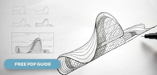 👉 CLICK HERE TO DOWNLOAD YOUR FREE PDF GUIDE 👈
Save this pin for future reference! 👇

How to Draw The Impossible Triangle? [Draw Along Video For Beginners]
In this article, I will walk you through a step-by-step process so that you can follow along and draw your own Impossible Triangle in no time. Let’s get started!What is the Impossible Triangle?
The Impossible Triangle, also known as the Penrose triangle, is actually an optical illusion.
It was first painted by Swedish painter Oscar Reutersvärd who is sometimes reffered to as ‘the father of impossible figures’. Two decades later, Roger Penrose, an English Mathematician drew it in perspective view and further added the effect of impossibility.

It was believed that an impossible triangle doesn’t exist in real life, but can only be depicted in a perspective drawing. (That’s how it gets the name, right?) But, look at this sculpture in Perth:

Source: Google Images
Yes, it is actually possible to recreate it in real life. Except that it can only look impossible from one point of view, while the from other angles it would look just like any other real & ordinary sculpture.
However, it is very easy to draw on paper or tablet. So if you are a beginner in drawing and looking for some fun, this is a great start. At the same time, you can also draw along with me by watching this Youtube video below.
In the video, I use Morpholio Trace on iPad which offers assisted drawing along certain grid or increments of angles. You can follow the same steps with analog tools like pencil, ruler, and paper, though.
Step 1: PREPARATIONStart by clicking on the wrench tool, then set the grid. Choose the middle option, which is the axonometric grid. Change the angle of the grid to 30°. Then adjust its size and opacity.
Next, choose the dashed line, a drawing brush of choice, and color for drawing the initial underlying structure.
 Step 2: Drawing The Base
Activate the smart ruler and change its setting to either 15° or 30°. This will assist you with drawing along the grid. Now you can use the grid to outline an equilateral triangle with cut corners. Follow the grid to draw inner lines suggesting the thickness of the triangle.
 Step 3: Tracing
 Then, lower the opacity of this drawing, create a new layer and trace the dashed lines to draw the optical illusion. Once completed, turn off both the grid and the underlying drawing. The drawing can be seen clearly now.
 Step 4: Shading
Finally, it’s time to add shading for depth and dimension. Activate the smart hatch tool and choose a solid color. Use 3 different tones - light, medium, and dark - of the same color to suggest the shading.

If your hatch spills outside of the drawn borders, simply adjust the threshold slider. And then…. Voilà, you are done!
Your final drawing will look something like the one below - or you can try to recreate the original idea with 3D cubes in isometric view.

If you are a regular reader, you know how much I love to use it. Whether for developing a design concept, or drawing an interior perspective, Morpholio Trace is easy to use especially for beginners. Interested? Click this link to download the app and try it out.
Have fun!
Save this pin for future reference! 👇

July 28, 2022
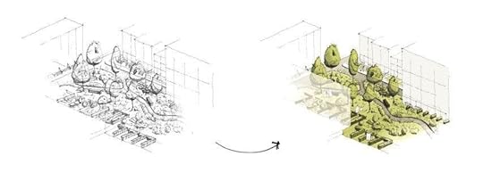
Digitize Your Drawing - 5 Benefits to Go From Paper to Photoshop
Imagine a cup of coffee just spilled over your sketchbook. Now, all the hours spent perfecting your drawing officially go to waste with the new brown stain. But, the ending would be totally opposite if you have digitized your drawings.
Digitized artwork acts as a backup, a safety net in case of loss or damage to the original.
 2 - Easy to Share
 Say your client from 1000 miles away wants to see your work progress during a video conference meeting. A digitized drawing can do just that. Or, you might want to post your drawings on social media to win more commissioned projects.
In these cases, if you know how to digitize your drawing properly, you can show crispier and sharper line work in the softcopy via email, USB, or messages. Digitized artwork looks more appropriate on professional occasions (eg: communication with clients and colleagues), as well as showing your work portfolio on social media platforms.
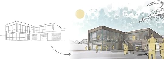
 3 - Non-Destructive Editing
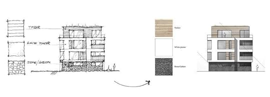
Once digitized, you can edit your sketches and drawings in non-destructive ways. From cleaning, sharpening, coloring & texturing your drawings — without having to worry about making a minor accidental mistake that would destroy the whole piece. Plus - you can change any of the edits at any time, now or in the future!
For artists, this means not only more safe editing possibilities to improve the drawing but also a peace of mind.
During the digitizing process in Photoshop (or similar software), take advantage of using:
multiple layers,
smart objects,
smart filters
layer masks,
and adjustment layers
to make your illustration easy-to-edit at all times.
This allows you to edit anything at any point in time, with peace of mind knowing that you won’t destroy the artwork. If you want to learn more about this topic, I shared these details in one of my online courses which I will talk more about later.
 4 - Iterations, Revisions, Feedback
 Digitized drawings make it quicker and easier to iterate ideas. You can create multiple variants or alternatives to your drawings. Most importantly, it allows you to quickly make revisions based on the feedback from your client or your boss.
As you can see now, digitizing your drawings improve overall workflow efficiency. Making changes normally cost hours on paper, but will only take a few minutes or less time if you do it on a tablet or desktop software.
This skill is invaluable as it increases work productivity, especially if you are working on a bigger project with more complexity, or if you’re busy on a few projects at the same time.
 5 - Stand Out From The Crowd
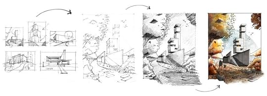
 Once you are familiar with digitizing drawings, slowly and surely you will find the unique visual techniques and styles that makes you stand out from the crowd.
In conclusion, digitizing your drawings not only improves workflow productivity but also presents endless possibilities and encourages creativity. Certainly, there are many softwares out there that can help digitize your drawings, but personally, I love using Photoshop (or Procreate on iPad).
If you're interested in the details, I'm sharing all the ins and outs of my process for putting your ideas on paper, improving their composition, perspective, and shading,
and taking it to the NEXT LEVEL in Photoshop in my new Domestika course Architectural Drawing: From Paper to Photoshop.
Save this pin for future reference! 👇
