Wade Walker's Blog
February 17, 2025
The Unbent Curve is on the way!
I've finally finished writing The Unbent Curve, book two in the sci-fi time travel trilogy that began with The Gap Year. It follows the further adventures of Anna and Indy in ancient Greece, as the technological and societal changes they set in motion last time—with the best of intentions!—begin to careen forward, out of their control.
It's still several more months from release, since I need to finish the final editing and proofreading process. But in the meantime, here's a bit of the cover sketch by the incomparable Fernanda Suarez I'm very excited to see what the final cover will look like!
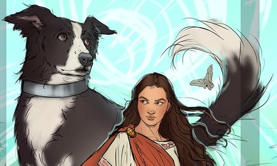
The tail is my favorite bit :)
If you want to be notified when the book is available, you can sign up for my mailing list at https://www.wadewalker.com/signup, or just follow me at https://www.facebook.com/WadeWalkerBooks and I'll let you know. There's less noise on the mailing list, since it's for releases only, whereas on Facebook I also post about sci-fi and fantasy in general. If you want to learn more about my self-publishing journey (spoiler: it's way harder than I thought it would be), you can read all about it here in this blog. I'm also an occasional poster and opiner on Reddit at https://www.reddit.com/user/WadeWalkerBooks/.
Huge thanks to everyone who's supported me this far! I look forward to hearing what you think about the next one.


February 16, 2025
Why I won’t use AI
(Discussion of this post on Reddit’s r/selfpublish)
Maybe this will sound weird, coming from a sci-fi author. But I refuse to use AI in any form, for writing or for any other creative endeavor. Look at the creepy, humanoid fingers that an AI put on the “border collie author” image that I generated for this post. It’s a crime against art, right? And every time I log into Amazon and browse through the AI-generated wasteland that is my “sponsored results”, I’m reading the literary equivalent of this.

I love how he’s not even looking at the screen. And it’s a dead giveaway that the Mac has a useful number of full-sized USB ports—no real laptop looks like this :)
I want to be a writer, not an editorAI is great at quickly cranking out glib, plausible-looking text. But the more closely you look at it, the less it hangs together. I don’t want to spend my one, irreplaceable life beating AI output into shape. And AI doesn’t learn from any feedback you give it, so you don’t even get the satisfaction of teaching it to be better, like a real editor would.
The work of a human master rewards study. The more you engage with it, the more you learn, and the more hidden detail and meaning you uncover. AI output isn’t like that. When you generate some statistically-likely sequence of words, derived from all the zillions of words that have ever been written out there, the result appears superficially valid. But it doesn’t reflect any underlying idea that informs and makes sense of the entire work. Reading a work of AI is a hallucinatory experience. It keeps almost coming together, but just when you think you have it, it morphs into something else.

The weirdly elongated muzzle, the reddened sclera giving me the side-eye… this image creeps me out.
I don’t want to break faith with readersWhen someone goes online to or to the bookstore to pick out a new book, they need to have confidence that the books they’re browsing are honest attempts to create something that a reader will enjoy. A book made with AI can seem okay for the first few pages, but the further into such a book you read, the more it dissolves into an incoherent mess. Sure, the “authors” of such works can make a few quick bucks this way, fleecing the unwary. But in the process, they’ve made the readers gun-shy, afraid of buying anything new, since any book could turn out to be hard-to-spot garbage.
The use of AI “floods the zone” with stuff nobody wants. Some have suggested that this is not a problem, since the good stuff will rise to the top, and the bad stuff will sink. But that process isn’t free—it sucks up valuable, finite human attention to sort through and make sense of things.

It’s almost worse when it’s more realistic. I have scary-looking doggy nails on fur-covered, humanoid fingers, with a dog’s pastern bone instead of a human wrist.
I want to support creatorsI also refuse to use AI to do anything else that’s creative. My book covers? Illustrated by a real live artist, by hand. My proofreaders are humans, and so are my designers. Sure, I might be able to slop something together with AI that passes a quick glance. But the quality’s just not there. And more importantly, I want to help other people create new and wonderful things, not draft off the work of others. AI doesn’t put any new value out into the world. And the presence of AI-generated works dilute the value of everything around them.

I like the delicate pinky on the left paw-hand. I guess I have no thumbs, though?
February 9, 2025
Can you (profitably) sell your own hardcover on Amazon?
Spoiler: No. No, you can’t.
Even before I finished writing The Gap Year, I knew I wanted to offer a hardcover edition. They feel great in your hands, and look great on the shelf, even if they’re pricier than paperback and Kindle editions. But I had no idea how little financial sense it makes to do this as a self-published, print-on-demand author. I’m doing it anyway, but it turned out to be just a vanity edition for friends and family, not something any normal customer would ever want to buy.

The original Indy, facing her literary counterpart
I published the hardcover edition through IngramSpark, the Tennessean print-on-demand colossus. As an author, I can buy a copy of my own book directly from them, at a cost of $14.61. And at first blush, this price sounds pretty okay! A sci-fi book of similar size on Amazon, like James S. A. Corey’s Leviathan Falls, sells for $16.50 with free Prime shipping. So maybe this isn’t insane?
My first problem is getting my printed books shipped to me. If I order just one copy of The Gap Year from IngramSpark, it’ll cost me $26.30. That’s with the 10-day printing speed, not expedited in any way, and with the cheapest shipping they offer that has tracking.
All right, but I’m going to sell these on Amazon, right? What if I buy a whole box at once, and sell them one at a time? IngramSpark charges $208.61 for a box of twelve of my books, which comes out to $17.38 per book, delivered to my front porch. You can see where I’m going with this, though. I’m already above a normal retail hardcover price, and that’s just to get the books into my inventory!
To ship each book to a customer, I need a book mailer and some bubble wrap. Uline S-11215 mailers are perfect for my book, along with Duck 12” small-bubble cushioning wrap. If I buy these in bulk, the amount I need to package one book costs me $1.61 (one mailer and 2 sq. ft. of bubble wrap). That puts my cost per book now at $18.99. Then shipping it to my customer via USPS Media Mail (the cheapest option with tracking, which Amazon requires), is another $6.13. So my final cost per book, from IngramSpark in Tennessee, to me, to my customer’s doorstep, with no profit margin, is $25.13.
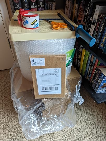
At least I’m at no risk of running out of mailers…
Okay, that’s a lot of money. But newer sci-fi/fantasy hardcovers can cost up into the mid-twenty-dollar range from Amazon, right? I just ordered Robert Jackson Bennett’s The Tainted Cup (Shadow of the Leviathan) yesterday, which cost me $22.90. So maybe this isn’t completely ridiculous?
There’s one last thing, though. I still need to sell the book on Amazon. I created an Amazon seller account, added a listing for The Gap Year, and set the pricing. Which is where Amazon shows you that their fee for selling each book will come to $5.56.
That’s right. To sell my print-on-demand hardcover book on Amazon, the breakeven price is $30.69.
I did it anyway, since I wanted my friends and family to be able to buy one on Amazon and have it show up on their doorstep, hand-wrapped by me, with a cute little border collie return-address sticker. I just had to apologize to each of them for the ridiculously high price!

Completely waterproofed with a ridiculous amount of packing tape!
The final twist is that Amazon themselves are now selling my hardcover, at a price of $29.38. They say it ships in 2-3 days, which would have cost me an extra $1.50 - $4.50 per book from IngramSpark. And IngramSpark will ship it directly to me for Amazon, though their packaging isn’t as nice as mine. This way, I do actually earn $1.00 per book, since I set the IngramSpark price so that my royalty would be a dollar.
Yep, you heard me right. For every one of my scorchingly-expensive $30 hardcovers that Amazon sells, I earn the princely sum of $1.00 :)
June 3, 2024
Overlooked classic: James P. Hogan’s Code of the Lifemaker
(Discussion of this post on Reddit’s r/printSF)
If someone’s gonna recommend just one book by classic sci-fi author James P. Hogan to you, it’ll usually be 1978’s Inherit the Stars. It turns out I don’t have the one with the iconic Darrell K. Sweet cover of two astronauts discovering a giant’s mummified, red-space-suited body half-buried on the Moon. Instead, I have this unfortunate sci-fi book club omnibus edition from 1981, shown here with a border collie for scale:

Don’t get me wrong, the Giants series (continued in The Gentle Giants of Ganymede and Giants’ Star) are great books. Lesser-known, however, is Code of the Lifemaker, from 1983:

The great cover by David B. Mattingly is very evocative of that era of sci-fi, and tells you exactly what you’re in for: a first-contact story between humans and robotic aliens.
The idea of self-replicating robots wasn’t new in 1983. Fred Saberhagen’s Berserker series used it to great effect starting in 1967, and scientists had talked about the idea at least since John Von Neumann in 1948. In fact, NASA did a study in 1980 which Hogan could have heard about, looking at how you might build self-replicating factories on Earth’s moon.
But Hogan had an original twist—these robots are the product of an abandoned alien factory complex, whose deployment on Saturn’s moon Titan in the year 1,000,000 B.C. goes awry due to damage it sustained during its travels. The factory sprawls messily all over the moon, running amok, and the end result is the evolution of an entire robotic ecosystem, instead of an orderly mining complex that would have shipped valuable products back to the aliens’ home planet.
The main part of the story is about humans discovering this robot society in around the year 2020 A.D., when an unmanned probe sends back pictures. The robots’ own bodies are quite sophisticated technology, as are the other robotic ‘animals’ and ‘plants’ that have evolved on Titan. But the technology that this robot society has developed for itself is the inverse of humanity’s, built using organic materials, with their own bodies’ inorganic workings remaining a mystery to them.
The robotic society is at approximately a medieval level, and the arrival of humans, whose rival factions compete to exploit or befriend them, threatens to change that society forever. The book explores many thoughtful themes, including colonialism, religious intolerance, and humanity’s bizarre attraction to pseudoscience even as our real science becomes ever more advanced. It’s a fun read, and stood up pretty well on a re-read forty years later.
As usual, with a book this old, a few things will seem odd. All the characters have very square-jawed ‘Firstname Lastname’ kinds of monikers, and many of the women in the story have secretarial-type roles, though Hogan did grant one of them a Ph.D. and another a military pilot’s license, so you could tell he was at least making an effort to get beyond what was normal in his day. Hogan himself reportedly adopted some crackpot beliefs later in life, but those don’t come through in this work. And anyway, down that road lies madness—I’m a big advocate of taking each work as it stands, and not worrying too much about authors’ weirdnesses. Plus, for a book this old, you can always opt to buy it from a used bookstore, if you want to choose who profits from your purchase.
May 22, 2024
A Nerdly Harvest: What I've been reading recently
(Discussion of this post on Reddit’s r/printSF)
I’ll admit it—I’m too lazy to properly scan and shelve each of my books as I finish reading them. Instead, they pile up on my “done” shelf, and every so often I do a “harvest” to put them all in their places. Well, it’s been a shameful three years since the last harvest, so I had 42 books piled up!

Of the science-fiction books, my favorites were the two slim volumes by Becky Chambers, starting with A Psalm for the Wild-Built. I’m a sucker for hopeful sci-fi, and Chambers squares the circle here, writing a book that’s environmentalist without being doomful or preachy, and hopeful without being smarmy. I was also partial to Scalzi’s The Kaiju Preservation Society. I won’t spoil it for you, but as a guy who’s usually suspicious of thin books written by authors who used to write fatter ones, I didn’t think I was going to enjoy this one nearly as much as I did. I’ve got his Starter Villain waiting its turn on my to-read shelf right now, too.
Then there are the Y.A. books by Kaufman & Kristoff, Novik, Sanderson, and Shusterman. I want to keep up with the zeitgeist, but my time is limited, so I usually only read the blockbuster Y.A. books, like your Divergents or your Red Risings. But my own writing is sort of Y.A.-adjacent, so lately I’ve been trying to read more in the genre to get my head right. My favorites here have to be the Scholomance books by Naomi Novik, which started with A Deadly Education. I suppose you could high-concept pitch the books as “Hunger Games meets Harry Potter”, but that doesn’t nearly do them justice. What if Hogwarts had a good, legitimate reason for wanting to kill its students? It all makes sense, and it’s both cool and horrifying.
I’ve also been trying to branch out from my dependable, go-to authors, to get some fresh blood into my collection. I had not previously read any Arden, Bishop, Blair, Buelman, Clark, Dewes, Elsbai, Eriksen, Gwynne, O’Keefe, Shusterman, or (J.F.) Wells, so I felt pretty good about my 29% new author reading rate! Of those, the one that stood out the most for me was John Gwynne’s The Shadow of the Gods, a Nordic-themed fantasy set in a world where the titanic bones of the dead gods litter the landscape, post-Ragnarök. Okay, that sounds really weird, but it was an interesting and original take, in a genre where it’s a lot easier to just copy what everyone else has already done.
There are also a few odd ducks in this pile, like the four Lindsey Davis books (starting with The Silver Pigs). Set in Rome around 70 A.D., these are essentially private-eye books, but done in a way that really jumps off the page at you. Davis has a rare talent for writing a story set in the ancient world that feels personal, real and richly detailed, without turning into a set of tedious info-dumps. I’m mostly a sci-fi and fantasy reader, which might make these sound like an odd choice. But really, Imperial Rome is so alien to today’s world, that these books are more like reading a fantasy series that just happens to be set in a real universe.
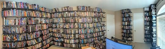
P.S. As a bonus, here’s a fisheye view of where these books go after the harvest. Yep, bookshelves on all four walls :) Putting wraparound shelves in my office was the best quality-of-life improvement ever!
April 16, 2024
Can Amazon KDP and IngramSpark beat my ancient laser printers?
(Discussion of this post on Reddit’s r/selfpublish)
How does the print quality of Amazon KDP and IngramSpark compare with the decades-old printers I have sitting on my desk? Not as well as you might expect!
Before I became a self-published author, I had no idea what kind of quality to expect from the printed books that my readers would one day hold in their hands. People with industry experience generally told me something like, “The big print-on-demand companies print books using huge, industrial printers that cost hundreds of thousands of dollars. Obviously, the quality is going to be much better than your janky home printer.”
It turns out that’s not true!
I’ll show you the evidence in a moment, but first let me introduce the printers we’ll look at.
Amazon’s Kindle Direct Publishing (KDP) and Lightning Source’s IngramSpark are two of the biggest printers of self-published books in the world. A walk-through of an Amazon facility on YouTube shows that they do indeed use huge, industrial printers. If you scrutinize the video, you can see what appears to be a Canon/Océ ColorStream 6000 at the beginning:

The ColorStream 6000 is a huge inkjet printer. Those two print towers are taller than a human! As near as I can tell, they cost from $700,000 to $1.5 million, depending on the options. But for that price, you can print up to 1400 pages per minute! That’s almost 50 times as fast as a home laser printer.
Later on in the same video, they show an industrial-size laser printer, which seems to be something like a Canon varioPRINT 6000 Series TITAN:

The TITANs are a comparative steal at “only” $25,000. They print about twice as fast as a home printer, because they can print both sides of the paper at once. And they’re rated to produce up to 10 million pages a month, which implies you can run the thing full speed, 24x7, for weeks on end. This would probably melt a home printer!
I can’t find similarly detailed information about IngramSpark’s printers, but their documentation says they use inkjet printers, so I think we can assume they use similar industrial models to what Amazon uses.
To compare against these monsters, I have…two old printers lying around my house.
The first is a Dell Laser Printer 1710 from 2005:

Old Reliable here cost me about $300 back in the day. In 2006, PC Magazine said “Output quality for the 1710 is nothing to write home about,” but it’s served me well for many years. At 19 years old, it’s old enough to vote! It prints 27 pages per minute, so the paper goes through it at about the same rate as the TITAN, though it can only print one side at a time.
My second printer is a Brother MFC-9840CDW from 2008:
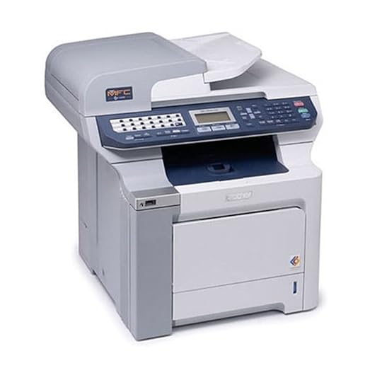
It’s an 80-pound back-buster that I seem to remember cost me about $600 when I bought it new. This is a color laser printer intended for home-office use, and it’s 16 years of age, about what you might want for a fine bottle of whisky. Again, it was not the best home printer available at the time, it was just the best one I could afford. It’s a little slower, at 21 pages per minute, but produces higher quality output than the Dell.
To compare the print quality, I scanned the first paragraph of my book at 2400 dpi. Let’s take a look at the whole page width.

At this level, all four look pretty similar in print quality. The initial capital “A” on the left looks different, and we’ll explain that in a minute. But the normal-sized letters, set in 12-point Garamond Pro, appear quite comparable. The background of the first two scans is slightly darker than the second two, but this is only because fiction books are printed on cream-colored paper, not white printer paper.
But when you hold these pages in your hand at book-reading distance, they don’t look much alike. To see why not, let’s zoom in closer.

Looking at all four first words, including a little slice of the initial capital “A”, you can tell that IngramSpark is using an inkjet printer, where Amazon is using a laser printer. The dithered texture of the capital “A” is characteristic of inkjet printers. The last three show halftoning on the capital “A”, which is how laser printers typically print grayscale. Amazon KDP and my old Dell 1710 seem to have the same number of lines per inch in the halftone, though Amazon’s halftone dots look more uniform. The Brother 9840 has more lines per inch in the halftone, and the halftone dots are rounder. This makes sense when you look at the dots per inch (DPI) of resolution that those three printers can achieve. The TITAN is 600x1200 DPI, the Dell is 1200x1200 DPI, and the Brother is 2400x600 DPI.
And remember, the Dell and the Brother are 19 and 16 years old, respectively. They’re not cutting-edge technology! But home printer resolution doesn’t seem to have increased in quite a while. If you look at modern home laser printers, they have the same DPI that they did 15 or 20 years ago. If you want higher resolution, you can buy something like a Xerox VersaLink C7000, which gets you to 1200x2400 DPI. But a printer like that is about twice as expensive as my old Brother was.
Finally, let’s zoom in to the level of a single word:

I stacked them tightly, so you could see that the quality increases as you go down. The best one is a 16-year-old home printer!
Let’s look at them one at a time. First, the Brother, which I think subjectively looks best:

The letter edges are pretty smooth, though not perfectly so, with little lumps or knobs every so often. There’s a bit of a halo around the edges, but not much, and it’s the same thickness in the horizontal and vertical directions.
Now the Dell, which I’d say is second-best:

There are a few one-pixel voids in the letters, which probably just means that my printer drum needs cleaning :) But the edges and halos look about as good as the Brother.
Third-best is Amazon KDP:

It’s crisp, and their drum is clean, so there are no little voids. But look at those stair-step edges on the letter “w”. That probably means that Amazon is running at 600x600 DPI instead of 1200x1200, presumably to speed up printing. So KDP could potentially look better, but that might take a bite out of Amazon’s profit margins :) At arm’s length under a reading light, it looks plenty good.
And finally the worst one, IngramSpark:

The outlines of the letters are clearly quite rough and irregular. And interestingly, the irregularity is mostly in the vertical direction. This is probably because of the extremely high paper speeds in those continuous-feed inkjet printers. You can’t see all these details when reading a book printed this way, but the naked eye can certainly tell that the letters have fuzzy outlines. It’s not egregious, but it’s noticeable.
So there it is. In summary:
Amazon KDP print quality is slightly worse than an old home laser printer
IngramSpark print quality is noticeably worse than an old home laser printer
Also, there may be more complexity to this story that I haven’t puzzled out yet. I’ve seen variations in print quality between books printed by different authors at the same Amazon facility, so there could be some dependency on which specific printer a given book is assigned to, or how the author prepares their PDF file. But I’ll leave that for a later post!
March 16, 2024
Overlooked classic: John Varley's Gaea trilogy
(Discussion of this post on Reddit’s r/printSF)
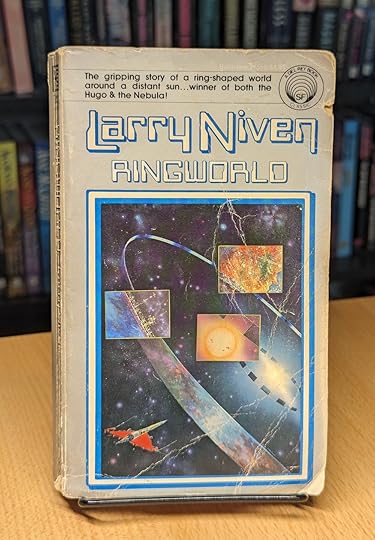
There are a lot of famous sci-fi books where our heroes explore an enigmatic alien megastructure. The first one that comes to mind for me is Larry Niven's Ringworld:
There's also Arthur C. Clarke's Rendezvous with Rama, which I've lost my copy of, but which Denis Villeneuve is apparently making into a movie! And the genre's still going: arguably Iain M. Bank's 2008 book Matter falls into this same category.
A bit less well-known than these is John Varley's inventive Gaea trilogy, the books Titan, Wizard, and Demon:
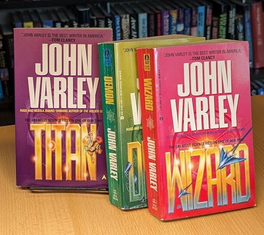
These three books have a very different take than the other "exploring the huge alien thingy" stories I mentioned above. In Rama, the whole plot (spoiler alert!) is pretty much "land on megastructure, see a bunch of stuff we don't understand, then leave." In Ringworld, the protagonists crash-land on the structure and then struggle their way across it for a few months before escaping. But over the course of the Gaea trilogy, our protagonist Cirocco Jones spends probably 100 years in-world, first as an explorer, then later as a sort of roving employee, then as a rebel. It's a sprawling story, and one that gives itself plenty of time to settle in.
The books also explore a lot of cool ideas about alien consciousness and the morality of creating sentient beings. The Titan megastructure is full of bizarre and imaginative creatures, including centaur-like beings that speak in music and have an improbable affinity for Greek scale modes. And the story is good fun; more pop-cultural and less scientifically serious and high-minded than some of the older books in the genre.
As with any story written many decades ago, some parts might be a bit jarring to the modern reader. There's some pretty cavalier treatment of sexual assault, for example (though arguably no worse than in the 2012 movie Prometheus, say). And some of the tossed-off lines which I obliviously read over as a youngster would now probably make me do a double-take.
Still, the series is well worth a read (or a re-read) if you want a gonzo, bunch-of-ideas-at-once take on this classic genre. Varley's Eight Worlds series is also plenty of fun, and contains one of my all-time favorite ideas about how an alien invasion of Earth might play out. It starts with The Ophiuchi Hotline, and goes all the way through Irontown Blues in 2018, which I kept forgetting about, since it came out twenty years after the previous book in the series. I finally ordered it just today!
March 10, 2024
Does KDP print quality vary across books printed at the same facility?
(Discussion of this post on Reddit /r/selfpublish)
This week, I finished reading Theft of Fire by Devon Eriksen. It’s a lively and fun story set in an Expanse-like future, but this isn’t a book review :) Rather, I’m asking a question about Amazon print-on-demand: what’s up with the variation in print quality between Kindle Direct Publishing books printed at the same facility, within just a few months of each other?
I had been hunting around in r/selfpublish for a new indie sci-fi author to check out, and the intro pages of Theft hooked me and made me want to read more. So I ordered it on Amazon, and it showed up a few days later. So far, so good!
I typically read books while lying in bed, with the book propped up just a couple of feet in front of my face, right under a reading lamp. And as I read Theft, I noticed that if I looked really closely, the text was slightly fuzzy. At normal arm’s length, it looks perfectly fine and legible, but close up under a lamp, the font edges were a bit rough.
I pulled a copy of my own indie sci-fi book, which had been printed at the same KDP facility in Coppell, TX as Theft. Comparing a single word in a 1200 DPI scan, here’s mine on the left, and Theft on the right:

I had previously seen that KDP black-and-white interiors seemed to be laser-printed, but Theft seems to be inkjet printed, more like what IngramSpark does. Here’s a look at the print-on-demand information from the last pages of both books, again with Theft on the right:
So what’s going on here?
I’ve come up with a few possible answers so far:
Perhaps KDP uses a different printer for different paper types? But no, both books use the same options: black ink and 50-61 pound cream paper. I compared a 100-page stack of pages from each book, and they were identical thickness and color, as far as I could tell.
Maybe if a book contains black-and-white chapter start images, KDP routes it to an inkjet printer to avoid halftoning artifacts? But my book also has chapter start images, though they’re smaller than those in Theft, so that doesn’t seem likely.
It could be that if a book’s PDF source includes images in a non-grayscale color space like DeviceCMYK/DeviceRGB instead of DeviceN, or text which uses a color other than 0C 0M 0Y 100K, KDP might route the book to the inkjet printing flow used for standard color interiors, which are inkjet printed. I can’t check this without access to the PDF source, though.
The most annoying possibility: KDP has both laser and inkjet printers, and books go randomly to one or the other, so the customer has no idea what they’ll get.
March 3, 2024
Overlooked classic: Julian May’s Pliocene Exile series
(Discussion of this post on Reddit’s r/printSF)
For the last few years, I’ve been going back and re-reading sci-fi books that I loved long ago, to see what I think of them decades later.
One series that held up very well is Julian May’s Pliocene Exile series, comprising The Many-Colored Land, The Golden Torc, The Nonborn King, and The Adversary. It’s a time-travel sci-fi series, where misfits from future Earth, circa 2110 A.D., travel back to the Earth of six million years before, which is unexpectedly occupied by two warring alien races, who are uncannily reminiscent of the elves and dwarves of human legend. I won’t spoil it for you, but May tells a huge story over these four books, stuffed with inventive and original ideas.
How can I call this series “overlooked” when the first book won a Locus award back in 1981, and all four of them have hundreds of Amazon reviews? Well, it’s because it doesn’t seem like May was ever as popular as her talents warranted, and now she’s sort of fallen in the cracks, not quite famous enough to be widely celebrated.
May’s background as a writer of thousands of science encyclopedia articles (!) gave her a wide knowledge of a vast array of topics, and when you read her work, you can feel that coming through. She didn’t over-pack her books with obvious or boring research. But a casual mention of a single word that you’d never seen before, or her clever descriptions of how her invented systems of future technology and psychic powers worked, made it feel like there was a whole world of plausibility there behind the page.
The editions shown here in my picture aren’t all the same ones I read as a child—I had to re-buy some of them used to complete my collection again, since they had gone missing over the years. They seem to be out of print now, and it looks like the covers have changed several times since the 80s. Still, the series is easily available either used or on Kindle, and is well worth a read.
Overlooked classic: Julian May's Pliocene Exile series
(Discussion of this post on Reddit r/printSF)
For the last few years, I’ve been going back and re-reading sci-fi books that I loved long ago, to see what I think of them decades later.
One series that held up very well is Julian May’s Pliocene Exile series, comprising The Many-Colored Land, The Golden Torc, The Nonborn King, and The Adversary. It’s a time-travel sci-fi series, where misfits from future Earth, circa 2110 A.D., travel back to the Earth of six million years before, which is unexpectedly occupied by two warring alien races, who are uncannily reminiscent of the elves and dwarves of human legend. I won’t spoil it for you, but May tells a huge story over these four books, stuffed with inventive and original ideas.
How can I call this series “overlooked” when the first book won a Locus award back in 1981, and all four of them have hundreds of Amazon reviews? Well, it’s because it doesn’t seem like May was ever as popular as her talents warranted, and now she’s sort of fallen in the cracks, not quite famous enough to be widely celebrated.
May’s background as a writer of thousands of science encyclopedia articles (!) gave her a wide knowledge of a vast array of topics, and when you read her work, you can feel that coming through. She didn’t over-pack her books with obvious or boring research. But a casual mention of a single word that you’d never seen before, or her clever descriptions of how her invented systems of future technology and psychic powers worked, made it feel like there was a whole world of plausibility there behind the page.
The editions shown here in my picture aren’t all the same ones I read as a child—I had to re-buy some of them used to complete my collection again, since they had gone missing over the years. They seem to be out of print now, and it looks like the covers have changed several times since the 80s. Still, the series is easily available either used or on Kindle, and is well worth a read.