COVID-19 Forecasts for most countries
In this post I describe a Susceptible-Infectious-Recovered model and how I simplified it to fit actual data. The code for the fit is available on github, where you can find also forecasts for all countries. Data from Hopkins University.
Below the projections for a few countries, with comment:
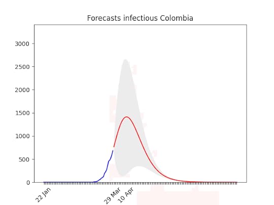
Blue line: the dataRed line: best projectionGrey area: 70% confidence level (i.e. if it’s big the projection have high probability of being wrong)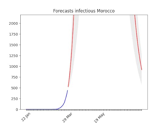
One known effect of the simplification I made is that forecasts for countries at the beginning of the epidemic are over-pessimistic. Have a look at Morocco for instance. With only 500 cases, and difficulties in imposing social restriction, it looks like the number of cases is going to skyrocket. Most probably, though, in a week the projection-curve will go down. In addition to that, the statistics (number of cases) at the beginning is, by definition, low, which means bad forecasts.
Actual ForecastsItaly — static and animated forecasts.
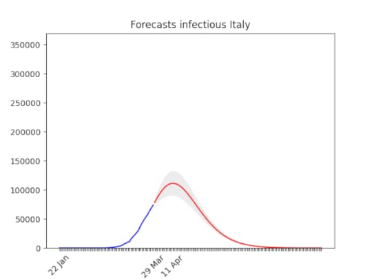 Italy, march, 29: The confidence band (the grey area) is quite narrow now. See below the animation to see how the forecasts have improved with time, and why. The worst has yet to come, but it’s not far. In addition to that, a few regions are very close to the peak, others not so close–but the latter ones have less cases (see Italian regions forecasts).
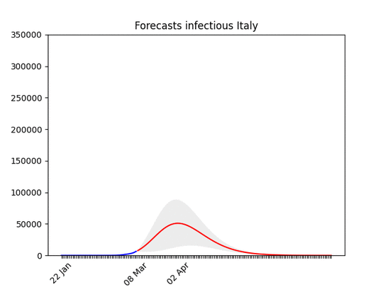 Forecasts for Italy with latest data, and animation with all the forecasts made during the last 3 weeks: you can see how the forecasts improve with time. WIth the restriction it has gone down. This means that at the beginning, without social restriction, most probably the number would have grown considerably.
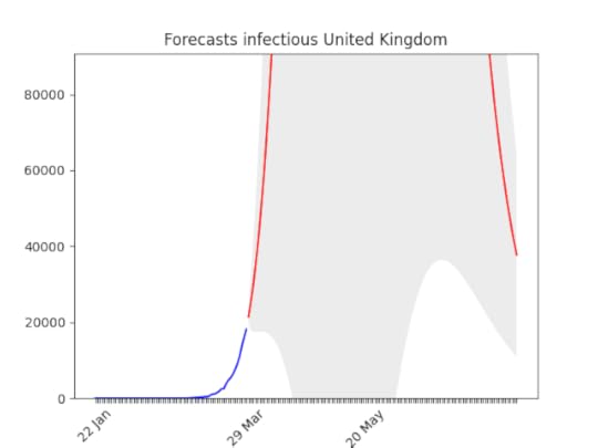 Hard to believe, but the situation is actually improving (still, it looks not good). Remember that at the beginning of the epidemic, also Italy the number of infected people seemed to grow exponentially. With time it went down.
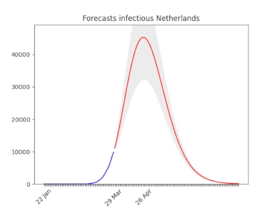 In the Netherlands, the situation is improving by the day.
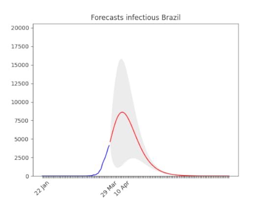 Huge errors in the prediction. But you can see also by naked eye that data showed an improvement (apparently no one is listening the Brazilian president, and most people avoid social contact anyway).
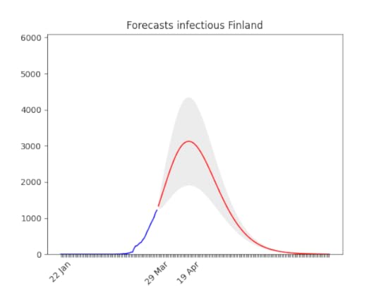 After a bumpy start, the data show a clear direction. There might be changes in the next days, but most probably the peak will arrive in the second half of April, with a three-fold increase of cases.
 I put the animation here, because the forecasts are not getting much better . They have improved only the last day, let’s hope this trend will continue then.
 Still big error (grey area), but the peak is forecasted here as well for the second half of April. The number of cases is going to be huge though, as Germany (see below).
 As above, probably a bit later.
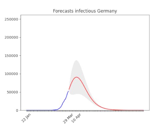 It has grown super fast lately. It is worrying that it might arrive to a 150,000 cases –more than Italy.
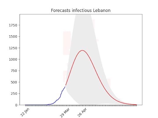 huuuuge uncertainty on the forecasts (look at the data!), but there seems to be room for hope.
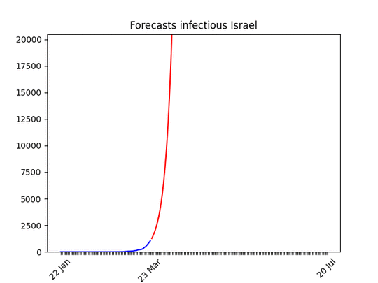 I put the animation here just to show that the situation is improving. Most probably in a few days the shape of the forecasts will be similar to other countries.
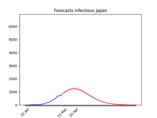 Data in Japan show a big increase in the rate. Only for Japan, I took data from the past 21 days for the fit (instead of 14) and increased the smoothing process. I did that because I’m confident that the increase of the past days is temporary .
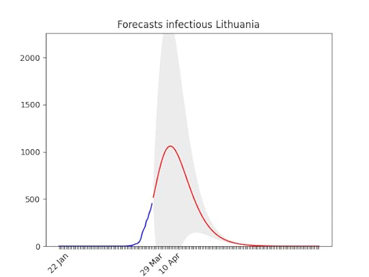 Lithuania.
 Not bad… let’s see if the data were actually meaningful!
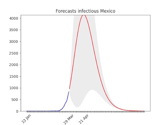 The behaviour looks similar to the US, but without a huge number of cases.