My Logos A-Z: ATOM to BATMAN
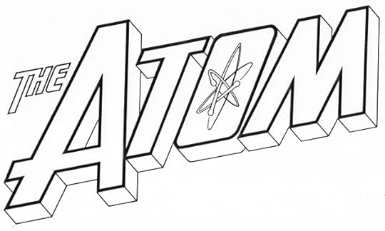 Image © DC Comics
The Atom. Client: DC Comics. Medium: pen and ink. Date: 1993. My task was to update the Ira Schnapp logo from the 1960s, and my main addition was the atom symbol of whirling electrons in the O, which was also a bit rounder. I then added telescoping. Used on two issues of THE ATOM SPECIAL.
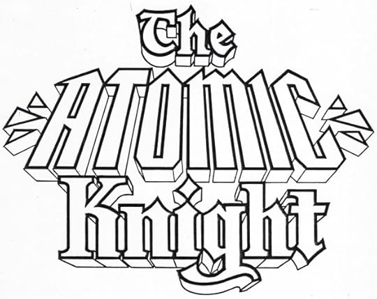 Image © DC Comics
The Atomic Knight. Client: DC Comics. Medium: pen and ink. Date: 1990. A mystery in that I can’t find it used anywhere. My guess is a backup series was planned for Gardner Grayle, the leader of the Atomic Knights seen in STRANGE ADVENTURES in the 1960s, or possibly it was meant for a new character, but the backup never happened. My logo is based on the Ira Schnapp one on splash pages in the 1960s, THE and KNIGHT are from there, ATOMIC is my own take, and of course I added telescoping.
 Image © Rob Liefeld
Avengeblade. Client: Maximum Press. Medium: digital. Date: 1996. This used a commercial font as a starting point, though I added all the blade-like extensions and stroke ends. Appeared on two issues.
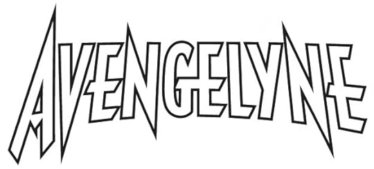 Image © Rob Liefeld
Avengelyne. Client: Maximum Press. Medium: digital. Date: 1996. This also started as a commercial font, and again I tweaked and added to it. Appeared on nine issues beginning with #7.
 Image © DC Comics
Azrael. Client: DC Comics. Medium: pen and ink. Date: 1984. This was the female space angel character from The New Teen Titans, not the male character spun out of the Batman books. I don’t know where this was used, not on a cover as far as I can tell, perhaps on an inside story page. It did appear in the second issue of the original WHO’S WHO, so possibly it was done for that, but I have it listed separately in my payment records, not with the other Who’s Who logos.
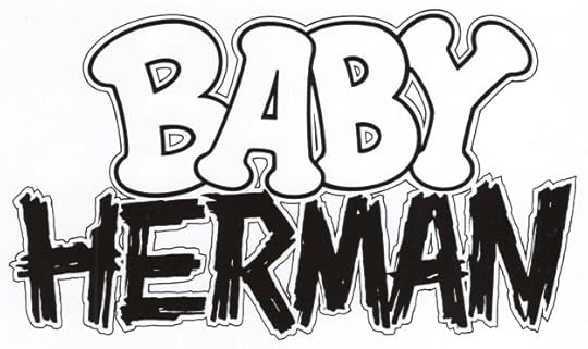 Image © Disney
Baby Herman. Client: Disney Comics. Medium: pen and ink. Date: 1990. When Len Wein, who I had worked with at DC Comics, became editor at Disney Comics, he brought in many people from the New York comics world, including myself. I was asked to design logos for ROGER RABBIT’S TOONTOWN and some of the supporting characters, which were used on stories featuring them. This one first appeared in issue #1. Two contrasting words can make an interesting logo, as I think is true here, and it’s also funny. HERMAN was created with a dry brush in multiple stroke, than probably touched up with a pen.
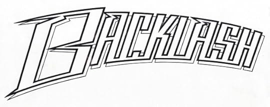 Image © WildStorm
Backlash. Client: WildStorm. Medium: pen and ink. Date: 1994. One of the first things I did for Image Comics, I was contacted by Bill Kaplan, who I had worked with at Marvel. More about it HERE. It wasn’t used on the book, but I was paid.
 Image © Michael Uslan
Batfilm Productions. Client: Michael Uslan. Medium: pen and ink. Date: 1980. Occasionally current or former DC employees would come to my desk in the production department and commission a personal logo. This was for a letterhead and business card for Michael Uslan when he was getting started as a producer of Batman films. I didn’t keep a copy, so I contacted Michael online and he kindly sent me one of his few remaining copies by mail. It’s not a great logo, but it’s nice to see it again. Looks like I used press type for the bottom line. Michael has gone far since.
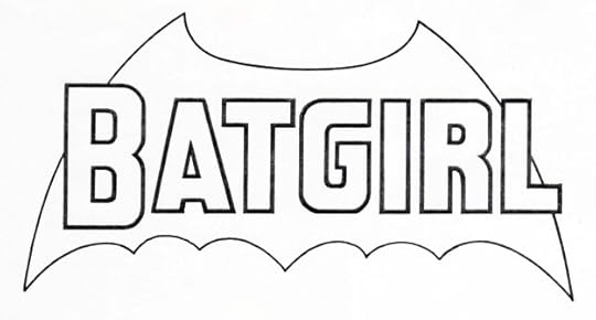 Image © DC Comics
Batgirl. Client: DC Comics. Medium: pen and ink. Date: 1980. This was created for the cover of DC COMICS PRESENTS #19, I don’t know if it was used anywhere else. For years I’ve thought it was designed by Gaspar Saladfino, and I had credited him for it on my blog post about his logos of the time, but the shape of the R should have made me realize it wasn’t by him. I found a payment record for it by me, and I’ve removed it from that blog article and put it here instead.
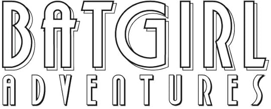 Image © DC Comics
Batgirl Adventures. Client: DC Comics. Medium: digital. Date: 1997. Appeared on a one-shot spinoff from comics tied to “The New Batman Adventures” cartoon series of the same year. I did several others for Batman cartoon show comics, and they all featured art deco styles, as this one does. I think it’s a combination of a font I designed with some letters tweaked for this logo.
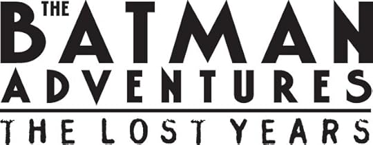 Image © DC Comics
The Batman Adventures: The Lost Years. Client: DC Comics. Medium: digital. Date: 1997. Kind of a continuation of the comic of the same name based on a cartoon series, but I think taking the characters beyond the cartoons. The main logo is similar to the previous one largely because they’re both using art deco alphabets. Here it’s a commercial font. The bottom line is a commercial font of distressed letters that suggest a rubber stamp. Used on five issues.
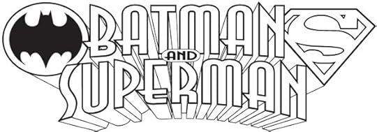 Image © DC Comics
Batman and Superman. Client: DC Comics. Medium: digital. Date: 1997. For a children’s magazine I think not published by DC, but by someone else, perhaps Warner Publishing. The few issues I can find online seem to use The Batman and Superman cartoons as their art style, and I can’t tell if there are any actual comics in them, but I don’t think so. The logo uses a commercial art deco font as a starting point. I don’t know how many issues there were.
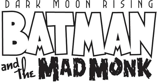 Image © DC Comics
Batman and the Mad Monk. Client: DC Comics. Medium: digital. Date: 2005. For a series scripted and with art by Matt Wagner, and he provided a layout for the logo, which I did not save, so I can’t say how detailed it was. It has the feel of a 1940s horror film, which I think was the idea. Appeared on six issues.
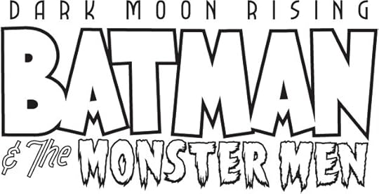 Image © DC Comics
Batman & the Monster Men. Client: DC Comics. Medium: digital. Date: 2005. The other Matt Wagner series, for which I only needed to do the bottom line from his layout. This seems to have been a single graphic novel.
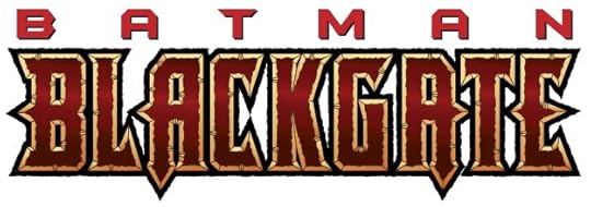 Image © DC Comics
Batman Blackgate. Client: DC Comics. Medium: digital. Date: 1996. The Batman top line is the logo for the character being used at the time. I did only BLACKGATE, which began with one of my title fonts that was heavily distressed and modified. It was used on a single issue.
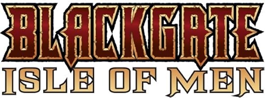 Image © DC Comics
Blackgate Isle of Men. Client: DC Comics. Medium: digital. Date: 1997. Another single issue for which I only had to do the second line. I used a commercial font.
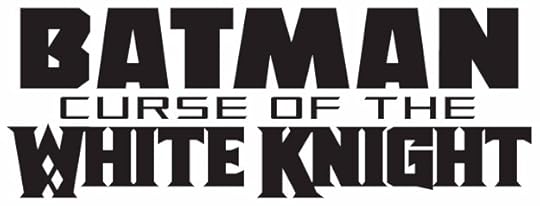 Image © DC Comics
Batman Curse of the White Knight. Client: DC Comics. Medium: digital. Date: 2018. For a series I lettered that was written and drawn by Sean Murphy, sequel to BATMAN WHITE KNIGHT, and the same except for the middle line. The diamonds in the W hinted at the Joker connection. Each line used one of my title fonts. Appeared on eight issues.
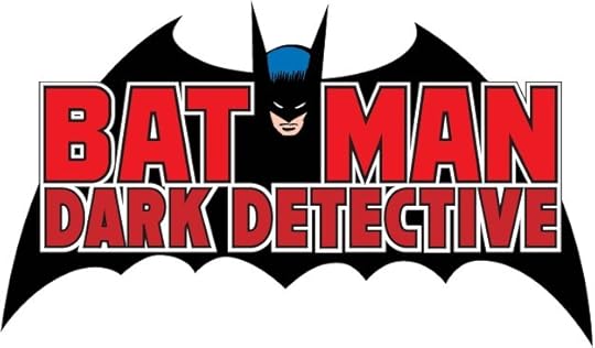 Image © DC Comics
Batman Dark Detective. Client: DC Comics. Medium: digital. Date: 2005. This series reunited the creative team of writer Steve Englehart, artists Marshall Rogers and Terry Austin, and letterer John Workman, who had produced some wonderful Batman stories in the 1970s. The logo is essentially the Gaspar Saladino one from then with a shorter first line and a new second line by me. It used one of my title fonts for that. And, of course, I had to digitally recreate the old logo. It ran six issues.
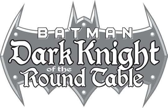 Image © DC Comics
Batman, Dark Knight of the Round Table. Client: DC Comics. Medium: digital. Date: 1998. For this Batman in King Arthur’s time I used a commercial font that has a medieval look like an old manuscript. BATMAN was the style of his own book being used then. I’m not sure if I created the bat shape or if it came from somewhere else. Appeared on two issues.
Posts in this series are listed on the Logo Links page of my blog.
The post My Logos A-Z: ATOM to BATMAN appeared first on Todd's Blog.
Todd Klein's Blog
- Todd Klein's profile
- 28 followers


