My Logos A-Z: BIZARRO to BRAIN STORM
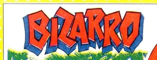 Image © DC Comics
Bizarro. Client: DC Comics. Medium: pen and ink or marker. Date: 1984. By the second issue of the original Who’s Who, the Definitive Directory of the DC Universe, I was set in a routine of creating quick, generally simple logos that we didn’t have. Where possible we pulled logos from the files or cover lettering, but as we didn’t have an organized stock of saved cover lettering (the collection of cover lettering mostly by Gaspar Saladino was done the following year), or an easy way to browse through past covers as the internet provides today, that was a limited option. Nothing great about this logo, which appeared in issue #2.
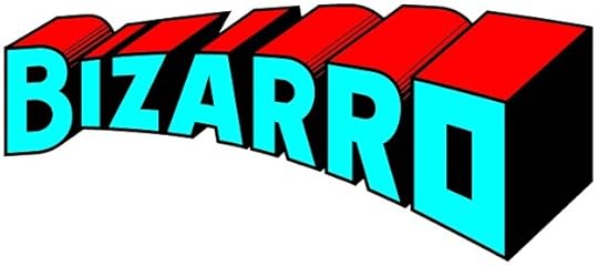 Image © DC Comics.
Bizarro. Client: DC Comics. Medium: digital. Date: 2015. The idea was for this logo to be the opposite of the classic Superman logo. To get there, I made a copy of that logo flipped left to right, and worked over it. That succeeded, but there was something missing. I decided to make the final O a cube, like the Bizarro World, and everyone liked it. More HERE. Appeared on six issues.
 Image © DC Comics
Blackbriar Thorn. Client: DC Comics. Medium: pen and ink or marker. Date: 1984. Another one from Who’s Who #2, using an Old English style.
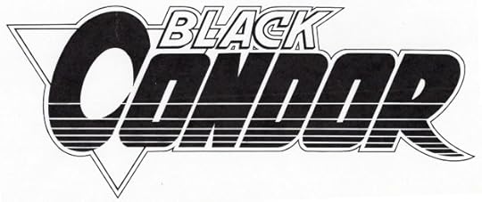 image © DC Comics.
Black Condor. Client: DC Comics. Medium: pen and ink. Date: 1991. Rags Morales, the co-creator of this version of the character, and artist of the series, has said he designed this logo. I have two marker sketches in my files, one is exactly like this, but possibly I used what Morales did as my guide. I’m happy to share credit, though I was paid for the final logo. It appeared on twelve issues.
 Image © DC Comics
Blackhawk. Client: DC Comics. Medium: pen and ink. Date: 1988. This one is confusing, even to me. Howard Chaykin wrote and drew a three-issue Blackhawk miniseries in 1988. The logo on that is by Ken Bruzenak, who also did the cover and interior lettering. When a new monthly series began in 1989, Chaykin was not involved, but DC apparently wanted to visually tie the look and logo to his series. I was asked to do this logo in Ken’s style, but I made a few changes, like the larger B and the open drop shadow, as well as the credit line in the same style. Why they didn’t have Bruzenak do it I don’t know. The book ran 16 issues.
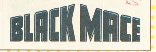 Image © DC Comics
Black Mace. Client: DC Comics. Medium: pen and ink or marker. Date: 1987. Appeared in Who’s Who Update #1. Simple, but the implied three dimensional angles are interesting.
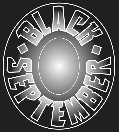 Image © Marvel
Black September. Client: Malibu Comics. Medium: digital. Date: 1995. This was a crossover event symbol that ran large on a single issue and I think also on a number of other titles. Malibu added an infinity symbol in the center oval. The type is one of my title fonts.
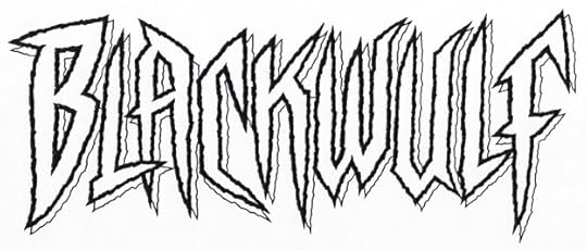 Image © Marvel
Blackwulf. Client: Marvel. Medium: pen and ink. Date: 1994. Part of the Marvel boom in new titles of the time, fits the “sharp and pointy” style, and is also rough and energetic. The letter shapes are somewhat similar to the new Spider-Man I did for them around that time. Appeared on ten issues. A little more on this HERE.
 Image © Entertainment Weekly
Blade Runner. Client: Entertainment Weekly. Medium: digital. Date: 2016. I think you had to read the articles in this Comic-Con Preview issue to know why the logo styles were chosen, like this one in the style of Marvel’s Iron Man. It makes little sense on its own.
 Image © DC Comics
Blasters. Client: DC Comics. Medium: pen and ink. Date: 1988. I enjoyed doing the radiating texture in this one, it adds depth and lots of energy. Appeared on the BLASTERS SPECIAL one-shot.
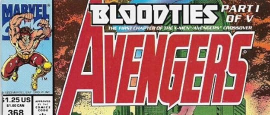 Image © Marvel
Bloodties. Client: Marvel. Medium: pen and ink. Date: 1993. During the late 1980s and 1990s, story arcs running on multiple issues were a thing. Usually I considered them cover lettering, and billed it as that, but occasionally it was commissioned and paid like a logo, as this was, and the Black September one above. The main title was done once, like a logo, and used with type defining which part it was, as seen here. Appeared on five issues, obviously.
 Image © unknown
Bluebaker. Client: Ross Andru. Medium: pen and ink. Date: 1984. This was a project that Ross was working on privately that he planned to sell to DC, but it didn’t go far. I think I designed the logo directly for him, and he paid me for it. If he did any pages, I never saw them. Ross had been on staff at DC for a while, but was freelancing for them at this time, and I always enjoyed talking to him. The letters are standard stencil style, I think it was a military book of some kind.
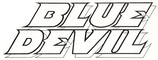 Image © DC Comics
Blue Devil. Client: DC Comics. Medium: pen and ink. Date: 1983. Another logo I like, the character looked like a devil, but his personality was not that at all, leading to sometimes funny situations. So, I tried to make it devilish in an appealing way rather than a scary one. Appeared on 31 issues and an annual, and probably other places.
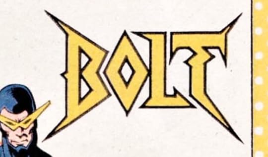 Image © DC Comics
Bolt. Client: DC Comics. Medium: pen and ink or marker. Date: 1984. I had room on this entry in Who’s Who #3 to make a more interesting logo, and I like the zig-zag in the T.
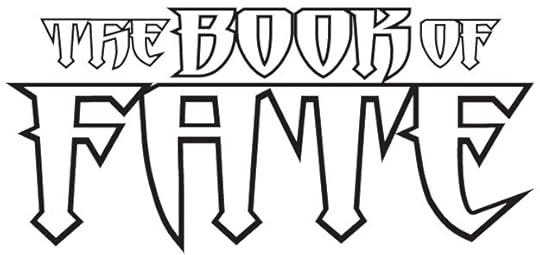 Image © DC Comics
The Book of Fate. Client: DC Comics. Medium: digital. Date: 1996. This continued from the FATE series just previous, but I used one of my title fonts to create a different style for that word and the rest of this logo. Pointy and dangerous. Appeared on twelve issues.
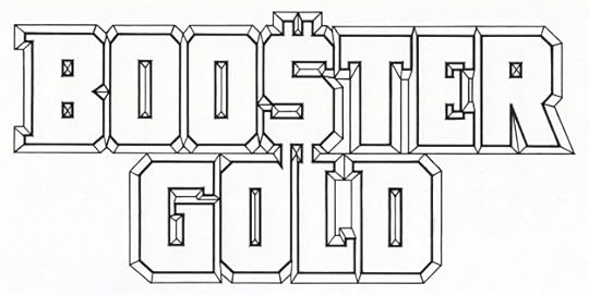 Image © DC Comics.
Booster Gold. Client: DC Comics. Medium: pen and ink. Date: 1985. I don’t recall if creator Dan Jurgens provided any ideas for this, but he probably did. The dollar sign for the S is something I might not have thought of myself. The bevels add depth when they aren’t overwhelmed by heavy colors. Appeared on 25 issues.
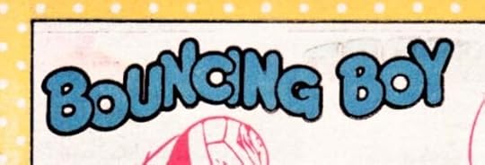 Image © DC Comics
Bouncing Boy. Client: DC Comics. Medium: pen and ink or marker. Date: 1984. The name may be corny, but it sure is easy to design a logo for. Appeared in Who’s Who #3.
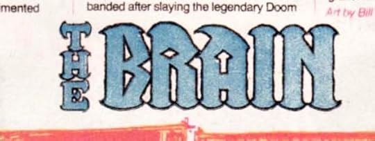 Image © DC Comics
The Brain. Client: DC Comics. Medium: pen and ink or marker. Date: 1984. Another one for the same issue with interesting shapes. I might have been thinking of Brainiac, see below.
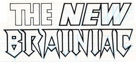 Image © DC Comics.
Brainiac (The New). Client: DC Comics. Medium: pen and ink. Date: 1983. This was created along with a similar “The New Luthor” for ACTION COMICS #544, where they appeared on pinups of the characters. This shows I was already into pointy and dangerous for certain kinds of villains. A little more on this is HERE.
 Image © DC Comics
Brainiac. Client: DC Comics. Medium: digital. Date: 1996. Created for DC’s Licensing department, I don’t know where or if it was used. The circuit design looks old fashioned now, but it took a lot of time to do it.
 Image © DC Comics
Brain Storm. Client: DC Comics. Medium: pen and ink or marker. Date: 1984. Another for Who’s Who #3, not very interesting or original, but it fit the space well.
Posts in this series are listed on the Logo Links page of my blog.
The post My Logos A-Z: BIZARRO to BRAIN STORM appeared first on Todd's Blog.
Todd Klein's Blog
- Todd Klein's profile
- 28 followers


