Internet Column 69: Book Cover Designs – Anyone Got Saul Bass’s Number?
I don’t know if I’ve mentioned this, but at the moment I am unemployed – well, sparsely employed. The downside of this is that my son, who is mentally preparing himself to live without the aid of amniotic fluid, may not have a home to live in once he’s finished being born. The upside is that I’ve had plenty of time to work on I Am Suicide Man and I’m now ready to design the cover.

When balls were just balls
Tonsils, £30
Much of my life is currently spent refusing to eat to save money and contemplating selling my tonsils on eBay, but in lighter moments I’ve been pondering the apparent fact that book covers do not attract the same reverence or critical acclaim as, say, big sports event posters, film posters, or album covers.
I love looking at the old World Cup posters – the striking simplicity of Italy 1934, the flag-bedecked football sock of Brazil 1950, and in particular the defiantly stark Chile 1962 design (right). Similarly, the Olympics has inspired some wonderful designs too, particularly for Helsinki 1952.
Better Call Saul
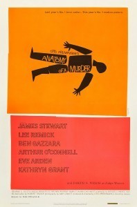
When it comes to film, I am a huge fan of Saul Bass’s work (watch this recent Google tribute –  fabulous). Vertigo is probably my favourite, but I also adore the bold simplicity he gave to Preminger’s brilliant Anatomy of a Murder (left).
Film posters have long been the subject of art exhibitions and it’s easy to recall those that are probably as famous as the movies themselves: Breakfast at Tiffany’s, The Silence of the Lambs, A Clockwork Orange, Trainspotting and that’s without mentioning some of the deliciously tawdry artwork conjured up for exploitation flicks. When I was at University there were as many Harvey Keitel Reservoir Dogs posters on student walls as there were Chairman Mao portraits hanging in homes across China. But does anyone revere and frame book covers in the same way?
They rarely seem to reach the level of iconography achieved by, say, The Beatles’ Abbey Road artwork or the original Jaws poster. There are some classics of course: the butterfly, padlock and key for Papillon (right); the red lips of Memoirs of a Geisha; Paul Bacon’s legendary cover for Catch 22. But there are not too many that really stick in my mind.
Perhaps book covers are simply never displayed in the same way as posters. Waterstones is more likely to construct a pyramid of books in a window than showcase designs in the more dramatic way that Olympic posters dominated London last year, or the way film posters leer down at the public as they walk past an Odeon.
Not too terrorist-y
Even so, covers remain pretty crucial and I Am Suicide Man is giving me some bother. I initially wanted to have a head, covered by a balaclava, speaking into a microphone, but it felt a bit too terrorist-y. So, I’m searching for other motifs or key moments from the book that could inspire a simple yet striking image. For example:
A chocolate fountain.
An ‘ON AIR’ sign.
A logo for a supermarket called ‘The Organic Way’.
The bottom half of a head, showing a bloodied nose and a priest’s collar.
A noose made of rough old rope.
Hopefully, I’ll be able to reveal the final design soon. It probably won’t be one you want to hang on your wall, mind.
This week’s soundtrack: Johnny Cash – At San Quentin
This week’s e-book recommendation: Papillon – Henri Charriere
// ]]>


