Vote for my cover art!
I’m finishing the short story about Captain Lewis’, a prequel to Dreams of the Queen, and I’ve whipped up some simple covers. I know, these aren't the most amazing book covers in the world, but since I’m going to be listing the story for free, I really can’t afford to spend a few hundred dollars on a cover artist. So this is my digital art. Considering that I’ve only started learning photoshop this year, I think I’m doing decently. It helps that I’ve been a self-taught color pencil artist for most of my life, so I have a eye for color, design and balance all of which transfer between media. Unfortunately, photoshop has a steep learning curve, yikes!
Okie-dokie… So I’d like y’alls opinions. Which one catches your eye? Which one do you like the most? I need some quick answers because I’m going to be uploading next week.
You can either leave a comment here or use this link to go to my blog and vote on the official poll.
http://jacquelinepatricks.com/2013/08...
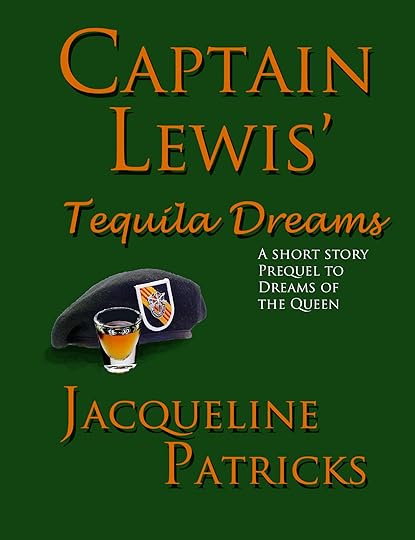
COVER #1 TEQUILA GOLD FONT
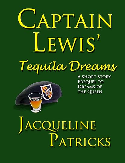
COVER #2 BRIGHT YELLOW FONT
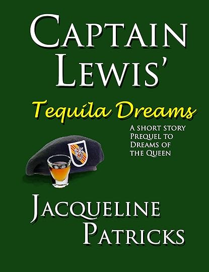
COVER #3 COMBO YELLOW AND WHITE FONT
Okie-dokie… So I’d like y’alls opinions. Which one catches your eye? Which one do you like the most? I need some quick answers because I’m going to be uploading next week.
You can either leave a comment here or use this link to go to my blog and vote on the official poll.
http://jacquelinepatricks.com/2013/08...
COVER #1 TEQUILA GOLD FONT
COVER #2 BRIGHT YELLOW FONT
COVER #3 COMBO YELLOW AND WHITE FONT


No comments have been added yet.