Andy Kubert and Adam Kubert, illustrators The world's Greatest Detective stalks the fiercest killers Gotham City has ever known in these collections that bring together two major forces in comics action and adve
Librarian note: There is more than one author in the GoodReads database with this name
Dave Gibbons is an English comic book artist, writer and sometime letterer. He is best known for his collaborations with writer Alan Moore, which include the miniseries Watchmen and the Superman story "For the Man Who Has Everything". He also was an artist for the UK anthology 2000 AD, for which he contributed a large body of work from its first issue in 1977.
Gibbons broke into British comics by working on horror and action titles for both DC Thomson and IPC. When the science-fiction anthology title 2000 AD was set up in the mid-1970s, Gibbons contributed artwork to the first issue, Prog 01 (February 1977), and went on to draw the first 24 installments of Harlem Heroes, one of the founding (and pre-Judge Dredd) strips. Mid-way through the comic's first year he began illustrating Dan Dare, a cherished project for Gibbons who had been a fan of the original series. Also working on early feature Ro-Busters, Gibbons became one of the most prolific of 2000 AD's earliest creators, contributing artwork to 108 of the first 131 Progs/issues. He returned to the pages of "the Galaxy's Greatest Comic" in the early 1980s to create Rogue Trooper with writer Gerry Finley-Day and produce an acclaimed early run on that feature, before handing it over to a succession of other artists. He also illustrated a handful of Tharg's Future Shocks shorts, primarily with author Alan Moore. Gibbons departed from 2000 AD briefly in the late 1970s/early 1980s to became the lead artist on Doctor Who Weekly/Monthly, for which magazine he drew the main comic strip from issue #1 until #69, missing only four issues during that time.
He is best known in the US for collaborating with Alan Moore on the 12-issue limited series Watchmen, now one of the best-selling graphic novels of all time, and the only one to feature on Time's "Top 100 Novels" list. From the start of the 1990s, Gibbons began to focus as much on writing and inking as on drawing, contributing to a number of different titles and issues from a variety of companies. Particular highlights included, in 1990, Gibbons writing the three-issue World's Finest miniseries for artist Steve Rude and DC, while drawing Give Me Liberty for writer Frank Miller and Dark Horse Comics. He penned the first Batman Vs. Predator crossover for artists Andy and Adam Kubert (Dec 1991 - Feb 1992), and inked Rick Veitch and Stephen R. Bissette for half of Alan Moore's 1963 Image Comics series.
Works other than comics include providing the background art for the 1994 computer game Beneath a Steel Sky and the cover to K, the 1996 debut album by psychedelic rock band Kula Shaker. In 2007, he served as a consultant on the film Watchmen, which was adapted from the book, and released in March 2009. 2009's Broken Sword: The Shadow of the Templars Director's Cut for the Nintendo DS and Wii platforms featured hand drawn art by Dave Gibbons.
Predator acts way out of character in this, randomly killing pets. And then repeatedly going after boxers seemed strange. Batman is also in only maybe a third of the story. Most of the story is clunky exposition coming from the 6 O'Clock News and random Predator kills. The story was much lamer than I remembered. The art by the Kuberts is good.
Almost best Batman crossover ever. Loved the storyline, the Kubert bros amazing artworks and the Predator 2 movie flick vibe, sadly the Hunter killing dogs, cats and an old unarmed boxer seemed acting too much out of character for me. Five stars missed by an inch, what a shame.
"I don't believe it's of this world. I think it's on safari here in Gotham, choosing only the biggest, most powerful prey to hunt . . . it almost caught me." -- expositionary dialogue courtesy of Batman
Viewed now as a little slice of early 90's nostalgia (piggybacking on the success of the original and excellent '87 film, plus the so-so sequel three year later), Batman vs. Predator delivers exactly what it promises in the succinct title. The mysterious extraterrestrial creature covertly arrives in Gotham City and immediately begins slaughtering folks with connections to the vast and storied criminal underworld, confounding the Gotham City PD and vexing the Dark Knight. Of course it will build up to a climactic mano-a-mano confrontation between the two, but the book is sometimes a little too slow to get there. Still, once Batman suits up (reminiscent of his armor apparel late in the cinematic Batman vs. Superman: Dawn of Justice) for battle this inspired cross-over gets sort of interesting.
I mention a couple spoilers in the review but here’s the only spoiler you need to know: this comic is pants!
This is gonna be an unpopular opinion (what’s new?) but the first Predator movie sucked. I’ve seen it twice now, ten years apart just in case it was an age thing, and hated it both times. It’s boring. Actors who can’t act go into a jungle and are repetitively hunted by an alien until Ahnuld kills the alien. Snore. But a lot of people liked it and a lot of people like Vs comics, especially in the early 90s, so we got Batman Vs Predator which swaps out Ahnuld and the jungle for Batman and Gotham City. And somehow it’s even more boring!
The plot? It’s the title. There’s some nonsense about prizefighters and the mob but it’d be a waste of time attempting to describe it because it doesn’t matter. It’s just there to fill up space in between the fight scenes of Batman vs Predator that bookend the story. Ditto the “investigation” Gordon conducts with the GCPD which is really them showing up at one murder scene after another and asking himself where Batman is. Yeah, great “story”, Dave Gibbons - I think I know why you’re more known for your art than your writing!
Predator is probably the best-liked non-character in pop culture. He’s weird looking with dreadlocks and that face, a cool shoulder-mounted cannon, and he can cloak, but he’s not really a character - he’s just an unstoppable killing machine. Batman’s a great character though he’s out of most of the book in a full-body cast after his first encounter with Predator (Batman spent a lot of time severely laid up in the early ‘90s didn’t he?).
The film may have been crap but the ending isn’t all bad and Ahnuld beat the Predator using his wits (and by “his” I mean his character - Ahnuld himself would’ve been dead a long time before the end!). Batman? Despite being written as clever and resourceful (in other Batman books) and he’s in Gotham City, the one place in the world he knows better than anywhere, with all of his gadgets at his disposal, Bruce’s “plan” involves hitting Predator with a baseball bat (Bat-Man, geddit, HARHAR....!). He doesn’t even fully defeat him - Predator’s people show up and kill him at the end! Rubbish!
Alright, I laughed at the baseball bat. You do get to see Batman and Predator throw hands in an epic final battle and I wasn’t expecting that but still. It seemed very stupid. Unless this was all an elaborate joke for Dave Gibbons to build up to a pun? If so, bravo sir. And you are crazy.
Like a lot of Batman comics from this era, Gibbons deploys the “news reader as Greek chorus” to get across large chunks of pointless information. It’s so tiresome to read this crap writing in this way - I hope to never see a newsreader telling us what we already know in a story ever again. Also Gibbons gives Predator dialogue in this book but when its so redundant - “kick butt”, “gonna get you”, “son of a…” - you might as well have him silent like in the movie. I mean, what does that non-dialogue tell us about the character? Oh right, nothing!
I suppose Andy Kubert’s art is alright though he completely flubs the Predator’s cloak. Rather than blending into his surroundings, Predator is a bright white opaque silhouette, a look that couldn’t be less suited to dark, dark Gotham City - he’s like a walking Christmas tree! Also Adam Kubert won an Eisner for his inking in this book but I’m not seeing anything special on the pages here. Then again I’m no expert so maybe it’s brilliant in a way I’m missing.
I really wanted to say Batman Vs Predator was a fun, silly crossover but it’s not. I can’t think of a single redeeming quality to it. Even the Batman Vs Spawn crossover, as bad as it was, had a hilarious final page! This one? Well, I can see why it’s out of print. Like everything the Predator’s in, Batman Vs Predator is commercial garbage.
I can't understand why this has no ratings. I have the original comics that are contained in this book and they are absolutely fantastic. These are your typical Batman comics with mob bosses and Batman playing the detective of why they're being knocked off. But he's never met an adversary like this before... and the Predator is out for blood! Fantastic story and great artwork! This should be on every Batman fan's shelf!
One of the first of these sorts of crossovers, from back when Dark Horse published Predator comics and the whole thing was more mysterious. The story of fighting Batman is essentially Predator II's plot, which is great. The monster kills boxers, kills gangsters, and eventually goes up the line in Gotham until it gets to Batman.
Although obviously the Predator is an alien, it's a very grounded Batman story with a Year One vibe. Real world gangsters, no super-villains. Until the robo suit at the end but I'll allow it. Batman gets defeated halfway through, and has to prove himself in a satisfying conclusion where they fight in the Batcave.
Maybe the story is a little conventional, but it's done with the proper atmosphere for the era. What I particularly love is the art by early Andy Kubert, before his long X-Men run and long far before he eventually returned to DC. It's a lot of fun to read. Nice and self-contained graphic novel, you don't need to know tons of continuity, from an earlier time in both comics and franchise sci-fi horror movies.
Predators always look for preys at their prime, the best of the spieces, fastest, strongest... They live for the challange of the hunt. And what better prey but Batman could live up to these standarts. A Predator at Gotham, found Batman. Even Batman was unprepared for such a fierces hunter, and bearly escaped in batmobile after a big and pretty much one sided battle against the Predator, with heavy wounds from the battle. But leaving Batman alive was a big mistake, Batman got healed in the bat cave with the help of Alfred. And got prepeared for the Predator. An armor and nececasry gadgets. Now, the predator was gonna get the challenge he was looking for. A fierces Battle Between them and this time Batman was victorious. Hunter's moon in the night upon them. The best humankind could offer once again beated the Predator. May be another young Predator couldn't pass his adulthood challange or this time the seasoned hunter Predator met his match. Whatever the sport behind the predators hunt, he was bested...
Spojení Batmana a Predátora funguje překvapivě dobře. 3 sešity kazí dvě věci: - zbytečné vedlejší postavy, které zabírají dost prostoru a slouží jen jako cannon fodder - občas chaotická kresba a malé panely 3,5*
The infamous Predator has descended on Gotham City, and it’s after Gotham’s favorite hero. What will this new foe push the hero Gotham needs to. Will Batman be able to stop this reign of terror?
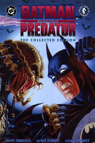
Batman Versus Predator: The Collected Edition by Dave Gibbons
★★★★ Genre: Comic Book/Superhero Release Date: April 1993 Source: Library – Borrowed On My Shelf: I Kind of Want It to Be
I’m kind of obsessed with Batman comics, and I’m kind of not sorry at all for it. I snatched this one at the Library, and although I wouldn’t label myself as a Predator fan, I knew I had to read this. It was a pretty mixed experience.
What I mean by this is that I wasn’t very impressed with the plot, but the writing wasn’t altogether bad, and I was super impressed by the art. See? A total mixed bag!
I’ll start with what I didn’t like: the plot. I found this storyline to be pretty bland, static, and boring. But, that’s how I find the Predator movies (the one’s I’ve actually persevered through to watch, that is), so I’m not someone well-informed about this villain nor a person who’s going to like this lineup for main villain/antagonist. There’s just not a lot of substance in the Predator villain and that showed in this comic. Like I said though, I’m not one to stand up for Predator.
That being said, I can’t really complain about the writing/storytelling. It was not bad nor boring. For me, the boring aspect of this plot came from the content/story base itself and not from the way Gibbons told it. However, I do not think Gibbons is a particularly good storyteller either. It wasn’t bad, but it definitely shows that he is an artist and not a writer.
Heck though, he is a mighty fine artist. Overall, I would have given the story and execution of it 2 stars, but because of the art, this rating went through the roof I originally thought this story would hit. This artwork is absolutely intoxicatingly beautiful. I mean, it’s honestly some incredible work. I was eager to take in every panel and found myself much more invested in the artwork than the story, which without a doubt increased my enjoyment of this comic.
Overall, I recommend this to readers like me who like to appreciate the art of comic books and not just the story, but if you’re solely a story person, this one probably isn’t for you–unless you’re a Predator fan.
I read this graphic novel at the prompting of my husband, and I really enoyed the story. It started off with Batman as more of the detective until the time for his first one-on-one encounter with the predator. The story jumps around from different perspectives quickly, but that is part of what gives the book such a nice pace. Without a spoiler, I thought the ending was fitting. I'm definitely reading the next one (Batman versus Predator II). The artwork was well done and added to the overall story enjoyment. As far as the novel as a Batman story, it was good, but I still prefer the Joker stories.
A pesar de lo bizarro de todo el crossover, la visión que aporta Gibbons está muy bien hecha, bebe directamente de las dos primeras películas y esta historia de Batman se podría considerar una tercera parte de la continuidad de lo visto en la pantalla grande. Muy buen trabajo de Gibbons y los hermanos Kubert a pesar de todo
Batman vs Predator is a great crossover from the early 90’s. Generally I don’t like the idea of crossovers, but this was an extremely entertaining and goofy story with amazing art from the Kubert brothers.
How can it be that one of the best Predator stories contains Batman? It seems odd, but it works. Batman must deal the Hunter's as they arrive in Gotham City. Highly recommended...
I'll admit it, this is hands down one of the best Batman crossovers out there. An intergalactic trophy hunting predator going up against the Giga Chad Plot armored Batman? Sign me up for the tickets to that match.
Now, to anyone who has ready any Batman comics, you can pretty much guess how this is going to end. The Predator is good, but not the Title character of a major comic conglomerate, or one of the long running flagship characters of the comic book industry. So you know it's gonna bite the dirt in the finale. But this is one case, where the journey is more entertaining than the conclusion.
So the premise is pretty standard stuff. A Pradator from the Yautja race has landed in Gotham, and he's taking out the big guns of the city one after the other. Prize fighters, Gangsters, Cops, Corrupt politicians, everyone's on the hit list. And naturally, its attention turns to the biggest baddest game in town, that swings around the city brooding on rooftops.
The first confrontation between the duo, doesn't go well for Bruce, having to be saved at the last minute by Alfred, and stuck with a full body cast, unable to do anything while the Predator reeks havoc across the city. But my man Batman is anything is not resilient, and is all about that coming back stronger theme.
Using all the considerable tricks in his utility belt, his considerable resources, not to mention home field advantage, Batman manages to incapacitate the Predator. Even more impressive considering how, sticking to his stubborn as a mule 'No killing' rule, he was trying to apprehend, not kill the Predator.
Things end as you would expect. Mother ship arrives, the loser Predator commits ritual suicide, and Batman is given a nifty badass sword as a trophy. Order is restored, at least for now.
Now, there is nothing novel or engaging offered here for the casual fan. No philosophical discussions, relevant themes, or deep subtext is on play here. Just the good ol' 90s action movie confrontation between two unstoppable titans.
In that regards, and in regards to being a Batman crossover, the story is damn entertaining, and tickles all the right muscles for a bat geek like me. But I don't expect it to appeal to everyone out there, and that's OK.
Plus, the artwork is gorgeous, cinematic and brings out everything that is good about that era's dark, gritty gothic vibe which is so characteristic of Gotham and Batman. All in all, a solid read for the fans. I'll give it 4 out of 5
Está curioso ver a un Predator en Gotham, jaja. Y Batman, con esa chulería que le caracteriza, enfrentándose a él. Una lectura de lo más friki. Podrían hacer peli o serie de esto. Sería un puntazo. Hay dos partes más. Seguiré.
This is a case study on how you could make good comics by crossing different franchises, without selling out, without simply milking what is already popular. A Predator comes to Gotham City, the epitome of an urban jungle and proceeds to hunt what it considers "its strongest", starting with prize fighters, moving on to major mob bosses, then the politicians and finally the police.
Above all, obviously, the Batman, the only one to whom the Predator accords some respect.
There is a whole lot of allegory here, about what we perceive and signal as "strong", but that may be in the eye of the beholder. More than anything, this comic excellently depicts weird urban terror and the small single-mindedness of our species. Not for nothing, the comic has one of the best examples on how to realistically depict an empowering female character, who is not even a co-lead.
Detective Kandowski is a no-nonsense female cop, among the few who actually manage to properly wound the Predator while saving Commissioner Gordon's life. She then gets unsurprisingly butchered like any other normal (non Batman) human, but her death happens "off-screen" because we have already seen how the Predator kills and depicting that would simply be part of the usual female death exploitation.
She fights the good fight to the best of her abilities, she is not the only one who does so (albeit somewhat more effectively) and consistently with internal logic, she dies a horrible, yet honorable death.
Other than that, the whole comic could be the Kuberts delivering a crash course on how to play with angles and atmosphere, while keeping the art clean and crispy. I could not appreciate all that when I first read it, some 25 years ago, but it is one of those comics whose imagery has stayed with me to this day.
Given DC's terrible track record in recent years and the changes that to me are a symptom of freefall, it's good to remember they used to make great comics.
A crossover that was inevitable, considering the popularity of both characters at the time. The creature that fought against Schwarzenegger himself, versus the Dark Knight of Gotham City. Here it is, and from the hand of the co-creator of one of the most influential pieces of comic book history, Watchmen, as well as the iconic illustrator, Andy Kubert, with his brother in the inking. A combination that, on plain sight, might not look as much, but the final product turns to be much better than anyone would’ve thought. The story starts in Gotham City, there is a series of savage murders across town, and Batman, along Commissioner Gordon and the rest of the G.C.P.D. are investigating what this might had to do with the gangster bosses that are handling the boxing tournaments, since the fighters are becoming victims of the unknown killer. Eventually, Batman will realize the kind of threat he’s about to encounter, and a battle of genuine warriors will define the fate of Gotham. Back in my ‘Batman Aliens’ review, I mentioned how I wished that crossover toyed better with the concept of mixing two of the most iconic figures in pop culture history; whether by crafting a far ambitious plot, or just exploiting the idea of Batman fighting the Xenomorphs with a little more creativity than the one presented in the final product, and despite my liking of the two issues- mostly due to the art of Wrightson-, the event felt too conventional and simplistic to my taste. Who would’ve thought that the actual better crossover already existed, published 6 years prior? Not only Dave Gibbons gave us the better story, but he actually exploited the concept with far better interest and debt than Ron Marz? And while, obviously, the art of Kubert doesn’t match the one from Wrightson- that is almost an impossibility-, Andy Kubert pencils are so addictive to look at, despite how reminiscent of the early 90s they feel. For starters, Gibbons sets the scenery in Gotham- as I wished for the ‘Aliens’ crossover-, so the threat feels far more dangerous than to just place Batman dealing with an off-world threat in a foreign jungle (which happens to be the one from the first Predator movie). The Predator here is hunting the boxing-champions, and the people that is proving to be a danger to it. And yeah, Batman is the one realizing about the code and the hunting rules of the Predator after a couple pages of investigation, that includes, the Predator taking human parts of its victims as trophies, and the use of alien technology for its hunting, and yes, Gibbons even respects the Predator rules of only fighting armed prey. I wasn’t surprised to see how Batman unravels these traits, after all, he’s the World’s Greatest Detective, and it is handled in a way that feels exciting and thrilling. I was also glad that there’s not one, but two fights between the main characters; it reminds me a little to the whole ‘Knightfall’ event in the Batman series, however, the latter came 2 years after, so I cannot help but to see a certain source of inspiration in Gibbons’ crossover for writer Doug Moench. As for the art, as I said, Andy Kubert became a huge star in the Marvel Comics after becoming a sort of “replacement” for the X-Men series, by Chris Claremont, after the departure of Jim Lee from the project. Andy and Lee both had a similar style that places their pencils in a messy, overly detailed, and pretty aggressive proportions that weren’t that extravagant in order to be absurd and phony, but not that realistic either. In here, both Batman and the Predator look terrific, just as you might expect out of a 90s comic book crossover, but the highlight it’s got to be the newer “armor” that Batman uses, to fight the Predator the second time, a strong reference to the ‘Dark Knight Returns’ graphic novel by Frank Miller. It really feels like a piece of its time, but not in the dumb-ugly looking way many comics were back then; this is stylized, violent, “manly” if you’d like. It looked cool for the concept, and the art perfectly matched the tone of the story, with a fine addition of colors by Sherilyn van Valkenburgh. It is a vintage piece, in the good way, it really does justice to the Predator design, since it is the very same of the first movie, which might come as a mistake in canon, since each Yautja is different from each other, but I understand that this is a creative decision to give the classic image of the alien for it to fight the Batman. As for flaws, of course there are some; for starters, and while is not as much as in Batman Aliens, it takes a while to see the two characters fight against each other, there is also a couple of convoluted plot devices throughout the first issue that really got me going back some pages to follow up what was going on, and I refer here to the whole “gangster” sub-plot, in the beginning. As much as I loved the art in here, I won’t be lying saying I didn’t lose myself in certain frames, because of how many things Andy Kubert draws, even in the smaller ones, and the shapes from time to time represent an excessively detail problem of proportions, so again, it turn some pages a little confusing to stare at. Nevertheless, neither ruins or destroys the final product, in many ways, it is a strange case of a crossover being better than it had any right to be, and while the story doesn’t deliver any pretentious or “thought-provoking” plot devices, it does offer mindful title that takes into consideration both franchises, and their respective lore, in a respectful and engaging way, all in order to put two of the most emblematic characters in pop-culture history together in an emblematic rumble, a match that’ll please, and satisfy fans of both legends.
Pocos momentos mas épicos en la historia del comic como el día en que Alfred le disparó a un Predator con un trabuco. Es un excelente comic, muy visual y con una historia muy buena (para entretenerse). Muy divertido!
haha what wasn't there to love? Of course, spoiler alert, the predator always loses. It's sad, one day i'd like to read a story where the predator actually kills the hero... ah well.
Rileggere questa mini degli anni '90 è stato interessante, un poco perché non ne ricordavo praticamente nulla, e un poco per via del fatto che i fratelli Kubert andavano controcorrente in quegli anni dove i disegnatori americani si divertivano a disegnare sempre male, con poche pose stereotipatissime, anatomie da improbabili a impossibili (sì, mi riferisco alla scuola di Rob Liefeld) e sfondi inesistenti. Invece i Kubert, degni figli di bravo genitore, si sforzano di essere corretti anatomicamente, aggiungono gli sfondi, non si fermano a quelle due o tre pose e nel complesso rendono questa mini veramente ben disegnata. Dal lato del soggetto la trovo povera, non era così 5 lustri fa, ma oggi vedo debolezze che all'epoca non capivo. Resta una buona storia, ma il fatto che la trama fosse completamente scomparsa dalla mia memoria è segno che davvero non era un granché. 3 stelle.
I think the book would’ve been better if Predator didn’t talk so much or at all and the artwork was a bit more clear, there were times that the action was drawn so poorly that I had no idea what was happening across the panels.
Overall, even though it had its moments, what should’ve been one of the most epic crossovers of all time ended up being mid at best.
Gran historia, un Batman detective con un toque similar al de las caricaturas de los 90, enfrentándose a uno de los personajes más emblemáticos también de la época, Acción y suspenso podrás encontrar en este ejemplar
Mucha machaca y litros de sangre. En general los dibujos están muy bien, aunque la narrativa por momentos se hace complicada y hay que prestar más atención o incluso volver a ver viñetas anteriores (siempre me sucede esto con los hermanos Kubert). La historia no agrega demasiadas novedades a ambas franquicias, pero es una lectura entretenida.
Extremely bad. Bad writing that manages to get the source material wrong and makes no damn sense and very bad. The only reason I almost gave this 2 stars is because the sequels manage to be even worse.
I remember reading this story back when it first came out and loving it quite a bit. The nostalgia factor is still there, of course, but I still found myself enjoying the narrative (despite the authors not quite following the 'canon' established in the Predator movies). I have usually enjoyed crossovers between major companies, and I remember how excited and nervous I was when I first learned of this crossover. So, yeah, I thoroughly enjoyed it the first time I read it. Now, I still enjoyed it, but it was not quite as "AWESOME!!!" as I remembered. The story does move at a pretty good clip, overall, and it took a few "surprising" turns (to be honest).
The artwork was okay; sometimes the colors worked and sometimes they did not. I realize it can be difficult to translate the Predator's "cloak" into a comic book format, so I can 'forgive' how he is presented in the pictures on the pages (as really standing out more than he should). There were a couple of money shots scattered throughout the story (especially the 'shot' of Batman in his suit of armor facing off against the Predator; that was still pretty awesome! The pic of the Predator atop the cathedral was pretty awesome, too.).
It is an interesting story; it starts out as a 'mystery' and turns into a "big-time brawl" by the end. Batman is shown using his skills as a detective to try and learn what he can about the alien; it is kind-of-amusing, as one would think the police's detectives should have been able to figure out the same hints and clues that the Batman was coming up with on his own. Some of the "discovers" that Bruce discusses with Alfred really did remind me of some of the old Sherlock Holmes mysteries I have read in the past; logically, the police detectives should have come up with the same information that Batman did based on the clues that were found. Perhaps Batman was supposed to have discovered clues and materials the detectives missed? I know Batman likes to have 'first access' to crime scenes before they are 'spoiled' by the police department's crime lab techs, but it still seems like, unless Batman was finding 'stuff' that the GCPD was unable to find for some bizarre reason, the police should not have been quite so far behind the eight ball when compared to Batman. Even then, it was still 'fun' to see Batman trying to piece together where the villain of the piece might be hiding.
The series was very different, as it seemed to move against the 'established canon' of the movies. That was not the only thing that stood out to me.
There was one 'overall thing' that I did like about the comic.
Overall, it was a fun series to reread, as it has been quite a few years since I last read it. I could see myself reading it again at some point in the future.
I wonder if Dave Gibbons had seen Predator 2 before he began writing this series, because the urban landscape and the way the Predator cut through various mob bosses reminded me of the doomed sequel in some ways. Fortunately, Gibbons' script was better.
It's hardly cutting edge stuff, but it's fun for what it is. The bosses are all fairly basic, none of whom will stick with you long after you put the book down, but Gibbons does use them well to build up the Predator's fearsome stature. The only part of the script that bothered me, really, was that prior to putting on his armor and fighting the Predator, Bruce was a mess, barely able to stand, but after the armor is damaged and discarded, he seems to be near his fighting peak.
Andy Kubert, in what was one of his first major penciling jobs as I recall, does a decent job. He draws scenes from interesting angles and keeps the pages exciting, but his storytelling skills are pretty poor at this point. He seems much more concerned with dramatic poses than with clear panels. There are a couple sequences which still make no sense to me.
Overall, it's fun. Nothing essential, but if you dig this type of crossover, it's a good time.