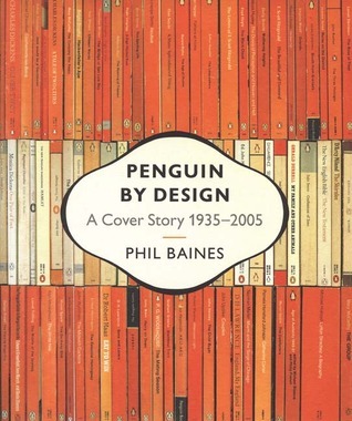
Ever-since the creation of the first Penguin paperbacks in 1935, their jackets have become a constantly evolving part of Britain's culture and design history. Rich with stunning illustrations and filled with details of individual titles, designers and even the changing size and shape of the Penguin logo itself, this book shows how covers became design classics.
By looking back at seventy years of Penguin paperbacks, Phil Baines charts the development of British publishing, book-cover design and the role of artists and designers in creating and defining the Penguin look. Coupling in-depth analysis of designers - from Jan Tschichold to Romek Marber - with a broad survey of the range of series and titles published - from early Penguins and Pelicans, to wartime and 1960s Specials, Classics, fiction and reference - this is a distinctive picture of how Penguin has consistently established its identity through its covers, influenced by - and influencing - the wider development of graphic design and the changing fashions in typography, photography, illustration and printing techniques.
Filled with inspiring images, 'Penguin By Design' demonstrates just how difficult it is not to judge a book by its cover.
Now I know what you’re thinking – “the old idiot has finally lost his marbles, he’s already reviewed this book, and only last month too, what a shame. He’ll be carted off to the Home for Gaga Reviewers soon”.
No, that was a different one.
Also not to be confused with this one
so there are three books published by Penguin celebrating the sheer effusive penguinity of their lovely covers! Well, why not. It’s their rules, they paid for all this, they can do what they like.
Here are a few random favourites from this collection, starting with some socially-sanctioned sleaze from the 60s
I love this one
and this
there was a handbook on scootering. Like, how to ride a scooter. Scootering? Scootering!
This is quite interesting. Graham Greene thought his name was sufficiently big so that he did not need any kind of illustration on his book covers. So Penguin published a few of his novels like this
According to this book “sales fell dramatically”. So the illustrations came back :
I mean, just a little scribble and something that looks like a broke down tardis makes people immediately buy it? What does that say about us book buyers? Are we that shallow?
This is a gorgeous book… as a bookbinder, I try not to enthuse too much about cover-art since I know it’s the least relevant part of the book to most people (isn’t there some sort of saying…) but if ever there was a book to bring up the subject of looks, this is it. I don’t know if it was available in hardback, but the paperback cover version is lovely, with mock dust-cover flaps, striking, (there’s something about that ‘penguin orange’) and everything about it makes me want to pick it up and revel in the wonderful book cover illustrations again.
*cough* er… was I drooling? Anyway. What you get inside this book is a history of the evolution of Penguin cover design, some of the motivations for lines and imprints introduced, how they both changed and changed with the market, the impact of the war on titles released, changes to the typography both inside and on the front covers of each line; none of which, of course, would mean anything without a history of the company itself, which is given in rather a necessarily potted form; as Baines says in the introduction, there is not enough space to include a complete catalogue of covers – by extension there is not enough room for a full biography of each member of the board, although Allen Lane is given plenty of … oh, god… coverage. Sorry.
The book covers used to illustrate these changes are chosen well and there’s no chance of flipping pages without stopping to actually examine each cover… Baines is also not afraid to point out flaws as he goes. Penguin’s story is one I find fascinating anyway, but I think it’s accessibly written and anyone with the vaguest interest in books or graphic design would be won over by the constantly evolving approach to not only catching the paperback reader’s eye with artwork, but catching their imagination with a brand that they would always feel had the best shelf appeal.
Phil Baines concisely outlines Penguin's history from its founding by Allen Lane in 1935, to the Great Ideas series of 2004. From Edward Young's horizontal grid design, the introduction of the Pelican line (educational nonfiction for the masses), the beautiful Illustrated Classics with their woodcut covers -
King Penguins, Penguin Specials, Puffin Picture Books for children, the short-lived American Penguin, Penguin Modern Painters, the first Classic introduced in 1946, the designers Jan Tschichold and Hans Schmoller (bringing a breathtaking Teutonic purity and refinement to the designs), the wonderful roundels of the Classics, Penguin Poets, Nikolaus Pevsner's Buildings of England series, the Handbooks; Tschichold, Schmoller and Frederiksen perfecting the vertical grid -
one can only sigh in reverence. The hiring of Germano Facetti as Cover Art Director in 1961 and Romek Marber's handsome redesign of the grid -
[image error]
this was the golden age of Penguin. John Sewell's line drawings, and the composition of his Modern Classics covers deserve mention:
The decline of Penguin covers begins, to my mind, with Alan Aldridge (his Penguin John Lennon being one example), although not all the beauty was exhausted; there were still David Gentleman's woodcut covers of the New Penguin Shakespeares beginning in 1967. Some of David Pelham's covers were pleasing, as were many of Derek Birdsall's. The 70s saw disturbing developments in typography, which became larger and more modish -
Soon, covers would make even the most resolute weep and gnash their teeth:
But positive developments came in the 2000s with the return of the "black classics" and Futura typeface, and the lovely and tactile Great Ideas, with their uncoated stock and debossed cover elements.
Baines is often strict, and always correct, in his assessments: "On some titles, this disciplined approach was allowed to lapse, and intrusively positioned 'homely' serif typefaces started to appear (Cordon Bleu Desserts and Puddings)." Cleanness, consistency, sans serif: these are good things.
"Nothing...can excuse the mixture of conflicting elements on Absolute Beginners."
"One shudders to think what Jan Tschichold (designer of Sabon) would have made of its letterspacing on these covers." (Baines hates to see letters crowded together.)
Baines is a cover designer himself. Here are two of his from Penguin's Great Ideas series:
He even includes a 2-page spread on logo development from 1935-2005 showing the 48 different penguin/pelican/puffin/porpoise/ptarmigan/peacock/peregrine/kestrel logo designs. This is a finely produced book that will delight any paperback connoisseur.
Absolutely marvellous; 'Penguin by Design' is a design classic in itself!
I have always loved Penguin Books and I specialised in them when I was a bookseller and I am writing a monograph at the moment entitled 'A Penguin Book Mystery 1951: Who was the mysterious fourth man?' It is no surprise, therefore, that my book collection contains many of the histories written Allen Lane and the firm. This is one of them an it contains a plethora of cover illustrations, as befits the title, and it is surprising how many subtle changes have been made to these iconic looking books.
Changes to the colophon are many and varied, and the covers, even of the original design, have gone through many changes until in more recent times printing processes changed so much that they introduced illustrations, both hand drawn and photographic, onto the covers.
There have been many additions to the lists over the years by introducing different series some of which survived, some of which, such as King Penguins and much more recently Pelicans, were discontinued others still going today. The personnel, administratively and artistically, changed, too, but the standard of production and elegance continued to be first class.
All this is covered in the historical text that runs through the book as we move seamlessly from one series to another, ending with one that at the moment I cannot recall seeing one of the volumes in the series. That series is entitled 'Great Ideas' and emerged in 2005 and includes George Orwell's 'Why I Write' and John Ruskin's 'On Art and Life' among others.
As the dust wrapper blurb states, the book is 'Filled with inspiring images, 'Penguin by Design' demonstrates just how difficult it is not to judge a book by its cover.'
Awesome, awesome book about the history and development of Penguin Books, with specific focus on its evolving design aesthetic. The images of the old covers are to die for: several times, I think, I had to wipe away the drool. The later chapters are a little depressing, however, like seeing an aging actor and thinking, “Damn! He’s really let himself go!” Penguin Books: the Mickey Rourke of publishers.
Fortunately, as with Mr. Rourke, all is not lost: despite letting the general look of its overall efforts decline, Penguin is still producing wonderful limited-edition series, like the Great Ideas series. These books are gorgeous; whenever we get new ones into the store, yup, it’s drool-wiping time again. The Wrestler could only dream of provoking such a reaction.
I've been looking for this for years and finally found a secondhand copy. Elegantly designed book that combines literature, history, art, and marketing. The author is very opinionated about Penguin's book designs, especially the bad ones. My plan was to make collages out of this after reading it, but there's no way I can cut up a book that's this beautiful.
A pretty coffee table book covering the history of Penguin Books' cover designs. Penguin has a strong artistic tradition regarding its covers. The orange spines that adorn the covers of this book are readily recognizable to any reader. Over the years Penguin produced many gorgeous covers and a few clunkers, and author Phil Baines curates a collection that includes both.
The original three-panel Penguin covers and the subsequent minor variations are beautiful examples of design. Everything looks clean, crisp, and aesthetically pleasing, and even decades later many of them do not appear dated. My favorite designs besides the originals are the Tschihold classics designs from the 1940s (the two pages of roundels are gorgeous), the physical sciences covers of the 1970s, the Games covers of the 1950s, the 2005 Reference relaunch (a tremendous homage to the original design), and the Modern Classics look from the 2000s that I think you can still find in bookstores today.
The text is satisfactory but falls short in two areas. For one, it does not always explain typography and design decisions in a way that laymen like me can appreciate. I'm not saying that the text is abstruse, but that when you are talking about letter spacing, halftone printing, etc. to non-designers, you have to take some time to illustrate clearly the effects of a design decision and its pros and cons to make us really and truly get what it is that you have to say. I also think that this collection could have been improved by showing some covers of the same book evolve over the years. For example, multiple covers of A Clockwork Orange appear in the pages; it would be cool to see them side by side, changing over the years, reflecting different selling approaches, popular reactions to the books, and so on.
In what I can only describe as a great irony, my copy of the book was very poorly bound, and the cover came unglued from the spine halfway through reading.
As a long time fan of the Penguin brand this visually rich account of Penguin design left me wondering why I hadn’t picked it up sooner. Although the book is now 14 years old, the impact of the full-colour-throughout covers has not diminished. I am now much better acquainted with the Penguin catalogue and will be seeking out less common imprints in my local second-hand bookshop.
Later chapters telling the ‘story’ of Penguin could be interpreted as ‘pandering to the execs.’ After all Phil Baines was paid to write this history and one can assume a certain degree of editorial interference. Nevertheless the overall tone is enjoyable, and potentially drier subjects of layout and typographical evolution are brought to life through concentrating on the personalities who achieved the iconic brand style.
It's purty. Actually it's interesting, too. Penguin's had some of the best cover design in the world, and that's the part I remember; this book reminds me they've also had plenty of awful, tawdry covers. Illustration has not been Penguin's friend. The 70s were deeply unkind to Penguin -- even those paperbacks that should've looked classy, like the white-field type-only Graham Greene novels, just look cheap and...well, Brighton Rock suits them, and so do Muriel Spark's novels of corruption. Plain, no serif, geometric design, this all seems to do well and last. Plenty of insider history, too, if you want it.
You know what they say: "Never judge a book by it's cover." But since we all do it anyway, here's a book of nothing but covers! This book is beautifully put together and gives you a nice look at how the covers of Penguin books have evolved over time. It was interesting and I liked being able to flip back and forth to look at all the changes.
I should’ve probably read this back when I was doing my masters in publishing but I’ve read it now. :p
Really excellent overview of penguin cover designs up to 2005, with plenty of reproductions inside to illustrate points made.
I admit I primarily bought this because I’ve got my hands on several metres of orange bookcloth strikingly similar to Penguin Orange, and I want to create some penguin mock-ups or homage covers with it, and I thought this book would have enough reproductions for me to be able to pull as references. It does! I’m very happy. And as a bonus there’s all these other covers too, to draw inspiration from.
A nice overview about publisher Penguin 1935-2005ish. It's not just book cover design but the entire book production business, from author acquisition to font design, and book marketing to commissioning images. It seems every major employee of Penguin tried to put their own mark on the brand, either by redesigning a large set of books, or by starting a new series, or taking a specific approach to typography. I loved the overview page in the back with all the different versions of the Penguin, Pelican and Puffin logos.
My favorite insight in this book is that graphic design has always been a factor of marketing. I love the 60s and 70s covers when the pop-art designers start taking all the advertising that surrounded them and making what they wanted out of it, especially when the cover design is in service of a challenging or transgressive book. The Peregrine Academic line is also a favorite.
A good book when it comes to the history of Penguin as a company and all the changes and context that led it to become one of the most important publishers in the world. Nevertheless, as a book that centres on cover designs and their process, book pictures are rather small in some cases.
Ok, not a word-for-word read, more of a skim and absorb, since it is a history of Penguin Books in 500+ covers. Visually delightful for those who consider books as art.
Of course digital is great; for starters it means not having to double the weight of your suitcase to take away those holiday reads; the trouble is, you do miss the feel of the book...and the cover.
This is a great book which looks at the fantastic covers of Penguin books from 1935-2005. There's plenty here to interest those who want to delve into the finer points of graphic design and the mysteries of typeface. Or like me, you can just sit enjoying the art covered here (yeah, awful pun intended).
There's the whole range of Penguin publications and style: the blue and white horizontal lines of the late 1930's Pelicans or orange vertical grids of the Penguins of the same era; the David Pelham SF designs of the late sixties; the white covers with bold letters of the 1970 Education series and of the stylish recent re-launches. Plus a whole lot more.
You can't help but pick out favourites and they change every time I look at it. They can also be picked for different reasons: representing a time in my life; a design skilfully adding or explaining the book contained; a memory of seeing that edition; the book being a personal favourite...or that it just looks nice.
Personally, and right this second, I would choose for a variety of reasons (though not necessarily including that I like the actual book, there's one here which I do not), I'd go for: Graham's Greene's A Gun for Sale (1963. Drawing by Paul Hogarth); Albert Camus's The Plague (using a detail from Nature morte au crane de boef by Pablo Picasso), James Joyce's Ulysses (Hans Schmoller's 1969 design of a plain black cover with only the author's name and title in white lettering) and John Berger's Ways of Seeing, (designed by Richard Hollis who makes it appear that the text starts on the cover and uses Rene Magritte's The key of Dreams) and Bentley/Farrell/Burnett's 1984 cover design of Evelyn Waugh's Scoop.
But then ask me tomorrow, and it will be another few. Nowadays, it is a cliché to call everything iconic, however, Penguin book covers are indeed iconic.
When I was thirteen I picked up a thin Puffin YA novel called That Summer and proceeded to fall madly in love with it. It was a perfect storm, combining the writing of Sarah Dessen and the featherlight, delightfully soft pages of the Puffin edition. Almost ten years later, the pages are yellowed and stained with Cheetos (I have the bad habit of reading books while eating them, it is HORRIBLE), and I still profess a love for the book.
This has everything to do with Penguin By Design, even though the Puffin trajectory isn't included. I admit a good deal of my childhood reading was dictated by this particular company, as I sought the books that felt right in my hand and weren't too bad to look at either. I'm biased, and I enjoyed reading it and appreciating all of the covers. Juxtaposing this book against Chip Kidd Book One Work 1986-2006, I find myself still in love with the conservative Penguin covers. Even though the Penguin design eventually broke away from the tripartite divisions and the overwhelming orange, there is a unity among them that just looks good on your bookshelf.
I'm going to stop writing this review, as I am dangerously close to mentioning all of the Penguin books that I am truly obsessed with (especially Complete Stories).
"Started by Allen Lane in mid-’30s England, Penguin was the first publishing house to bring affordable and handy paperbacks to the masses. Phil Baines’ text forms a too dry yet serviceable history, but the real star of this book are the covers themselves — arranged chronologically and grouped by series (classics, poetry, contemporary affairs, etc.). Paging through the book, one gets a sense that from the very beginning quality was Penguin’s main m.o. It’s interesting to note that many of these cover designs are quaint and even somewhat dull in and of themselves — but when they are presented here, usually four to a page and surrounded by thematically similar designs from around the same time period, it makes me appreciate the thoughtfulness that went into them. I love the covers’ crafty use of color, the grids, the judicious use of type (mostly Helvetica), and the audacity of the more recent ones. The book contains plenty of gorgeous covers from the classical ’40s up through the freewheeling ’60s and ’70s, and the compilers don’t shy away from including some plainly hideous examples of Penguin’s detour into mass market tastes in the ’80s. It’s a well-rounded and beautifully designed book which I’ve already gotten a lot of inspiration from." - Scrubbles.net review, January 20th, 2009.
Even as a kid, I noticed how Penguin Books had a unified design across all their book jackets, which was something I always appreciated:
It must have made an impression on others too, because today you can find a ton of "Penguin classics"-style fan designs of movies, modern books, albums, and the like!
Penguin by Design is an exhaustive overview of the evolution of Penguin's book cover designs, from the start of the company to the modern day. The introduction claims it has the largest assembled collection of covers from a single publisher, which I can easily believe. The book is also, to a lesser extent, about the story of the Penguin publishing company and the evolution of book design in general.
It fulfilled all of these aims wonderfully, so in my mind it was a great success. The specific subject matter, however, means that it's recommended for graphic design and typography nerds only, though.
Brilliant not only as a concise history of the Penguin brand, but also as a more general commentary on how corporate identity can evolve over a 75 year period. While it's easy to think in vague terms about how much a company values its own identity over the aesthetic independence of its products, the some 500 book covers reproduced in this book are visual absolutes, giving concrete proof to the vague notion of identity struggle. The only possible flaw I can see with the book is that it is already out of date (covering up to 2005), though as long as Penguin remains where it is this problem can never be solved.
A fascinating book. Penguins are a huge part of my life - we painted a chimney breast in our spare bedroom to look like a giant Penguin Book. This book is all about the design of the books, not the content or the typography, it's about the covers: from the horizontal orange and cream bands of the 1930s through the vertical orange and cream bands of the 50s (my favourite) and all those wonderful Pelicans, Modern Classics, Classics, Specials and Reference books. It doesn't cover the Puffins childrens series, which would be a great book in its own right, but this is a very interesting look. The read is less interesting, but the reproductions are awesome.
I think my favourite part of this book is all the politely derisive descriptions of the designs that came out of some of Penguin's more unfortunate years. I'm frankly a little surprised the phrase "The Dark Ages" never came into play.
Hilarity aside, this was a great overview of the history of Penguin's design, with a good balance between image and information. A slightly stricter chronological treatment could have made the progression a little clearer, but I think it serves well as both an introduction to the subject, and a source of interesting, anecdotal details for those with a general sense of Penguin's design development already.
first of all, this book is full of all the beautiful covers you can't find on this website without adding them manually. But it's also a fantastic history of the relationship between the company's design and subject matter and the British economy in war and peace, etc. I would bet a lot of money that Ray Davies looks at this on the toilet everyday or however often.
I'm doing research on certain Penguin covers of Victorian novels, which is why I read this book. It proved to be much more interesting than I initially thought, analysing the rise of Penguin and explaining the aesthetic changes going with that. I really liked the material approach this book takes on covers, and the author uses very funny anecdotes, which makes the reading quite enjoyable.
It's a treasure trove of book cover design that also analyzes and details the history of Penguin--the people, events and trends that have shaped the company and the covers of the books they produced. The commentary is intermittent but well-written and gives insight into the reasoning behind the titles they published. The covers, needless to say, are truly beautiful.