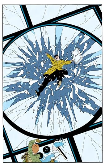
Visionary designer and comics creator Dean Motter (Mister X, Electropolis, Batman: Nine Lives) returns with the purest expression to date of his patented retro futurism! Terminal City is a place where transistor-tube robots rub elbows with old-time gangsters, where bright, shiny technologies cast deep noir shadows. Teaming Motter with celebrated artist Michael Lark (Daredevil, Gotham Central), this massive collection reprints the original series, along with its sequel, Terminal City: Aerial Graffiti! * All fourteen issues of the classic series, collected for the first time! * Eisner-and Harvey Award-nominated series! This is one of the best marriages of story and art I've seen in years and an absolute delight to read. -Alex Ross, artist of Marvels and Kingdom Come
Dean R. Motter is an illustrator, designer and writer who worked for many years in Toronto, Canada, New York City, and Atlanta. Motter is best known as the creator and designer of Mister X, one of the most influential "new-wave" comics of the 1980s.
Dean then took up the Creative Services Art Director's post at Time Warner/DC Comics, where he oversaw the corporate and licensing designs of America’s most beloved comic book characters such as Superman, Batman and Wonder Woman. In his off-hours he went on to create and design the highly acclaimed, retro-futuristic comic book series, Terminal City-- and its sequels, Aerial Graffiti. and Electropolis.
"The Compleat Terminal City" is the name for this collected work. It has two separate comics, the first is "Terminal City", which comprised nine issues, and the second is "Terminal City: Aerial Graffiti", which comprised five issues.
I must say this is one of the more unique and interesting GN's out there. It is set in a "retro-futurism" world. Robots and flying cars mixed in with gangsters and silent movie stars. It's as if the city reached 1990 or even 2000, but has never shed its skin of 1950s style.
Dean Motter writes a tale of a city (Terminal City) that exists at the nexus of many other cities. Terminal could mean many things- from the center point of the city's position in this fictional world as a meeting hub, or it could mean "terminal" in the sense of finality, as often expressed by the various characters and washed up heroes who have made it home.
Michael Lark's artwork does an excellent job of capturing the ideas behind Motter's writing. Both the primary stories seem to revolve around events surrounding briefcases containing a mysterious item that has drawn the interest of nefarious characters from crooked politicians to mob-bosses.
As strange as this may seem, the art, characters, and story combine to create a rather unique world. At once quite futuristic, with robots and interesting technology coupled with a very retro feel to the characters in terms of dress and manners. This extends to the mob figures or the silent movie stars.
The main characters, besides the city itself, are highlighted by Cosmo the Human Fly (it's his memoirs we are reading) and his friends. The City itself is a place that represents a place where,once, the future seemed bright. But, the reality is that the City is declining. The characters, many of whom are washed up adventurers, mirror this.
However, this is not a dark and grim story. There is plenty of humor and some of the characters show that there are still facets of decency, kindness, love, and even hope. As strange as this sounds it just "works". The coolest parts are the subtle hints interspersed among the story- from the names of the Mayors (Huxley, Orwell, etc.), or the fact if you look closely at the scenes depicting the used-robots for sale you'll notice R2-D2 and C3PO.
One of the more unique and interesting GN's I've read in a long time. It's obvious why it was nominated for so many comic awards. Are you looking for something different than the ususal fare of SJW/woke dreck being offered by the mainline publishers (DC, Marvel)-then this is a series that you will truly appreciate.
Lovely to look at, and the world building is often absorbing. But it seems like the actual plotlines were, at best, secondary concerns for Motter. All too often, the intended story gets lost behind the scenery. And yet, it's still an enjoyable book, because the scenery is just that good. The art is vibrant, detailed where it needs to be and simple where it can get away with it. And Terminal City itself is an almost endlessly fascinating place. It would have been so much better if Motter hadn't fallen so deeply in love with his city that he forgot to flesh out the plot. But here, that's understandable.
A few months in the lives of the colorful folk of retro-futuristic** metropolis Terminal City. Criminals, cops, and crooked politicians; professional daredevils and entertainers; and the humble employees and wealthy guests of the extravagant Herculean Arms hotel.
The huge cast is eccentric and kitschily or punnily named, including Cosmo the Human Fly; his one-time love interest Charity Ball (and her sisters Faith and Hope); crime boss Big Lil and her goons Knuckles, Shoebox, and Vito; aging heartthrob Lance Boyle; The Monkey Brothers, Hirno, Sino, and Speekno, who look a lot like certain Stooges; and I'm just scratching the surface.
I was impressed with the elegance by which the numerous characters and plot threads were introduced in medias res. The setting has a remarkable sense of history and scope. Reminds me of Alan Moore's work on Top 10 and Watchmen. Top notch world-building. It's like an epic sized slice of life.
While it brims with flavorful breadth, Terminal City lacks depth. Mysteries are introduced at every turn then often never resolved, or even examined. Why are physics-defying "somnambulists" waking up on the sides of skyscrapers? Who is the mute, mysterious woman in red, who keeps appearing out of nowhere to save the day then vanishing again? What's in Amnesia Man's case? Where does the map hidden in the print of poker-playing horses lead?
At the beginning of the book the reader is dropped into the middle of a profusion of ongoing stories, and at the end they leave the same way. It made for a unique reading experience but also a not-entirely-satisfying one. ---------------------------- **Retro-futurism (I had to look it up)--Views of the future from the perspective of the past, particularly from a time when it was assumed that technological advancement would lead inevitably to an idealized utopian state.
Retro-futurist noir pastiche following high crime and low life in the city from every grand old imagining of the gleaming world of the year 2000. Terminal City has transport links to Metropolis, Alphaville and Opal City, but has fallen on hard times - the old daredevil Human Fly is washing windows, and litter blows between those sleek towers. There are people here, most with terrible puns for names, and robots too (the most significant of whom is essentially Basil Fawlty reimagined as the menacing droid from Forbidden Planet), and even plots - a MacGuffin suitcase, an assassination scheme, an obscene skywriter. But what really matters are those poignant cityscapes - like all our early twentieth century dreams of tomorrow came true, but then we still managed to make a hash of it all, just because that's what humans do.
The Chicago Public Library recently established a partnership with online content sharing service Hoopla, which among other things means I suddenly have access to several thousand old comics I've never read before, including most of the back catalog of Dark Horse, Top Shelf and Boom! Studios. And among these was a title I had really been looking forward to -- the complete 15-issue run of Dean Motter's Terminal City, collected up into one oversized graphic novel, which I had spent years seeing as individual issues on the shelves of comics stores but had never actually gotten around to reading.
For those who don't know, Motter started as the designer for many of the most famous album covers of the late '70s and early '80s, and helped create that Nagel-like look that we associate with New Wave music (the angular typography, the neon effects, the primary colors, etc); it was through those assignments that he gradually ended up creating a nebulous character for his own amusement named "Mister X," which then became an early and infamous example of vaporware -- announced as a high-profile indie comic years before Motter was ready to actually make it, the first four issues instead sporadically came out under the guidance of the Hernandez Brothers of Love and Rockets fame, with Motter finally taking over writing duties with issue 5 but the entire title becoming one of those semi-mythical hard-to-find projects that became such a hallmark of the early-'80s, with the entire run still yet to ever have come out in a definitive book form.
1996's Terminal City was supposed to have been Motter's chance at redeeming this universe, a brand-new title set in the same city as Mister X but not actually featuring that character for legal reasons, put out under a regular schedule and with proper promotional resources for the first time. And that's what makes the title so frustrating, I've discovered now after finally reading it, is that this finally definitively proves that Motter really had no good ideas for storytelling when first creating this universe; for while the setting itself is great, a "retro-future" story about a grand Art Deco utopian metropolis of the 1920s, which has become a decaying, dysfunctional land of endless slums by the 1990s, the storylines Motter actually writes to take place in this setting are nothing more than tired generic noir-type tropes, ones involving gangsters and stolen jewels, disgraced boxers and public daredevils, crooked cops and noble aging movie stars.
That's a real shame, because there's so much that could've been done with the universe itself that Motter builds up here; there's an entire century of history of this fascinating, unique city that could've been the focal point of the series, a sense of world-building that could've been a major source of delight and horror, but he instead ignores almost all of this to give us boring, cliched stories set within this barely fleshed-out universe. It's no coincidence that the most interesting parts of this book by far are when we get glimpses of this world-building Motter could've concentrated on -- the failed World's Fair that has left decaying artifacts scattered throughout the city, his version of Coney Island which has become a Warriors-type post-industrial wasteland -- and this would've been a much more memorable title if the series had concentrated a lot more on this, instead of the cheesy dialogue and go-nowhere plots of the stories he did eventually decide on. A big disappointment, and I doubt I will be revisiting other work of Motter's again.
A playful retro-futuristic noir that, quite refreshingly, refuses to take itself too seriously. The characters are colorful, likable and plenty; the plot is mcguffin driven and a bit ridiculous; the art is superb and evocative, and the humor involves ample sight-gags and puns.
This book is fun, but kind of all over the place. Some plot threads get resolved for too easily, while others don't get resolved at all. Characters come and go seemingly at random, sometimes disappearing entirely, despite the fact that they are seemingly important to the central narrative. In other words, the story is a bit of a mess. However, the book manages to get by on a healthy dose of charm. The world Motter has created is detailed and fun, and the book is filled with great word play (particularly the character names). This is almost enough to make the reader forget about the narrative shortcomings, and just focus on having a good time.
The Compleat Terminal City is a collection of Dean Motter and Michael Lark’s Terminal City series of the mid 1990s. The artwork is superb and it brings to mind the work of Chester Gould. Awesome art deco retro-futurism, I really enjoyed it. Having said that, a couple of the stories were a little weak, although the artwork more than makes up for some goobered stories.
All in all, I think Dark Horse Comics cranked out a nice product; and I highly recommend it for the comic book fan or the retro-future enthusiast. I give it 4 stars out of 5. It’s a shame that the future didn’t include a few robot servants because my living room could use a cleaning (Peppy’s fault, he’s a messy dog).
Maybe it's just that I've seen a lot of retro-futuristic comics over the years, but I really wasn't impressed by Terminal City. It's puns and references were partially interesting and partially distracting, and the overall story seems to place no importance on the climax. The first series is better about that, but the followup series (also contained in the book) manages to place no impact on the climactic moment of the book, and then takes five pages wrapping up plots that felt like they could have filled another two issues. Some of the characters are interesting, but none of it feels important. There's no scale, no impact, but it feels like there should be. The artwork is serviceable but not memorable. The story is the same. Interesting characters appear and then disappear with little to no explanation. I'd recommend Astro City or Top 10 over this - they give the same sense of retro-futuristic appeal with a little more impact and meat to them.
A victim of its own cleverness. While I found the world and the design intriguing, the stories themselves left me unimpressed. I had to reread the endings of both of the included stories and I'm still not entirely clear as to what happened. There were many seemingly extraneous characters and tangents that took 'screen time' away from the central stories. But in the end I don't think that mattered. I'm not sure the stories were as important as the general atmosphere and the kinetic feeling of life in TC's crazy world: both frozen in time and always on the move. Added half a star for the It's a Mad, Mad, Mad, Mad World movie reference buried deep within.
When I picked this up from the library, I was hoping for a rich, inventive story that took advantage of the original and compelling world. Instead, I found a graphic novel overflowing with half-characters, none of whom I cared even the tiniest bit for, tied up in plots that were nearly impossible to follow.
There were some redeeming factors, such as a handful of clever puns (both verbal and visual), but on the whole, it was an entirely unenjoyable read. I'm honestly surprised that I bothered to finish it.
So this is kind of a mess. It's a beautiful mess, and one populated with some interesting characters, but nonetheless a mess. Like, I can't even think of a coherent plot to steer the narrative through its 350ish pages. Just specific scenes. Some could have given the story something to focus on, but which get matter-of-factly dropped as characters shift in and out of the narrative.
The absence of any actual plot is pretty cumbersome for The Compleat Terminal City's success, but as a casual, on-the-cheap read it does have decent legs by way of the world it crafts. This is largely aesthetic in nature; gorgeous architecture that feels ripped off the covers of old, pulp sci-fi magazines. It's that "retro futurism" thing, right? Bioshock, say, except without the horror.
But the world also includes characters and most of them are fun to spend time with. The best is a short, stocky mob boss-type leader named Lil. She's awful, but in that way that is vibrant on the page. If you're the sort who likes to read comic dialogue out loud, give her the lowest, raspiest voice you can to make every scene she's in is perfect. Our primary character (ie, the one who most frequently becomes the perspective character, although this is too much an ensemble narrative to really have just one "protagonist") is an aged daredevil who used to be known as "The Human Fly" because of his skill in climbing buildings. Now he's just a has-been who cleans windows. "Has-been" describes a lot about Terminal City, which had thrived when it was the site of the New Worlds Best Fair, but has fallen into disarray since. In fact, the New Worlds Best Fair seems to be where a lot of the characters experienced their downfall.
The more you focus on the whispered tendrils of a possible plot, the less fun you'll have. But if you like the idea of exploring a retro-future via slice-of-life type scenes with its many weirdo inhabitants, I think The Compleat Terminal City is a worthwhile experience.
I sped through the first five issues in this collection firmly believing this book would be a 4 or 4.5: Retro-futurism with a heavy dabbling of punny names, an Art Deco cityscape, and a bold blood-red night sky. But after that, the story seemed to spin its wheels until issue nine when absolutely everything got wrapped up in 30 pages. Not to mention the black boxer coming back from retirement only to fight apes, a missing link, and a robot. Mother may have been just trying to throw in a John Henry reference but it just came off as problematic, at best.
Maybe he was just rushed after finding out they were cancelled at 9 issues? The second volume Aerial Graffiti, quickly proved me wrong for my benefit of the doubt. Even more aimless followed by rushed at the end. He had to have known he was only getting five issues that time. I’m just convinced that Motter has issues with pacing and endings while being great at world building. Loved the atmosphere and Lark’s art, though AG looked markedly rushed compared to the first story.
I’m so bummed it didn’t live up to its potential from those first five issues or so.
This graphic novel comprises two parts--"Terminal City" and "Aerial Graffiti". Together, they are art deco noir with its tongue firmly in its cheek. The art is exquisite--I'll never tire of looking at it. Cosmo and B.B. and Jezebel are characters to cheer for.
That said, "Terminal City" is significantly better than "Aerial Graffiti", the former being a stronger, more complete story. The latter, suffers from an insufficient plot with barely fleshed out characters. It ended abruptly, with an out-of-nowhere alternation of status for one character that was far, far too coincidental, yet completely clichéd. Fundamentally, the story of "Aerial Graffiti" didn't make much sense and would've made none without "Terminal City". And the most disappointing aspect--with a bit more work, it could've been a 'contendah'.
The most annoy aspect of both stories was the mute, Monique. She is an utterly inexplicable character who pops up everywhere without explanation--except in the 'voiceover' she provides, which strikes the eye, if not the ear, as pretentious.
This is a hard review to write. I absolutely loved the world building here--the noir feel, the retrofuturistic world, the playful word games, puns, and gags scattered throughout. The art is phenomenal, and the vibrant color palette makes every page pop. I even loved the weird menagerie of characters with all the strange plotlines randomly bumping into each other. But ultimately, all those interesting plotlines didn't get equally interesting endings. In fact, the end is rather a muddle, and I'm not really sure exactly what happened with some of the plot lines; some of that was probably me reading incautiously, but some of it was the fact that there was just so much going on, and various threads didn't have the same heft when the finale rolled around. The book is definitely a keeper--I can easily see reading it again in a few years--and there's a lot to recommend about it, but my ultimate rating is only so-so.
Packed with brilliant Deco compositions and a highly unique retrofuturistic aesthetic, Dean Motter's Terminal City tells a broad, sweeping story about a utopian city in an alternative 1920s which has been subject to slowly erodng infrastructure and institutions. The story is filled with classic noir tropes such as gangsters, crooked cops, film stars and a fine balance between decadence and decay. Unfortunately, the story is a little too broad and doesn't hone in on anything all that cohesive nor does it really do anything with the tropes it sets up. The cityscapes are beautiful, but the world feels highly devoid of anything interesting. The book reads mostly like empty worldbuilding since there aren't really any characters with depth to populate said world with. A pretty disappointing read overall.
Alguses tahtis sisseelamist ja tegelastega tutvumist saada ja kui siis vedama hakkas ning huvitavaks läks tõmmati otsad jällegi kähku kinni. Esimene run oli 9 nummert. Teine run oli 6 numbrine ja seal tõmmati otsad veel kiiremini kokku. Iseenesest kunst päästis palju, juhtusin olema art-deco lainel ja retrofuturism sobis. Lugu jooskis kohati lamedalt a siis jälle mingi liin läks mõnusalt pulp-ilikuks ära ( 30ndate poksimathid ntx ). Oligi selline 30ndate ajastu miksitud 80ndatega vaib.
Neli aga miinusega siiski!
p.s. eessõna oli lahe, muidu neid vahest ei loe aga siin kavalalt pani lugema, see algus!
Tyylikäs noir-sarjakuva tulevaisuudesta jota ei koskaan tullut. Hienovaraisia viittauksia ja hauskoja hahmoja. Hyvää aineistoa cyberpunk-kampanjaan: ihminen vs. robotti -nyrkkeilymatsi, pneumaattisia matkustusputkia, entisiä daredevileja ikkunanpesijöinä, kesken jääneitä jättiläispilvenpiirtäjiä/arkologioita, samaa miehen ranteeseen kahlittua salkkua jahtaavia rikollisjengejä, isottelevia/pomottavia robotteja/AI:ta jne.
I really wanted to like this more. I liked the characters, I liked the backstory, and the design of the city was phenomenal, but the actual stories in here left a lot to be desired. There was far too much coincidence, a lot of unexplained stuff, and the stories ended rather abruptly with nothing really changing except some characters were dead now. This could have been truly amazing, but instead it was just meh.
With the exception of the excellent pencils, I found everything about this pretty forgettable. Silly "pulp" or "noir" dialogue and the most uninspiring coloring I have seen for such great art. My dislike of the coloring surprised me. In Motte'rs other retro-futurist work, "Mister X" I am pretty much impressed, but in "Terminal City", I feel the coloring lacks nuance.
A sprawling epic of a retro, sci-fi comic, following the lives of several unique characters as they navigate the ups and downs of Terminal City. Daredevils, sentient robots, pale mobsters, a lady in red.. drama and humor abound as murder and intrigue befall the city.
The retro future vibe combined with golden age of adventure plots prices a winning combination. Motter bravely resins done plots while leaving other mysteries. The end of Aerial Graffiti was rushed. Four stars.
There are many striking visuals and fabulous setpieces. The characters are fun, with distinct personalities, a sense of backstory, well-depicted and brought to life. Unfortunately the plot is a mess, with many threads introduced and never resolved.