Jump to ratings and reviews
Rate this book

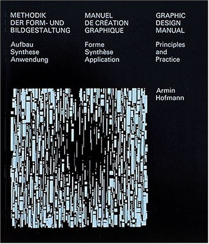
Graphic Design Manual: Principles and Practice

Rate this book
Very slight cover wear, interior is like new, spine is not cracked at all.

200 pages, Paperback

First published October 1, 1977

18 people are currently reading
601 people want to read

About the author

Armin Hofmann

10 books5 followers

Ratings & Reviews

What do you think?
Rate this book
Friends & Following

Create a free account to discover what your friends think of this book!

Community Reviews

5 stars
70 (50%)
4 stars
50 (35%)
3 stars
11 (7%)
2 stars
5 (3%)
1 star
4 (2%)
Displaying 1 - 13 of 13 reviews
Profile Image for Konstancja.
54 reviews1 follower
September 25, 2024

If you think back to the Bauhaus, and the basic exercises to explore qualities like contrast and scale and form, but which students used all kinds of materials and elements, these are radically simplified versions of the same idea, only with the control of black and white only and the most limited set of geometric elements like a field with white circles. Where by moving the circles around, you create different forms, being able to read the positive form and the negative form. Sometimes the addition of elements like this problem that starts out with three simple circles, but where different compositions are created by the addition of elements, these are projects where the student is meant to learn how to see devoid of any of the more expressive problems that are contained in graphic designs communicative world. So, there's no idea in these projects, other than be able to see composition and to learn how to create visual difference within, again a very limited means of production. Like for instance, this exercise where variation in a group of circles is created simply by changing the weight of the circles. Then the student is allowed, at a certain point, to become free and to compose with these simplified elements to create more and more dynamic compositions. But the idea of being able to create within an incredibly limited means has continued to fascinate graphic designers even though this sort of design barely exists out in the world. The economy of means though is incredibly seductive.
4 reviews
May 5, 2024
این کتاب بسیار مفیده،خصوصا برای درک و تحریک خلاقیت بصری اما ازش انتظار متن خاصی رو نداشته باشید در واقع یک جور نمایشگاه یا دایره المعترف تصویری هست که فقط کمک میکنه که مطالعه بصریتون بالا بره،و خوب البته در هنرهای تجسمی به نظرم بهترین کار هم همین هست و خیلی وقتا کاری که مطالعه تئوریک نمیتونه انجام بده رو میشه با مشق عملی و مطالعه بصری به خوبی انجامش داد
Profile Image for Spencer Linton.
238 reviews4 followers
September 2, 2020
Genius. A simplistic visualization of “defamiliarizing the commonplace”
Profile Image for 4.
175 reviews
May 28, 2024
"To bring together disparate values, to achieve equilibriums of every kind, to resolve opposites on a higher plane is a task transcending the problems considered here from the graphic point of view and has, indeed, become one of the cardinal tasks of our age.
(...)
Today it is a practical impossibility to acquire a mastery of every separate technical and artistic aspect of the creation of pictures and lettering. There has been a change in the functions of the graphic designer. Today he must know, on the one hand, precisely what can be offered him by the highly specialized branches into which the originally simple and readily understood printing trade has split and, on the other hand, he must develop and realign his artistic perception accordingly. Only then will he be able to find creative solutions to the problems presented by a confrontation of opposites."


Ok ngl when Hoffman said, "It would be wrong to conceive the work of the designer as anything but the service of giving messages, events, ideas and values of every kind a visible form." I had to stop reading for a bit and think about how I would present my disagreement with his sentiment regarding graphic design education (cause this topic has been in my mind for awhile ever since I decided to enroll in the design program that I'm currently pursuing). As much as I do agree that design students MUST learn to observe not from just their field of work but also take inspiration from other fields too (like art, architecture, fashion, etc.), at the end of the day, effectively communicating through visual cues should be the main focus of one's practice. It is VERY easy to get confused between graphic design and graphic arts. You can be experimental with arts but when it comes to design, you have to balance things out. It is a privilege to be experimental as a graphic designer, and while I do believe we should all keep it our daily practice, I think it is totally okay if your commercial works value clarity and effective communication above all, at the cost of visual woo-woo.

Still, this is a good reference book. His recommended practices are rock solid, so I'd definitely recommend it for building a strong foundation. One thing though, the writing can be a bit bland and vague at times. I'd also recommend checking out on Ellen Lupton's Graphic Design: The New Basics for a modern day approach to graphic design practice.
Profile Image for Sarbook.
329 reviews39 followers
July 3, 2017


کتاب مبانی هنرهای تجسمی کاری از آرمین هوفمان ترجمه مهرنوش ارشدی توسط انتشارات کتاب آبان در سال 1388 منتشر و بارها تجدید چاپ‌شده است و چاپ آخر آن (چاپ پنجم) در سال 1393 به بازار عرضه‌شده؛ عنوان دیگر این کتاب طراحی گرافیک: تئوریک و عملی است.

کتاب حاضر تلاشی است که توسط هنرمند و گرافیست حاذق آرمین هوفمان، برای حل مشکلات طراحی گرافیک با نگرشی روشمند انجام‌گرفته شده است. کتاب راه‌حل‌های ساده و بنیادینی را برای آموزش طراحی بصری پیشنهاد کرده و سلسله تمرینات طبقه‌بندی‌شده‌ای را ارائه می‌دهد. این کتاب برای تمام هنرآموزانی که فعالیت در رشته گرافیک را می‌خواهند شروع کنند و تمام مدرسینی که در آموزش این رشته فعالیت دارند مفید خواهد بود.

از دغدغه‌های هوفمان برای ارائه این کتاب وجود مشکلات تدریس پایه‌ای و آموزش صحیح تخصصی این رشته در هنرستان‌ها و مدارس بوده است و با این کتاب سعی کرده است این نقصان را جبران نماید. وی در کتاب خود راه‌کارهای ساده اما مفیدی را ارائه کرده است، او می‌نویسد: «امروزه آموزش هنر، چگونه باید سازمان‌دهی شود تا بتواند خود را با پیشرفت‌های اخیر وفق دهد، به‌طوری‌که بتواند مطیع اهداف خود شود و وسایل تکنیکی مدرن در دسترسش باشد، چنان‌که تمام نیازمندی‌های طراحی در دنیای ظاهری به‌شدت صنعتی شده تشخیص داده شوند و آیا راه‌حل تدبیر شده را می‌پذیرد؟» در ادامه راه‌کارهایی جز به‌جز ولی ضروری و ممکن که باید امروزه به کار گرفته شوند را مطرح می‌نماید؛ مانند: «مرز بین آموزش عمومی، آموزش تخصصی و آموزش پیوسته باید به‌گونه‌ای تعیین شود تا این امور هنری، موضوعات خاصی را شامل شود و بی‌هیچ انقطاعی ادامه یابد و آهسته عمیق‌تر و متنوع‌تر شود»، «نباید هیچ مرزی بین کاری که باکیفیت‌های هنری انجام می‌شود و اثری که صرفاً با کاربرد تجاری تولید می‌شود گذاشته شود»، «باید مرز بین کار به‌عنوان تمرین و کاری را که صرفاً به دنبال نتیجه‌ای مشخص است از میان برداشت»، «هیچ فاصله‌ای بین اثر خودانگیخته با ویژگی احساسی و اثری که باخرد هدایت می‌شود نباید وجود داشته باشد هرکدام مکمل دیگری است».

اطلاعات بیشتر در
http://sarbook.com/product/302593
1 review
March 26, 2022
The title’s misleading, though that’s not why I’m leaving such an unflattering review. The book essentially consists of a few pages of slightly-pretentious waffle about a few particular aspects of design (it’s unfair to call these design principles, as the few pages of actual text in this book do little to establish or elaborate on any actual concrete principles) followed by just over a hundred pages of obscure studies.

I suppose one could argue that it’s quite an attractive book, and makes for good coffee table literature; unfortunately, beyond that, this seems to be a book of little substance.

I’m sure I’ve ruffled the feathers of many who consider this to be a ‘classic’ or ‘essential reading’. Do I regret buying this book? No. Would I have bought it had I had the chance to pick it up and flick through it first? Probably not.

A nice thing to have, but far from essential reading in my opinion.
Profile Image for Max Oliveira.
163 reviews15 followers
October 31, 2023
I got to admit, at first i was little skeptical with reference books, but this one proved extremely useful for daily practice and got me hooked. I’m already looking forward for the abusive amount of money (which i do not have) i'm going to spent collecting them now.
Profile Image for Bryan.
70 reviews2 followers
April 12, 2024
A design classic from the '60s, this book introduces the simple concept of the relationship of a dot and a line and then provides a ton of examples of varying complexity. There isn't much to read beyond the first few pages, but it's timeless and fun to flip through.
Profile Image for Mahdi Khosravi.
69 reviews3 followers
February 19, 2019
من ترجمه‌ش رو خوندم
خیلی جالب نبود
ولی فرم‌هایی که کنار هم قرار داده بود کمک می‌کرد به فهم قضیه
Profile Image for selin ho.
30 reviews
June 2, 2025
!!!!!!!!! a great resource when finding a visual guide on how to manipulate shape, line, and text
Displaying 1 - 13 of 13 reviews

Can't find what you're looking for?

Get help and learn more about the design.