With the full permission and cooperation of the Jordan estate, adapted by well-known comics writer Chuck Dixon, The Eye of the World: The Graphic Novel has been hailed as an exciting interpretation of Robert Jordan's classic fantasy novel. It features brilliant interior art by Marcio Fiorito and Francis Nuguit, and stunning covers by Jeremy Saliba and Seamus Gallagher. It collects issues thirteen to eighteen of the comic book.
Rand; his friends Mat, Perrin, and Egwene; the Aes Sedai Moiraine and her Warder, Lan Mandragoran; Thom the gleeman and Nynaeve, the village Wisdom, split into three groups while trying to escape the ancient, dead city of Shadar Logoth, where they are pursued by the deadly Mashadar. A disastrous river crossing leaves Perrin and Egwene on their own—until they meet a mysterious stranger who claims that he and Perrin share a remarkable ability. Meanwhile, Rand, Mat, pose as Thom’s apprentices as they sail downriver on a cargo ship.
Charles "Chuck" Dixon is an American comic book writer, perhaps best-known for long runs on Batman titles in the 1990s.
His earliest comics work was writing Evangeline first for Comico Comics in 1984 (then later for First Comics, who published the on-going series), on which he worked with his then-wife, the artist Judith Hunt. His big break came one year later, when editor Larry Hama hired him to write back-up stories for Marvel Comics' The Savage Sword of Conan.
In 1986, he began working for Eclipse Comics, writing Airboy with artist Tim Truman. Continuing to write for both Marvel and (mainly) Eclipse on these titles, as well as launching Strike! with artist Tom Lyle in August 1987 and Valkyrie with artist Paul Gulacy in October 1987, he began work on Carl Potts' Alien Legion series for Marvel's Epic Comics imprint, under editor Archie Goodwin. He also produced a three-issue adaptation of J. R. R. Tolkien's The Hobbit for Eclipse with artist David Wenzel between 1989 and 1990, and began writing Marc Spector: Moon Knight in June 1989.
His Punisher OGN Kingdom Gone (August, 1990) led to him working on the monthly The Punisher War Journal (and later, more monthly and occasional Punisher titles), and also brought him to the attention of DC Comics editor Denny O'Neil, who asked him to produce a Robin mini-series. The mini proved popular enough to spawn two sequels - The Joker's Wild (1991) and Cry of the Huntress (1992) - which led to both an ongoing monthly series (which Dixon wrote for 100 issues before leaving to work with CrossGen Comics), and to Dixon working on Detective Comics from #644-738 through the major Batman stories KnightFall & KnightsEnd (for which he helped create the key character of Bane), DC One Million , Contagion , Legacy , Cataclysm and No Man's Land . Much of his run was illustrated by Graham Nolan.
He was DC's most prolific Batman-writer in the mid-1990s (rivalled perhaps in history by Bill Finger and Dennis O'Neil) - in addition to writing Detective Comics he pioneered the individual series for Robin , Nightwing (which he wrote for 70 issues, and returned to briefly with 2005's #101) and Batgirl , as well as creating the team and book Birds of Prey .
While writing multiple Punisher and Batman comics (and October 1994's Punisher/Batman crossover), he also found time to launch Team 7 for Jim Lee's WildStorm/Image and Prophet for Rob Liefeld's Extreme Studios. He also wrote many issues of Catwoman and Green Arrow , regularly having about seven titles out each and every month between the years 1993 and 1998.
In March, 2002, Dixon turned his attention to CrossGen's output, salthough he co-wrote with Scott Beatty the origin of Barbara Gordon's Batgirl in 2003's Batgirl: Year One. For CrossGen he took over some of the comics of the out-going Mark Waid, taking over Sigil from #21, and Crux with #13. He launched Way of the Rat in June 2002, Brath (March '03), The Silken Ghost (June '03) and the pirate comic El Cazador (Oct '03), as well as editing Robert Rodi's non-Sigilverse The Crossovers. He also wrote the Ruse spin-off Archard's Agents one-shots in January and November '03 and April '04, the last released shortly before CrossGen's complete collapse forced the cancellation of all of its comics, before which Dixon wrote a single issue of Sojourn (May '04). Dixon's Way of the Rat #24, Brath #14 and El Cazador #6 were among the last comics released from the then-bankrupt publisher.
On June 10, 2008, Dixon announced on his forum that he was no longer "employed by DC Comics in any capacity."
I absolutely love this series! It's gorgeous and really brings Jordan's books to life. Each twist in the story just enriches the whole. These are amazing in every way. Bring on Vol 4!
3.5 stars rounded up. I wanted a quick read that didn't call for concentration. I have read the actual series several times so I could keep my place even while interrupted by a certain kitten 20,000 times. Beautiful artwork!
So, the novel version of “The Eye of the World” (which I give 5 stars to) now has a comic book / graphic novel adaptation. The comic series is 36 issues which has been combined into 6 graphic novels. This is graphic novel number three which puts me halfway done. I’m giving this five full stars so far! The story is being adapted splendidly and all of the characters look just about like I pictured them in my head! I will definitely continue with this series! Highly recommended… whether you’ve read the novel or not!
I took all the Wheel of Time-related graphic novels out from the library and brought them along on vacation. Unfortunately, I didn't realize that The Eye of the World comes in six volumes, and only brought the three my library has. I got to the end of the third pretty certain that a good chunk was missing and, sure enough, I'm only halfway through. Still, I figured I'd better write a review, since I don't know when I'll be able to get my hands on the next three volumes.
I was quite surprised by how much of the first novel's plot I could remember. The middle books, particularly around where it became obvious that Jordan had completely dropped the reigns of the plot, are a blur, but I had distinct memories of everything covered in the graphic novels. I've found the same thing with A Song of Ice and Fire - where the first book is also quite well plotted, with a much tighter storyline than later books. In both cases, I feel like the authors started off with a very clear idea of a beginning, and then much vaguer notes for the rest of the series. It's a shame.
Regarding the graphic novels specifically, I found the text to be much better than what I saw in the New Spring graphic novel. It was much easier to follow what was going on, and I think I would have been able to read it even if I hadn't read the book first. I'm not sure how much of that is a real difference in quality and how much is just because the plot of Eye of the World is so much more action-oriented, relying less on narrative (and therefore more easily exportable to a visual medium), though.
The artwork was a little disappointing, though. The images looked messy, for lack of a better word - like coloured sketches. This meant that it was often difficult to tell one character apart from another - particularly in the beginning. Some of that might have been intentional, to show how ordinary the three Ta'veren are at the start of the story, but I don't feel like that came through very well.
There were also quite a few consistency issues, particularly with Moiraine's forehead pendant (which changed shape and style frequently from panel to panel).
Generally, though, I thought it was fine. It was certainly readable. I'm just scratching me head over who the intended audience might be for these. There isn't really a lot of added value for someone who has already read the novels, and I'm not sure how well someone who hasn't read the novels would be able to follow along with the graphic novel version. It seems a bit superfluous. Or perhaps they are looking for people like me, who are at the end of the novels and want a refresher on the series without having to tackle the doorstopper tomes for a second time.
The Eye of the World comic has finally reached the halfway point of the book after 3 compilation graphic novels. It's very cool to relive the story of the Wheel of Time visually in this way, and it seems to follow it very faithfully. The only reason I only give it 4 stars is that I don't like the art style of the book. At times it seems too cartoonish, and it definitely doesn't have the level of detail and depth that I would prefer, and see in other works. I wish they would give other artists a chance to contribute as the series continues on.
The illustrations were done by a different artist than the one who did the first two volumes, so the look of the familiar characters seems a little different. It matters not, however, as the art is once again excellent and the story even more compelling at this point. I'm looking forward to reading the next one.
Inconsistent artwork but still, I love seeing the story told visually. I just wish it wasn't taking so long. They just left Whitebridge at the end. Sigh. I guess it IS a good thing that they are not leaving anything important out of the adaptation.
Perhaps it was the art, but something about this edition just didn't seem to connect with me as well as the 1st and 2nd editions. Still, if you're a fan, you'll want to pick this up.
The quality of these graphic novels continues to astound me. Chuck Dixon did an amazing job of condensing The Eye of the World, and he managed to somehow walk the fine line between cutting too much so the story becomes merely a skeletal outline of it's original novel format, but not leaving too much in so that every page us chockablock full of 10+ centimetre-sized speech bubbles. But I do think that Volume Two was better than this volume.
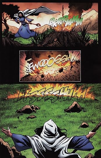
But good things first, right? We got to see some more channeling this this volume, with Moiraine using more of the Five Powers that had not previously been illustrated in the graphic novels. She used Fire to get rid of some Trollocs and Halfmen and stuff: She also used a weave of Air, which I thought was depicted well: And there was also some weaves of Spirit, but I showed a picture in my review for the second volume, which I think is a better representation that anything in this volume.
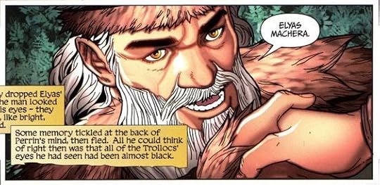
We also got to see Elyas in this volume! I really like Elyas' character, and his past is interesting to wonder about. Anyway, this is what Elyas looked like: His golden eyes are cool, and I look forward to seeing the goldening (shut up spellcheck, that's a word) of Perrin's in further volumes. We got a hint of it here, with his eyes a shade of lighter brown than his usual dark colouring (oooooooh I just had a thought about the TV show coming from Amazon and how cool golden eyes are going to look on Marcus Rutherford who's playing Perrin).
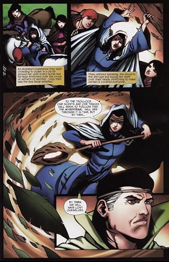
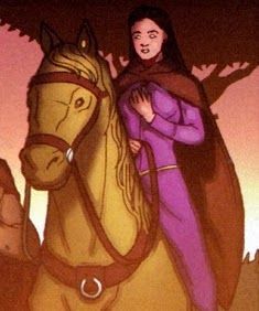
Now for some icky things. Volume Three begins with the main cast escaping Shadar Logoth with Trollocs and Myrddraal on their heels before being separated and having to continue their journey apart in three individual groups. Perrin and Egwene end up with Elyas and then later the Tinkers, and for some reason, Egwene look really... strange: Is it just me, or does Egwene not look the best in this image. I'm not knocking the artists at all, they've been phenomenal in all that I've read so far, but... I can't explain it any other way than just saying she looks weird. And it was a consistent thing too. Specifically with Egwene's character. In this illustration, she looks like a freaking Wight from the Peculiar Children series. Don't believe me? Look it up, I'm not going to all the trouble to finding a picture and whatnot (seriously Goodreads, you need to find a better system for inserting images in a review). I guess I'm just disappointed, because Egwene looked really awesome up until now, and I hope this is only a one off event.
But nothing is going to stop me from reading the rest of the volumes, because it's Wheel of Time, and when it comes to Wheel of Time, I loose all self control.
This brings the artistic adaptation of The Eye of the World to the halfway point and the beginning of when the group has broken up and must make their own ways and the end of the volumes that the local library possesses so I don't know if I'll go any further into the illustrated collections.
Having been re-introduced to the Wheel of Time series after starting it nearly 20 years ago, I will likely want to dive back into the actual written word version.
The workers on The Spray basically all look alike while the gleeman, Thom Merrilin, is completely different from the previous two volumes - personally I prefer the earlier version.
I have to admit that reading these type of adaptations exposes a entire new group of readers to a variety of stories - be they considered literary classics or modern adventures.
I think I summarize my general thoughts in the previous two volumes so my comments will be specific to this volume only.
This volume has the issue #13, #14, #15, #16, #17, and #18 and follows the story of them being separated and trying to find their way down to Caemlyn. The story flow is very reminiscent of the previous two but the visuals for this one was straight up disappointment. Maybe it's because I had a different image of Shadar Logoth and Mashadar in my mind but they were so poorly presented regardless. I was also very disappointed with how they painted Tuatha'an as well. I have no problem with the story flow or the dialogues but I feel that it will be unfair to the previous two to give more than 2 stars to this volume.
The comic summarizes the story of the novel very well (as it is much more faithful to the novels than the TV series) but the art is really terrible. As it changes artist with every volume, the quality is inconstant. The second volume was an improvement on the first, but this one is the worse. The story is interesting, but the ugly art is a distraction. I thought the comic would be a good way to avoid reading the lengthy novel series (while waiting for the next season of the TV adaptation), but, considering how a tedious reading it is, I am not so sure. I am not very enthusiastic with the idea of continuing reading this comic series and I cannot really recommend it.
Not much to say about this that I didn't already say about the first two volumes. The main group of characters has gotten separated now, so we're seeing a bit of character development for the supporting characters. I was having trouble telling Mat and Perrin apart until this volume, where they started developing some personality. (I'm guessing the novel probably put more work into giving the characters distinct personalities earlier in the story, but that stuff got lost in the translation to comics.)
The heroes reach the dead city of Shadar Logoth. It's the point in the series where the lore and worldbuilding take a magical, arcane twist. It kind of reminded me of Sindbad and his encounter with the genie, although Jordan has written the character of Mordeth in a much darker way. The notable change of illustrator does influence the style of the series but the storytelling is as fluid as the previous volume.
One of the many adventures that have stuck with me are their incursion into Shadar Logoth. The drawings, in my opinion, came a bit short of the magnificence that was described in the books. Shadar Logoth was and is one of my favourites.
This is the third graphic novel that continues the story in the first book of The Wheel of Time series. The way they could condense a long book into a few pages is amazing. It was easy to read and the artwork was stunning.
Holy cow! This was an action packed stretch. So many questions about Shadar Logoth, the metal tower, the White Bridge, and many more elements introduced here.
I am happy to find this graphic novel of one of my favorite books ,,,love how they are making my favorite characters to life better than the Amazon TV series
I finished reading Robert Jordan's The Eye of the World on May 28, 2010--just over four years, ago. In the months that followed reading The Eye of the World, I read all the (then available) books in the series. I, like so many others, had fallen in love with the characters in the series of The Wheel of Time.
And then, the graphic novels appeared, of course, beginning at the beginning, New Spring. And then, The Eye of the World: The Wheel of Time, The Graphic Novel. I began reading these, too. I completed volumes one and two, and now, I have finished volume three, the one I am reviewing, here, today.
A graphic novel is, in form, a bound book with material similar to full novels. They can be hardcover or card stock and include topics of fiction and non-fiction, or even such things as anthologies or collections.
The graphic novel is distinguished from comics or comic books even though the bulk of the material consists of art work. Comic books are printed on inexpensive bulk paper and graphic novels are printed on much higher quality of paper. Some are truly beautiful with glossy pages and beautiful illustrations. Moreover, comics contain advertising whereas graphic novels do not. Also, graphic novels invariably contain a story line that has a beginning, middle, and end; comic books tend to be episodic in nature. Comic books are much, much, shorter than graphic novels (some graphic novels I've seen approach 150 pages--an average seems to be around 100 pages.
I mention these attributes to graphic novels because some purported-to-be graphic novels are nothing more than a few comics put together with a card stock cover. It is so disappointing when a title is described and billed as a graphic novel and you spend your money expecting to get a graphic novel, but end up with a glorified comic book. (See the Thor: The Dark World Prelude, A Graphic Novel by Marvel Comics). Now, let's take a look at The Eye of the World, Volume three, Graphic Novel to see how it stands up under scrutiny.
This book has absolutely no advertising of any sort, anywhere in the book; so that's very good. The artwork is by Marcio Fiorito and Francis Nuguit, Lettered by Bill Tortolini, colors by Nicholas Chapuis, and is adapted by Chuck Dixon. The book is published by Tor (Tom Doherty Associates, LLC).
The book is a full hardcover book with a full-color, glossy, dustcover. The images are beautifully rendered and colored and the art is on glossy paper that is, indeed, beautiful to look at. Additionally, it has 176 pages; it is in the English Language, the ASIN: B00GQ625KU.
The story is adapted by Chuck Dixon, and it is clear that the story is adapted from The Wheel of Time Series, The Eye of the World(the novel). Remembering that it is a graphic novel, we know that not everything can be included from a full size book is 753 pages, distilling the book down to 176 pages of art and dialog, it seems that the adapter did a more-than-adequate job, he did a great job. The requirement of having a complete story arc is met: the story follows Jordan's book plot with a beginning, middle, and end.
The book's glossy pages, beautiful art, colors, and design, exciting story arc, and well-constructed features make this one of the finest examples of graphic novel I have ever had the pleasure to read and review. I rate this beautiful book 5 stars out of 5. Thank you for taking time today to read my review. Sincerely, Sharon Powers.
Not that they care, but I warned the publisher that if they produced another installment with inconsistent (and generally terrible) art and didn't take the time to put together a quality comic they'd be seeing 1s. Well, here is another 1.
Robert Jordan is a genius, and his world building capabilities are near peerless. He absolutely deserves to be put into the same bucket at Tolkien, and I find it a bit offensive that Tor would jam out subpar graphic novels of the Wheel of Time. If they did a good job, I would buy them, give them to friends to turn them onto the series, etc. These, I grab from the library, shake my fist as I land on pages like 15, 41, 73, and 133, and shake my head at dozens of cells throughout the story. I fight back tears. Big ones.
The colors look like a cross between bad cartoons, bad photoshop, and old cellular -out of focus- (cartoon) photography. Most of it looks half finished, and that's when I'm willing to overlook the stylistic issues I have with it overall. The writers/publishers are still struggling with trying to get all the content they want across on the pages, and end up putting way too much in also. Maybe adopting a 1 page blurb before each chapter would ease this. The letters are often times distracting, and make you really appreciate when they are done well.
Overall, Boo. Please take more time to get future comics right. Sure, some people will buy these, and tell you how great they are, and how much they love them. However, you are probably either paying them, they don't have a good cross-section of graphic novels they've read to make comparison, or just love the WoT too much to say bad things about it.