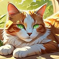
Copper is curious, Fred is fearful. Together, boy and dog are off on a series of adventures through marvelous worlds, powered by Copper's limitless enthusiasm and imagination. Each story in this colle
Kazu Kibuishi (born 1978) is an American graphic novel author and illustrator. He is best known for being the creator and editor of the comic anthology Flight and for creating the webcomic Copper. He has also written (drawn) the Amulet series. The webcomic artist and noted critic Scott McCloud has said that some of Kazu Kibuishi's work is so beautifully drawn that "it hurts my hands when I look at it".
I'm not so sure this should be shelved in the kids' section. Our library puts it in Juvenile, and yes, the illustration style is round and cute and colorful, and yes, it features the adventures of a kid-looking boy and his talking dog in the style of Calvin and Hobbes, and no, there isn't any content that makes it inherantly inappropriate for kids.
But the humor and mood of this is definitely twentysomething. Early on, there are metaphors about people being in bubbles and missing your destined love. The very first comic is about a fantasy of flying being spoiled by coflyers dropping bombs on the earth. Much of the wild and crazy fantasy hinges on being smashed back into reality. Yes, it's still very cute and fun, but it's more about disillusionment than dream building.
At least that's how I read it. I loved it. But I'm almost thirty.
When I read Flight Volume 1, edited by this author, his own contribution to the collection appealed to me so much that I went and ordered not only other titles he edited, but this book as well.
This is a 2010 collection of Kazu Kibuishi's webcomic Copper. I want to quote the introduction by the author, if I may. "What had begun as a somewhat dark comic strip series quickly became more optimistic, more hopeful. The boy, Copper, was at first an observer, but by the third comic he became an active participant in his world, making choices based on his hopes and fears. Fred, the dog, was always there to question his best friend's optimism, but Copper walked ahead with his ideals, undeterred."
The Copper stories here show wonderful imagination. I like the drawings, the colors, the spirit our two characters show. And you can indeed see Copper growing into himself as you progress through the stories. I had many favorites, and as a matter of fact, I intend to keep this book handy and re-read here and there whenever I need a break from my current non-fiction title.
I had not meant to zip through Copper quite as fast as I ended up doing. I meant to stretch it out for a few more days. But sometimes, you just gotta stay with things that make you smile, you know Stay safe, everyone.
Znam da nije fer uporedjivati neko delo sa drugim pa reci da je nesto lose posto nije ko to drugo ali ovo na momente tolko potseca na Kalvina i Hobsa da ne mogu da se odvojim od toga. Imamo klinca sa pricajucim psom (mesto tigra) koji prozivljava izmisljene avanture. Problem za mene pretstavlja cinjenica da realan svet vidjamo jaaaako retko pa samim tim likovi su nekako nevezani i nerealni, fali ono nesto sto bi ih ucinilo realnim. Samim tim ne mogu da se vezem za njih pa mi brzo sve dosadi.
Sa druge strane ima finih situacija, artwork je lep i na momente autor stvarno pusti sebi na mastu sto uvek bude zabavno. Ima potencijala ali za mene ne iskoriscen. Meh.
Copper and Fred are part dynamic duo and part odd couple. Copper is the more adventurous of the two, and Fred is just about always worrying or complaining about their adventures, which is what much of the humor is drawn around.
In each "strip" (they are usually more of a page than a strip, but still take on the format of a strip in the sense that each page, except for a few several-page installment, is its own thing) one can find some combination of philosophical musing, fantastical dreaming, wry near-misses in love and love gone awry.
While some of the strips didn't quite work, most of them were enjoyable. I see why people compare this to Calvin and Hobbes though I also see why some readers think this comic is more for young adults than for kids. I think younger kids would be fine reading it, but that some of the humor would be more appreciated by adults.
I was between a 3 and a 4 but decided to go for the 4 because I appreciate all the mishaps and the focus on relationships, how these strips are as grounded as they are absurd.
This is a really quick read of the Copper web-series comics which are beautifully illustrated by Kibuishi. The colour palettes used for the panels was my favourite part of reading this but the short one-page stories (with a few longer than one-page thrown in) were all rather amusing and thought-provoking. This series is certainly not a kids one as far as I see it because there's a lot of reference to satire and irony about love, war and so on. However I would certainly say that the illustration style and humour is a great bonus and this is a lovely book to own.
This is a collection of various Copper and Fred adventures which are all set within the realms of Coppers imagination (which is pretty wide and crazy and filled with all you can think of). It's the story of a man and his dog and the fun they can have when they daydream together, and it's a cute and heart-warming story with darker undertones.
I adore Kazu's colours and style as I feel that his work is truly unique and easy to spot. I think there were certainly some stories within this which I found more amusing or sad or thought-provoking than others, but there was a great mix of everything and I'd certainly recommend it. A solid 4* read, if only there were longer and more crazy adventures, but maybe it would lose it's sweet charm of 'one minute it's here, the next it's gone leaving you with only memories and questions'.
What the hell did I just read.... This was just utterly confusing. There are some stories that are just one page, but often didn't make sense, and then we had a few that just seemed to go on and on an on and on. :| In other words, yawn!
I also agree with another reviewer: Why is this categorized in various places (not GR) as a Children's book? This is NO children's book. It might have the colourful art, but the text, all the stories we have? No. There are bombs, destroyed worlds, talk about death, destruction, there is one comic where the character dreams of dropping bombs upon people. Not to talk about the depth of the conversations at times.
The dog is thinking everything is out to kill them, he is negative, he really ruined the whole book for me. I just wanted him to be silent, maybe a bark here and there, but nothing more. Sometimes you shouldn't make the animals talk.
The art, yes, I did like it (well at times), and I also liked that at the end of the book the process on how this comic was created is shown. But that didn't save the book from the 1 star I am giving it.
The comic itself would get a 3, but because he took the time out to tell you how he made the comic and give you each step in detail, so that you can learn how to make your own comic, I have given him a 4. I love that he did that. I love that he gave you that information so that you can be awesome and make comics as well.
Artist history:
The intro to this book was very interesting, because you find out that the copper comics began as it designed for a sticker and a T-shirt. He just had an image and a line under the image. He lost his graphic design job and went through other problems, and then decided to pursue cartooning which he had always wanted to do. The cartooning helped him get through a dark period of his life, and become more optimistic and hopeful. The main character goes from being an observer to an active participant in his world, making choices based on his hopes and fears. The dog is always there to question his friend’s optimism, but the boy walks ahead with his ideals, undeterred.
—- The actual comic:
The cartoon style is very cute, but I don’t overly like the stories that the comics portray. I feel like a lot of them are very boring. It’s not really a funny comic but it’s more of an introspective like “let’s think about this” comic or most of the strips in this book are like that.
I like these comics:
Fall - The dog scared to be in love, trying to run away from it, and then accepting it when the possibility of him getting neutered is mentioned.
Happy - Kind of creepy, kind of sad.
Waterfall - This one is kind of thoughtful, like the artist is encouraging other artists. Boy: “I’ll bet if I tried drawing that waterfall, it would come out terrible.” Dog: “I dunno, I think the beauty of that is just in trying.” Boy: “Yeah, but no matter how hard I try – it will never be as nice as I remember it.” Dog: “and what’s wrong with that?”
Mission Control - Dog: “ hey, copper, do you ever think about the creation of the universe?” Boy: “ not that often” Dog: “ it feels like there’s so much going on out there. Planets forming, stars exploding… And yet it’s so quiet where we are, like we’re not really a part of it all. Knowing there’s so much happening and yet hardly noticing, it creates such a lonely feeling. Don’t you think, copper?”
Observer- Dog: “ hey, copper, you ever wonder how the captain knows where to go? He never seems to have a plan. He just goes. And yet we discover all this weird stuff. There’s so much ocean to cover out there. How can he possibly know where to dive?” Boy: “ maybe he doesn’t have a plan. Maybe he figures there’s so much out there to discover that you don’t need one.” Dog: “then he’s an old fool. If this is arbitrary, then why are we even down here? This is all pointless!” Boy: “ I dunno, Fred. I think just being here to observe it all is reason enough.”
Angler - the dog sees a fish and sees that the fish is eating something and gets angry “gah! He stole my worm! Come back here, you freeloader!”
Lunch pack - the dog is meant to protect their lunch but he is sad because he couldn’t. He says he can’t even protect a sandwich and questions what kind of dog is he? And then the monkey brings him bananas and he is so happy.
—— The best best best part of this book is the behind-the-scenes where he teaches you how he actually draws comics I think that part is amazing. (P85-94):
Steps: “turning an idea into a sketch. Penciling a page based on this sketch. Inking the pencil page. Cleaning up the image. Scanning the ink page into a computer. Digitally coloring the page.”
I read the whole thing voice to text (please excuse the errors) so I would have these steps. I will summarize them here.
“ copper a complete single page comic is different from my longer comic stories (longer - need for speed. Shortcuts - inking with a pencil instead of a pen, or scanning my sketches, and using them as the pencils by printing them out very large).
copper - slow down. ( simpler methods - limiting the use of color, gradation, space, and digital color layers). (copper is done predominantly with simple flat colors). fostering creativity, simpler methods force me to do More with less.
The drawing board Keeps it messy to get creative thoughts
Thumbnails Turning an idea into a story drawing a thumbnail on a sheet of regular white paper. (rough sketch version of the final comic page). Draw thumbnails around simple idea. This thumbnail is your guide as you lay out your panels.
Panels Preparing the canvas My drawings for copper are really big. pad of Bristol paper is 19 x 24”. With a blue pencil, I draw the lines to create a 15 x 15” square in the middle of the paper. This is the size of the final strip. Inside the square box, I draw a line about a quarter inch from the edge to establish the outermost panel borders.
Using my very rough thumbnail as a reference, I lay out all the panels. I’ll need to tell the story. These panels are not drafted to exact measurements. I just use a ruler and draw the panels to approximate sizes to save myself some time.
Penciling Laying the foundation begin by scribbling rough versions and then go back for details and solidify the shapes. prisma color Col-erase blue pencil = easy to use, resulting lines easy to read. blue lines invisible to a photocopier and can also be easily removed when scanned into a computer. Plus it’s erasable
minimize number of mistakes by using a lot of construction lines. (Construction lines are basic shapes, drawn in a sketchy fashion; they are the basis for your final character and environment drawings. Construction lines are really helpful if you don’t draw good shapes).
I round the corners of my panels for some reason
Lettering Putting words in their mouths dialogue is tightened up, fix shapes in fine details. grab a 0.3 Staedtler pigment liner pen, and begin lettering the comic.
Lettering allows control over the composition of every image in the drawing stage. treat the letters like images. Copper is mostly hand lettered. Uses a digital font made from handwriting for longer projects.
Inking The old-fashioned way Uses old Hunt No. 102 crow quill dip pen. old-fashioned pens that you actually dip into an inkwell. Great natural line variation. ink is Higgins black magic India ink by Sanford.
“The dip pen is a difficult tool to master. The correct way to use a dip pen is spoon down with the ink on it facing the paper. I know this seems dangerous, but don’t worry if used correctly, the ink will flow through the pen tip and not simply spill off and spoil your page.
After many years of breaking, pen, nibs, spilling ink, and ruining drawings, I finally become comfortable with this old-fashioned fashion really quite fond of it. If you plan to use a nib pen, be sure to start early.
I make my way down the page, moving from left to right as I ink. I don’t necessarily follow the panels in reading order. I go whichever way guarantees I won’t run my drawing hand over any wet ink. With a dip pen, the ink drives very slowly.“
Going digital Technology as a paintbrush “Once I put the old-school pen and ink away, things get a little advanced. You may not need all of this technology to create your own fine comic strip, but these digital tools do a lot to help me bring a professional level of finish to my comics. Coloring using the computer allows for tons of flexibility in the editing process and nearly all final files used for print product production or digital nowadays.
For the digital part of the Copper process, I use a: Computer Scanner Drawing tablet Adobe Photoshop
My computer is hooked up to a tablet screen, and also regular drawing tablet. A tablet is a tool that allows the user to draw on the computer. Well, the tablet screen allows me to draw directly on the screen, the regular tablet allows me to draw without my hand getting in the way of my view. Both tablets have their advantages, and I enjoy Using both for different projects however the regular tablet can be purchased for a modest price. Some cost less than $100. The screen is very expensive. I recommend using a simple cheap tablet to begin with. I got my first by trading away a video game system.
Adobe Photoshop is the computer software I used to color all of my comics. It is an incredibly powerful piece of software that most professionals used to create and touch up images.”
digital part of the process - scanning the comic into the computer. I currently use a large format scanner but used small cheap scanners before and scanned in 6 parts, and then piece them together in the computer.now I only need to stitch together two pieces. saves time. scan the comics at 300 dpi+ to make sure I have enough information to make the files read clearly when printed. (DPI stands for dots per inch, and represents the density of the information being scanned. The higher the DPI is the sharper the image will look.)
Coloring The magic of digital paint Scanned and pieced together then Using hue/saturation And level adjusts, I can cancel out the blue lines and the paper texture, cleaning the image, and leaving me with only the black lines to work with.
The line work is left on its own layer, set to multiply (which allows you to see through the white portions of the page) and I will begin painting on separate layers underneath the line work.
I start by selecting the panels and coloring them with a neutral value. And example of a neutral value is the color gray, since it is lighter than black and darker than white. It is helpful to begin with this neutral color and add to it rather than to just drop different colors onto the white page. This allows for the color palette of the entire piece to remain balanced and cohesive. Painters called this applying a “key “color to the image. The dialogue bubbles are kept white, so they are easy to read.
color the characters and objects, setting them on separate layers for easy Adjustment. make sure all the colors look good together.
The characters and objects are painted with simple colors and their own layers. These will provide the base for the comics final color palette.
Since I am using only flat color, I can easily select the individual colors and change them using tools like the hue/saturation adjust. I spend a lot of time messing around with the colors to get the comic to look just right.
Here I have shifted the background panels to cooler colors using the hue/saturation adjust. I found that these cooler colors better fit the blue of the characters armor. The green color is a mix of the tan color established above and the cooler blue of the armor. Having an understanding of how color mixed together is very helpful at this point and one of the great things about working in digital media is the ability to test out various color combinations to see what happens. Before working on the computer I never formally learn to paint or use color but now I feel I have a good grasp of colors and basic painting techniques.
In most cases, I focus on one panel at the beginning, and get the colors just right for that panel. That way I can use this fully colored panel as a guide for the rest of the comic. Once a color is selected for a particular item like the armor, I can just apply that same color to the armor in each of the rest of the panels and save myself a lot of time.
On this comic strip, I decided to use effects layers. By applying a solid orange color on the characters faces on a separate layer and turning the layer, transparent, I create the illusion of a clear mask on the helmet. An effect layer is also applied to the background to create the illusion of shadows. This can be seen in the darker greenish Hughes on the background of the version below. Tricks like these can add depth to the images.
In the stages of the coloring process, I highlight to the characters and backgrounds to indicate the lighting in the scene. Putting a lighter blue on the top of the helmets and armor really helps give the comic a sense of space.
—-
Published by GRAPHIX, an imprint of scholastic inc
I started reading due to my students but I ended up hooked by it. Really enjoyed the phlegmatic humor and almost each little story. The scholastic edition also has a little description from the creator of how he does his work. Really cool.
It didn’t really have a beginning or end. It did not tell you where they were or anything like that. If you are looking for a good graphic novel, pick a different one in this one.
I just enjoyed reading the copper book for the first time. Interestingly enough, my first exposure to copper was in book format vs. web format. It was a highly pleasant experience. Copper is a story about a boy and his dog. Both embark on journeys together and retain a solid friendship. The work reminded me of two kinds of naturalism that could apply to one's thoughts and actions, and although not as overt, it reminded me a lot of this xkcd comic here (with Copper being the "enchanted" one and Fred the "disenchanted" one). Beautiful art. Engaging panels. Well worth adding to a personal or library collection. (At the very least, check out the original webcomic, though the actual book is a gorgeous thing to behold.) Also, there is a great bonus at the end when the author explains his creative process and shows how copper goes from an idea to a finished comic.
A single-author compilation of short web comics about a boy and his dog. Basically this pair is a reversal of Charlie Brown and Snoopy, so that the boy is adventurous and the dog is a cautious worrier. As with all compilations, the stories vary in quality. But the art is consistently terrific.
This book is about a boy and his dog who are opposites (the boy, Copper, is curious and takes risks, and his dog, Fred, is fearful). Together, they go on adventures together through Copper's curiosity.
This graphic novel was adorable and imaginative. The first aspect that drew me into this book was the dog named Fred. He was too cute not to pass up. The basic plot was Copper, Fred’s owner, and Fred would go on these outrageous adventures. Some occurred while Copper was sleeping or Fred was sleeping. Others happened when they were walking around town. One adventure that stood out the most to me was the last one they went on. The setting was the forest. They went on a hike and were just looking around. Copper found a cave and wanted to explore it. He told Fred to stay outside the cave and keep watch of the backpack with their food inside of it. Fred took protecting the pack very seriously. He wouldn’t even let butterflies near it. ”I must protect this backpack with my life! (Kibuishi77)”. While Fred was waiting for Copper and trying to protect the backpack, a monkey snuck over and took a sandwich out of the bag. When Fred realized what happened, he chased the monkey all through the forest. Once he caught up to the monkey, the monkey threw the sandwich in Fred’s face. “I can’t even protect a sandwich, (Kibuishi 82)”. As an apology, the monkey gave bananas to Fred to replace the sandwich he took. I would recommend this graphic novel to anyone who likes to read short quirky comics. It was a fast read and I would love if there was a second book.
I find it hard to believe that my son only got interested in graphic novels in December 2010. It seems like we've been sharing books for ages. The book that first piqued his interest was Copper by Kazu Kibuishi.
Copper is really more of a comic book anthology than a graphic novel but there is some on going character development. Copper and Fred, a boy and a dog who share adventures that span the mundane to the fantastic.
Copper has dreams of things as well that sometimes bleed into reality and sometimes it's difficult to tell if he's awake or a sleep. Some stories are self contained and others span six or so pages.
For me, I wanted more cohesion and more plot. My son, though, who was new to the format loved having everything so short and straight forward.
This is a webcomic I greatly enjoyed and you can read them online at Bolt City dot com but this book is a beautiful addition to any collection. As far as I can tell the comic has been discontinued due to all the other projects Kibuishi is working on.
Copper and his dog Fred are a wonderful duo, they compliment each other's personalities really well, and the one-page (usually) stories all put such a hopeful, positive and creative spin on life and the world. Sometimes they consider the meaning and purpose of life, love and nature and sometimes they just like to fly around or dance with some robots. The artwork is also gorgeous with brilliantly vibrant colors.
I am maybe not as enthused about Kazu Kibuishi as others seem to be - this book made barely any impression on me at all, save that I do like the artist's landscapes. And colors. 2021 update: I read it again, probably 10 years later, and found that Fred and Copper had stuck in my mind… so yes it’s an unprepossessing collection, but a very dear one. Sometimes things don’t have to be flashy.
this is a good book it has meny storys in it. i enjoyed it because it had meny stories and they all were interesting. it is about a kid and his dog who like to go on adventures. i gave yhis book 3 stares because i did not engoy itvas much as other books i read but it was a good book. i reccomend this book to people who likes a book with adventures
I thought this book was weird and delightful. I've never read the webcomic but enjoyed reading it as a collection. I thought the step by step guide to how Copper is created was really interesting too!
Copper cop·per Noun, Definition: A reddish-brownish metal, the chemical element of the atomic number 29. If I had to power to change the definition for this word, it would be: The title of a totally awesome book!
Started out really good and dark, but as it went on the comics got more predictable and punchline-based. Still, Kibuishi's world-building is incredible.
This is really adorable and great. From the author that brought us Amulet, we have a wonderful book full of short stories in graphic novel form. I recommend it to grades 3 and up.
Kazu's work is a favorite of mines. Copper a boy, Fred the dog. Ironically. Each page a new story. Very creative & a fun read for anyone. You can even find a few hidden messages in it.
I acquired this after some frustrated searching and having to consult a bookstore employee to special order it.
I am now rereading it to see if I should go through the hassle AGAIN, as my copy sustained some water damage.
It's not MAJOR damage, but I do prefer at least the majority of my "KEEP FOREVER" books to be in decent-ish condition, or at LEAST be flat. (Mine is a bit bendy, even after weighing it down to counter the water damage, and I have more money to just buy a new copy than time to devote to "repairing" this one.) I don't mind donating it to a free library if I get a replacement, though—it's not like it's UNREADABLE or mouldy, just wrinkly... and, frankly, I've seen worse books donated (which I take and recycle/compost accordingly).
Kibuishi mentions at the beginning that Copper initially started out somewhat dark, but the stories quickly evolve to be more about exploring an unexplained strange world and otherwise uplifting* (Fred initially complains loudly when Copper takes him surfing, but then ends up quiet and, as they're leaving, asks when they'll do it again). This sort of story became popular in Flight, where the focus was more on having a tiny glimpse into a completely foreign environment than on more complex storytelling. That had more to do with the anthology format than anything else, but Copper has space to explore longer stories. I think instead Kibuishi was dabbling in storytelling while trying to figure out what to do, since this was his first venture into cartooning full time, and the stories were being submitted to other anthologies.
*Don't get me wrong, there are still some dark elements, like "Look, even the slaves here are very happy. See?" *slave has a forced smile—literally forced by some kind of wire implement* (Um.) It's that Copper becomes more of an active participant in the world as the stories progress.
It's neat, but there are the odd pages where the reading order is a bit confusing. It takes me a second readthrough to "get" the story for these. I know this was his first effort, and he definitely improved since this! There's also a bonus "making of" section at the end that shows off... Kibuishi's atrocious pencil grip, yikes! I feel like he'll get hand cramps that way.
A collection of legendary comic artist Kazu Kibuishi's early comics "Copper" featuring an anxious dog and an adventurous boy.
I've been interested in checking out this comic series ever since I heard Kibuishi speak at a convention a couple years back. After indulging in these comics, I can say that Kibuishi is truly a master at his craft, but I don't think any of these comics are going to stick with me for very long.
Some of the highlights of this collection has got to be the fact that Copper and Fred ride around on giant turtles as a mode of transportation, which is just super unique and very Kibuishi. I also appreciate all of the moral concepts that Fred dwells on as well as the mental health aspects that are explored through this dog. He often considers his own mortality, whether people truly care about him, or if the adventurous ideas that Copper has are truly a good idea. I found this dog relatable in many ways, and I feel he most definitely reflected the moments that Kibuishi was having during his struggling career as an artist and some of the many difficulties he came across as a new adult.
Overall, Kibuishi's "Copper" comics dive into some deep concepts that many teens and new adults can relate to despite this book often being categorized as middle grade graphic novel. Kibuishi is a genius in his art form, but I just didn't get that much enjoyment out of the majority of these comics. I really enjoyed some of them, and certain ones even had me pausing my reading journey to take time to consider what Kibuishi wanted me to take away from said comic strip. I will always appreciate Kibuishi as an artist and a human, even if I unfortunately have not fallen in love with his work.
Kazu Kibuishi is my favorite graphic novelist. I'm completely awed by his artistry in sketching full worlds and characters, while also writing fun and complex stories.
Copper is a break from his longer story arc of Amulet, which is arguably his opus. Each story is self-contained in a page or two or three (a couple stories go a few pages longer), but his imagination is crazy creative. When I compare Amulet to Copper, I'm impressed that both have very unique visual styles, as if they were drawn by two completely different people. It goes to show the talent and skill of Kazu as a top-class illustrator.
The end of the book is also gold, as it details how he plans out a Copper story from concept to finished product. It's fun to see his desk and his work area (including I'm assuming his wife in the background).