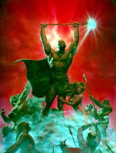
World acclaimed artist Corben spent over five years creating more than 500 individual paintings for his masterpiece. This enchanting visual epic will be ranked among the great classics of fantasy.
American illustrator and comic book artist best known for his comics featured in Heavy Metal magazine. He won the 2009 Spectrum Grand Master Award. In 2012 he was elected to the The Will Eisner Award Hall of Fame.
A shy, nerdy kid from Kansas, Richard Corben grew up reading paperbacks by Edgar Rice Burroughs and H.P. Lovecraft and drawing fantasy worlds of muscular heroes, buxom blonde damsels, and ferocious monsters. He never suspected, I'm sure, that he could make a living out of it.
Dark Horse Books has recently been publishing gorgeously refurbished hardcover editions of Corben's work; stuff that has, until now, been out of print for decades. Many of these were published (in somewhat edited versions) in the now-defunct but legendary adult comic magazine Heavy Metal. Some of this stuff has never been published.
His most popular creation, Den, is the story of a Kansas teenager transported to another dimension in which he is a six-foot musclebound bald hero with a giant penis. He quickly meets Kath, a young girl from London, England who is transported into the body of a voluptuous blonde with huge breasts. Together, they fight witches, dragons, and slimy lizard-creatures. And have lots of sex.
If you've ever seen the 1981 animated film "Heavy Metal" you should recall the section featuring Den (voiced by John Candy) and Kath (voiced by Jackie Burroughs).
If you've never seen Corben's artwork, I daresay you've never experienced truly great comic book artwork. Run to your nearest comic book store and look for these books. (If you're cheap, like me, your local library is also a good place to find them, and they're free...)
The late Richard Corben has an odd place in the world of comics. He seems to be universally known and respected by other comic artists – hailed as a great innovator, and often treated as an outright legend – and yet his work doesn’t neatly fit in with any scene or genre, and as a result he spent his whole career on the fringes. At first he was associated with underground comix, where his work somewhat fits in due to being explicit and sexual (some would say smutty), but really his earnest genre fiction has little in common with most of that scene. Later on, he dabbled in the US mainstream – working for Marvel, DC, Dark Horse and IDW, including on big titles like Hellboy, Hellblazer, Luke Cage and The Punisher – but he never really built a career there, presumably because his art style and genre interests are too out-there for most superhero fans (or maybe because he didn’t like working in corporate comics). Perhaps the place where his work fits in best is alongside the European adult-orientated genre comics of Métal Hurlant, but even there he stands out for being on the wrong side of the Atlantic, and for lacking a certain European je-ne-sais-quoi. Presumably as a result of his failure to fit in anywhere, much of his work is long out of print (at least in English): if I’m not mistaken, the most recent English edition of Neverwhere was published in 1991, which is 30 years ago at the time of writing! All of this adds up to Corben being something of an enigma to me, so it was with a great deal of anticipation that I leapt into this, my first taste of his work.
Corben is primarily known for his artwork, and in particular his unique, vibrantly coloured, painted-and-airbrushed style, with characters that look like they’ve been moulded out of putty. This is a big part of what drew me to pick up Neverwhere, and it’s all here, but actually to a lesser extent than I expected. I guess that through the course of this work (which I think was originally serialized from 1975 to 1978) Corben was still developing his trademark style – either that, or he was rushing to meet deadlines. The bottom line is that the art’s very uneven: especially in the first half, a lot of it’s surprisingly rough. Sometimes, for no apparent narrative or artistic reason, a very different style is employed from one panel to the next, or even for different characters within the same panel. One thing that I find particularly grating – even in images impressively rendered in Corben’s signature style – is the depiction of human faces. Expressions are often goofily theatrical (especially when the protagonist is surprised, confused or afraid), and sometimes a character looks completely different in different panels. A particularly conspicuous failing is that Corben seems to be incapable of drawing attractive female faces: the women are all described as beautiful, but frankly look ugly (though Corben tries to avoid showing their faces head-on, presumably due to awareness of the problem).
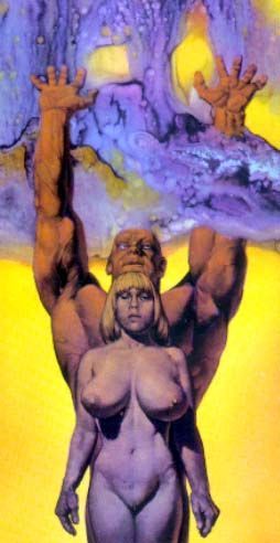
Perhaps in order to distract from their faces, the female characters all have enormous breasts and are constantly naked. Many will find this gratuitous – there’s certainly no narrative explanation for the nudity – but I’m willing to accept it as part of the package (it would be unreasonable to complain about sexual content in what’s essentially a work of soft erotica). I should also note that there’s equal-opportunity objectification, in that the male protagonist is also perpetually unclothed, allowing the reader to admire his bodybuilder’s physique and his sizeable penis, which swings around freely throughout his adventures. Although the nudity doesn’t bother me on a moral level, I have to say that I find the sleazy ‘70s porn star aesthetic to be quite tacky and unappealing.
While my aesthetic reaction to the art is mixed, my assessment of its visual storytelling is basically negative. Corben draws some astounding static images, but he rarely manages to create any sense of flowing movement, and action-packed sequences are often quite hard to follow. Attempts to inject the images with a bit of dynamism generally result in characters standing in absurdly exaggerated poses, gesticulating awkwardly or crouching uncomfortably. My biggest gripe with the storytelling is the extent to which it’s reliant on text, and particularly verbose, melodramatic, expository first-person narration. This was a shock to me: as Corben’s primarily known as an artist, not a writer, I’d expected the text to be more minimal and the storytelling to be more visually driven. Instead, the plot is primarily propelled by big blocks of prose, often simply describing what’s in the pictures, and sometimes describing things that are happening but aren’t even depicted. It sometimes feels more like an illustrated novel than a comic.
As far as the story’s concerned, I don’t really have much to say. There is a relatively complex plot, full of rival factions, intrigues and double-crossing, but ultimately it all boils down to the muscleman protagonist roaming around a fantastical wasteland, getting into fights and having sex. In short, I didn’t find myself invested in the story at all. I tried to just let go of my inhibitions and enjoy it as a pulpy romp, though its corniness and clichés sometimes make it difficult to do so, especially as it takes itself so seriously.
The one thing I do wholeheartedly enjoy is the setting. The monsters and non-human characters all have great designs, the landscapes and architecture are really evocative, and I love the combination of ancient, mediaeval, modern, futuristic and fantastical elements. This factor – together with the better parts of the art – ensured that I overall enjoyed the reading experience, despite the many flaws.
Artistically, this comic is certainly interesting, and occasionally amazing, but ultimately I found it quite disappointing, considering Corben’s reputation as master of the craft. I’m glad I’ve read it, as it’s an important piece of comic history, and I didn’t find it overall unenjoyable, but I think I would’ve preferred a Richard Corben art book.
Neverwhere (originally serialized in Heavy Metal magazine when I first encountered it) was one of the works that made me truly see the potential of comics as a medium not solely the province of kids. Corben's powerhouse draftsmanship, innovative color palette (the result of his painstaking hand-separation technique), and visceral, fleshy figures, sucked me in as an adolescent and never let me go. Rich in homages to pulpsters Lovecraft and Robert E. Howard, and ribald, frank sexuality, Neverwhere is a timeless adult fantasy epic.
Finally this book gets a proper professional reissue from Darkhorse comics. Gone is the terrible lettering. The color is fantastic here and the whole thing has been remastered and rejigged to be the best it can be
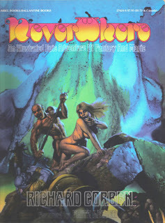
The story is a twisted play on Princess of Mars. A skinny kid wakes up in Neverwhere as the jacked muscle bound Den and gets thrust into a war between a witch queen and some evil dude. Full of lizard men, dragons, flying mounts, sorcerers and lots and lots of nudity. Den's (well-endowed) package is featured on most pages. Lots of boobs and full-frontal nudity throughout.
The artwork varies from being cartoonish with ink lines to fully painted 3d models. Corben was the best colorist of the era, no other comic in the 70s looked like this.
I'm excited to keep reading these reissues by Darkhorse. I hope they can go through a lot of Corben's neglected catalogue. Honestly, this version was just so much better than the episodic nature of reading Heavy Metal issues. The color reproduction and refreshed lettering elevates the whole experience. The lettering in the original was some of the worst I've seen.
Trippy and violent fantasy comic book from 1977. Best known for being the basis of one segment in the 1981 animated fantasy anthology "Heavy Metal", and while it faithfully follows much of the plot there are key differences - and the low budget early 1980's animation does absolutely NOT do justice to Corben's artwork which I frankly think this comic is worth reading for alone.
The plot here follows a scrawny nerd who accidentally gets sucked into a surrealistic alternate dimension where he's now a muscular barbarian warrior. He promptly gets pulled into all sorts of convoluted intrigue with different religious cults (one of which worship a deity named "Uhluhtc" - the name of eccentric 1930's era horror author H. P. Lovecraft's extraterrestrial god Cthulhu spelled backwards) and corrupt decadent aristocrats scheming for control over an orb with strange and terrible powers called the Loc-Nar. (which became the centre for the framing device of "Heavy Metal" '81 hence being included in every single segment there)
What I liked this for was... okay, mostly the artwork. Which is full of gorgeous renditions of psychedelic multicoloured skies reflected in details in water; panels where everything covered in light is in different shades of one colour and everything covered in shadow is in different shades of the light's complementary colour; extremely detailed depictions of the physical texture of engraved granite, exquisitely decorated stone masonry with beautiful reliefs or toned musculature - every male character has the body of a champion weightlifter and every female character the body of a supermodel with most of them running around completely naked for the vast majority of the story's duration.
Corben also shows a masterful command of picture composition, being really good at depicting characters travelling across vast complex desolate yet beautiful landscapes. The universe he dreams up is rather varied too allowing him to depict many different environments and aesthetics from desert landscapes with architecture clearly inspired by Aztec and Mayan cultures, over other locations that resemble Art Deco takes on traditional Middle Eastern and North African or even Pueblo Indian architecture, to idyllic forests and meadows painted in myriad shades of lime green and turquoise with pink and purple flowers everywhere. I likewise enjoyed the idiosyncratic setting where the characters use laser guns along with swords, ride around on gigantic bats/insects/lizards/pterosaurs instead of horses, as well as its sapient inhabitants including various species of beastmen from lizardfolk straight out of Robert E. Howard's "The Shadow Kingdom" to others that look like pop culture images of the yeti.
Bottom line: There is a reason that none other than Jean "Moebius" Giraud named Richard Corben as one of the fantasy/science-fiction comic book artists whom he considered superior to himself, and you get to see why in "Neverwhere". I'll see if I can read as much more of Corben's work as possible in the near future.
The saga of Den is a fantasy series about the adventures of a young underweight nerd who travels to Neverwhere, a universe taking inspirational nods from Robert E. Howard's Hyborian Age, Edgar Rice Burroughs's Barsoom and H. P. Lovecraft's horror dimensions. There, the boy becomes an enormously endowed nude muscleman who has erotic adventures in a world of outrageous dangers, hideous monsters, and buxom nude women who lustfully throw themselves at him. This story was adapted in a highly abridged form in the animated film Heavy Metal, where Den was voiced by John Candy.
Corben's collaborations are varied, ranging from Rip in Time with Bruce Jones, to Harlan Ellison for Vic and Blood, to the Den Saga, the Mutant World titles, Jeremy Brood, and The Arabian Nights with Jan Strnad.
From 1986–1994 Corben operated his own publishing imprint, Fantagor Press. Among the titles Fantagor published were Den, Den Saga, Horror in the Dark, Rip in Time, and Son of Mutant World. Fantagor went out of business after the 1994 contraction of the comics industry.
Due to the sexual nature of Corben's art, it has been accused of being pornographic, a description he himself disagrees with. One notorious example was the interview he gave Heavy Metal editor Brad Balfour in 1981.Corben was very dissatisfied with the interview. He felt it portrayed him as a "petty, childish, borderline psychotic oaf". He wrote a letter in retort, which was published in the September 1981 issue.[
Quotes about Corben
Corben's work is admired and respected by many artists, illustrators, and authors.
Corben's work is singular in its humanity. He works with towering technical skill... ...the wondrous thing of it all is that underneath all that technical tour-de-force is the sound of a beating heart. —Will Eisner
Corben's stuff was great. He put stuff into his comix that the overground press wouldn't print. —Robert Crumb
I feel like I was particularly impressed by Richard Corben's work. But in general I would not say the underground made that big of an impression except for Corben... His science-fiction stories, those almost primitive black and white comics he did back then. I was very struck by the visceral punch they had, by the unusual artistic point of view. And also by the unabashed exaggeration. It's as if you wanted a woman to have big breasts, you drew it. There was something just so joyously excessive and erotic about his stuff, that I just ate it up. —Frank Miller
Richard Corben, stands among us like an extraterrestrial peak. He has sat in his throne for a long time, above the moving and multi-coloured field of world comics, like an effigy of the leader, a strange monolith, a sublime visitor, a solitary enigma. —Moebius
Mr. Richard Corben... a genuine giant of his chosen medium. —Alan Moore
People like the American Richard Corben... are, in my view, maestros. —H. R. Giger
Corben's technique introduced the airbrush to comics. His sophisticated knowledge of how color is printed allowed him to get fantastic results. His work has maintained a sense of humor and spectacle in tales of barbarians, time travelers and Arabian nights. —Harvey Kurtzman
A graphic novel about a young nerd is transformed to another world where he becomes the naked baldheaded muscleman Den. Den fights his enemies, has sex with women (including his enemies) and stops a mythical monster from entering the world. The story is somehwat original, but not very good. The characters are flat. The focus on muscles, tits, violence and sex becomes somewhat boring after a while.
Still, this is a great book. Why? Because when this came out, there was nothing like this. Een today there is nothing else like this. First because of the art, the daring colours, the weird lightings, the detailed painting of bodily parts (including huge pesises and huge tits). You'll never see another comic book or graphic novel that looks like this. And then there is the concept. There are a lot of fantasy adventure stories where heroes crush their enemies and sleep with whoever they find. But have you ever seen a fantasy adventure hero who is bald, completely naked, and has no sword? Den is the only one. And then the fights. I am not saying that Corben is very good at drawing combat scenes, in fact he is not, but he certainly has an unique approach. The way Corben depicts someone smashed in the face or grabbed by the balls is quite different from how any other artist draws combat. It is unique.
The story starts rather interesting, but gets boring near the end. Okay, they prevent the mythical monster from entering the world. which is good, but you are left with unanswered questions and a lot of sex, and nothing else. Well...maybe that is good too. Maybe that is the way it is supposed to be.
Richard Corben's character Den was a keystone of the early issues of Heavy Metal, back when that magazine was exploding with wildly imaginative European comics talent. But Corben was an American, influenced by the very American precedents of Robert E. Howard, H.P. Lovecraft, and especially Edgar Rice Burroughs.
One might even accuse Corben's Neverwhere of being a raunchy ripoff of Burroughs' John Carter of Mars series, enhanced with near-perfect (and always naked) human physiques. It's easy to get distracted by all the prodigious breasts and penises, but to the author's credit, he delivers an entertaining hero quest set in a world of dark magic and sinister mystery that just happens to feature a lot of nudity.
Because Neverwhere represents some of Corben's earliest comics work, these pages feature frequent stylistic transitions, as the author was experimenting with different visual techniques and figuring out how best to present his story. Oddly, that inconsistency of approach works to advantage, as it echoes the shifting currents of malevolent sorcery that power his tale.
Neverwhere is certainly not perfect, but it nonetheless captures the spirit of uninhibited creativity that made the early days of Heavy Metal so thrilling, and is an enjoyable throwback to those heady days.
This was definitely an interesting read! It looks like a standard fantasy graphic novel, but, after you careful read it you realize that on top of that, there are some interesting & unique elements that elevates this one high above other books of the same genre. And let`s face it, the story is also quite straightforward, but the power and the originality of this book it`s in the small details in the art style of Corben`s drawings, it`s impressive treats & drawing approach that it`s so well known for. I`m really curious to see where this series it`s going with the second volume.
When Richard Corben sidled into American comics' mainstream after decades of Adults Only work and self-publication, he was greeted as a conquering hero: ushered into prime position on a prestige Batman project, garlanded with fulsome Alan Moore introductions, catered to by star writers intently providing vehicles for his talent. This country’s comics cognoscenti, on the other hand, have generally reserved judgment. Despite his status as a prime-period underground cartoonist, published in the same magazines as Spain Rodriguez, Jack Jackson and Kim & Simon Deitch, the genre tropes and brawny physicality in Corben always struck a different vibe than his Last Gasp and Print Mint publishing mates. His 1990s-2010s crossover to the mainstream—so seamless in the context of his own career—was perhaps the final confirmation that this was Not One of Our Guys. "A jot simplistic," sniffs the Elevated Reader, polishing their pince-nez, "and hardly elegant," snickering into their cufflink.
They're not wrong. It’s more difficult than with Crumb or Rodriguez to make the case in writing that Corben's Neverwhere, in which a horse-hung nude muscleman stomps monsters' heads into jelly on his quest to save a girl with some big-ass titties, is deep and complex. But reading it makes things feel less plain than they seem, simply because Corben is two kinds of artist in one. As an image-maker, Corben is as innovative, layered and incisive as any of the pantheon-level Great Cartoonists you care to name. But as a writer, he plays it straight, stolidly refusing to sing along with the wildness of the music conjured by his drawings, keeping one foot grounded in populist entertainment for the comic book likin’ masses. Art is harder to write about, to even describe, than writing - and let's face it, most critics come from a writerly background. The importance of what is there on the page in front of your face is paramount in comics, and yet it's too often been passed over in the literary critic’s search for prosaic indicators of intelligence or sophistication.
If you are reading comics, you signed up for an experience more visceral and sensory than what is offered by word books, and having a threshold beyond which these things are Too Much is like having a point where music gets Too Loud. You know what they say: if it's too loud, you're too old!
The comics form's linchpin is drawings of the human figure in motion, and in Neverwhere—the first of (so far) five announced collections to feature Corben's signature character Den—this artist reaches the absolute pinnacle of a certain approach to the art. Corben's style, ultra-realistic yet vigorously cartoony, rotgut pulp with Beaux-Arts flourish, is shockingly visceral, overwhelmingly sensory. It provides an ultimate form of what reels in so many readers when they're young and ripe for picking: the meticulously detailed fantasy images of gender and power that give action comics—superheroes in particular—their psychoerotic escapist charge. All muscle-hero (or milker-hero) art takes you, reader, into your own suspension of disbelief; you've never actually seen a body so perfectly developed, but there it is, living on the page, walking down the street and talking to people and turning its head to look at you, just like they do in real life. That's the magic of the art form at work, the germ of what we all end up addicted to.
In Neverwhere, Corben overloads this system, sending the needle into the red. His characters' almost exclusively nude bodies are inflated with so much brawn and pulchritude that they go beyond the pleasant or attractive straight into grotesquerie - yet they are still powerfully seductive, appealing on a level less erotic than perverted. Muscles cut not from granite but molded out of still-damp clay; heaving muskmelon tits both pendulous and buoyant; thick-veined firehose cocks with angry nectarine heads; all wrapped in smooth and hairless skin that seems to glow dully from within. These are rendered with such disturbing realism, such light and shade and squash and stretch, that it becomes impossible to deny their essential freakishness - the freakishness of the heroic ideal that any comics reader has spent an afternoon or fifty floating in the lizard brain appeal of. Neverwhere is purely visual satire, exposing uncomfortable truths to pitiless light with a deadpan tone that takes great skill, since the point of it is never to crack and show you're in on the joke.
No cracks here - Corben is as much a classicist as he is a satirist, and his comics are as much a pleasure taken straight as with a wink. This is where his work gets tough for sophists. In Corben there's true point and counterpoint, where most cartoonists strive for streamlined unity of form and purpose. His dynamically posed, creatively angled, virtuosically drafted figures are tremendously affecting. His plainspoken meat-and-potatoes writing gives the wicked humor of the drawing its edge. He pursues the same ends as plenty of humor comics, from Wally Wood's and Harvey Kurtzman's "Superduperman" to C.C. Beck's Captain Marvel stories to Moebius's "The Horny Goof" - but nobody else before Alan Moore did Miracleman managed to lampoon hero comics' bodybuilding pipe dreams in a way that still held them worthy of respect and awe, delivering the atavistic goods.
Corben's writing never hits any emotional register. It's never funny or scary, or even sad or happy. It confines itself to simple presentation of the Strange and the Exciting. It is the mythic form of storytelling, a rote succession of plainly told events, each topping the last in imagination and outlandishness. It's not what lots of readers—superhero fans included—want from their comics, but it's the best and maybe the only voice to keep the overall work balanced on the same edge as its art: between farce and fantasy, beauty and ugliness.
If I'm speaking entirely in generalities, it's because Neverwhere is absolutely Corben's typifying work, where his unique brilliance and wide-ranging skill set shows to greatest effect. A plot summary isn't the keys to this kingdom, but for courtesy's sake: Neverwhere follows its big-dicked adventurer's lumberings through blasted wastelands: part Western hardpan, part sci-fi phantasmagoria, part high fantasy realm, which is to say all pulp. Same goes for the through line of brawny, naïve Den’s struggle with sly, sophisticated, inevitably gay-coded Ard, who took Den's girl from him and, in matters of less import, wants to end the world, or conquer it or... well, something.
As in so many of the comics published in Métal hurlant (and that magazine's American offspring, Heavy Metal, which took over the serialization just under halfway through), the journey's delights are greater than the destination's. Corben nails the simple wonder of seeing a story play out in comics form; when it's drawn this boldly, a simple transition to a new setting or two figures negotiating each other's presence in physical space are compulsive reading, and how they impact the master narrative is less important than that they lead to more experiences in the same vein.
There's a special reason why passive, zoned-in reading is the default mode of experiencing these comics: Corben's colors. Whether you think his drawing is gorgeous or garish, or if you enjoy the humming dissonance between those two magnetic poles, the hues he bathes his world in bypass critical thought to soak directly into the brain's pleasure centers. Executed mainly with their artist's proprietary method of layering acetates painted in partial tones of each color over the black line art, the color builds up stunning depth of field and roundness of form with deceptively simple chunks of purple, green and orange that bleed into each other here, pop vigorously there, and swirl into lysergic abstraction whenever the story gives them half a chance. The contents of this book, originally serialized across several venues between 1973 and '78, see Corben testing out a number of different drawing approaches, and the otherworldly burn of the color is what forces an otherwise scattered work to cohere. It's hard to imagine any writer's efforts giving a comic as strong a tone as Corben's color does for Neverwhere.
Just as impressive is Corben's worldbuilding: this comic's setting is no pulp magazine or sci-fi paperback cover hand-me-down, but a rich visual dimension all its own. Corben's way with monumental architecture feels both instinctive and educated, cobbled together from the leavings of pre-Columbian empires and Soviet brutalism. The many monsters massing in the corners of panels are largely humanoid in form, but in close-up panels they show how pure and imaginative a cartoonist their creator could be. Some visual flourishes go beyond drafting to show a keen mind for the form at play. The shadows on Den's face sluice into an abstract oil-on-asphalt pattern as he orgasms; a figure seen in a vision fades into transparency against a boldly marked background of barren tree limbs; a nude girl in an ornate headdress strides across desert sands with bells tied to her ankles ringing into the silence. This stuff goes beyond just good drawing and into the realm of good thinking about what makes an effective comic. It's instructive to contrast Neverwhere against Corben's contemporaneous horror stories for Creepy and Eerie, well-scripted by crack hands like Bruce Jones and Doug Moench. Corben’s own scripting may lack the snap and bite of some of those short-form thrillers, but the epic scope, dreamlike pacing and natural feel for the alien and uncanny are genuinely special. There's a reason beyond the art that Neverwhere is one of the very few Heavy Metal serials getting a deluxe hardcover reprint treatment nearly half a century later.
It's long overdue, honestly. This stuff has been out of print since the early ‘90s, and its publication history wasn't simple before that. Neverwhere's opening chapter was created for issue #2 of the underground series Grim Wit, a typical four-color process printed comic book of the early '70s. (This comic succeeded a 1968 live action/animated hybrid short film introducing the story concept.) Corben's approach to those first pages is graphic and primitivist compared even to the stories he was doing at the time for the Warren horror mags, or undergrounds like 1971's Rowlf. Thick black lines and blocky figures stomp through an acrid haze of color, the setting feels less alien and more Mayan, and one of the biggest joys in the whole book comes in the first fight scene, where already stripped-down drawings shed yet more detail and gain an emphatic simplicity that feels as close in spirit as the undergrounds got to Jack Kirby.
The following installment is probably the craziest-looking thing in the book, as Métal hurlant and its vastly superior slick magazine printing took over the serialization. Corben now applied his color process over artwork that was fully painted in black and white, photographic elements collaged into the backgrounds, allowing him to sculpt dimension and detail in three different media. Skies feel choked with gaseous fog, eldritch forces swirl with true majesty, and figures are weighty with momentum, their sense of animation feeling just a bit obscene. Kirby had to wait decades for his own experiments with photo collage to be as seamlessly incorporated by printing as Corben's are here. It's obvious why this material was chosen to headline the Heavy Metal animated movie: argue about its merits all you want, but in 1976 comics had never looked so vivid.
Following what must have seemed an obvious progression, Neverwhere's next installment featured fully painted color art boards (co-signed with studio assistant Herb Arnold); but here Corben was on shakier ground. The painted colors don’t punch with the same force, and the figurework grows tentative, smeary and crusty where it had been smooth and sharp as glass. Credit to Corben: he realized how important the artificial textures of mechanical reproduction were to making comics, and went back to a color over black-and-grey line art approach for the remainder of the serial. Where much painted (or painted-style) comics art is all about shading, importing none of the strengths of paint and illustrating how resolutely line-based the cartoonist's approach is, here Corben was really revealing and refining an ability to draw with color, using an arcane, labor-intensive process he invented himself. Just seeing this stuff is incredible enough: knowing how it was made is awe-inspiring. One panel of Den is simply beyond a lot of cartoonists' talent level. Only a handful of comic book artists have ever worked with the combination of drafting skill, unique visual style, color sense and technological innovation that Corben was flexing here.
Of course, technology never stands still, and this new edition of Neverwhere has undergone a good amount of optimization on its way to the market. José Villarrubia's digital remastering of the colors from the original art boards and acetates is yeoman's work, done with a true craftsman's attention to detail and sympathy for the artisan's intent. More unusual is the standardization of the pages, drawn over the years for the varying trim sizes of different publications to fit this book's one frame. It's subtle, but a few gutter spaces and between-panel breaks are widened significantly, and sap individual sequences of some momentum in favor of giving it back to the book as a whole. An interesting choice, and one I ended up appreciating.
I'm less wild about the standardization of the lettering. It might be a necessary evil, given that this book's contents were originally lettered partly by hand, partly with mechanical type, depending on the venue - but Corben's scratchy, sometimes labored or cramped letters constantly remind you that a human hand actually made all this stuff, and the digital professionalism of Nate Piekos's well-executed job loses something by comparison. This being said, the overall yoking of a work with as far-flung a publication history as Neverwhere into something that reads as smoothly as an original graphic novel is a tall task. Maybe I'm being my own kind of pencil-neck by imagining a presentation of this work that celebrates the fucked-upness of how it was first ladled out to the world, rather than something likely closer to the artist's actual vision.
Two generations after Corben, in the first decade of the 2000s, a wave of neo-underground comics from publishers like Highwater, PictureBox and certain corners of Image would mine the same delights, exhibiting fresh new drawing styles to remind us how much fun it is to watch characters simply move and encounter, and to take it all in next to them. Video game and RPG-influenced comics chronicling lone wanderers’ progress through multi-stage fantasy landscapes have become a rich and varied 21st century genre of their own, and while Corben can't quite be called the father of the idiom, this work is the first epic of its kind, one that's lost none of its power in the 50 years since its first pages appeared. Aside from all the cool comics that followed, it's impossible to imagine Dungeons & Dragons or The Dark Tower or The Terminator existing without these specific images… but that's damning with faint praise. Neverwhere is the comics medium pushed as far as it has ever gone in one particular direction that tons of its practitioners have strived to take it, first-ballot hall of fame comics by a master. If it's too loud, you're too old.
Que bestia Corben, que cosa increíble. Que haya hecho esto en los 70 es descomunal. La fuerza, la energía que derrocha en cada viñeta es una patada a la cabeza. Tal vez más ahora incluso que cuando lo descubrí a los 11, 12 años
Nunca había leído esta primera aventura de Den, leí muchísimos trabajos suyos para Warren y muchos de los álbumes publicados en España (mismo tamaño que esta edición). La historia no es tan sorprendente leída hoy como podría haber sido en su momento, pero se sostiene súper bien, la narración es muy ágil y te quedas dos horas mirando cada viñeta. Me pregunto si a los fans del isekai les podría llegar a gustar esto...
It’s fun, and I appreciate the place it has in comics history, but I feel like time has made it less revolutionary than I’m sure it was back in the 70s. Not to say Corben wasn’t an amazing painter, he does some really cool shit here, but the story itself is pretty simple and straightforward. Today this comes off more like a standard fantasy comic story-wise. Although, the recursive nature of Den’s existence, and his inherited memories, add a bit of weirdness that helps. I won’t lie and admit I had built this up in my head as a sex-crazed showcase of comix might, so maybe this is on me. BUT it is pretty fun, and the action is great. And like I said earlier, Corben was an amazing painter so this is a great spectacle.
A boy from Kansas awakes in the muscular nude body of Den on the strange planet Neverwhere. Soon he meets vicious enemies, has to fight for his life but also enjoys a good share of love from gorgeous women.
The story is typical for high fantasy of the early 20th century and can't be compared to what we get these days. It's violent, raw and brutal where every fight is for life and death and mighty beasts meet the muscle power of a true hero. Den isn't the smartest person and his simple-mindedness is quite refreshing. As in the old days, the suffering is made bearable for him by the love of (in this case voluptuous) women.
Richard Corben loves to draw bodies and the pictures in this graphic novel are at times absolutely stunning although the overall quality is a bit uneven. Be warned that there is a lot of nudity.
I truly enjoyed the trip to the barbaric, mythical world of Neverwhere. You don't get such stories these days anymore.
A phantasmagorical piece of work by a one-of-a-kind artist. If you've seen the animated sci-fi film Heavy Metal, you'll be familiar with Den from one of the stories. That segment is basically a condensed version of the first volume. What is most impressive are the techniques Corben used here. It looks like a mix of watercolor and early digital coloring, but I think it's all analog. I have to admit this is an aesthetic I wasn't into before, but Corben really shows what can be done with it. His closest contemporary is probably Philippe Druillet.
A psychedelic odyssey across a magical world where the main pastimes are nudity and betrayal. This feels classic, from the beautiful fantasy art to the rudimentary fantasy story. I'm excited to travel further into Richard Corben's world ✨
Den is the saga of a geeky sort of young guy who follows clues left by a vanished uncle and is transported to another world. Furthermore, he now has the body of a muscular and very well-endowed man. Befriending a similarly transformed woman, he tries to unravel the mystery of what became of his uncle while avoiding new and unimaginable dangers.
There was a time when I hated Richard Corben's art. His characters looked very weird to me and not in a way that was appealing at all. However in recent years I have grown to appreciate it and actively seek it out. In this work particularly, there is an unabashedly primal quality, a joy in the rendering of both male and female bodies that is exciting and refreshing.
Corben's earlier work has become scarce but I hope I can find more of these volumes. Recommended for the adventurous.
Mixed reactions to this. I remember the tale being serialized in Heavy Metal magazine; it stood out for me as one of my earliest exposures to the artistic depiction of a penis (quite a large, thick one), and as an unwitting gay youth I find it most memorable.
I was keen to read the actual story from the beginning, thanks to this republishing. In one sense it's very much of its time—the bookshelves were full of novels where a person (or persons) travelled to another realm, whereas (for the most part) current novelists now realise you can set your work in the other realm and off you go—I'm surprised that despite the Lord of the Rings' popularity at the time, it didn't much influence writers in that regard.
Anyway, Den goes through the portal, acquires a new hairless body with a large penis, and meets attractive women with the same haircut (eventually I learned Kath's hair is slightly longer at the back than the Queens'), and gets involved in adventures that require quite a bit of fighting. It's not, for me, the most particularly exciting story. The artwork is impressive and looks like it would have taken a great deal of time. Corben likes modelling, all his figures are quite rounded, as if made of plasticine, and have a lot of volume. His colour choices are interesting and vivid. His delineation of facial features oft goes awry, like background extras in a Stable Diffusion-generated artwork.
Hence a kind of middling reaction: I like some aspects of it (the ambition, the colour, the modelling, the background location art) and dislike others (the story, the draughtsmanship, the world-building).
(Note: I'm a writer, so I suffer when I offer fewer than five stars. But these aren't ratings of quality, they're a subjective account of how much I liked the book: 5* = an unalloyed pleasure from start to finish, 4* = really enjoyed it, 3* = readable but not thrilling, 2* = disappointing, and 1* = hated it.)
A re-read for me. With the passing of Richard Corben, DARK HORSE has begun to reprint and remaster his classics. It began with his final piece MURKY WORLD before swinging into his epic DEN. A book that lasted 5 volumes (6 if you count DEN SAGA, 8 if you throw in his brother DENZ and possible great-grandson DENAEUS in SHADOWS OF THE GRAVE). Best known for the animated adaptation appearing in the HEAVY METAL film. This is his love letter to the heroic journey you see in epics like The ODDYSEY and normal guy becomes a hero on an alien world a la JOHN CARTER. Corben pulls no punches from the start as his male character DEN spends most of the book with his genitals hanging in the wind. Throw in his paramours The Red Queen and Kath who are very ... ahem, "healthy" women and you can see why this book was such a hit with the underground comix crowd. As Patton Oswalt says in his preface, "Those bodies!" Corben is big on living in the moment. He sets up plenty of mysteries but never fully explains them over the course of DEN's 5 (or 6) volumes. But we're here for the art, not the writing and even here: still a bit primitive and unrefined, the genius of Corben is undeniable.
A young nerd who comes temporary to the land Neverwhere, a universe inspired by Robert E. Howard's Hyborian Age and Edgar Rice Burroughs's Barsoom (Burrough's are mentioned inside this album as H P Lovecraft's Cthulu also are and comes in the end), get transformed to a muscular hero who kills, have sex and save girls from monsters and other troubles. The book haven't got a good drawing style which is its big disadvantage and take away the nudity which would give the story a better face because that's a good one... for me it felt like it was too much focus on sex and nudity to drive the story forward and get the focus right and the great oldschool Sword & Sorcery drawing on the frontpage which made me pick this up, together with the Fritz Leibers foreword, makes a lot of promises for both the story and drawings in witch the drawings sadly didn't deliver that the front page had given me for expectations. The story are a good one who would be given rightness if it had more proper drawings attatched...
I read the Heavy Metal excerpts in the 70s. I owned the paperback edition of this in the 70s. I just read the work this year and was struck again by Corben's use of color. The color palette reminds me of black light poster contrasts. No wonder his work was so popular back in the day. The story itself borrows generously from many sources, Greek mythology and Lovecraft, to name a couple. And I love those sources. So a happy trip down memory lane.
The imagery is violent and sexually explicit, so proceed with caution.
This is apparently the first of five volumes of the Den Saga being produced. #2 is also out as of this writing. I got my hands on both just to embrace the nostalgia.
I saw Heavy Metal in the theater at a midnight showing decades ago, and that's what turned me on to the magazine. Picking up a few issues and finding the continuing adventures of Den was fantastic. I suspect Corben's emphasis on independence is one of the reasons why the character isn't more mainstream. Producers/publishers want a slice and if he was reluctant to let go they might look for someone less protective--and savvy, honestly. That and, of course, the relentless nudity and sexual content which a lot of Western culture just can't abide without pearl clutching. But imagine the what if's. What if Arny had played Den instead of Conan? What if some enterprising adult film director had made a version a la some of the 70s or 80s X-rated films. What if the film adaptation had been entirely about Den rather than the rather weird Loknar shorts? Ah, what a world we might live in today....
The open sexuality of this story is more often than not prurient and even puerile in a way that would raise even Freud's eyebrow, but it's weirdly equal opportunity. Those who take issue with Corben's ridiculously buxom female characters (which is a bit like watching a Russ Meyer movie for the cinematography or reading Playboy for the articles) also have Den's crafted, steroidal physique and manhood swinging like a baby elephant's trunk to assess. Sure, it's still sexist in the clear divide of gender and sexuality it exemplifies, but it's also lampooning than self-same sexuality at the same time. It's hard to take seriously concerns about a product that is this cartoonish in its embrace of adolescent fantasy imagery. False equivalency? Maybe. Or maybe it's a free love fantasy as much as a fantasy fiction, and we shouldn't take the sex any more seriously than the sorcery lest we fall prey to that most pernicious of literary traps: taking ourselves too seriously.
Speaking of the imagery, the late 70s psychedelic atmosphere and that contrast with the current trend in fantasy to give everything the color palette of a color blind cataract patient. The dynamic colors of comic books are translated into dull, muted versions to suit the current fashion, and that's all well and good. Things need to adapt with the times. But it's nice to have a look at something so much more abstract and colorful presented before Batman's wardrobe became the archetype in anything wondrous.
Corben apparently used a lot of air brushing in his work, giving a lot of the 2d depictions the appearance of clay models being photographed. I'm curious about his process and hope that later installments will have a more fulsome account of how he created his comics. His look was and remains quite unique, and that makes it worth checking out alone.
Having been sufficiently exposed to Corben's "Den" from the pages of Heavy Metal, I wasn't expecting too much from the collected edition. When read in shorter, serialized segments, Den hardly made sense, but I did hope reading it in a proper collection things would be more clear. While I can now say I at least grasp the story a bit better, I can't say I enjoyed the story all that much. Den seems to be a mash of Corben's many influences - Robert E. Howard, H.P. Lovecraft, Edgar Rice Burroughs, etc. - but with Corben's signature vision of muscular men and buxom women navigating the surreal and fantastical sword & sandals settings. The story, broadly speaking, is about a skinny nerd who passes through a portal and assumes the identity of the muscular warrior known as Den. In this new dimension known as "Neverwhere", Den meets Kath, another human who has also passed into the dimension. Kath spends a signifcant portion of the story as the damsel in distress, with Den having to carve his way through swaths of lizard men, giant insects and other monstrosities to confront an evil queen. The journey Den takes is winding and brimming with all sorts of magic, sex and violence to keep the primarily (young) male audience of Métal hurlant/Heavy Metal appeased. The story is pretty much "Alice in Wonderland", but for dudes.
The appeal to Den, is of course, Corben's artwork. His distinctively static style gives off the appearance of claymation film frames, but the loud color palette evokes an almost ethereal feel to the story. The exaggerated features are borderline hysterical, but also is something I find incredibly daring. Corben just did his own thing, irrespective of what other cartoonists in the same space were doing. There's something admirable about a cartoonist cultivating an aesthetic so distinctive, and no can deny that Corben's compositions were unique.
This is a review of the 2023 reprint from Dark Horse Comics which includes some color touch ups and re-lettering by José Villarrubia. I'm usually apprehensive to modern restorations, but Villarrubia does an admirable job here. Compared to the garish letter colors found in previous printings, this really makes the whole comic much easier to read. I normally like going for the more vintage printings, but this version is really the best version of Den out there.
I don't know that there's ever been a better graphic entry into weird fiction than Richard Corben has provided us with Den. The obviously greater appeal of Den is in Corben's artwork, which depicts an empty wasteland with a few bulbous features, and surrounded in an atmosphere of highly-saturated, swirling colors. Every single page is gorgeous, I've spent decades staring at pages of Den more than reading them. For it's part, his new Dark Horse edition prints it beautifully. Honestly, if ever there was an artist whose work in the 1970s hold up well to 2020s digital remastering, Corben's illustrations feel future-proof.
The main criticisms of Den are, rightfully, in the storytelling. The weight of Den's importance is carried on the very beefy shoulders of the artwork, while the narrative is as sparse and odd as the setting. The main character is a clueless beefcake who is isekai'd into a hostile world, caught between the dangerous ambitions of a sexy sorceress queen and a sexy necromancer, and his solution at every turn in his quest to save his sudden girlfriend, Kath, the voluptuous prop, is to punch in any face that gets close enough. It is far from groundbreaking work, but for those who appreciate the uneven charm of real pulp, it's a treat. Den is a creation that comes from a singular cartoonist who is happy to tap into the depths of his fantasies. It's sexist and violent, but not maliciously so. Credit to Corben; everyone's naked. Beyond that the cosmic horror is a barely-comprehensible swirl of ill-contained form, and there are giant bugs and bats and demihuman hench-things with automatic rifles. It's a wonder that anyone could survive, and few actually do.
Den isn't for everyone. Even the astounding artwork comes from a style that might be off-putting for people used to something gentler. The writing ain't poetry, but it is what it intends to be. It's great fun, and it's definitely for me.
Overall I quite liked it, even if it had unevenness. I think it adds to the charm; it gives it such a fluid energy that is absolutely crackling with life. Like this world is sprinting forth from a mind before our very eyes, page after page. Story wise, it’s a simple tale but it’s there to sustain the images, and hooo boy the images. A nebbish guy gets trasported to a fantasy land and turned into a Conan style He-Man, trying to find his way in the world. This involves him finding the two Fs, fighting and I think you can guess the other one.
Absolutely lush presentation too; with lovely essays about him both before and after the main event. I hope they get another run in circulation, it seems this one went quick.
I can see its influence (and what it was influenced by) everywhere. I would not at all be surprised if Kentaro Miura and a bunch of mangaka have read it. I also feel it has a bit of a kinship with the Spaceman Spiff strips of Calvin and Hobbes; the way it uses sparse, alien landscapes and a lone hero, both clearly evoking Burroughs and the level of fantastical detail of Alex Raymond (and in Corben’s case Conan too.)
I’d recommend this book to anyone who likes beautiful painted fantasy lands and tasteful nudity.