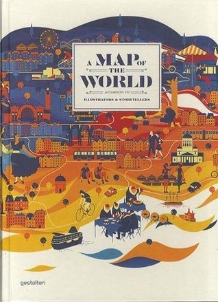
Maps help us understand the world. This book features the most original and sought-after map illustrators whose work is in line with the zeitgeist. Drawing a map means understanding our world a bit better. For centuries, we have used the tools of cartography to represent both our immediate surroundings and the world at large--and to convey them to others. On the one hand, maps are used to illustrate areal relationships, including distances, dimensions, and topographies. On the other, maps can also serve as projection screens for a variety of display formats, such as illustration, data visualization, and visual storytelling. In our age of satellite navigation systems and Google Maps, personal interpretations of the world around us are becoming more relevant. Publications, the tourism industry, and other commercial parties are using these contemporary, personal maps to showcase specific regions, to characterize local scenes, to generate moods, and to tell stories beyond sheer navigation. A new generation of designers, illustrators, and mapmakers are currently discovering their passion for various forms of illustrative cartography. A Map of the World is a compelling collection of their work--from accurate and surprisingly detailed representations to personal, naive, and modernistic interpretations. The featured projects from around the world range from maps and atlases inspired by classic forms to cartographic experiments and editorial illustrations.
A deeply frustrating book, given it's potential. A couple things to note:
1) Despite the title implying a nice geographic distribution, I'll bet if you counted, roughly 30% of the all the maps in the book are just of London (no exaggeration). Past that, you're looking at a huge concentration of major cities in Europe. Then the US, which apparently contains only LA, NY, and San Francisco. Non-Euro-American cities and regions make up...oh, maybe 5-10% of the book (that's including maps of the entire world).
2) It's a nice, large format book, but most of the maps here are clearly even larger format, and when reduced to fit on the page, many of them are illegible. For those that are, they often contain numbers specifying locations, but the key is not printed, so....even if you wanted, you didn't know what you were looking at.
3) It's sad to say, but...overall, many, many of these maps basically look the same. This is not in any way the individual fault of the illustrators and artists, it's just that...well, apparently whatever design aesthetic predominated modern illustrated maps has a kind of a standardization, which becomes apparent when you see so many of them together. Or else the editor just has a type of map that they really, really like.
I was enormously excited about this book, so perhaps that feeds to my disappointment in it for the above reasons. If you are interested in maps, I would say skip it. If you are interested in modern map design (that is, as a designer)...you might find some ideas.
A large and beautifully printed collection that contains some unusual gems (Matthew Rangel's gorgeous work for example, which combines sketches with topographical maps). Explicitly focusing on contemporary work, which makes sense, but resulting in an unfortunate over-representation of a specific (and repetitive) digital style which, to me, highlighted the derivative rather than the creative aspects. The one other glaring issue is the fact that, while being described as featuring "projects from around the world" it includes almost exclusively work from US and European graphic designers. Ironic that a book that aims to highlight the diversity of ways to see the world is so narrowly limited to a Western gaze. I'm not very familiar with the work of Middle Eastern, African or South American cartographers (and this collection didn't help since the number of artists from these regions represented here are... zero) but I have a growing collection of contemporary Asian maps (so I know there is a volume of work from which one can draw) which showcase an aesthetic diversity that would have benefited this collection.
This brings together a rich and semi-diverse selection of maps from around the world, bursting with colour and creativity and is sometimes even a bit cheeky too. This is a fun journey through the world, as seen from many inventive viewpoints.
This isn’t without its flaws, there seems to be an over emphasis on certain places, like London and other mega cities at the expense of so many other places. This isn’t quite up to the excellent standards I have seen elsewhere in other kinds of map related books, but this still has enough going for it and is worth the time for avid map fans.
Absolutely gorgeous, intriguing collection of maps by (as the title indicates) various illustrators and storytellers. Quite enjoyable to flip through. I've even noted the name of an illustrator who I plan to buy from once I have some money. :) Would make an excellent gift and/or coffee table book.
Most of the art and examples were pretty great. I thought the variety was lacking, though (how many maps of just London and Manhattan do you need to show?), and a good number of the pieces I think are a bit of a stretch to call a "map."
Maps tell stories. Sometimes those stories pretend to present objective ideas; sometimes those stories are strictly imaginative, as in maps created for novels such as "We Were Liars." "A Map of the World: The World According to Illustrators and Storytellers" conflates the worlds of traditional cartographers with imaginative storytellers and sellers of ideas to offer a collection of unique maps that help us understand and construct myriad worlds. The book is a beautiful collection, including maps created for ad campaigns, maps that guide tourists, and maps that present histories, as well as many other types of maps. The landscapes cartographers create have me thinking about how mapping can promote creativity and knowledge acquisition among my students. For example, on p 104 one finds maps from the Cosmographies, described as mapping "locations using personal experiences as a way to contribute to the understanding of place." The New Littles map on p 141 maps New York City's boroughs based on ethnicity. The map offers inspiration for students mapping their school, their town, their activities, their vision for their future. This is a stunning collection that offers another way to bring visual literacy into the classroom, and for those not in education, the book would make a fantastic coffee table book or gift.
The description says it better than I can. Imaginative and engaging, mesmerizing and awe-inspiring, this book would be a gorgeous gift for the illustrator or graphic designer in your life. If they're older than 25, pick up a magnifying glass and head lamp as well (the tiny text size on some reproductions make them impossible to read).
A lot of great stuff here, but I was bummed out by the way only partial collections were collected. I mean, it makes sense, but it ended up being more of a jumping off point rather than something I would want to own on its own. And at one point, all the art started to blur together.
Con m��s de 200 p��ginas, toda una revisi��n del dise��o de hoy en d��a de cartograf��as para todo tipo de prop��sitos. Un lujo a un precio muy razonable (en amazon.co.uk)