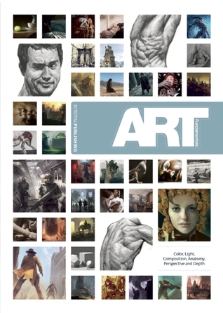
A broad understanding of the fundamental concepts, conventions, and theories of art is essential when it comes to producing a successful piece of work. Art Fundamentals addresses key basic subjects such as color and light, composition, perspective and depth, anatomy, and portraying emotions in a series of insightful chapters. Find out about color relationships and how to choose colors that work well together. Learn about the Rule of Thirds, Rule of Odds, Golden Triangle, and Divine Proportions, all of which are key when it comes to creating a realistic and dynamic composition. Discover the power of storytelling in an image and how the slightest tilt of an eyebrow can transform happiness into anger. Written by some of the most experienced artists in the games and film industries, including Gilles Beloeil ( Assassin's Creed series) and Andrei Riabovitchev ( Prometheus and First Class ), this title gives newcomers the tools they need to get them started on their artistic journey and offers veterans a chance to brush up on their theory. Gilles Beloeil is a senior concept artist and matte painter at Ubisoft Montreal who has spent the last several years working on titles in the best-selling Assassin's Creed video game series. Andrei Riabovitchev works for MPC in the United Kingdom as a concept artist and has an impressive résumé that includes Prometheus , First Class , and Snow White and the Huntsman .
I was so excited about this book, but as I was reading it I got a bit disappointed: it feels like the artists are here to showcase their (great) artwork, and not to teach, which to me was a bad thing. I mean I'm sure there's an audience out there who just want to see good artwork and happily buy "art of books", but personally I want to learn to make such artwork and I thought this book was a lot more on that side of things. As it is the book has some teaching elements, but I think the actual teaching is only like 40% of the book. The rest in my humble opinion is just showing off cool artwork, something with lengthy fancy words attached like the kind you'd hear at an art gallery.
The book itself seems to be more a collection of different articles from different people, which was to me another minus as it seemed all thrown together as opposed to building on the previous lessons and getting advanced by the time you finish the book. As such, each chapter I feel is so different that probably needs a separate comment:
1. Color and light - fantastic artwork, love the artist. Some nice thoughts but he didn't feel like a teacher as much as a great artist. What i was left with was his thought that if the lights are warm the shadows must be cool, and if the lights are cool the shadows warm
2. Composition - this felt to me like total soft logic magic number thinking. I mean the artist is obviously good but like that famous tennis player example sometimes even the master might have the wrong explanation as to why his work works. Complicated formulas and pointing to pseudoscience to argue that some magic number/square/ratio/spiral is why the piece is good and your eye goes to a certain spot in the painting when in fact he just also happened to put the highest contrast and detail there. As the economists say: correlation is not causation.
3. Perspective and Depth - little practical advice, mostly felt like a wikipedia article, not teaching
4. Anatomy - I would say this is the best teaching in the book, in the sense that though the explanations are not exceptionally constructive the drawings finally feel like they were done specifically for teaching and not simply repurposed illustrations. Oh, and here the very strange design choice of the numbering of the illustration becomes really obvious: the numbers are small and low contrast and the texts are not related to them, making it hard to find what they're talking about. This was a problem in the whole book but here I particularly cared. Out of the whole book this is the only section I'd keep in my library for the future, if only it wasn't surrounded by so much other fluff: after this chapter the book ends for me, continuing mostly with image galleries... that's why the web was invented, so we don't have to waste precious print teaching pages on big images :P It says something about the quality of this section's teaching compared to others if I liked it most though my passion is for environments and not figures.
5. Reference Gallery - good artworks, but a waste of space in a teaching book IMHO
6. Art Gallery - pretty much the same as the previous chapter, big images with commentary, not so much about the process as poetic descriptions. Still, at least in this chapter I found some hints as the the thinking of the artists in respect to some technical choices they made so that was interesting, still, doesn't take the place of actual teaching in a teaching book.
So, overall I find this book totally putting presentation over content, from the beautiful original book case and cover to it being filled mostly with beautiful illustrations, but relatively little teaching. I still learned some things from it, and maybe others will find it much more useful than me so I'm happy it's out there, I just personally expected for this price a more constructed teaching book. With all due respect for great artists, and all those in the book are obviously people I hope to learn a lot from, it is one thing to make great artwork and put time into painting, and slightly different to then also put time into preparing teaching material. In many fields I think you have to think a lot more about your stuff if you actually want to distill the things you know into a form that others can understand it too. I really feel quite bad about saying not so great things about a book filled with such great artwork and with such amazing presentation... I just wished it hadn't tricked me into thinking it's a teaching book and would have sold happily among those hundreds of awesome art-of books out there. As it is I find this book is a half-breed hybrid between a book I'd see as I'm exiting an art museum and an actual training book for art students.
Art Fundamentals looks at the elements that contribute to a successful piece of art.
The fundamentals covered in the book includes light and colour, composition, perspective and depth, and anatomy.
It's written by several guest artists, among them Gilles Beloeil (Assassin's Creed), Andrei Riabovitchev (Harry Potter films), Roberto F. Castro and Matt Smith. The artists provide their own examples and commentary.
There are whole books written specifically for each of those subjects mentioned earlier. Having four in a book, I felt that the depth of coverage is sacrificed at times. So do not expect in-depth complete coverage on each subject. Think of this as a book of tips rather than a detailed practice-along instructional book.
The chapter on light and colour has 27 pages only. It's brief considering it's a huge subject - James Gurney wrote over 200 pages on the same subject in his book Color and Light. Here Gilles Beloeil uses his Assassin's Creed concept art as examples and talks about the fundamentals of lighting.
The next chapter on composition deals with the indispensable golden ratio. There are many useful composition diagrams and example paintings that highlight the importance of strong composition. The concepts are easy to grasp and the subject is sufficiently covered.
Next is perspective and depth. There are basics of 1,2 & 3-point perspectives, and vanishing points of course. What's missing are the rational behind using the different point perspectives and the placement of viewpoint positions. Coverage of depth is too brief. I would definitely recommend a dedicated book on learning perspective instead.
The chapter on anatomy has 76 pages. Emphasis is on muscle form of the body and there are many beautiful detailed illustrations of muscles of the torso, arms and leg. Other parts like head, nose, ears, expressions are briefly covered. There's mention of posing but not much.
The last two chapters are sizable galleries with accompanying commentary discussing each image. The first of the two talks about the paintings with attention to the art fundamentals covered in the book. The last chapter has contributing artists talk about their own artworks, specifically the concept behind. The work featured are contemporary paintings.
This book has useful tips and insights. But because of the limited space, each subject somewhat feels incomplete. Personally, I prefer books dedicated to single subject or aspect of drawing.
I'll recommend this book to beginners, probably as a supplement to what you've already learned.
This is a great book about the fundamentals, especially for beginners that need to understand what is color, values, and the rest. The only part that was "meh" for me was the pieces where they showed how to apply each fundamental. The quality of some or them, or the explanation of the artist, was subpar compared to the rest of the book.
Ordered for school and was used when studying and working on 3D design. Very good book. Is a must have when working with light, composition and etc. Works exactly for what the book is written for.
Gives you a very basic starting point from where you can kickstart your art career, or patch a few more holes in your knowledge that you might have missed along the way. The book is massive and contains a lot of info, but ultimately boils down to some simple guidelines and nothing more. The most informative and longest section is the one on human anatomy, but I feel that they missed out on so many things there and could make another section on just movement and gesture.
The biggest takeaway for me is that there are sections that showcase some beautiful artworks but don't explain well enough how they are connected to the fundamentals that the book was explaining.
If you have $40 to spend, then I would advise you to definitely buy the book and read it thoroughly. Otherwise, I feel that everything that was written in the book (apart from the anatomy section) could be summed up in a 15 minute Youtube video.
Good detailing of art fundamentals, each chapter by a different artist. The section on colour was immensely helpful, clearly explained and detailed with good illustrations. The chapter on composition devolved into a hugely mathematical study of the golden ratio and was not at all practical. Also featured a useful gallery section that showed the fundamentals at work in different artworks.


 (More pictures on my blog)


