Tailored from the adored Jane Austen classic, Marvel Comics is proud to present PRIDE AND PREJUDICE! Two-time Rita Award-Winner Nancy Butler and fan-favorite Hugo Petrus fathfully adapt the whimsical tale ofLizzy Bennet and her loveable-if-eccentric family, as they navigate through tricky British social circles. Will Lizzy's father manage to marry off his five daughters, despite his wife's incessant nagging? And will Lizzy's beautiful sister Jane marry the handsome, wealthy Mr. Bingley, or will his brooding friend Mr. Darcy stand between their happiness? Pride and Prejudice #1-5.
Nancy Butler also writes under her real name, Nancy J. Hajeski.
Nancy Butler has been an Anglophile since she was nineteen, when she traveled to England to see Carnaby Street. (“I blame it on the Beatles!”) Her frequent visits to an American friend living in London have furnished her with enough inspiration to keep writing Regencies well into the new millennium.
Butler resides in northern New Jersey with two cats, Aja and Puck, surrounded by her collection of artwork, funky antiques, and books. When she manages to get away from her computer, she can usually be found riding her quarter horse mare, Ginger, through the scenic wilds of Bergen County.
Butler is the 1998 Golden Leaf Award winner for Best First Novel.
[Never more awkward than when you accidentally walk in on the book's one moment free from alternating monologues.]
Of Jane Austen's works, perhaps the most difficult to satisfyingly adapt is Pride & Prejudice. It's proven itself so through several lackluster film versions (the only one that represents the book well enough is the 1995 BBC adaptation—and that only succeeds because its leisurely five-hour runtime allows it to indulge in more characters and more plot directions). The other viable conversion is the 1940 adaptation—its chief strength lies in its creators' ability to shear from the source novel with liberality. The problem with Pride & Prejudice, it seems, is that Austen crafted a story that is just too complicated, steeped in nuance and characters and pivotal plot moments. When any of these are stripped away, the result is something other than Pride & Prejudice as Austen envisioned it.
And because the original novel is so well-loved, revision becomes blasphemy. Authors seeking to adapt generally either a) fall into the category of fans themselves or b) are at least well-enough aware of Austen's fans that they recognize any cut will be seen as betrayal. Where one of Austen's lesser works—say, Mansfield Park—could be filmed with a certain liberality and only Austen's most ardent admirers would care, Pride & Prejudice is another matter. So you have clipped, confusing products like 2005's Keira Knightley adaptation that rushes to its finish, packing in every plot point possible yet never allowing the viewer a chance to catch up. For a graphic novel version of the book to succeed then, it must either offer a sturdy page-count or be willing to refashion Austen's story to better suit a more diminutive length.
Unfortunately for Marvel's edition, writer Nancy Butler proves herself unequal the task of adapting Pride & Prejudice, following after the lack of pruning that made Keira Knightley's version such a wreck. This is no big surprise, really. As mentioned earlier, the book seems ridiculously hard to bring into other mediums. Add to that the fact that Butler is a prose novelist as yet untried as a comics scribe. Predictably, she leans too heavily on her words (or Austen's words if you want to be like that). Panels are filled with walls of text, desperate to get out the requisite information before the book's finale—which comes way too fast. As Butler's version speeds to its conclusion, we have all the dry information we need to ascertain what just happened,* but we haven't been given the room to process it. And more than that, we haven't seen the characters develop in any ways not directly associated with their words.
Which brings us to Hugo Petrus' art.
Even had Butler's writing left plenty of room to make use of the visual storytelling unique to the comics medium, this adaptation would still be roundly considered a failure. The art, apart from being actively bad, is so great a mismatch to the book's content that one wonders how on earth this casting decision was ever made. Petrus' style, even if it was well-done (it wasn't), tries to turn Austen's Eighteen-Aughts romance into a sleek, sexy soap operatic mess. Here, look at the introduction of the Bennet Five:
[Hi, I'm Larry. These are my sisters Herp and Derp and my other sisters Herp and Derp]
Let's forget for a moment that Lizzy looks like she's just polished off a mug of vodka and that Kitty is gazing wild-eyed into the hole in the back of Lydia's head. This looks like the cast of an awful sitcom about five women who co-own a design firm and have wacky, wacky adventures with clients whose requirements they aren't really able to meet but still continue running their business because the show would end otherwise. And apart from their collars, it could probably be set in a period as recent as last year (though one of them would have to have shorter hair, maybe). They're even wearing lipstick and doing the whole pouty-lip/duckface thing.
The real tragedy is that for months before the book came out, Marvel teased Pride & Prejudice covers. These are what we saw before the book came out:
[Seriously, aren't Elizabeth and Darcy just TOO adorable here? (click to enbiggen)]
They were fantastic-looking. (I mean, apart from the faux-Cosmo text thrown up all over.) The illustrations by Sonny Liew were completely adorable. That was an Elizabeth Bennet that I wanted to read about—even if the writing was only so-so, Liew's art sold me on the series, easy. An artist who could create such a winning Elizabeth and Darcy was easily worth my attention. If you hadn't figured it out already, allow me to point out: Sonny Liew is not Hugo Petrus and Sonny Liew's only contribution to the book is cover art. This is why some readers get upset when the art featured on a book's cover does not at all resemble the art in the book's interior. Even though this is pretty common practice, it stinks of false advertising.
So, Jane Austen gets stuck with Petrus, who (at least in this volume) seems incapable of matching character art with what is going on in the panel. Examples:
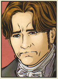
The Elizabeth who has shown herself cynical enough to merrily jest about the folly of the class-conspicuous occupants of Netherfield suddenly appears dead inside, reacting to Jane's goodwill toward Bingley by being overwhelmed by the hopelessness of a world that will always beat down truth and beauty in every instance:
[Note: Jane is supposed to be playfully exasperated in this scene]
Mister Collins, buffoonish applicant to marital bliss with Miss Elizabeth Bennet, while talking of the girl's possible loss of income, decides to model Blue Steel for Mrs. Bennet:
[Personally, I prefer to lead with the tongue or teeth, but if lips is what you've got then lips is what you've got.]
Mr. Bennet takes off his glasses in time for the aneurism that will absolve him of any personal responsibility in steering his family in a manner that would guarantee Elizabeth's loss of both fortune and the bearing of Darcy's future-babies:
[Looks like Mr. Collins will be taking on the house at Meryton sooner than later]
Elizabeth, hearing of Mr. Darcy's devotion, happily bites her lip and squeezes out a fart:
[Suddenly Squirtle!]
You get the idea. The drawing style strangely shifts throughout, especially in the final chapter. He moves from the crisp (if badly chosen) linework at the book's start to something more thick-lined and chunky resembling Alex Maleev's work in Daredevil. While the later work is generally better, it's still a failure to take the job seriously (if not by Petrus himself, then at the least by his editor).
Marvel fumbled the ball badly with this adaptation. While one might question the purpose of adapting literary fiction to the comics form, I do happen to enjoy a well done transportation of a text from one medium to its new home in another. Pride & Prejudice squanders the goodwill set in place by Sonny Liew's covers and offers nothing of value to the reader. On the off chance that someone will read this adaptation before approaching Austen's novel, it's very possible that they will abandon the novel altogether. And that, of course, is a verifiable shame.
[Arf?]
Note * Well, we probably have the information we need. As someone who's read Austen's novel four times, it's hard to approach this as someone who doesn't already know what's going to happen. I'm taking it on trust that it's all there and I'm not filling in plot holes with information I learned twenty years ago when I first read Pride & Prejudice. ___________________________
“It is a truth universally acknowledged, that a single man in possession of a good fortune must be in want of a wife”--Austen
Pride and Prejudice is one of my favorite novels. I wrote a Masters thesis in the eighties about three of Austen's novels. So you have to consider the source here. But I'm no snob; I read some graphic adaptations and like some of them, and there's a kind of explosion of them out there now, better and better work. I was curious (and skeptical) how committed Marvel is in its series to illustrate the classics. Marvel??!! And I'm well aware that adaptations abound in Austen-land. And yep, I even read Pride and Prejudice and Zombies and enjoyed the joke, so there.
Nancy Butler has written 12 Signet Regency classics, she tells us in her introduction. She pitched this adaptation to Marvel as something that would appeal to girls. And you can see how they hoped to sell it, as a teen mag approach, Seventeen Magazine format, how to get your man! So from the cover we can expect the movie Clueless to Austen's Emma. To her credit, Butler knows her Austen, and knows this is not just a simple romance. This is a decent comics adaptation of the basic, stripped-down story, it includes most of the high-point scenes, and she keeps some of Austen's language, but it in a short time only hints at some of the rich subtlety, missing layers of complexity.
In other words, this is not just a great story, a plot, but has rich and complex language in it! That first sentence of Austen (above), for instance, is one of the most complex sentences that had yet been written in the history of the novel at that point, layered with ironies. One can only hope that someone reading this adaptation would turn to the actual novel. But the artwork doesn't encourage one to do it, it doesn't quite fit the story for me, it's not great, in my opinion. So in short, it's what you would expect from Marvel: Disappointing. Maybe 2-3 stars for the writing job, 2 stars for the art.
the thing about this is that it's a jane austen novel adapted into a graphic novel, which is simultaneously a very good and very bad thing.
i mean, it's more jane austen content, which is good.
but it's also jane austen that's very abridged and shortened and leaves out the little details and nuances and commentary and witticisms and at that point it's like...why read jane austen at all.
but also it's like a 45 minute read, and that's good too.
basically this is fun and nothing else. and that's good enough.
part of a project i'm doing where i review books i read a long time ago to try to get on your nerves, blah blah blah, and so on
If you're already a fan of the book (and you enjoy graphic novels), then this will probably appeal to you. It would also be great for people who don't want to read the book, but do want the condensed version of the story. Because let's face it, there are references to Pride and Prejudice everywhere.
The great thing about this is, Butler stuck with Austin's version of P&P, and she gave us all of the favorite scenes and quotes from the book. The bad thing about that is, I don't think it will make younger (or reluctant) readers want to read this. I don't blame Butler, though, because this was a no-win situation for her. Having said that, I wouldn't recommend buying this as a Christmas present for that special teenage boy in your family. At least, not if you want them to say, "Thanks! That's just what I was hoping for!". Then again, you may be one of those people who enjoy watching kids' faces contort into that look of utter disappointment when they open your gift. Whatever, it's your call.
My biggest complaint would have to be the artwork. It's just not that great. I'm not saying it looks like a child drew it with their crayons, but I would have liked to see something a little more visually spectacular. I mean, it's Pride and Prejudice! Give me something gorgeous and glossy, for God's sake!
Me ha encantado. He adorado revivir mi novela favorita convertida en cómic. Siempre temo las adaptaciones, pero verdaderamente le ha hecho justicia a la obra de Austen.
"It is tolerable, I suppose, but not handsome enough to tempt me."
Admittedly my knowledge of comics and their designs, art is close to nil, but I still find it a very odd and underhanded choice to publish this Price and Prejudice comic with this promising cover and then go with a completely different art on the inside.
I found the drawings offputting: it was hard to differentiate between the Bennet sisters, Mrs Bennet was a horrible atrocity. The overall shading was harsh and unforgiving: a baffling anmd overwhelming yellowish-greenish-brownish hue, hardly advantageous to anyone and in stark contrast to the a pastel shading that would have been so much more suitable.
Ok so this was a pretty fun read! ^_^ I liked getting to read one of my favorite books as a graphic novel :D I just wish that the characters looked the same as Lizzy looks on the front cover lol It is not horrible, but the characters in the actual book look way different :P An example of a page is below
Still, I love Pride and Prejudice so this was just a really quick and fun read for me :) I might read some more of these classic versions of graphic novels, but I'm going to wait until I read the original books first hehe xD
Now that Anne and I are done with the Austen novel, let's see about the graphic novel adaptation.
THE GOOD:
Its faithfulness to the original, for although this adaptation alternately takes shortcuts and includes scenes from the screen adaptations, etc., it doesn't take so many liberties with the plot as to both miss the key story themes and plot points and irritate Janeites out of their minds. It tries to maintain the relevant elements intact when necessity demands eliminating some for the sake of visual storytelling or to accommodate its limitations. Case in point: In this, Bingley is given only one sister whereas in the novel there was two. Does it matter? Not really, because this adaptation keeps the plot-relevant sister, which is the unmarried Miss Bingley that causes some trouble and moves the plot on. The other, the married one, has barely more than an one-time appearance.
Its keeping true to and inclusion of the original dialogue, for Austen's dialogue-writing is period-perfect and quite distinctive. It does sound like her characters are of their time whilst at the same time being so clear we still can understand it two centuries later. Besides, she can write witty dialogues, banter and sarcasm/irony that is bound to be lost if altered or summed-up. For the most part and as much as the medium allowed, the book dialogue was included in its entirety, sometimes with a few cuts to fit in the "dialogue box" assigned to each character.
THE BAD:
Non-book scenes opening and closing the story. I wasn't amused when I saw that the opening panel depicting the first scene is an in-your-face rip-off of the 2005 "Pride and Prejudice" film, that starts with the camera zooming-in slowly on Longbourn from the outside before Mrs Bennet excitedly blabs out to her husband about the new neighbour. And even less amused when the last scene is of Lizzy and Darcy about to kiss, which I'm willing to bet is also from the film. In fact, it seems to have been copied from that scene and it's exactly the same angle in reverse (with Lizzy to the right):
I know Hollywood loves to sex-up everything, and that kiss plus the "dinner kiss" scene that was cut from the international version are popular, but why exactly did they include film-only scenes and visuals in an adaptation of the book into a graphic novel? Seems to me this was meant to bank on the popularity of the film, and I don't appreciate it in the least. I want my adaptations and illustrations to come from the artist's imagination, I want them to resort to their creativity and interpret book scenes as they see it in their mind, I do not want a lazy let's-copy-the-film doodling that passes for adaptation of a book scene. And I am not even going into why they had to include film-only scenes! As I've not seen other adaptations like the BBC serials, I cannot tell whether there are more, but seeing the examples from the film I know, I am sure there might be others. There are enough from the 2005 film to guess this one might have been the main visual "inspiration," which is another point I find criticisable; I can understand using screen adaptations as inspiration, but I can't stand using film-only scenes in purported book adaptations that use the book's dialogue more.
THE UGLY
The faces. For the graphic novel style, the art overall is, to use Darcy's terms, "tolerable." Neither awe-inducing in its refinement and beauty nor particularly displeasing for the eyes. Personally, I found it lacking in polish and I didn't appreciate that Lizzy had the face of Keira Knightley (see my point above), which was obvious and easy to detect because the artist didn't make an effort to disguise Keira's features. But at least there's consistency with Lizzy, as both in the covers and in the inside art she has the same face, Keira's, unlike Darcy, who in some of the covers is very recognisably Matthew MacFadyen, but the Darcy from the inside art is . . . not Matthew. I have a suspicion that it's Colin Firth. Proof? See:
Seems like the adapter and artists couldn't decide which Darcy was the hottest, and decided to have both. Not that I'd blame them, but . . . consistency!
Yes, I know that the cover artists and the inside art artist are often different persons, and this is common practice; that the characters in the cover will look different, etc. I accept that, and that's not really an issue with me as a rule. But what I mean is that even when cover and inside art are different, that's usually a matter of style: one artist will draw in his/her style and the other in his/hers, and that's the reason. But normally they're drawing the same looks. Not in this case, both actors don't look alike at all, they don't even sport the same hair whilst playing Darcy, therefore it's like having two Darcys instead of just one Darcy that looks different due to artistic styles.
Besides, I really dislike this trend of having graphic novel adaptations with characters looking like actors who portrayed them on screen. I prefer to have my own "headcanons," I like to use my imagination, not be spoon-fed by the media.
This graphic novel might be adequate for those who don't want to read the book, I think. But I'd still recommend to read the novel instead, and enjoy the films and serials on their own separately.
This is such a fun comic! I picked it up at the library when browsing, even as I was thinking how this comic wasn't going to be another AMAZING book based off of Jane Austen's Pride and Prejudice, but it really was.
Any of you that know me, know that I am not a big fan of the original story. Of course, I understand that it's a classic, but I really just can't get into it. But stories based on P&P are some of my favorite novels. It's weird, right? Haha.
CONTENT: This book is clean! Minor romance, with little or no kissing. The content is pretty much the exact same as the original book.
DISCLAIMER: I read this book about 2-3 weeks ago, meaning some details in this review may be off and/or from another book I have yet to review.
Liked this a whole lot better than I thought I would, but it'd be pretty hard to go wrong when most of the dialogue has been lifted straight from the novel. As Nancy Butler says in her introduction, you don't mess with Jane, and she didn't, although the story has been somewhat condensed but I expected that.
As I'm a JA fangirl more than a graphic novel reader, I can't comment on the artwork much more than to say I liked it, and it made me laugh in all the right places.
This has been sitting on my shelves for years and I probably wouldn't have picked it up now other than I was looking for a light easy read. So glad I finally did :-).
Adapting Jane Austen’s work in this format was an immense undertaking to begin with. A Jane Austen story with incredibly limited dialogue? Dubious. Then add in the fact that the graphic aspect of this graphic novel,,,failed it, and you have yourself ghastly with a side of dreadful.
OR I'm an uncultured child who knows nothing of this sacred art form.
Adapting to a graphic novel makes this classic about Lizzy Bennet and her crazy family more accessible to people who would never pick up the book in the first place. At least, I think so. Hopefully it’ll make those people go out and pick up the book. If not, at least this adaptation tells the tale fairly well. And the artwork is gorgeous.
Il fumetto della Marvel nasce in un contesto di riduzione dei classici della letteratura: I tre moschettieri e La maschera di ferro di Dumas, disegnati da Hugo Petrus – disegnatore anche di Wolverine – sono alcuni esempi che precedono Pride and Prejudice. Ma, se questi erano romanzi adatti sia a un pubblico maschile che femminile, Orgoglio e pregiudizio è notoriamente disdegnato dagli uomini, principali destinatari degli albi della Marvel. Pride and Prejudice era una scommessa, atta a richiamare l'attenzione maschile e fumettofila su un classico della letteratura e quella femminile e austeniana su un genere che, di solito, non apprezzano fino in fondo.
L'adattamento dei testi da parte di Nancy Butler, in modo che il romanzo si trasformi in una sequenza di vignette è encomiabile, se si considera che molte delle citazioni fondamentali del romanzo di Jane Austen vengono mantenute intatte. Purtroppo, decurtando scene e personaggi, lo spirito della scrittrice dello Hampshire si viene a perdere. Ogni traccia della proverbiale ironia austeniana viene spazzata via.
Come nell'adattamento di Joe Wright del 2005 Bingley si trasferisce a Netherfield con una sola sorella, Caroline, sebbene qui si menzioni Mrs. Hurst come 'la sorella, quella sposata', nella cui casa di Londra Miss Bingley soggiornerà dopo la partenza affrettata dall'Hertfordsire. Anche i Gardiner sembrano non avere figli (come sapete, invece, ne hanno ben quattro!), per evitarsi l'incombenza di disegnare quattro bambini di varie età o forse – molto più probabile – per poter alzare l'età di Mrs Gardiner ben oltre la menopausa! Ebbene sì, sono rimasta molto delusa dall'età di un po' tutte le donne di questo fumetto, che dimostrano minimo dieci anni di più! (E date loro da bere Acqua di Fiuggi, no?!) Le linee marcate dei lineamenti, si sa, aggiungono qualche anno ai personaggi, ma forse il signor Petrus doveva informarsi sull'età delle varie signore (lasciamo stare che non è delicato chiedere l'età a una signora...) Mrs Bennet, su cui mi soffermerò più avanti, dovrebbe avere poco più di quarant'anni e non sessanta! E Mrs Phillips ne è la sorella – probabilmente minore – invece dimostra almeno settant'anni! Mrs Gardiner, che appare come un'altra sessuagenaria, dovrebbe invece pochi anni più della nipote maggiore, Jane, avendo quattro figli piccoli. Diciamo intorno ai trenta-trentacinque anni...
Anche le cinque sorelle Bennet sembrano piuttosto mature per la loro età, a causa dei tratti decisi del disegno a fumetti e sembrano perennemente truccatissime; soprattutto le labbra sembrano sempre ritoccate con un rossetto scurissimo e poco adatto al periodo.
Francamente io avrei per lo meno rispettato una delle pochissime indicazioni fisiche forniteci da Jane Austen (quando ci sono cogliamole, no?), facendo disegnare Lydia come la più alta delle cinque sorelle. Infatti, se capisco che negli adattamenti non sempre si possano scegliere le attrici in base all'altezza (anche se, ahimè, Lydia di Lost in Austen ha il phisique du role più delle altre Lydie nelle ultime trasposizioni!), qui non c'era nulla che impedisse a Petrus di avere una Lydia più simile all'idea della scrittrice inglese... E così Mr. Collins dovrebbe essere alto e robusto, esattamente il contrario, cioè, di Tom Hollader di Orgoglio e pregiudizio 2005, il cui metro e 65 di altezza sembra però perfetto per rispecchiare l'altezza di spirito del meschino personaggio. Invece questo Mr Collins – come molte altre cose di questo fumetto – sembra essere ispirato proprio a P&P 2005, malgrado lo sforzo del disegnatore di non lasciar trapelare nessuno degli attori del film nei tratti dei volti.
E non diciamo che il colonnello Fitzwilliam, che non dovrebbe essere bello ma piacente, qui è proprio bruttissimo (a volte sembra anche strabico); che i "fine eyes" di Lizzy sono tutt'altro che belli e si riducono spesso a capocchie di spillo da cui non passa un'espressione intelligente neanche a pagarla a peso d'oro o che, in generale, Lizzy è proprio la meno bella delle fanciulle del fumetto (a parte la povera Charlotte, che avrà pure avuto 27 anni e sarà stata bruttina, ma qui sembra una megera quarantenne!)
Su Mr Darcy non mi pronuncio: non male, anche se spesso sembra un pesce lesso (meno di altri personaggi, però). Privo tuttavia del carisma proprio di Darcy tanto che, arrivata in fine di recensione, mi sono resa conto che stavo trascurando qualcosa... lui appunto. Personaggio senza infamia e senza lode, impossibile per un 'vero Darcy'!
Mrs Bennet, infine, sembra il personaggio più di spicco dell'intero fumetto. Come mai? Ma logico: lei è Kathy Bates! Sicuramente Petrus si è ispirato all'attrice americana per farle interpretare la parte della madre delle cinque sorelle in età da marito, ipocondriaca, chiassosa e un po' volgare. Ora, io adoro Kathy Bates, ma non la scritturerei mai per la parte di Mrs Bennet: è troppo americana, ha i lineamenti troppo marcati ed è troppo matura per essere una quarantenne che, a detta del marito, è ancora così carina da poter essere scambiata per sorella delle sue figlie! Invece lei arriva qui sul fumetto della Marvel e, da grande attrice qual è, ruba la scena a tutti gli altri personaggi, che si perdono davanti a cotanta invadenza.
Sono contenta che il fumetto sia stato tradotto perché, come non mi stanco mai di ripetere, è giusto che in Italia abbiamo a disposizione tutta la produzione anglo-americana collegata a Jane Austen. Se devo essere franca, però, nutro molti dubbi sui possibili estimatori di un siffatto prodotto: se dovessi far avvicinare a Jane Austen un rappresentante del sesso maschile, per quanto estimatore degli albi della Marvel, preferirei partire da qualcosa in cui l'ironia di Jane Austen venga messa in evidenza, piuttosto che resa opaca dalle pochissime battute rimaste in piedi dai suoi romanzi. Jane Austen stessa, insomma.
Intanto attendo Ragione e sentimento e L'Abbazia di Northanger che, disegnati da altre penne illustri della scuderia Marvel, ci riserveranno forse delle sorprese...
Potete leggere la recensione completa (con immagini) QUI
Marvel, you guys really need to hire some good illustrators, cause the sheer disparity between the cover & actual panels is jarring.
And worse, the panels themselves seem like some art house savant level caricatures. The faces of the characters are weird, the way they emote is bizarre. Hell, even the panels themselves are arranged in a such a haphazard way with no regards to spacing & pace. It's like the Michael bay school of storyboard writing, where everything is crowded and off kilter.
The readers don't get a chance to take a breathe, and the progression of the pages are nausea inducing. Literally, after a few pages I had to look away and recompose, cause my eyes were just swimming around in a migraine inducing haze. This, in combination with the house of horror level of character design just ruined a classic.
It's sheer absurdity how Marvel gets their hand on almost all the IPs out there, from classics like Pride & prejudice, and video game adaptations like that of Halo, and utterly butcher it, with no regards to the source material.
Marvel comics have become much like their movies, bland, uninspired, formulaic production line. Do better, be better.
Das Buch würde von mir die vollen 5 Sterne erhalten, wenn es nur um die Geschichte ging. Doch es ist eine Graphic Novel und da liegt der Fokus auf der Zeichnung. Und hier scheint der Illustrator im Verlauf der Geschichte immer mehr die Lust verloren zu haben. Waren die Zeichnungen zu Beginn noch schön ausgearbeitet, wurden sie nach und nach immer oberflächlicher. Zum Schluss hat man Schwierigkeiten, die Figuren vom Beginn überhaupt noch wiederzuerkennen, was sehr bedauerlich ist.
Definitivamente es una nueva manera de conocer esta historia, creo que es un buen formato para adentrarte los clásicos de una manera sencilla y que no dejen de lado la trama original.
Honestamente las ilustraciones no son mis favoritas, pero al menos me hicieron reír una que otra vez con sus expresiones, ahora sólo me falta el manga 😉.
Загальновідомою істиною є те, що секрет вдалої адаптації класики полягає в аптечному балансі між старим і новим: очікуваннями аудиторії (а солідна частина праведних остенів - аудиторія доволі консервативна) та свіжими поглядами. У марвелівській коміксовій версії і з першим, і з другим вийшло якось не дуже.
З одного боку, йдеться про справді дуже дбайливо збережений текст: відомі цитати на місці, в потрібних місцях напилок працює охайно і доречно, але... Але щось таки трохи не так. Головна проблема цієї версії не сюжет - там всі ключові події збережені, 5 випусків дозволяють, а в інтерпретації характерів. Не можу сказати, що Pride and Prejudice я люблю аж прям нестямно, але деякі емоційні повороти трохи здивували. Це комікс, тут все просто. Тому в перших випусках містер Дарсі грубіянить майже безперервно, Ліззі робить теж саме ледь не до останніх сторінок, Джейн сумно зітхає в куточку, вчасно подаючи сестрі репліки, містер Беннет всю дорогу вигляда таким відмороженим, яким я його в жодній екранізації не бачила, Керолайн Бінглі нагадує заздрісну першокурсницю, містер Бінглі та третина героїв взагалі декорації декораціями, зате Вікхем залишається пафосною чарівняшкою до переможного кінця (про тутешню Лідію промовчу, про місіс Беннет - тим більше). З усіх інтерпретацій несподівано сподобалися містер Коллінз (він дуже трогатєльно любить свій сад) та леді Кетрін з її обсесивною фіксацією на інтер'єрах. Спрощення в такому випадку не уникнути, але перетворювати P&P на парад манірних ляльок - такий собі варіант. Причому (спів)авторка фірмовий гумор намагалася зберегти, але там, де в Остен напівприхована іронія в кулачок, тут - кпини на шкільній перерві.
З іншого боку, можна було б (перепрошую за ганебну тавтологію) зайти з іншого боку. Постмодернізму додати (обкладинки в стилістиці підліткових журналів дозволяли сподіватися на те, що якихось родзинок нам тут зважать). Але ні. І - страшне зізнання - наприклад, дивитися екранізацію "Г і П і зомбі" (не книжку читати, нє-нє!) було значно цікавіше, аніж гортати цей комікс.
Окей, поговоримо ще про картинку. У картинки тут все добре з посторінковою динамікою (що не так вже й часто трапляється) і все класно з колористикою. Зі стилістикою - по-всякому, видно, що старалися й епоху не образити, й деталями не перевантажити. Головна проблема тут з обличчями молодих героїнь. Усе старше покоління, молодики - з ними все ок. Сестри Беннет натомість виглядають, неначе сучасні моделі, і міміка у них відповідна. Нє, ну якщо цільова аудиторія такого варіанту - тинейджери, яким ліньки першоджерело читати, то воно, може, й логічно. Але краще б уже осучаснили, чи я не знаю.
Розширена версія відгуку (ворнінг: багато картинок!) - як завжди, у блозі.
It is probably close to 15 years since I read Jane Austen's 'Pride and Prejudice,' so I can't say my memory of it is very clear. But, from what I can remember, it felt like it followed all the main points. The language definitely had the rhythm and style I remember the original novel having. Though I can't say for certain how many lines were taken verbatim from the book. I have been wanting to revisit the novel for some time now, and this adaptation makes me more eager to do so.
I enjoyed the art style overall. And having the beautiful illustrations gave a more definitive image to the background of the story then I remember having had from just reading the novel years ago.
I think anyone who enjoys seeing a story given a new view through a new medium will enjoy this version of a classic novel. Or, for those who are uncertain about how they might enjoy a book written so long ago, this could be a nice introduction.
Nancy Butler hit all the major, popular story beats (popular if you've seen either the Jennifer Elhe or Kiera Knightley adaptations), and simplified Miss Austen's sharply witty and somewhat densely-written Regency language for modern readers. However, something about the storytelling never really took off for me. And I really didn't care for the artwork.
Uyarlama fikri muazzam, kapak şahane haliyle diyorsunuz ki "Tamam yav aradığımı buldum!*" lakin içeri bir giriyorsunuz aman aman nereye geldik? nE- NELER OLUYIR?
Derken üçüncü ciltte pes etme kararı aldım çünkü bu dünyanın en kötü işlerinden biri. Buraya kadar gelmiş olmak bile kendime olan saygıma vurulmuş bir darbe gibiydi.
Gibisi fazla. Gerçekten çok kötü. Marvel çizgilerine aşina biriyim fakat bu bilinmedik bir dert.
এটার দুই তারা হচ্ছে শুধু মাত্র আর্ট ওয়ার্কের জন্য। জেন অস্টেনের মূল লেখার জন্য কোনমতেই না। ক্লাসিক কে কমিক্সে নেওয়া একটা কঠিন কাজ। তবে ক্লাসিকের মতো খটমটে লেখাকে নবীন পাঠকের কাছে পৌছতে কমিক্স বা গ্রাফিক নভেল এডাপশনের জুড়ি নেই। কিন্তু সেখত্রে ছবিগুলো সুন্দর না হলে একদম মাঠে মারা যায় প্রোজেক্ট। এখানেও আমার কাছে তাই লাগলো।
While this was a fun way to read a story I love, this medium does not portray Austen's commentary, character introspection, and their subsequent growth well. Great as a starting point to expose teens to Jane Austen's work in an approachable way, but not a substitute for the novel itself. The drawing style bothered me in how they depicted the sisters because sometimes it looked as though they were wearing makeup and had modern hairstyles. However, the use of color to depict the English countryside and tone of the locations (high vs low society) was excellent. If you pick this up, it's good to either A: read a beloved classic that you already know about in a different way (cue many obvious pulled scenes from the 2005 P&P film), or B: expose you to Jane Austen before you pick up the novel, preferably immediately. :)
I almost put this book down after reading the first three pages, and my opinion of it did not get better the more I read. I did finish the whole thing, much to my regret.
There is very little good I can say about this graphic novel adaptation of P&P. I guess the only positive is that it might appeal to some people and inspire them to read the actual novel. In that case, then it is good. But that's about it.
Nancy Butler, the person who adapted Austen's work into a text appropriate for a graphic novel, says in her prologue that she went back and read P&P for the umpteenth time. I don't doubt that she has read it many times, but I also don't doubt that she has seen the Kiera Knightly film adaptation many times. The same characters who are left out of that film are missing from this graphic novel. Why leave out Maria Lucas or Mrs. and Mr. Hurst? I just don't understand why people don't think these characters are worth including. Don't you think Jane Austen put them in the story for a reason?
There was also one potential error in the editing of the story. When Elizabeth first sees Anne de Bourgh, she says to herself that "She will make him a proper wife." Yet nowhere prior to this had there been any mention of the fact that Mr. Darcy is supposed to marry Anne. Overall, Elizabeth's relationship with Mr. Wickham (who is the one who should have told her of this intended marriage) was basically ignored. Mr. Wickham in general hardly appeared in the book, and Elizabeth certainly didn't show any preference for him except that she talked about him to herself a few times.
I also didn't really like the illustrations. The overall style was not really my taste, and I didn't see that it fit the tone of the story particularly well. I also thought that the representations of the characters were not consistent, especially the female characters - I had trouble figuring out which woman was which sometimes, and I even knew what was going. I can only imagine how confusing it would be for someone who has never read P&P or seen one of the movies.
Basically, I was not a fan of this book. I have seen classics successfully adapted to graphic novel format, and this was not on their level. I do not consider myself a "Jane Austen purist" - I have enjoyed plenty of the take-offs and adaptations. But I just didn't like this book.
Para el desafío Curioso 2017: Cómic o manga histórico.
¡Orgullo y prejuicio! Un eterno fav que recibió el tratamiento Marvel y acabó con una adaptación decente de la historia que la verdad se ve un poco arruinada por el dibujo interior del artista (¿Las portadas bonitos del inicio de cada tomo? Tienen a una artista distinta al de la historia en general) que muchas veces me hizo reir por lo absurdo de las expresiones de los personajes (en momentos en lo que nada divertido estaba ocurriendo).
Es una adaptación aceptable porque el número de páginas es bajo para una novela de la extensión de OyP y que cuenta con tantas escenas y diálogos conocidos por quienes han leído la obra (o visto sus adaptaciones más fieles e.g. the BBC one). Eso obliga a que a veces las viñetas tengas más burbujas de conversación con párrafos extensos que imágenes, lo que lleva a pensar que unas cuantas hojas más -o al menos un tomo más- hubiera sido mejor para desarrollar la historia.
Pd. DAMN YOU, MANGAS! Me pasé las primeras páginas teniendo que releer las cosas varias veces porque leía de derecha a izquierda y nada tenía sentido xD
They aren't for everyone - graphic novels. Maybe they feel juvenile to you, or like a dumbed-down version of things. For the most part, I am a fan. I like that they give me another way of looking at a story and the drawings are entertaining.
Since I am already a fan of Pride and Prejudice as well, I liked reading this. Lizzie was pictured maybe more breathtakingly beautiful than I'd imagined, but it was totally done in-period, which felt authentic. And the text, at least the dialogue, was often just Austen's own words, which I really appreciated, since who could write Mr. Darcy's words as well?


 and then go with a completely different art on the inside.