I don't even remember how I was originally pointed to Butterick's, but it has served me well for years. I frequently use it as a reference, but this is the first time I've gone back and read the whole thing.
I was genuinely looking forward to rereading in anticipation of my place of work's rebranding project. We're taking the opportunity to standardize and improve our forms, templates, and other paperwork, and I am so very excited by the prospect of functional, readable, non-hideous documents! (The person who originally created them had only the most basic understanding of MS Word; among other issues, the rampant use of spaces and hard line breaks instead of tabs, paragraph spacing, and page breaks makes them a pain to update or modify.)
The second edition adds several sections, including Emoji/Emoticons and Free Fonts -- an invaluable source if you are a poor student or freelancing Millennial who cares about typography. There are also several articles and opinion pieces at the end, which include a lot of information about typographic history and current trends. My favorite was a thorough analysis of the recent research which claimed to prove that two spaces after a period is better than one (https://practicaltypography.com/are-t...). (Even I knew that the fact that they used a monospaced font made the research functionally useless, but it's nice to have input from an expert.)
In summary, Butterick's Practical Typography should be required reading for anyone who does any document creation whatsoever, especially professional writers. If you don't feel like reading a whole book on the topic, just review the basics (https://practicaltypography.com/typog...) and summary of key rules (https://practicaltypography.com/summa...). It won't take more than half an hour and will really make your writing stand out.
Sensacional livro sobre tipografia moderna. Toca muito em diversos pontos importantes, como escolha de fontes não-óbvias e antigos hábitos da época das máquinas de escrever que inexplicavelmente ainda perduram tanto em trabalhos impressos quanto na web.
Mais do que um bom livro, ele é a prova de que a tipografia pode ajudar muito o conteúdo: eu não acredito que teria lido até o final se não fosse uma leitura tão visualmente prazerosa.
Recomendado especialmente para todos os amigos que trabalham com web design. Pode ser lido na íntegra, gratuitamente, em http://practicaltypography.com/
Surprisingly engrossing online book about typography. Butterick argues that anyone who writes should care a little and know a little about typography, since it affects how readers perceive their work. I'll never underline heading text again.
Great reference for those of us who need to think outside the box, when it comes to typography. Though it's free online (or was at the time of this review), I would have been willing to pay for it. And why? Because it's a thorough, but concise, primer on typography: its history, significance, aesthetic value, and effect on readability. The one advantage to only having it online, is the ease of navigation. Internal hyperlinks abound, making it easy to jump from one place to another in the text. But wait- there's more! Mr. Butterick not only challenges the reader to stop thinking about typography in the same old way, he also sells fonts he's designed. (Equity Text is the one I fell in love with and purchased.)
Some nice tips for beginners, i ges. I would call it “How to make yur Word documents look not ugly”. Sure, absolutely do not use straight quotation marks, &c. &c. Very prescriptive. Some bits ar questionable at best. For a horizontal line, it says to tipe a string of underscores. No. Go hunt for the horizontal line or rule option in the menus. Insisting on unspaced em-dashes – no. Use spaced en-dashes. Using italicized straight quotes for prime and double prime (0.9144 m, 25.4 mm) is creative, but why not use the proper characters »′« and »″«? The book tells yu to tipe the codepoint number (alt-numpad on Windows) for lots of other characters. Why not for these?
Clear, accessible, and concise. With just the right amount of humour to be perfectly readable, this is an excellent primer for practical typography. Butterick makes the case for small changes that can make an enormous difference to the presentation of all kinds of text documents, and, on the strength of the book I purchased one of his fonts, and fully intend to come back for more.
A little too decisive some times, but I can say that there are no mistakes that I know of in here. Fantastic summary that sits somewhere between pushing design forward and paying homage to its pedigree.
This was a truly exceptional book on typography and I enjoyed every minute of it. Matthew’s direction is clear and detailed while his historical and contextual information helps keep things interesting. What surprised me most was how broad his subject is; going well beyond design details into grammar, how to improve typography in Office products as well as best practices for web typography.
Initially, I was a little bit annoyed by his insistence to produce no ePub version and having to read the book entirely in the browser, not my usual preferred experience but I grew to appreciate his reasoning.
It’s obvious that Matthew put a lot of time and energy into the design and user experience in ways that wouldn’t be possible with today’s ebook formats, here’s hoping we can get an open standard for ebooks with advanced typography control in the future.
It’s also an interesting business experiment, this is a commercial book and asks you to pay for it but does nothing to require you to due so by hiding anything behind a paywall, nor are there ads; it’s entirely an honor system. You can pay him directly for the book or you can buy his fonts, the same ones used throughout the book to good effect and I’ll be picking up at least one of them myself.
On that note, for the record, I did not feel like he mentioned his fonts inappropriately or gratuitously, this book is a business venture and he deserves to be paid one way or another.
I will definitely be returning to his book for reference often and not just because I still haven’t fully wrapped my head around his conceptual math page on comparing the size of infinite sets in the appendix.
If you write anything on a computer, you should read this book or at least browse through the typography in ten minutes page.
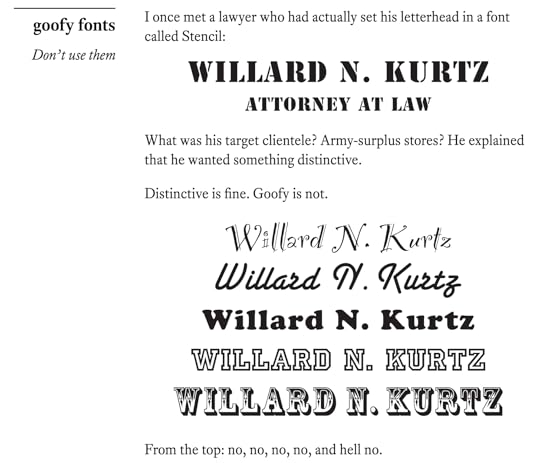
Do you get a little frisson of pleasure from the way serifs draw your eyes across the page? Does improper kerning make you irritable? Do you vandalize notices made in Comic Sans? If so, this book might be for you.
Butterick's argument is that typography matters. Good typography, defined as the visual component of the written word, conserves the reader's attention, helps your work stand out, and is an art worth practicing in and of itself. The problem is that the world is full of bad typography, from moronic defaults in word processing programs, to holdovers in design from newsprint and typewriters. With just a little of effort, you can do much better. The book itself is proof that this works: freely available on the web, it is one of the most minimalist but elegant sites I've seen. I stayed up way too late hitting the next page for the joy of seeing the layout.
Much of Butterick's advice is eminently practical. Learn to use the style settings on your word processor, which even in Microsoft Word are powerful enough to do almost anything. Focus on the body text first, and use white space more. 11 point fonts with 20 point line spaces and a narrower column size make for a much better reading experience than 12 points double spaced as wide as it can go, let alone abominations like exotic fonts, Arial, and BOLD UNDERLINED CAPS. His resumes are a thing of beauty. Unfortunately, in much of my life as an academic I'm constrained to other people's formatting, but I will try and follow his advice. (by the way, scientific journals can eat a dick. This is not 1970, no one reads paper copies, optimize for screen and printer and legibility, not fitting as many words as possible in 4 columns of tiny type).
Butterick does constantly up-sell his custom fonts, which is a little annoying. A guy's got to eat, and apparently people are not paying for a free webbook. I'm actually not that opposed to system defaults, unless you're a graphic designer, in which case your skill should be knowing better options than Helvetica. Typography demands sensitivity to context, and one thing that seems clear is that the 80-20 rule applies here: Doing a little will make your typography much better, getting that last little bit requires literally hand-tuning a document. System fonts are like jeans or a dark suit. They signal something like "I am wearing clothes." Putting in the money and effort to get bespoke fonts may give you a subliminal bump in credibility, but also seems like playing the business card scene from American Psycho straight.
As an aside, Butterick's resume is fascinating. He switched from math to design at Harvard, specialized in typography, got a law degree, wrote a custom web typesetting tool in a LISP variant, and a couple of books on typography.
My takeaways: use Helvetica (if you use system fonts, choose from the excellent A list here); if able, two inch margins and one point lower font size; 45-90 char line lengths; word processors have lots of cool features like "keep with next" and "page break before"; feel free to experiment with your preference settings in Word; for hierarchical lists do like 1, 1.1, 1.2, 3, 3.1...; never underline headings (I knew that); you can use font styles to avoid having to plug in the same settings each instance; typography history; opinions; white space is a construct; be consistent; don't overstate; either indent paragraphs or separate with line breaks (not both); the formats commonly required in institutions are dumb (based off typewriter habits) and when you can, follow the advice in this typography instead of a few strict rules (12 pt times new roman double spaced, bleh, not optimally legible); think of page elements as either foreground or background; use black background for powerpoints; use the ellipse character rather than typing three dots with spaces inbetween; ~75% of all web traffic is video streaming; font standard wars are complex and mostly controlled by the big tech companies like Apple; and ebooks are monetized by companies and even epub doesn't have formatting options, and pdfs are better but still tied to the past and physical pages, therefore more books should be web-based. Sorry about vomiting all these notes; I'm just trying to learn. I guess this isn't really a review...
The style is very snarky and modern, yet still isn't completely clear enough to read too quickly. It's also cool to be able to see a book published like this, and I completely agree with Butterick that more books should transition to using the web as a book publishing medium (and not ebooks controlled by apple/amazon, but the independent web. With its variable page size and hypertext, the web has evolved to be a perfect medium for this, and the author wrote his own web book publishing system called Pollen, used to publish this book). For those complaining about the author asking for money occasionally and advertising his fonts -- read the ending. It makes a lot of sense. Vote with your wallet and help content creators be able to make quality stuff. Otherwise the Internet will descend into the lowest common denominator.
Recommended for anyone who spends a significant amount of time with text, particularly on the creating end. So a lot of people!
Loved everything about this on-line book. I've been mildly interested in typography for years, but only as a dabbler: I love a proper em dash, end sentences with only a single space, keep an eye out for attractive layouts to emulate, and, of course, avoid comic sans. This book helps crystalize things I've mused about, and explains why some design decisions work and others don't. It also gives me a great foundation to use as a teacher whose students do most of their work via keyboard. Eighth grade ain't too early to start getting it right.
Butterick definitely practices what he preaches—the book is gorgeous and the writing is sharp and witty.
My only regret is that many of his suggestions can't be implemented in Google Docs which is my primary word processor these days. But I still keep full-featured word processors around for work that requires precise design, and Google may evolve to be more design-friendly in time.
This is my favorite design book I've ever read. Given, I'm not a designer (I'm a computer scientist and software engineer, which is mostly the opposite of what 'design' normally means) but I do have a strong passion for typography in particular and design in general.
Each section was quick and straightforward, immediately inviting me to tinker on something and feel the power of what Butterick had discussed. I always loved that the text had personality both in the typography but also from the author, between throwing shade and making sarcastic comments and just flat out telling you, don't do this because.
Even if you're not a designer, even if you're not into typography, this is a worthwhile and quick read that will help you improve your résumé, presentations, papers, anything with text.
The best part of this book is that it is free, and it's about typography. I have struggled with typography in my design and it is nice to learn more about it. I like how Butterick breaks down the very differences between dashes, hyphens and others. I love the tips and tricks and his explanation for why he used what he used with regards to type, programming and software for this book. I wish I could purchase a hard cover/paperback of this book, because I believe every designer should have it as a reference book in his shelf. Totally worth the read, you'd be surprised how wrong you were about the language you thought you knew.
This is a great book on typography. It contains a lot of helpful advice that does the title justice. The language is concise and to the point. New knowledge is introduced at a satisfying pace throughout the book.
It is clear that the author is very skilled in his field. I did however grow tired of his elitist tone throughout the book. At first I found it entertaining. But after a while I didn't care for the reiterations of how the author thinks everyone, reader included, is completely ignorant with regards to typography.
If I would have to reccomend one book on typography for absolute begginers - this would be the one.
Seriously, every designer (especialy web or anything connecting to text) and every blogger and writer that doesn't use profesionally created blog themes should read this.
I read it. I loved it.
Oh, and the design of this web book... Was bloody amazing. I was literally waiting every day just to come back to this book and enjoy reading it. Superb!
There is nothing really new about it. but it's a great book for those who doesn't know anything about typography and have to deal with words everyday. I knew about 70% of this book. Although it was really good to read them again and learn some new things.
Excellent. Easy to understand for those who are new to typography and design, and solid information for those what are already familiar with typography and design. It's available for free (donation requested) at www.practicaltypography.com.
It’s not often that I read a book that fills me with the need to make everything around me better. “Practical Typography” has done that and taught me a lot while being entertaining.
Great read for everyone, even those who’d never consider it.