Explore 100 key concepts, theories, and guidelines that are critical for choosing and using type.
We communicate with text every single day, but what does it mean to really understand type—to use it with clear intent and purpose? The art and science of typography combines subtle tweaks to line lengths with harmonious combinations of weights and styles; considered typeface pairings with a robust set of alternate characters; exciting technological advances with the realities of font licensing. There are so many ways designers can optimize how text is read and influence the way its message is understood—and yet so many designers miscommunicate without even realizing it.
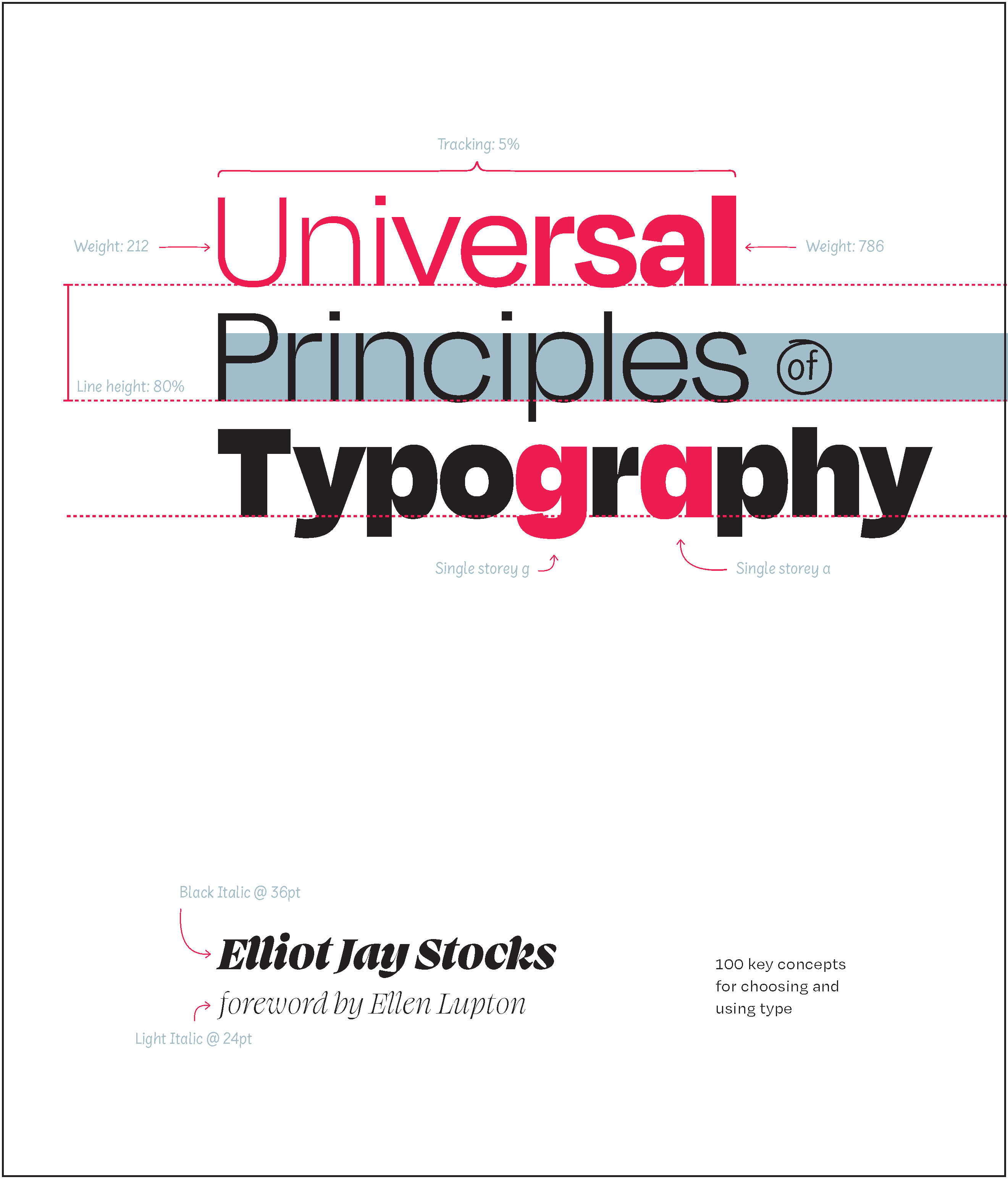
Richly illustrated and easy to navigate, Universal Principles of Typography pairs clear explanations of each principle with visual examples of it applied in practice. By considering these concepts and examples, you can learn to make more informed, and ultimately better, typography decisions.
Building upon tried-and-tested principles from the world of print through to the very latest advances in browser technology, this book will equip you with everything you need to make the most informed typographic decisions in your design work today.
Featured principles are as diverse
Each principle is presented in a two-page format . The left-hand page contains a succinct definition, a full description of the principle, examples of its use, and guidelines for use. Sidenotes appear to the right of the text, and provide elaborations and references. The right-hand page contains visual examples and related graphics to support a deeper understanding of the principle.
With Universal Principles of Typography , gain a deep understanding of the universal principles of typography and learn how to apply them across any work you do with type, from the simplest of documents to the most complex of cross-platform design systems.
The titles in the Rockport Universal series offer comprehensive and authoritative information and edifying and inspiring visual examples on multidisciplinary subjects for designers, architects, engineers, students, and anyone who is interested in expanding and enriching their design knowledge.
This is as the Title says, all about Typography. The Author gives us information set into 100 Topics… in a concise and precise manner.
As a digital media designer myself I went through this book slowly to see how explicit it would go with the subject. It was a satisfying read, at a first glance I would say this has everything you need to know for a starter and maybe even beyond.
If there is one impression I get about Elliot Jay Stocks from this "how to.." guide to typography, it is that he doesn't really like rules. That makes a book like this a little difficult, even when he is explaining why something doesn't work he often throws in a caveat that the effect that makes it seem bad, might also be the effect you are after. But then this is more of a coffee table how-to, than a prescriptive handbook. The book is split into 100 double-page spreads on a particular typographical idea, often explaining a concept rather than proscribing a rule. In many ways this works best as a bluffer's guide to typographical jargon, an awful lot of these "principles" are here to explain weight, point size, ligatures etc. He also knows he is writing this at a point when there is almost limitless control over what you can make your font-set do, with Open Type software becoming more standard, which allows you to manipulate your type to a near limitless degree. So not only is he not a rule-follower, he urges the reader and budding designer to get their hands dirty and manipulate their type.
The problem with this approach is that certain things end up with "just eyeball it" - and he can't necessarily teach taste. Very, very early on there are a few pages on clarity of purpose, are you setting a logo or paragraph for reading, and there are some decent rules of thumb about how to make the eye flow. But he is probably correct that you won't know until you set the page, and it is possible that his most important principle is to use the most flexible font possible, that has a proper foreign character set, choices of ligatures, and the ability to manipulate every aspect. Its also refreshing that he talks about designing for the web and the printed page, though it means the back end can get a bit CSS script-heavy.
It doesn't sell itself as a comprehensive guide to typography, but it is a useful guide to anyone who does a bit of typography on the side to sharpen their skills. In many ways, it would be most useful for people who work with designers to be able to talk to them in their own language (or check if they have that language, and maybe lend them the book).
Universal Principles of Typography was a useful and informative volume that covered all aspects of typography and typographical design. The earlier part of the book looked at the nitty gritty of typeface, from what makes up a typeface to how to combine different typefaces for the best effect. The latter part of the book was less interesting to me personally with it's focus on CSS and licensing fonts, but that would be of use to anyone working in a role that requires company branding and webdesign elements. Overall, the book was well presented with a nice layout and clear explanations, and I am giving it four stars.
I received this book as a free eBook ARC via NetGalley in exchange for an honest review.
I borrowed this book from my library. I thought it was an introduction to typography, and I thought the book would read like a primer or a textbook, but I think the reader has to know quite a lot about typography first.
Many examples were given to illustrate each concept, but in numerous cases I could not discern the difference between a bad example of a concept and a good example of the same concept.
I couldn’t understand the difference between a typeface and a font on pages 14-15, nor a glyph, a letter, and a character on pages 16-17. The explanations given didn't help.
There were occasional spelling discrepancies: page 28 had both “Carolingian” and “Carolingan”.
The author kept mentioning “CSS” from early in the book, but I never saw an explanation of what it was, or even what CSS stood for. I guessed it was some kind of coding language. The author had many appearances of what looked like computer code on gray background, like the ones on page 44, but other than telling that it was “CSS” I had no idea what to make of it.
On page 103, the author tried to illustrate the difference in heights and appearances between the italicized word "important" and the non-italicized word "heading", but because the illustration didn’t actually use arrows or some other symbol to point out the differences, it took me a while to notice the separate red lines in the upper illustration versus the single red line in the lower.
On page 164, the author correctly calls "UNESCO" an acronym, but then incorrectly calls "US" an acronym. It's an abbreviation. An acronym is pronounced (e.g.: UNESCO, NATO) and an abbreviation is read letter by letter (e.g.: USA, UK, CCCP, etc).
I wanted to show my wife the “tofu” symbol on page 209 after I had given up on the book, but forgot what page it was on. I tried to find "tofu" in the index, but it was not there, so the indexing is lacking.
“Weight” was mentioned numerous times in the book, but was not explained until many pages into the book. "Kern" and "kerning" were likewise mentioned many times in the book, but neither was explained until page 168.
The book had numerous split infinitives. Even though split infinitives are accepted now, they sound awful.
I tried reading the book, but quickly just flipped through most of it, the returned it to the library. I never finished the book.
Just when I thought this series couldn’t get any better, they come up with a volume on typography. I was so excited to see the title! As someone who dabbles in calligraphy and lettering now and then, this one is right up my alley.
I just love the format where concepts are discussed on the left side of the spread and examples and illustrations on the other. I have to confess that the right side of the spread usually catches my attention the most. Lots to learn for sure. And this one looks like a very good place to get essential info about typography.
Wonderful series and I wonder what the publisher will come up with next. Can;t wait to see!
I enjoyed this book. I found the tone conversational and I loved the use of examples which really brought the writing to life. For the areas I was most interested in (e.g., fractions, dashes, italics), I thought that the discussion was thorough. There were a lot of areas that didn’t apply to me, but I expected this from an encyclopedia. Nonetheless, many of these were fascinating. It did seem to me that the book was very thorough, covering the major areas of typography. Thank you to Edelweiss and Rockport Publishers for the digital review copy.
I don’t have much to say about this book beyond that I’m adding it to my reading list for designers. The tips shared by Elliot Jay Stocks are (in my opinion) fundamental to being a designer.
Each spread describes a principle in a compelling and understandable way. If you’re interested in achieving visual harmony when designing with type, you need to know these principles back like the back of your hand.
Interesting and practical guide to using typefaces in design. Includes history of types and explains different nuances found within the world of typography (fonts vs typeface for instance). This would be a great resource for designers using different typefaces in projects, including digital and web-based applications.
Interesting I learned a lot from this book even though my experience is with photo typography not digital typography. I would have given it 5 stars except that good typography needs good proofreading and there were just a huge amount of errors that should have been caught.