Darwyn Cooke is the Eisner Award-winning writer/artist of such classics as DC: The New Frontier, Selina’s Big Score, and last year’s smash-hit, The Hunter. Now, Cooke is back and following up the New York Times best-selling Hunter with a heart-pounding sequel: The Outfit. After evening the score with those who betrayed him, and recovering the money he was cheated out of from the syndicate, Parker is riding high, living in swank hotels and enjoying the finer things in life again. Until, that is, he’s fingered by a squealer who rats him out to the Outfit for the price they put on his head… and they find out too late that if you push Parker, it better be all the way into the grave! Darwyn Cooke is an Eisner- and Emmy-winning creator whose adaptation of Richard Stark’s first groundbreaking Parker novel has earned him multiple 2010 Eisner Award nominations!
Darwyn Cooke was an Eisner Award winning comic book writer, artist, cartoonist and animator, best known for his work on the comic books Catwoman, DC: The New Frontier and Will Eisner's The Spirit.
In 1985, Cooke published his first comic book work as a professional artist in a short story in New Talent Showcase #19, but economic pressure made him leave the career and he worked in Canada as a magazine art director, graphic and product designer for the next 15 years.
In the early 1990s Cooke decided to return to comics, but found little interest for his work at the major publishers. Eventually he was hired by Warner Bros. Animation after replying to an ad placed by animator Bruce Timm.
He went on to work as a storyboard artist for Batman: The Animated Series and Superman: The Animated Series, and in 1999 he animated the main title design for Batman Beyond. He then worked as a director for Sony Animation's Men in Black: The Series for a year.
DC Comics then approached Cooke about a project which he had submitted to the publisher years earlier which eventually became Batman: Ego, a graphic novel published in 2000.
The critical success of that project led to Cooke taking on more freelance work, such as X-Force, Wolverine/Doop and Spider-Man's Tangled Web for Marvel Comics and Just Imagine... Stan Lee for DC.
In 2001, Cooke and writer Ed Brubaker teamed up to revamp the Catwoman character. They started with a 4 issue serial "Trail of the Catwoman" in Detective Comics #759-762 in which private detective Slam Bradley attempts to investigate the death of Selina Kyle (AKA Catwoman).
The story led into a new Catwoman title in late 2001 by Brubaker and Cooke, in which the character's costume, supporting cast and modus operandi were all redesigned and redeveloped. Cooke would stay on the series, which was met with critical and fan acclaim, up until issue #4. In 2002 he would write and draw a prequel, the Selina's Big Score graphic novel which detailed what had happened to the character directly before her new series. Cover to DC: The New Frontier #6. Cover to DC: The New Frontier #6.
Cooke's next project was the ambitious DC: The New Frontier (2004), a six issue miniseries which sought to tell an epic storyline bridging the gap between the end of the golden and the start of the silver age of comic books in the DC Universe. The story, which was set in the 1950s, featured dozens of super-hero characters and drew inspiration from the comic books and movies of the period as well as from Tom Wolfe's non-fiction account of the start of the US Space Program The Right Stuff. The major DC characters are introduced in "The New Frontier" in the same order that DC originally published them, even down to the correct month and year in the story's timeline. In 2005, Cooke won an Eisner Award for "Best Limited Series", and a Joe Shuster Award for "Outstanding Canadian Comic Book Cartoonist" for his work on the series.
Most recently, Cooke contributed to DC's artist-centric anthology project Solo. His issue (#5, June, 2005) featured several different stories in different styles with a framing sequence featuring the Slam Bradley character. In 2006, Solo #5 won an Eisner Award for "Best Single Issue."
In July 2005, it was announced that in 2006 Cooke and writer Jeph Loeb would produce a Batman/Spirit crossover, to be followed shortly afterwards by an ongoing Spirit series written and drawn by Cooke. Batman/The Spirit was ultimately published in November 2006, followed in December by the first issue of Cooke's The Spirit. In June 2007, Cooke and J. Bone won a Joe Shuster Award for "Outstanding Canadian Comic Book Artists" for their work on "Batman/The Spirit", and Cooke won "Outstanding Canadian Comic Book Cartoonist" for his work on "The Spirit".
In July 2006, it was announced that Warner Bros. Animation and DC Comics would release a series of direct-to-DVD animated movies based on important DC com
You know, if you read Darwyn Cooke's loving adaptation of Richard Stark's (Donald Westlake) Parker alongside Agatha Christie, as I am doing, the obvious thing to say is that it is way more brutal. Parker is a thief, a career criminal. But The Outfit is also bleakly beautiful in its depiction of the story, which is again, after Cooke's first adaptation of Starks' The Hunter, a kind of revenge tale.
Parker, the toughest of tough guys, a really bad guy, never smiles in this book. He doesn't believe in emotion, or friendship, or love. He's the hardest-boiled criminal you will find (James Coburn, maybe?), a perfect reflection of sixties detective fiction, but he is also somehow smooth and sophisticated as he pulls off the caper, where he (of course) takes down The Outfit, which we admire in part thanks to Cooke's stylish approach. I really had a good time reading it. How can I like this guy? I was raised to go to church and admire the good guys! But thanks to Stark and Cooke, I like this Parker fella.
In the second of Cooke's Parker adaptations, Parker has changed his face via plastic surgery, being on the run from The Outfit. But when a colleague fingers him, Parker goes on the offensive, sending guys out on jobs hitting The Outfit where it counts, the bottom line. I think I enjoyed this even more than The Hunter. It shows Parker's cold, calculated side as he schemes to take out the head of The Outfit. Cooke's art has a a 60's pop-art look to it that fits the 60's setting perfectly.
As a fan of the Parker series and comic books, these adaptations are right in my wheelhouse, but what I find most intriguing about them is the clever ways that Darwyn Cooke has used to tell a text story into a more visual form while staying true to the spirit of the original books.
The Outfit was the third book in the Parker series, but this one also adapts the second novel, The Man With Getaway Face, into part of this story, too. Parker pissed off the Outfit and even though he’s gotten plastic surgery to change his looks, the mob is still coming after him. Parker contacts a bunch of his criminal buddies and asks them all to go on a robbery spree against various Outfit businesses, and they’re all too happy to do it. Parker works on his own scheme to make some cash and get them off his back once and for all.
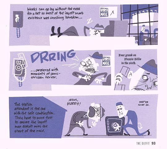
My favorite part in this was how Cooke converts several of the mini-stories from the book about how several professional thieves rip off Outfit joints. He incorporates a faux crime magazine cover and story (With actual text from the book.) as well as some short cartoonish style strips to recount these robberies. He also uses a game of Monopoly as the basis for giving us the history of the Outfit’s boss.
These graphic novels are excellent companion pieces to the original books.
Though it stands a little in the shadow of The Hunter (the excellent preceding volume featuring tough and taciturn antihero 'Parker'), The Outfit was still a reasonably entertaining graphic novel adaptation by Cooke from Westlake's long-running crime series. (I enthused in my prior review that it is a great collaboration between artist and author.) The energy or forward momentum is good until the halfway point and then things sort of . . . well, Parker is off-stage for many pages and it's not nearly as interesting without him. However, the gunshot-fueled hide-and-seek climax picks up the tempo, and I think the last page panel - as well as the late '63 setting in Lake Tahoe - hints at a fictional connection to a real-life kidnapping of a certain singer-actor's son.
This is the second of Darwyn Cooke’s comic book adaptations of Richard Stark’s Parker novels with this one using material from the novels “The Outfit” and “The Man with the Getaway Face”. After Parker walks off with a hefty chunk of change from the Outfit (a crime syndicate) at the end of the first book The Hunter, a price is put on his head as Parker heads south to enjoy his earnings in the lap of luxury. But even after altering his face with plastic surgery, he’s spotted and the Outfit are alerted to his location, Parker decides to gather his criminal friends and bring the fight to the Outfit’s boss.
Parker is easily Richard Stark/Donald Westlake’s greatest creation. He is an unstoppable, super-efficient career criminal who plans his heists meticulously, selects the most useful members for his team, and has no compunction with killing – but only with no other choice left to him. Parker almost seems like a robot at times – he regards emotion as weakness, and looks upon any kind of extravagance as wasteful, an element that will end the person and send them to jail. And yet he’s strangely likeable – or if not that, then fascinating to read as he pulls off daring heists so coolly.
Cooke incorporates different artistic styles to tell the stories of each of Parker’s gang hitting the Outfit in different ways even including prose from the source novel to tell certain parts of the story. The styles change the pace of the book, slowing it down while the action ramps up so you’ve got time to enjoy what happens at just the right speed. It’s a great balance.
Cooke’s done Richard Stark/Donald Westlake proud by doing such a fantastic job in telling the tale of one of Parker’s best adventures with style and panache that only someone as experienced and masterful a comics artist as Cooke could do. It’s a great crime caper comic that’s terrific fun to read. More, please!
Having read many of the Parker novels im hugely impressed by how Cooke adds a new dimension to the stories with his artwork,the way he narrates,uses two novels The Outfit,The Man with the Getaway Face into one Graphic Novel.
Cooke’s art has never been better the inking,the coloring,the use of shadows. Every page with Parker himself is priceless because he got Parkers look,movement so well. I just stared in awe in how great Parker looked. How he can be retro,cartooney art style and still draw hardcore,dangerous Parker i dont know. I also liked the different inventive ways he used to tell about the different heists. It was made the story,action less predictable to those who have read the novels.
Darwyn Cooke's art and Richard Stark's writing was made for each other, a perfect match and the way you should adapt a great novel,writer. You dont change everything that made the novel so good,you add new visual layers. I cant wait the next Graphic Novel in 2012!
I enjoy reading novels and I enjoy reading comics. However, when I'm reading a comic, I don't want a dozen or so pages of text/articles on them. It really pulls me out of the story. Minus one star for that. Even if they did involve Parker briefly.
EDIT: Reading book three and the articles in this one introduce us to some characters we meet later on, but they still pulled me out of the story. It worked in Watchmen at the end of each chapter, but in this, it was kind of shoehorned into the middle of one with no rhyme or reason. None of the characters in the story were reading or anything. These long articles of text just sort of popped up right before the climax.
Aside from all the text and articles, this one was really good, but I wasn't as into it as the first book, "the Hunter". Still worth a read and I will definitely be continuing this series!
Darwyn Cooke's adaptations of the Parker novels are pure comics perfection. The artwork is a perfect match for the material, very much in the early 60's mode. Although I wasn't born until the late 60's, I've read enough magazines and whatnot from the era to appreciate details like business logos and so on. Cooke's research is right on the money as far as the time period goes. This is a world of Esso gas stations and Timex watches and AAA maps and so on. This book picks up close to where the previous one left off. Despite a new face, Parker still apparently has a hit out on him. Needless to say, he's less than thrilled by this. But getting the hit cancelled means going up against the Outfit, essentially taking on the entire Mafia. You know this is going to be good ...
The art, as I said, is steeped in period details. There are several heists recounted, as Parker arranges to have the Outfit hit where it hurts, and Cooke manages to come up with distinctly different styles for each one. Honestly, the only problem I had with the art comes fairly early on, page 48 to be precise. I've read enough mysteries over the years to know that putting a silencer on a revolver is useless, and Parker is too much of a professional not to know this. The gasses escaping from the sides of the cylinder, the ones NOT going through the silencer on the barrel, are where most of the noise of a revolver shot comes from. Ah well, it's a tiny mistake, and the rest of the book is more than thrilling enough to make up for it. Highly recommended!
I am not normally a very patient person. Some might go to the extreme of calling me impatient in fact. But I am learning. After almost 3 years of struggle, I have seen several of my initiatives come to fruition at work recently and realized that my patience paid off. There were several moments of hesitation where I wanted to throw in the towel because I thought things were not moving at all, but I hung in there, continued to build a diverse and fairly huge fan base, and delivered high quality output. For the moment, it seems that blue skies are ahead and I am feeling really good. So, to celebrate, I am going to enjoy Justified and read some more…
imagesBut before I do, a friend suggested a book to me called The Outfit back in January which I went out and purchased. Well, actually, I bought the wrong one by Richard Stark which is a fictional novel as opposed to the one my friend meant which was by Gus Russo and is a non-fictional history of the Mob. I will go and grab the Russo book, but in the meantime, the Stark one was pretty fun. Apparently, Stark passed away in 2008 after writing about 24 books featuring the main character Parker. He is sort of like a Raylan gone bad who is highly intelligent and a dangerous killer. The book was about his revenge on the Outfit where he tries to free himself of the bonds they put on him. I liked the flow as well as the descriptions of the characters and mob operations. The Outfit is a very entertaining and relatively light read and has been adapted by Darwyn Cooke into a great comic book as well.
Writing under a pseudonym in 1963, Donald E. Westlake wrote a series about a calculating, hard-boiled career criminal named Parker, and after receiving Westlake’s blessing to adapt the series into a graphic novel series, comics artist Darwyn Cooke published this second installment in 2010. In the first installment, Parker was dealing with a former associate who double-crossed him, and ended up crossing paths with the mob, known as The Outfit. Since they continue to put hits out on his life, Parker undergoes plastic surgery, then returns to hit The Outfit where they live. Sending letters to numerous criminal associates across the country, announcing open season on The Outfit, a dozen of their enterprises are hit nationwide, with losses to the tune of a million dollars, with Parker promising not to quit until they agree to quit hunting him. With scenes depicted in black, white, and cool shades of steel-blue, the plot is easy to follow, and even includes a surprisingly educational glimpse into the criminal world, with clever illustrations detailing various mob enterprises, told in easy-to-understand instructional out takes, and I’m told the Crime Confessions Weekly newsletter usage was taken straight from Westlake’s original. Parker manages to convince the mob boss to back off, but something tells me they aren’t gone for good. Until next time...
Probably as interesting as the first graphic novel, this second one didn't leave me disappointed. Lots of cool 1960s decor and vibes are found in the cartoon panels. Remember the Esso signs? The graphic novel Parker fits my idea of the literal one from the Stark novels. The pages of text toward the middle slow down the story a little. Enjoyable enough.
Parker is still under the gun from the Outfit, a crime syndicate. His recourse - attack back. He zeroes in on the operations, contacting other bad guys to hit the Outfit where it hurts - in the pocketbook.
Darwyn Cooke decisively scored with his first comic book adaption of the Richard Stark ‘Parker’ novels: ‘The Hunter.’ ‘The Outfit’ doesn’t deliver the same bold punch. That might be expected from a sequel, and because the story line is not as hard-hitting or straightforward.
Cooke’s choice of palette is an indicator of a more workman-like delivery. There’s still just one color other than black and white, but where it was crackling cyan in ‘The Hunter,’ ‘The Outfit’ is tinted with a more muted blue.
Cooke also uses a clever device to telescope three hits on organized crime’s operations by employing different styles than the slashing lines that dominated ‘The Hunter.’ The most successful of these is a send-up of a 1960s pulp crime magazine. No matter how ingenious and necessary, though, these changes in style (and story) are drags on momentum.
But as might be expected from Donald Westlake (writing as Stark) and Cooke, it’s still a slam-bang narrative filled with action. After a nice opening two-pager aerial view hipping us to place and time (‘Miami Beach 1963’), we’re shoved right into a one-page panel featuring a gun shot and a woman screaming, as the indefatigable Parker rolls out of his swank hotel bed. That’s followed by a couple of tightly packed pages with no dialogue other than Parker’s would-be assassin’s mutter of ‘Guh…’
Then we’re introduced to the woman. A good match for Parker, Bett Harrow takes in the groggy invader without ‘fear or astonishment but breathless. Expectant.’
Parker’s on his ruthless way again, and if the pace is only slightly slower, Cooke demonstrates anew his gift for the comic book form, wringing a hurtling narrative from his simple and bold retro drawings. Cooke and Westlake are a perfect match-up and I’m looking forward to the next one of these.
After the success of Richard Stark's Parker: The Hunter, in which Darwyn Cooke adapted a classic of crime fiction for the comic book page, we're treated to this gem of a book. Too bad I can't give it six stars!
First off, there were some choices to be made, story-wise, to keep the book flowing evenly while respecting the source material and not going over a certain number of pages. Before the actual 'Outfit' story, Cooke included a short adaptation of Stark's The Man With The Getaway Face, in which Parker gets a new face to help remain under the Outfit's radar. They're still sore about him walking off with $45 000. (at the end of 'the Hunter').
Also, Cooke cleverly employs different art styles to illustrate the different heists that Parker and his associates pull on them. The subtle use of humour (and the inclusion of Grofield - which is NOT in the original story) is just icing on the cake. There are some departures from the source material, such as Parker killing the accountant Quill and giving Karns ten percent of the take from Bronson's Buffalo (a nice touch, that!), all in keeping with Cooke's vision of Parker. Truly a wonderful book.
Parker had evened the score with the Outfit, or so he thought. After extensive facial reconstruction surgery, Parker is identified by a squealer, outing him to his enemies. Parker realizes that the fight isn't yet over and he intends to finish it!
So, while I did like this book, I wasn't into it as much as The Hunter. Cooke seemed to take the story in a few directions towards the end, tying up loose ends and telling other parts in a different format. By throwing in a magazine style layout as well as different artwork; it really took me out of it. I wasn't exactly sure what he was going for with those deviations but it fell kind of flat for me. Luckily, it was only a small part of the story itself, so it's sort of easy to look past.
As far as the artwork goes, I'm still in love with it - that much Cooke doesn't change. The violence is played out really well, showing just as much as you need and nothing over the top. Stylistically, I still think it's one of the coolest presentations I've ever seen.
Apparently, I'm all caught up on this series as the 3rd book isn't out until sometime next year. I guess its finally time I get started on the originals. The only problem is that I believe this is books 2 and 3 together? I'm not entirely sure, I'll have to look into that.
I had to rate it 3 stars but I'm telling you it's a solid 3 and a half.
Parker: The Outfit is Darwyn Cooke at the top of his game, adapting Richard Stark’s hard-boiled crime novel into a sleek, cold-blooded piece of visual storytelling. The plotting is patient, the tension builds steadily, and every panel reinforces Parker’s ice-cold professionalism. Cooke’s layouts and pacing do as much work as the dialogue, creating a story that feels precise and controlled from start to finish.
This is crime noir that trusts atmosphere over excess — quiet conversations, deliberate movement, and the slow tightening of a plan that you know is going to end violently. Parker remains a compelling protagonist precisely because he’s so emotionally closed off, and the book leans into that without trying to soften him.
Most of all, it’s simply a great read. Stylish, confident, and deeply satisfying, The Outfit is a standout entry in Cooke’s Parker series and an easy recommendation for fans of crime comics.
This entire review has been hidden because of spoilers.
This is a fantastic second graphic novel in this series. It is smart, fast paced and brutal with beautiful art that enhances the 1960s setting. Highly recommended.
Originally published as a novel (by Donald Westlake) - 1963. 152 pages.
Current incarnation as a hardcover graphic novel - July, 2009. Price tag - $24.99.
When I was a lad they were called comic books and they sold for a dime - and this one is not even in color.
This one is from my favorite thrift shop in Pennsburg, Pa, where all adult books are sold for 50 cents (unless they are on sale for 30% off, or 50% off, or sometimes free day,) which is probably why I picked it up.
March, 1963. It seems that in a previous work, Parker got screwed over by "The Outfit," (which I take as "The Mob," - very Las Vegasy. In this one he gets his revenge.
I picked this one up because I liked the cover and the inside cover design, very mid-century modern.
If this were a movie, it would be a film noir, as it is, I guess it would be a book noir.
So it's the usual great vibe on '50s cool that the first one was, except more. The stand-out chapter is the second one, where, at Parker's behest, some colleagues and contemporaries undertake a series of heists against the eponymous Outfit. Each heist is conveyed in a different manner, like a magazine article, a Monopoly game, and an informative kids' cartoon. And that sequence alone makes the book worth its pricetag. It should totally get checked out by everybody who likes comics.
Dicen que lo que bien empieza, bien acaba y con este comic se cumple. Sigue la trama del numero 1 y deja todos los cabos bien atados. Gran historia en la que se basa este comic
I have never read a Richard Stark novel, so I don’t know how the Parker character reads in prose. Darwyn Cooke’s comics adaptation of The Outfit, however, is a great read all on its own. The late Cooke has a fondness for midcentury graphic design and advertising art which provides him with the tools to elegantly reproduce the early ‘60s milieu of the Parker novels. As a storyteller and draftsman, he was more than just the cartoonist laureate of the Jet Age, distilling influences such as Jack Kirby and Alex Toth into a sharp, dramatic style.
The Outfit is centered on master thief Parker’s vendetta against the powerful, wide-ranging criminal organization of the title. After he eludes an assassination attempt, our protagonist (he can hardly be called a hero) traces the hit back to a partner on an old job that didn’t quite go as planned. Cooke luxuriates in period architecture, cars, and fashions, as he follows Parker up and down the eastern seaboard, disrupting vulnerable points of the Outfit’s operations with grit and savvy.
This lean, muscular pulp plot is an excellent match for Cooke’s skills and sensibilities, and his affection for the source material is evident. The cartoonist juggles different period cartooning and graphic design styles as he tells different segments of the story with different moods without ever seeming disjointed or forced. Unlike his superhero work, which embraced the romance of heroism and derring-do, The Outfit, and I presume other entries in his series of Parker adaptations, proves Cooke could also deliver cool cynicism and bad behavior with the best hard-boiled crime purveyors.
Well, that was quick. Just hours after finishing Cooke's first book in the series, The Hunter, here I am reviewing book #2, The Outfit - guess that's what quarantine reading does to you.
Actually enjoyed this one quite a bit more, in part because unlike Hunter it was an unfamiliar story to me, but also because I can tell that Cooke just had more fun drawing it. While he maintains the same "Saul Bass-ian" hard noir graphic style for most of the book, when he gets to the four robberies that make up the lengthy middle section, he draws them in a range of styles that all end up looking like those vintage 1960s Public Service Announcements:
...so yeah, a nice cocktail of classic dark noir with a splash of dark humor as well.
The first three Parker novels are basically a trilogy, one long story about "Parker vs. the Outfit." However, the next book (and I believe most of the next 20+ Parker stories) are pretty much stand-alones, so I may dip in and out as they become available in our library or from the massive McKay's Used Books in Manassas, should it ever reopen. That said...I also note that Cooke only wrote/drew five of the Parker stories before his untimely 2016 death at just age 54 - and so being the OCD completist that I am, I will probably end up reading them as well, should I stumble across them.
Book 2 Of Darwyn Cooke's graphic novels based on Donald Westlake's, aka Richard Stark, Parker books is The Outfit. This story picks up not to long after the first story, The Hunter, had ended and it continues the story of Parker's run in with the Outfit. Parker has gone back to his life of resorts and rich women after he had gotten plastic surgery to change his looks when an Outfit hit man tries to take him out. This sets off a series of things as Parker has to "convince" the Outfit to leave him alone. What is really great about this story is that as you follow Parker through his plan to get the Outfit off his back there is a great set of side stories that come up about other "pros" who are hitting the Outfit at Parker's request. This to me really amped up the story and got me that much more involved in what was going on. The various "jobs" that are done and how they are done becomes almost more fun for me to read then the main story line, which has it's own unique and enjoyable twists. This book really builds on what was done with the first book and not only repeats what was right in that book but adds more that is new and fun in this universe. This is really stellar story telling.
Excellent adaptation of the novel. It even includes a nice "idiots guide" that explains illegal betting, the "numbers" racket and money-laundering/smuggling complete with illustrations. Yeah, I know it's a graphic novel, I was being sarcastic.
Sadly, IDW has not made the previous book The Man with the Getaway Face or the martini edition of The Hunter that includes the aforementioned book available for download on Kindle/Comixology.
Donald Westlake (Richard Stark) was one of the early sculptors of this picaresque anti-hero genre. In Parker, we have the mold that many have since used. In fact, the current TV show Vegas seems to borrow a lot from this guy. Darwyn Cooke's graphics fit well with the "throw-back" nature of the story...simple b&w renderings that don't distract from the words. This book is all about pay-back and, if that's your core interest, Parker delivers.
Disse bøkene er i seg selv veldig gode antihelt-historier. Spesielt denne andreboka. Parker er en lean, mean revenge machine, som det er svært underholdende å følge.
Men måten Darwyn Cooke adaptererer de originale bøkene over til tegneserier på utfordrer også grensene for hele tegneserieformatet.
I tillegg til dette tegnes hver bok i kun en farge +svarthvit, som gir enda mer visuell særegenhet.
Judgment of the Mob Alright Imma keep this review short so I can continue reading the rest of the series. The Hunter is a book that gets better as I think about it. I immediately jumped into this 2nd volume excited to see Parker reign hell of the mob. It started out semi strong and then turned into a snooze fest. The first 2 parts or so served as an entertaining heist. As soon as Parker starts trying to take down the Outfit, this book became a confusing and frankly pretty boring read. Every few pages random names are just thrown around with no other information. Y’know when you hear someone say “We are figuring things out at the same time the protagonists are”, basically meaning that the story is more immersive. But not in the case of this book. 75% of the time I was going “who?” or “how the f**k am I supposed to know who the hell that is?!” A more coherent and stream lined way of introducing important characters was really needed here. AND YES I know this was adapted from source material. But I’m willing to bet it’s not nearly as confusing as this was handled. I do however really like the character of Grofield. A charismatic pretty boy type character that I’m sure will provide a lot of great moments between Parker and him. Then….heh heh then the book became almost tortuous to read. There is a series of short stories that completely interrupt the flow of the story. I just found them so uninteresting and was begging for the already dry main story to continue. LOOK if anybody can tell me how in the hell those shorts were connected please tell me instead of getting mad. I really don’t feel like going back and analyzing the stories. It reminds me of those 2 issues of Hellblazer that Grant Morrison wrote back when Delano was writing. If any of you get what I’m talking about comment BUT either way it was a big interruption to me. Once those shorts are over the book picks up again and I was entertained till the end. Over all I’d say more of the book I disliked than liked. Parker as a lead once again is pretty wooden. (I feel like I’m literally the only one to have that opinion) I think he is serviceable but for the love of god needs more characterization.
What more is there to say about Darwyn Cooke’s iconic art style? I stopped so many times mid speech bubble just to gawk at the incredible penciling and inking I had in my hands. I know I sound cliched as hell saying this, but I don’t think anyone else’s style could encapsulate the Golden age 1950s/1960s feel as much as his. Even scenery in this book is gorgeously drawn. And one of my favourite aspects of the book is that not every drawing of a person is hyper detailed and perfect. Sometimes a lack of detail or polished forms really gives the book a more interesting aesthetic. At least to me. The blue shading and filling also works very well.
In the end I was disappointed by this volume of Parker. Confusing and dry storytelling, an entire section that took seemingly 5 years to read, but the intro and ending that were pleasing compared to everything else. Overall I would say if you are reading this series in full don’t get discouraged or anything if you didn’t like this volume cuuuuuuuuuuz volume 3 is a lot better. Letter Grade: (C)
Book Construction: Since I didn’t end up getting the Martini Edition, the four hardcover volumes are more than sufficient. These are some of my favourite hardcovers I own just because of the production value. The actual hardcover has a rough texture, there is a different silhouette imprint on each of them, and the spine is written in slightly embossed white cursive. Delicious. The paper is also thick ass card stock. So that’s also great, because compared to the recent marvel trades where you could put a whole threw the paper by blowing on it, this paper quality is fantastic.