From the beguiling imagination of Charles 80 comic books that never were. Master cartoonist Charles Burns has never hidden his passion for comic books and pop culture from the 1950 and 1960s. Inspired by the romance, horror, and sci-fi comics of his youth, as well as the 1960s American underground, the author of Black Hole has created a collection of 80 original comic book covers that, through his own inimitable aesthetic, present an alternate universe of stories that never were, but that you will wish existed. The covers ― some with otherworldly titles in alien letterforms, and others that riff on classic genres ( Throbbing Hearts, Unwholesome Love ) and eras ( Drug Buddy, Huss ) ― each inspire a multitude of interpretations, build entire worlds, and suggest entire narratives that lie within their non-existent guts. This is Burns at his most playful, imaginative, and suggestive, using the format of the comic book to continue to explore many of the themes that run through all his longer-form work ― adolescence, metamorphosis, nightmares, and sexuality ― and provide a pretext for the creation of some of the most mysterious and bewitching imagery of Burns’s incredible career. Kommix is like discovering an entire box of comic books you never knew existed. Full-color illustrations throughout
Charles Burns is an American cartoonist and illustrator. Burns grew up in Seattle in the 1970s. His comic book work rose to prominence in Art Spiegelman and Françoise Mouly magazine 'RAW' in the mid-1980s. Nowadays, Burns is best known for the horror/coming of age graphic novel Black Hole, originally serialised in twelve issues between 1995 and 2004. The story was eventually collected in one volume by Pantheon Books and received Eisner, Harvey, and Ignatz awards in 2005. His following works X'ed Out (2010), The Hive (2012), Sugar Skull (2014), Last Look (2016) and Last Cut (2024) have also been published by Pantheon Books, although the latter was first released in France as a series of three French comic albums. As an illustrator, Charles Burns has been involved in a wide range of projects, from Iggy Pop album covers to an ad campaign for Altoids. In 1992 he designed the sets for Mark Morris's restaging of The Nutcracker (renamed The Hard Nut) at the Brooklyn Academy of Music. He illustrated covers for Time, The New Yorker, and The New York Times Magazine. He was also tapped as the official cover artist for The Believer magazine at its inception in 2003. Burns lives in Philadelphia with his wife and daughters.
Burns is a comics artist with an extensive backlist, a distinct style (my partner, who is also a comics artist, catching a glimpse of this book over my shoulder: "Is that by Charles Burns? Is Fantagraphics the publisher? That looks like something they would do")—and a love of comics from the 50s and 60s. Here, he's created a collection of comic book covers, inspired by that era, for comics that never existed.
For the most part the covers fall under two categories: otherworldly (think tentacles, think fleshy pink blobs, think apocalyptic landscapes) and contemporary—though a contemporary world of fifty years ago, and with an emphasis on the ways in which the Western world is not a safe place for women. Some of the inspiration is clear, such as one character who repeats across a number of covers and would fit into Tintin's world without a blink. Several images—though one in particular—could be pulled from a vintage Archie, and I imagine that those better versed in comics of the era would be able to easily identify other sources of inspiration.
The ARC I read was all but textless, and in my ideal world the final version would have at least an introduction or some analysis at the end or something—not sure whether that's a possibility. In particular, I'd love a discussion of how much these covers are, or aren't, subverting expectation. I'm not an expert in comics (of the 50s and 60s, or at all), and I wasn't enthusiastic about how many of these images show half-naked women and promises of sexual violence; I'd have loved to see something talking about how these differ from older comics (other than perhaps making some of it more overt) and how much can be expected.
I wouldn't necessarily want to read most of the comics imagined behind these covers, but if you're a fan of Burns' style, you'll likely want to hang some of these on your wall.
Thanks to the author and publisher for providing a review copy through NetGalley.
Major thanks to NetGalley and Fantagraphics for an ARC of this book in exchange for my thoughts:
An art book covering covers of reimagined teen romance pulp and his X'ed Out trilogy. Quick and easy to flip through as it's playful, grotesque, odd, and alien, everything I like about Burns. There's always an underlying darkness to his work that aims at the warped and sourness of humanity's underbelly of American commercialism and culture.
Perfect for any Burns fan as it makes a perfect coffee table book.
There’s a lot of beauty hidden in this surreal gallery of stories that don’t exist. The art compels you to keep looking, to find meaning and connection in spite of its (frequently literally) alien nature. I love the kitsch of 40s-60s Americana aesthetic, especially when it’s turned on its head. It feels like cheating logging this nearly wordless experience as a “read,” but it’s about as thought-provoking as anything else I’ve read in a long while.
Nice collection of cover images of comics that exist only in the mind of Charles Burns, serving as a compendium of his obsession with 1950s horror, sci-fi and romance comics (and Tintin bande dessinées) filtered through his modern sensibilities.
The archivist in me wishes that each image would have included the metadata of its creation for a sense of temporality in Burns’ oeuvre.
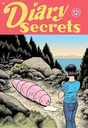
In between the devotees on either side of the AI art debate, one set far too convinced by the supposed wonders of technology and the other by the equally implausible brilliance of humanity, there's the more sensible position which says yeah, the machines may not be anywhere near emulating true genius, but a lot of the pap that goes down well, they're pretty close to getting that. Is it any surprise that one of the big test cases in music was Drake, that whole swathes of the internet are clogged with robots pastiching Wes Anderson's pastiches of Wes Anderson? Similarly, in comics, while you could easily picture DC opting to give their 16th monthly Bat-book to an algorithm and not getting noticeably worse results, Comics Journal types should pause before hooting, because some of the auteurs are going to be just as easy for our new robot overlords to rip off. And I'm not even speaking here only of ones I don't like - though yes, maybe I am thinking a little of that Secret Invasion issue where Skrulls assigned to impersonate Hank Pym keep killing themselves instead, and applying it to programs which despite lacking any sense of self would rather self-destruct than keep churning out the work of Chris Ware. Charles Burns, though - I like Charles Burns, or I wouldn't have bothered grabbing this from Netgalley. The suburban body horror of Black Hole is one of the high points in the whole well-regarded-by-the-broadsheets, self-consciously arty end of the medium. This, though? I'm not saying it was done by AI, to be clear - just that it might as well have been. It's billed as 80 covers for comics that don't exist, and yes, to some extent that's always going to be a frustrating format, but I've seen other creators work wonders with it, hilarious or mind-boggling teases of concepts that probably couldn't exist as whole stories, but imagine if they did... Whereas this is just 80 Charles Burns stories that look like they'd be well within the regular Charles Burns parameters if Charles Burns could be bothered to fully Charles Burns them. Many feature a post-apocalyptic Tintin figure stumbling across distorted landscapes and weird, stunted figures; these are also among the ones that really dovetail with AI art by being titled in an alphabet that looks almost readable until you actually try. Elsewhere it is English, like Diary Secrets, where the romance comic lettering jars with an image in which the heroine regards a horrid phallic chrysalis that lies dribbling in the wilds. But apart from anything else, there's just not enough variety to make the concept feel worthwhile. One issue of Sex Decoy magazine ("GIRLS: NAKED, NEEDY AND NUMB") is a valid, bleak satirical stab, but what do we gain from three? Another repeat publication, Huss, has hints of strangeness on some images, but one is just a guy looking mildly concerned. The whole thing feels unnecessary, extruded arthouse comics content.
Charles Burns trains his imagination by drawing 80 covers of vintage comics that never existed. If the drawing is impeccable (i.e. extremely polished, but also extremely inexpressive) the imagination... is conspicuous by its absence. Nothing here felt new or even remotely original to me. The most interesting theme of the volume, which takes up about a third of it, is a grotesque parody of Tintin, full of huge flaccid penises waiting to squirt their juices (I don' need to say what the main hero's head looks like). Other themes: hidden abuse (adult hands on the faces of submissive teenagers) or highly visible abuse (a series with voyeuristic, tentacled aliens), victims revenge (a feminist vendetta with housewives holding alien sex organs cut off with kitchen knives) and so on. OK only because the art is nice and some covers actually made me laugh.
Disclaimer: I received this book from NetGalley in exchange for a fair review. This didn't influence my opinion in any way.
Charles Burns' art book collects a series of covers to fictitious comic books that exist solely within the context of Burns' own imagination. Readers of Burns' previous works like the X'ed Out trilogy will recognize the type of comic covers presented here, particularly those that are more for romantic stories. In typical Burns fashion, the many comic covers also have a bizarre or grotesque aspect to them, belying a sense of unease to the types of stories they may contain. It is perhaps this aspect that makes Kommix (and the previously published Vortex and Caprice) so disappointing as these are stories we are likely never going to see. It basically serves to tease something that will probably not happen.
This is purely an art book, so really only recommended for the hardcore Charles Burns fan.
Totally my fault that, when I saw the library had recently gotten a new graphic novel by Charles Burns, I just went and put it on hold without reading anything about it. Because if I had done so, then I would have known this is not really a graphic novel as such, but just a collection of imaginary covers for different stories.
And while this might be perfect if you love Burns' art, which is not necessarily my case, if what you 'enjoy' of his work is the weirdness of the plots and characters, then certainly you are going to be missing out here.
So, anyway, 5-10 minutes and done reading. Except there's nothing to read here, obviously...
His interpretation of Tintin, I did find funny, somehow, but that's basically where it ended for me, so 1.75, maybe?
I was drawn in by the description of this book. Others have said that AI can equal and surpass this work and although that’s true, this hand drawn art is so unique. It tells the beginning of a story that has your mind and imagination fill in the rest. Give this a chance before you turn to AI, this doesn’t disappoint. Thanks to Fantagraphics Books, NetGalley and Charles Burns for the ARC. I received an advance review copy and I am leaving this review voluntarily.
One for Burns devotees - an assemblage of covers for comics that don't exist. A mix of TinTin and the Naked Lunch, True Romance type teen comics fed through a grinder of unsettling sci-fi, horror and uncomfortably awkward situations. Great stuff, but note that a significant number of these images also feature in his book Vortex and whilst both books contain material particular to them, there is a significant cross-over.
I picked up this book because I loved the art style and thought that seeing 80 covers of comics from the 1950s and 60s (that never existed) would be a cool exploration of a comic style that’s fallen by the wayside. Art-wise, this book delivered some interesting visuals. I particularly enjoyed the surreal, Tin-Tin-esque covers that are set in an almost post-apocalyptic, somewhat Asian space setting. If nothing else, they do evoke a sense of mystery and the inking is exquisite.
In the covers featuring teen/younger women, there is an alarming amount of nudity and nipples. Part of me wonders if this is supposed to be commentary on the over-sexualization of young women and the propensity to pair them with older men within the romance genre. In general, most of the artwork is jarring in the same way that surrealist art is jarring.
I think that this book would be strengthened by providing samples of Burns’ influences: samples of the source material that he is drawing from to create his pastiches. As someone who only has a passing familiarity with the romance comics of the fifties and sixties and almost no exposure to the horror/sci-fi comics of the time, I think the additional context could help readers better understand how the artwork conforms to and/or subverts the original standard. Additionally, I would’ve loved a little more copy on the covers; part of what made the covers of old romance comics appealing was the inclusion of over-the-top, cheesy taglines or overdramatic dialogue. While I suppose this could limit the number of different interpretations the audience could have of the work, it seems like a missed opportunity for parody/cultural commentary. Including some source material or analysis would help add interest to it as a coffee table art book.
Fans of this artist and fans of surrealist art will most likely love this book. Personally, it would have to provide more historical context and cultural insight into the comics scene in the 50s and 60s to make me want to buy it.
Disclaimer: I received a free digital copy of this book from NetGalley in exchange for a fair review.
Allegedly "80 comic books that never were", what this amounts to is a spread of wonderful comic or graphic novel covers, showing an intriguing launch-pad (or similarly cliff-hanger) for the non-existent book's main character. Several to start off with here featured a young explorer, with not much hair, a black quiff and a black cat – and plasters across the side of his head. I felt it worthwhile calling him Nitnit – and here is Nitnit finding bizarre shrines in caverns, stuck on a rock in the middle of a torrent rushing to the waterfall edge under both his feet, and witnessing naked aliens. Other books have a kind of femme fatale lead, before we get into the world of romance comics, weirdo alien romance comics, and so on.
I certainly wouldn't have subscribed to Huss, where the girls have men shielding their eyes, or else they're in a bathtub full of alien life-forms, or else – well, it doesn't bear thinking. Many of these covers have alien, pseudo-oriental lettering, so it's impossible to know what they're called, but we can easily have a go guessing. Suggestion is on the rampage here, which is the point – this shows the overt thrills that all of these books in their real-world, completed form, promised. This is not 'one man splurges and says I could have done all this with my eyes closed', this is done as tribute. It's in honour of the impact these covers would have had then – and, going much further than the times allowed, what they would look like now (certainly, Vagina Beauty would not have hit many drugstore spinners…).
Finishing with Nitnit in full-on squelchy alien orifice nutjobbery, this is fine – as long, of course, as you know what to expect. It's certificate 15 at least, it's quite graphic in silly ways at times, and it's fully non-narrative, except it's not. It's non-narrative until your dirty mind works out what that floating alien is doing with that sleeping man, what that lass is dreaming of, and what Nitnit has in store for later now. A strong four stars.
At the end of the Last Look trilogy, Doug is stranded in a vast delusional landscape of his own making. Reading KOMMIX, I began to sense I was seeing a sort of sequel. Doug has disappeared so far into his own mind that all we get of him are these images presented as covers to comic books, where a story is implied but never told, where Doug can dwell in the fantasy of possibility--anything just so he does not have to confront the reality he has created for himself. This fantasy goes so far as to generate covers to other comics, similar to the teeny pulp ones he gathered in Last Look, the implications of stories where he can further disappear. Even the gibber gabber kanji-esque written language feels like you'd see it in a dream, something so familiar but impossible to gather any information from. Exactly the type of thing Doug's fractured mind might come up with.
In these new fantastical comics of Doug's imagining, creeping alien masses of meat take over the frame from the stereotypical images one might expect to see. My guess? They're standing in for the guilt and rot that haunts him and surrounds him in his dream/nightmare world. I sense a logic, a loose one, but a logic nonetheless. Of course this is just a bit of a reach on my part. There is the possibility that KOMMIX is just a collection of leftover ideas fleshed out to book length. I prefer my interpretation.
The art is wonderful and the book is beautifully arranged (as all Fantagraphics publications are). But, the book is frustrating. You come away wanting to read an issue of HUSS, to see exactly what those floating deformed meatballs are really up to. My own theory about the sequel/side-quel to Last Look is likely a product of this frustration. Because Burns is always so good, you are left wanting more.
Charles Burns is probably my all-time favorite comic book artist/writer due to his gift for bizarre, grotesque horror combined with his retro ‘50s art style, but I fail to see the point of this. I would call it a cash grab but that might be overly cynical. The art here is great, as usual from Burns, however the 80 “imagined comic book covers” within seem (as others have mentioned) like something that anyone could accomplish with AI these days, which is a shame considering he doubtless spent countless hours laboring over these drawings.
If there had been some text or word balloons in each to tell a quick mini-story, as a preview of what the inside of these comics might have contained (like comics of yore), I likely would have been more receptive. Also, most of the titles are in a made up language, unlike the example above. I suppose it allows the reader to use their own imagination, but as it is there’s no reason to buy this, imo, even for a hardcore fan like myself. Better to just take 5 minutes and flip through it at the bookstore or library, and save yourself $25.
Mostly I’m upset that this was chosen to be published when Burns has several weird/horror tales from the 80s that have yet to be collected in the four decades since. His stomach-churning (full-color) story “Ill Bred” from the Oct. ‘85 issue of Death Rattle is one of the very best things he’s done, yet it languishes in obscurity. Go seek that one out instead.
As a kid, I used to love comic books (mostly horror), but I especially loved their covers: that sense of excitement! Of possibility! Of intrigue! Usually, the stories themselves turned out to be pretty banal, nothing like what the cover promised. With this concept book, I got thrown back to that dizzy excitement, although I have to say this was a totally different kind of buzz. These covers are weird, odd, sometimes off-putting, sometimes deliberately disgusting; of course they're also beautiful, puzzling, enticing and dream-like. Some of these I'd actually like to read. Others, not so much. Some of them would probably give you lifelong insomnia or superpowers or open the gateway to some other dimension, I don't know. "Kommix" is the kind of book you'd hide from the kids (and not just because of the nudity), which would make finding it (as they invariably will) even more of a deliciously thrilling experience for them (and not just because of the nudity). A word of warning, it's probably best not to leaf through the whole book in one sitting; I did just that, and by the last couple of pages I felt pretty much exhausted, taking away from the impact of the images. I guess there is such a thing as Charles Burns overload.
My thanks to Netgalley and the publisher for supplying me with an ARC in exchange for my homest opinion.
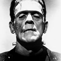
Charles Burns’ stories and artwork seamlessly unite horror, surrealism, and disquieting absurdism, depicted in the style of dead-pan realism of true story / romance comic books, relying on strong contrasts between light and dark. His graphic novel Black Hole depicted teenage awkwardness as a form of disfiguring disease (Mary Shelley’s Frankenstein can also be read in much the same way.) Throughout his collected works, one finds instances of normal people (usually teenagers) encountering mysterious aliens, worlds in which grotesque meets pathetic, mutation can provide beguiling romantic benefits, and nothing is what it seems. In Kommix, Burns creates a series of covers for magazines that do not exist, including their titles, many for publications suggesting origins in Asia depicting ambiguous images that suggest the answer must lie within the pages of the magazine, but sometimes it’s hard to imagine any context in which the story behind the image would make sense. Magazine titles in English suggest a teen audience: Diary Secrets, Throbbing Heart, Huss, and Teen-Age Romances (and their doppelgangers: Unwholesome Love, Vagina Beauty, Sex Decoy). Highly recommended but for adults only.
Charles Burns' talent and creativity are on display in Kommix a gallery of comic covers for stories yet to be created. There are the travails of young love, encounters between humans and grossly mysterious creatures or attractive people in revealing sexualized positions (mostly well endowed women) to draw the viewers attention.
Unfortunately, that is about all there is. This gallery lacks the labels that exhibitions traditionally provide so the viewers have some understanding of the artwork. Kommix is just the pictures and whatever text Burns decided to include, though many of them are a language made up by him.
Certainly playful and creative, and some of the covers are in conversation with each other. For example, there are images featuring repeated characters on some sort of journey, the same creature in different settings/locations or a series under a shared title with similar emotional moments. Many of them are clearly inspired by the pulp era (horror, romance, science fiction or Archie like).
Something for the completest fan of Charles Burns who clearly enjoyed making the comics, but not recommended for most readers.
I received a free digital version of this book via NetGalley thanks to the publisher.
idk man -- like it's not amazing but he was just having fun. 3 stars simply b/c I remember charles burrns fondly (having not read him for a while) -- but about to read final cut and then we'll see how i feel about it
read it once -- will go flip through it again after writing this review.
edit (2 min later): flipped through it again. yes there's gratuitous female n*dity but like burns has a sense of situation and the naked body which is fun (instead of an objectified static object al la david boring) and i don't know how else to say this but a lot of the girls have a bit of a diva attitude (which is a positive).
edit (the next day): was flipping through Final Cut and--Daniel Clowes (and Dash Shaw and Eric Drooker all those other guys) draw b**bs like they want to t*tty f*ck them and d*cks like they ashamed of that worm between their legs (Daniel Clowes and Dash Shaw) or like it's their moral representational duty to draw a d*ck for the good of equal representation (Eric Drooker). Charles Burns draws d*cks I w*nt to s*ck; honorary bis*xual if not bis*xual in reality (idk his s*xuality). Upgrading this to 4 stars. Pumped to read Final Cut -- hopefully the narrative and characters stand up to to the art. Maybe I'll go reread Black Hole then too....
This entire review has been hidden because of spoilers.
I took this material to be part of the world-building Burns would have done for the X'ed Out trilogy, where romance comics (in a bizarro dream universe) played a supporting role. But it might also be something he just enjoyed experimenting with; a rabbit hole.
For the most part, this book is a combination of what was published in France as Vortex (2016) and Caprice (2023). Vortex was heavier on the Nit Nit side and also featured process and alternate pages, where Caprice was more of an appendix of additional alt-romance covers, in a smaller softcover format. Coming as it does so long after the X'ed Out trilogy, I find Kommix a bit confusing in what it's trying to accomplish, though it does offer a sort of ‘one-stop shop’ for all the otherworldly comix covers. I prefer the more varied and immersive Vortex, which more explicitly welcomed readers further into the world of X'ed Out, as well as the deep, rich blacks of Caprice's glossy interiors.
Burns recently went so far as to put out an actual issue of Unwholesome Love (one of the titles featured in Kommix), and it's quite good.
Kommix is a collection of covers. Each page is one cover evocating multiple possible stories to be told if the comic was ever written. The style is classic recognizable Burns and the theme is very evocative of pulp stories. Some covers have some surreal quasi weird elements, others are the classic sexual innuendo or nudity, there's a series of Tin Tin inspired issues and much more. If you are a Burns fan this is a great book, if you aren't a fan or particularly interested in this kind of art and period, the book won't do much for you. I kept thinking I'd love for this to be a challenge to some other comic authors, each one following from one of the covers. Lastly, one recommendation: do not pick this up on a hurry, or you'll just run through all the pages and the book will feel useless. Give yourself some time and let your imagination fly page by page and try to find connections between some of the stories and the experience is something else entirely.
Woohoo, new Charles Burns book! Oh… it’s just a series of covers. For comics that don’t exist. Hmm.
Kommix contains a number of covers featuring Doug, his Tintin proxy from the Last Look trilogy, hinting at possible adventures he went on after that series wrapped. I’d actually be ok with Burns going back to that character/world and doing more comics - thems was a fun read.
Most of the other covers are subversive homages to (why not?) teen romance comics from the 1950s and ‘60s. The imagery is a mixture of trippy, grotesque, humorous, and surreal, and the art throughout looks great - Burns has only gotten better as an artist over the years. I also liked the made-up kanji-type letters he puts on some of the covers in lieu of actual language - tres creative.
But it’s still just an art book and I think I speak for most Burns fans when I say a full length narrative comic would’ve been preferred. Kommix will only appeal to collectors and/or fans of Burns’ art rather than most of his audience, including myself. The book is pretty to look at but offers up little else.
Thank you to NetGalley and Fantagraphics for providing me with an advance copy in exchange for a fair and honest review.
I am a long-time fan of Charles Burns. Black Hole is a legendary book within the realm of graphic literature and was for me, like many others, one of the first books I read when discovering that comics were more than just the big three publisher's superhero stories.
in 'Kommix', Burns has created 80 covers for non-existent comic books. While I am a sucker for his art style, this release missed the mark for me. While the technical execution is stellar as always, the lack of anything beyond the beautiful (and sometimes disturbing) artwork left me with a hollow feeling. Perhaps these pieces would work in an art gallery, but 'Kommix' seems to me like a souvenir book you'd purchase in a museum gift shop after attending the showing.
I didn’t get this at all when I flipped the pages. I had to go and find out what’s this about because the blurb doesn’t say anything. So, the guy who did this drew covers to the comics that never existed and this presents those covers. Now that the mystery is solved, I can go analysing this. I haven’t really read the 50/60’s comics but I know what they look like. So, technically these are good but most just disgusted me with their sexual images. Although I have to admit that some of them wickedly amused how distasteful they were. I couldn’t get anything out of this, even they’re good pictures. The front cover is the most interesting and I could imagine it being from some thrilling sci-fi story. Others were so stagnant that I couldn’t imagine what could happen in them. I guess this guy also likes Tintin, because there are so many pictures of him...
Haven't kept up with Burns' post-Black Hole work so I'm not sure if this is a mode he's worked in before but man there is something to the way this being "just" a collection of fake comic covers makes you slow down and really pay attention to the images that really works for me. There's definitely more to it, as images from different comic "series" start showing up in others and the fake Tintin seemingly keeps waking up from dreams, and I'm pretty sure with some work you could actually parse out at least some of the alien languages. In any case, this works as a pure delivery method for Burns' disciplined, goopy art as well as a pretty interesting storytelling vehicle in its own right, even if I'm not tooootally sure what story it's telling.
2.5 stars Burns’s art looks bold and attractive as ever, but this really is just ~70 imaginary comic covers without much connecting them or offering any loose meta narrative or broader concept. Burns riffs on a few different midcentury comic genres like sci-fi and teen romance, often adding mildly grotesque or leering elements, but it’s pretty dry overall. Most of the cover text is written in an elaborate (fake?) language that’s visually interesting but acts as a further obscurant. There’s also a lot of neatly trimmed pubic hair on display, for whatever mildly subversive purpose that’s supposed to serve.