“Hickman has created a unique and thrilling graphic novel on par with the best spy fiction.” -- Booklist
A man gets shot in London, a law firm gets broken into in Washington, an accountant gives away the password to his computer, and something put to sleep 20 years ago awakens. What is the unsavory relationship all these things share, and how could it bring down two of the largest governments in the history of the world?
Brought to you by award-winning writer Jonathan Hickman and break-out talent, Ryan Bodenheim, Secret is an espionage thriller that takes a deep look into the shadow world existing between the government and private security firms.
Jonathan Hickman is an American comic book writer and artist. He is known for creating the Image Comics series The Nightly News, The Manhattan Projects and East of West, as well as working on Marvel Comics' Fantastic Four, FF, and S.H.I.E.L.D. titles. In 2012, Hickman ended his run on the Fantastic Four titles to write The Avengers and The New Avengers, as part the "Marvel NOW!" relaunch. In 2013, Hickman wrote a six-part miniseries, Infinity, plus Avengers tie-ins for Marvel Comics. In 2015, he wrote the crossover event Secret Wars. - Wikipedia
The scene: a cold dark night. A bar/hovel/log cabin in upper Northern Canada. It's cold.
The clientele: Huge, mustachioed, French accented tough guys dressed in lumberjack garb, plus a few moose wander in and out of the place.
Suddenly the door opens and in walks a man clad in a tuxedo, accompanied by a teenaged sidekick.
The patrons of the bar all reach for their axes, chainsaws, broken bottles, etc.
Bar patron (twirling his mustache): Wat iz zees? Get heem boyz!
Tuxedoed man: “Fellas, before this degenerates into fisticuffs, let me tell you why the Northwest Passage is the hope and future for our beloved Canada. But first a little history lesson….”
Fade to black.
Fade to screen. Back at the bar. It is two hours later
Tuxedoed man “ …and this is why crack is a bad thing. Any questions?”
Aside from the bartender, the rest are fast asleep.
Bartender: What’s your name son?
“Von Talkerson. Talky Von Talkerson.”
Bartender: Well, bub, if you ever show your face in this place again, I'll break your kneecaps."
Teen-age sidekick: “Gosh, Talky, that was swell. Tell me again why Gump Worsley didn’t wear a goalie mask.
Talky: “Well Bobilink, it all started in Neolithic times…”
Three and a half stars rounded down.
Information dumps are a perilous thing when reading a regular book, but when you are trying it in a comic, it had better be cut down to the bare bones. There is nothing worse than a comic book page dominated by word balloons.
This is a story about espionage and security companies and hidden bank accounts, so Jonathan Hickman has his work cut out for him, but it’s fairly smooth going. There’s plenty of digressions and “explanations”, with some violence thrown in here to keep the average reader turning the pages.
The art is of the guess-who-the-character-is-from-page-to-page variety, but by the mid-point of this thing, you kind of know who’s who.
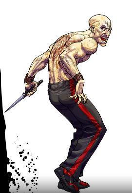
The cover is enticing, but what it has to do with the actual contents of this volume is anyone’s guess.
Until next time, Talky!
Apologies to all my Canadian friends. Except Gavin.
I reviewed the first issue of Secret when it was released. Back in July, 2012. It took almost 2 years for this to come out, and at only being 7 issues long, that is a long time (I believe the creative teams other collaboration Red Mass For Mars suffered similar delays). But, like a lot of Hickman Image stuff, it is a comic that will read best in trade. It's a complex storyline that's more in line with The Nightly News than Manhattan Projects. Secret Government Hitmen doing secret Government things. Also has an interesting colour palate to it were it's more colour shaded than traditional colouring. Some pages will be black and white, with 1 character in 1 panel being shaded red, whereas other pages will be more green shaded. I think it's done to help split the time periods apart.
Now that's the first volume is finished (I'm not sure if he's continuing with this series or not, and the ending doesn't really give much indication if he is or not), I'll have to sit down and re-read the whole thing properly in one sitting. Maybe it'll get an extra star or two when I do.
I had a hard time telling the faces apart at times. Which makes a spy thriller thing pretty weird. I like the art and the artist, but I think that some of the key faces weren't distinct enough for me to know, at a glance, who was who, and who was shooting who why. There was one dude who I'm not entirely sure I EVER found out his identity. Although I'm not sure I really cared.
There's a certain type of story, a slick spy story that involves the intersection of technology and smooth operators and a shoot out and a plan coming together and almost always, because this is the future, computer hacking. My god do I not need another thriller that involves ANYTHING with the computer. I'd like to see a pact made, all thrillers will now take place in 1994 or earlier, when we were happy to say that computers could magically clean up really shitty images from security cams if someone simply said "Enhance!", but that was about it. No file origin nonsense, no encryption bullshit. That's all I ask.
This brings me around to another Big Topic in Comics Talk. Sexism and the Depiction of Women.
How does it come around to this?
I saw a promo for the new Samantha Bee show, and we had one of these things where Bee is talking to artists about why a woman's comic book costume isn't very practical.
I don't disagree with the idea that women's costumes are totally impractical. But I am kind of bored of that point being made the same way, and it's weird to me that no one provides real answers.
I do think there's a few reasons that are not often well articulated, or at least some good questions that warrant asking, so here we go.
Why does Wonder Woman Dress Like That?
I think that's the basic question, yes? Why doesn't she wear pants? A shirt? Why does Superman get pants and Wonder Woman gets no pants?
And by the way, I'm going to throw out the contextual arguments here. Because really, Superman and Wonder Woman could be naked. I don't think they particularly benefit from clothing in any way. Their skin is hard as hell. They're super strong. I would think that once you were up to a certain level of power, clothes would be of no benefit whatsoever and only a hindrance. Not to mention that if Superman was flying around with an exposed wang, he could probably ditch the Clark Kent glasses because who is going to be looking him in the eye?
If there's ever been a person with no use for clothing, it's Wonder Woman.
But I'm not going to rely on that because that's an easy out, and I don't think that's the reason Wonder Woman is so nude.
Part 1: Um, Men in Comics Are Also Preposterous
Superman wears his underwear outside his pants. As does Batman. Underwear outside the pants is a total comic book staple, and I can't conceive of a way in which that's possibly useful, practical, or even makes sense, really. And to say that's not sexualized, well, I dare you to go in the bathroom at work tomorrow, swap your underwear outside your pants, and see what happens. Maybe do that and take a stroll around a nearby playground, see how that goes for you.
And although men might not have exposed flesh, their costumes tend to take the "Are tights pants?" debate to a whole new level.
Look at this Green Lantern
I can see the outline of every muscle and sinew in his leg. Including some muscles that I don't think exist in human anatomy.
I can see how this is still a little better than being naked, but it comes down to the color used to fill in the costume. That's about it. If someone clicked the flesh tool, all the detail is there.
I ask you, why so tight?
Why is Hawkeye sleeveless?
Why is Hawkman topless?
Why is Lobo dressed like Rob Halford's wet dream, when he's dressed at all?
When we look at supposedly practical costumes, that brings up just as many questions.
Why does Iron Man's suit have abs?
Why capes, EVER!?
Why does Captain America wear welder's gloves?
Why did Spider-Man waste so much time sewing little spider webs into his armpits for a while?
Why doesn't Doctor Octopus, who is supposed to be so smart, know that darker colors would be more slimming?
Why, why, why?
And here's the quick answer. Nothing in the way comic book characters are dressed has anything to do with logic, real world science, or anything that can be explained rationally.
Comic book characters do not wear uniforms. They wear costumes. And costumes are not designed for practicality.
Part 2: The Hyper-Real World of Comics I give frequent talks about comics, and something that's brought up a lot is the unrealistic anatomy of women in comics.
Most people answer that question by saying that when comics began, they were sold to young boys. And what else is there to know?
But that doesn't explain the persistence.
One of the ways I talk about comics is to talk about how comics exist in the hyper-real. Not just the women. The entirety of comics. When you see a dude, a bystander, he looks like an Adonis. The entire world of comics seems to be populated by Mr. Universe rejects.
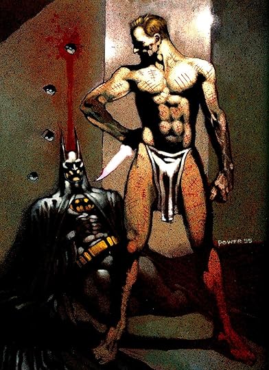
Here's an example I use a lot. This is Zsasz. A Batman character who is just an insane killer, no powers whatsoever, not some former military dude or a gymnast or something.
And look at him.
LOOK at him.
This is a non-aspirational murderer character, and this is his body, which is frequently on display.
This guy would have his own section of bodybuilding.com's forums if he were real. He'd be famous for being the world's most ripped prisoner. How does he do it? What's your secret? Push-ups? Cigarettes? Murder? Is murder the ultimate workout?
Not to get all Lake Wobegon, but when it comes to comics, the women are beautiful, the men are also beautiful, and everyone is strong as hell.
And once we've established that, I like to put this in context.
Think about the biggest sitcoms of the last decade. Especially the sitcoms that involve male/female couples. King of Queens, Everybody Loves Raymond, Friends (Ross and Rachel specifically). Homer and Marge Simpson, Fred and Wilma Flintstone.
What you'll notice about these is that there's a HUGE disparity in attractiveness when you look at these couples. I might be a weirdo in having Wilma Flintstone as an early crush and spending time determining that she's much better looking than Fred based on my own rigorously applied rubric. Or maybe the weirdo part is admitting it.
You'll also find, in movies, lots of examples where the male characters are romancing much younger female characters, but not many that go the other way around.
Here's what I'm getting at. Women are overly sexualized in comics. So are men. And it's in the medium of comics that I see the closest thing to equality in that BOTH men and women so, so often present the physical ideal.
In comics, every skyscraper is massive, every car is a sports car, every explosion rivals an atomic bomb. Everything is big and distorted, and so is the sexuality of the characters.
Keep in mind, I'm not saying that I like this or that it has to stay that way. But this is the landscape, as I see it. The entire universe of comics is bigger, stronger, nakeder, and generally blown out of proportion. Not just the women. Everything.
3. People like to create beautiful things Let's just mull something over.
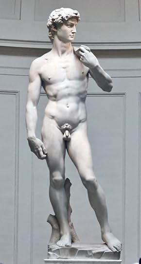
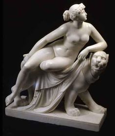
Here's an old ass statue.
Here's another one.
Here's Jesus. I think homeboy's been bulking.
We can talk up and down about the ideals of beauty, but to me it doesn't look like it's changed a ton in the last...500 years? David being from the 1500's. Calvin Klein ads from the early 90's definitely showed a certain malnourished chic, but from what I see in classic paintings and statues, not too dissimilar from today.
People also like to point out that heavier people were more attractive back in the day, which is great. Pat on the back for us. We painted nude the people we found most attractive at the time. Gold star.
Look at movies. We can talk about representation of men and women, racism, all these things, but one of the most pervasive divisions I see across the board in entertainment is attractiveness. I was watching Django Unchained the other day, and that's a great movie, and boy are a lot of the people in it distractingly good looking. Jamie Foxx is cut from goddamn oak. Kerry Washington emerges from a torture hole looking better than I could manage if I spent the year focusing on doing nothing but making myself look great for a 2-minute span. Leonardo DiCaprio looks a hundred times better than I do with blackened teeth.
Look at television. It's a rare show that has even vaguely unattractive people involved in any way. Lost was one of my favorites. I felt like the casting was like, "Let's get the hottest Asian guy ever, then the hottest Middle Eastern guy ever, then the hottest guy who can go hillbilly..." Was that plane headed to some kind of modeling contest or some shit?
Look at the tattoos people get. Are people getting tattoos of realistic looking people? Or are they getting pin-ups?
Look at video game characters.
Look at musicians. LOOK at them. They work in an auditory medium, and yet they are STILL some of the most conventionally attractive people on Earth. It was like a big fucking deal when Susan Boyle was on that show. Like, "Wow, can you believe that voice comes out of that pile of Pillsbury?" The entire setup was predicated on the assumption that an unattractive person could never do something beautiful.
Look at book covers. Novels. How many unattractive people are there? How many you'd even call plain? How many of those sad girls in pretty dresses are even homely?
Art is, in most instances I can think of, heavily, heavily skewed towards traditionally attractive people. Heavily. And while I understand that it's super not fun to see comics be yet another place this is happening, part of what gets old to me about the joke of why Wonder Woman is dressed a certain way is that I feel like it's asking a question of comics that isn't being asked of the art world, in general, and probably should be.
Why are comics answering for the fact that art loves a hot babe?
Part 4: The Secret
Victoria's Secret, that is.
Take my advice. Don't ever order anything from Victoria's Secret. That is opening Pandora's box, combined with Hellraiser's puzzle box, combined with saying Beetlejuice three times.
They send you A LOT of fucking shit, is what I'm getting at.
For the first time in like 15 years, I looked inside a Victoria's Secret catalog. And people, what the fuck?
I understand there's a need to show what underwear looks like. But...I wouldn't say I saw one model that was even, well, normal. Forget plus-sized or whatever, every model I saw looked weird, like something from a movie with shitty CGI where a hot babe unhinges her jaw and flies come out or something, she crawls around on the ceiling, and a fallen angel shoots her with a shotgun. SHE'S JUST PLAYING DEAD, YOU FOOL!
Not only that, but a large number of the photos showed a woman's breasts or her ass, and her face was cut off at the top of the page. There was a picture where a woman was leaning out of a window, and her entire body was visible, but her face was not. I've never seen this big a parade of headless women in my fucking life, which is a good thing because if I had an event to compare it to, that'd be terrifying.
Here's where it gets strange for me. I have to assume these catalogs are for women. I have to. Maybe men in general are buying a lot more women's undergarments than I am, but I doubt it. I think I'd be surprised to find that men make a third of the purchases from VS. I did a search for actual numbers on this, and I didn't find much. I DID find a presentation regarding the expansion of VS into Mexico. 40% of men surveyed were interested in receiving a catalog compared to 100% of women. 20% of men were interested in actually going in a store, as compared to 100% of women. (http://fisher.osu.edu/~west.284/mkt75...)
So. Are nude-ish women marketing to men? Or women? Or everybody? Or does it depend on the situation? What's going on here? How does this work?
I'm not uncovering a new phenomenon here. How long have women's magazines had covers that were as revealing as lad mags? What's the difference between a Cosmo cover and a Maxim?
My question with this is simple. Why aren't the Samantha Bee's of the world asking Victoria's Secret about what the fuck their marketing plan is?
And who "gets" to market to the world using nude women? Who earns that and who doesn't?
And again, I think fandom should be a place where people see themselves. I just find this whole thing very odd, and a question like Samantha Bee's isn't a bad one, but I wonder why it's so often directed at comics.
Finale
I don't know if I cleared anything up. Maybe just posited the theory that everything sucks. Maybe it's all a hellscape. A hellscape that, if you squint, looks like a hot babe with nice cans.
Breaking this down into the 3-act structure, the first act (introduction of characters and conflict) took 4 issues and the nature of the conflict is kept from the reader until the last page of that issue. The nature of character's interactions with each other is rather sketchy in all this, too. (I know I'm supposed to root for or at least sympathize with someone, but I had no idea who it was for these first issues.)
Act two takes two more issues to advance the characters into the conflict. There were several background scenes that the reader witnesses. Then, as if by magic, the protagonists also know what went on in a different country with a case they had no connection to. I'm not sure if I missed something or these guys are so much more intuitive.
The final act (resolution) is all tied up in the final issue and most of the action seems to take place either off-page or is set up as a planning montage. Did everything go as planned or were there bumps along the way (besides the obvious problems encountered)? In any event, way too rushed for a satisfying or suspenseful denouement.
Other reviewers have mentioned that the art was confusing with regard to keeping track of which old white guy was which. I had the same problem. Also, what's with the one-color panels? I liked some of the color touches that popped up to maybe differentiate characters, however, the randomly colored panel didn't seem to have any purpose (emotional or story-wise) that I could determine. It was just more visual distraction on top of all the interchangeable old white guy character designs.
There is a generic aspect to the art that makes three of the leads forgettably interchangeable, which is a shame, because the actual story is tightly told.
הלוואי שהספר היה נגמר בפרק החמישי ולא בפרק השתיים עשרה. שהרצח היה נשאר לא מפוענח. שהגירושים היו נשארים מוחלטים, כמעט לא מוצהרים. שהסוף היה מגיע כמו כדור לראש - פתאום, בלי שתהיה שום דרך לברוח.
OK, so this was good, and enjoyable story, and based on the title, it's about people who have secrets...however, it's actually just a spy thriller revenge story. I'm amazed that Jonathan Hickman told such a relatively normal story...in only 7 parts! I almost believe there are 2 Hickmans, like Jeckyll and Hyde. One does normal decent stories, the other does crazy insane 45 part crossover end of the universe stuff that blows the mind and often gives headaches...
This is one of the former.
Problem is, this is the plot for a ton of spy movies I've already seen. There's a bit of a better quirk for the motivation behind the bad guys, and how they set things up, but no different really.
The main problem is, there's nothing here that makes this stand out from other stuff in the genre...I mean I can't knock it for what it is...it's like a really well made piece of furniture, it's stained well, polished nicely, but it's just OK. I feel like the craftsman came up with this in his spare time, not like a labour of love that he poured himself into. That may seem like an odd complaint, and I'll grant I'd rather read this twice than have read a lot of the other shit I've unfortunately subjected myself to; but I just felt like it was missing something. Perhaps there's no single WOW HOLY SHIT moment or COOL! part in the whole thing.
I'm not saying this is a bad book, it's a good story, the characters all make sense, but I feel like deja vu with the whole thing, like I've read this, lived it, done it before, nearly note for note.
Grant is a corporate security guy who used to be a spy. His best friend is killed, turns out there's a whole conspiracy he uncovered that got him killed. Grant vows to uncover it, with the help of his estranged brother, who just got out of prison, his wife, who just handed him divorce papers (and who works by his side at the same company), and by the token Asian computer nerd. (The Asian is the only non-white face in the whole book, even if some of the whites are American, Russian, and Baltic). That's it. That's pretty much the whole plot. The bad guy has a henchman, the bad guy is someone they all know, close to home, and he's tied up with other bad guys of various levels.
That's the whole thing. It's good, solid, but nothing to elevate it past that. However, good is sometimes good enough.
SECRET: NEVER GET CAUGHT– Jonathan Hickman, etc This slow-burner is definitely worth reading and following through. Some visceral images and a few of the peripheral characters are hard to distinguish. Great job, Cuz. #1 – TEETH WITH WHICH TO EAT “.. you can’t be serious.” “I certainly am.” #2 – NEVER GET CAUGHT “They never realize it’s not a box, but a maze.” #3 – THE SYSTEM “… was your work exciting today?” “No .. not a bit.” [.. actually..] #4 – EYES WIDE OPEN “Excuse me, sir. We have to go. We have eyes on us.” #5 – NOCTURNAL “In fact, you’ve recently spent too much time looking where you should not… Like staring at the sun, such curiosity has a high cost.” #6 – KODIAK “I’m pretty sure work’s not done for the day.” #7 – A FAMILY AFFAIR “We – all of us here – were ideologues who sacrificed everything we believed in. that was our buy into whatever it is we choose to call this.”
An enjoyable, above average spy/heist thriller, if one that is somehow both overly complex and underdeveloped. I'm an unabashed Jonathan Hickman fan and Secret is pure Hickman: excellent dialogue, solid twists, a compelling narrative, and a deep sense of confusion over just what the hell is going on.
Hickman offers a handful of infodumps that help, but it's not really until the end of issue four that the main plot comes together. And then it's over pretty quickly and painlessly. None of the characters mean much and are almost entirely interchangeable white men. Ryan Bodenheim's artwork doesn't help in that capacity, with its unnecessary monochrome patches. I certainly enjoyed many of the scenes in Secret, but the work as a whole doesn't hold a candle to Hickman classics like East of West.
I liked the drawing and I liked the idea. The actual story line was convoluted and far too busy. There was all this buildup to a big show down and then they skipped over a huge chunk of action. The big boss is captured by one side and the “heroine” character is captured by the other... next thing you know, she’s in the hospital and he’s “missing”. What the heck? It’s like the skipped over an entire issue. Finally, they only killed off the least important characters. Why even bother having them there. Too predictable. Also, if you’re going to cut the main guy’s finger off, be consistent in your depictions. Two images showed issues with all of his fingers on his left hand: Never Get Caught - as he’s holstering his weapon at the range Nocturnal - he’s holding a coffee and talking to Veronica.
This entire review has been hidden because of spoilers.
Jonathan Hickman is one of comics' most acclaimed writers and his work is usually super high intellectually put together and sometimes, overwritten. That's not the case here as we get a pretty straight forward spy story. Grant is a likeable protagonist and I was rooting for him. The plot though wasn't fleshed out enough and the ending was very anticlimactic. I really enjoyed Ryan Bodenheim's art and thought it was a perfect match and the coloring was gorgeous. Overall, a decent spy book with some solid intrigue but the ending left me wanting some different.
Cool, but didn’t make a lick of sense to me. Design-wise, worst cover of any Hickman work. Great art by Ryan Bodenheim and the use of color amplifies the sparse and restrained emotions of our cast of spies. This and Transhuman make me think Hickman takes not only Warren Ellis but Garth Ennis as a big influence.
Woah so good. Didnt realise Hickman could do espionage so well. Loved the story telling and artwork. The story was pretty dialogue heavy but it seemed to really work well. This has made me a Hickman fanboy!!
An espionage thriller featuring a bunch of nearly indistinguishable white people with identical speech patterns and personalities. All plot and very little character… and the plot isn’t that interesting.