The graphic novel adaptations of the #1 New York Times bestselling Wings of Fire series continue to set the world on fire!
Three dragons. One unavoidable, unpredictable destiny. This is the beginning...of the end.
In the SeaWing kingdom, a young prince learns he is an animus—capable of wonderful magic that comes with a terrible price.
In the mind of a NightWing dragonet, a thousand futures unfold—and almost all of them, she knows, lead to disaster and destruction.
And under three full moons and the watchful eyes of his NightWing mother and IceWing father, the most powerful dragon Pyrhhia will ever know is clawing his way out of his egg. Darkstalker, the dragon who will change the world forever.
Long before the SandWing war, lifetimes before the Dragonet Prophecy...darkness is born.
The #1 New York Times bestselling Wings of Fire series soars to new heights in this Wings of Legends graphic novel adaptation, with art by Jake Parker.
Okay, I know what you’re thinking. Tui? What kind of name is that? Is it short for something?
Nope. Among the many great things to come out of New Zealand (the Lord of the Rings movies, cats that paint, my mom) is a bird called the tui—not as well known as the kiwi, but a heck of a lot noisier!
I was born July 31 (same birthday as Harry Potter!) in Caracas, Venezuela, and lived in Asuncion, Paraguay; Miami, Florida; and Santo Domingo, Dominican Republic, before moving to New Jersey in high school, where I started doing theatre—mostly backstage work, because (a) it was fun, and (b) you got to hang out in the dark with cute boys. (Er, I mean . . . because it was artistically fulfilling, yes.)
I graduated from Williams College in ’98 and I currently live in Boston with my husband, my perfect new baby, and my adorable yoodle Sunshine (what’s a yoodle? A puppy that’s three-quarters poodle and one-quarter Yorkshire terrier, of course!).
Much to my parents’ relief, I abandoned my theatrical aspirations after college for the far more stable and lucrative career of fiction writing.
My first two official books were beginning readers, part of Grosset & Dunlap’s “First Friends” series for kids learning to read. MEET MO AND ELLA is tough to find now, but FUN WITH MO AND ELLA should still be out there somewhere.
My first novel for teenagers was THIS MUST BE LOVE, which retells Shakespeare’s play A Midsummer Night’s Dream in a modern-day high school, from the POV of the two heroines, Hermia and Helena.
And now I'm writing in a new project called SEEKERS! It's a children's book series that I'm writing with Erin Hunter. Check out my blog to find out more!
WOH! Hold up why did I actually...like the this art style?
SO this graphic novel follows the legend/story of Darkstalker the nightwing, I'm not really going to review the story here because I already did, so go check out that review! I'm here to talk about the style and if I felt this was a good transition from book to picture. Let me stop you right there, YES. Sure the art is different and some characters have very prominent jaw lines and eyebrows, it still looked AMAZING! My favorite parts were the ones of prophecies and the scenes where you got a wide view of an area, those were always the prettiest and colorful! As for the story, it stuck EXACTLY to the book, no random changes, no everything was as I imagined, even....THE DEATH SCENES! I'm sorry! Yes! I know those aren't too popular but you GUYS! Arctic's was *chefs kiss* Queen What's-her-name, and her LINE?! *faints* It was all so awesome!
Content warnings: Violence: Lots of it is implied but not shown, and there are some scenes that get very bloody, including a massacre. People try to kill each other and sometimes succeed. Swearing: None! Romance: Just married couples and crushes and stuff. LGBT: None! 10/11+
overview (spoiler free!)
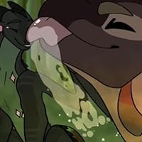
↝ Based on the novel Legends: Darkstalker, this graphic novel follows three dragonets whose destinies intertwine, witnessing the childhood of the most dangerous and feared dragon in history: Darkstalker.
my thoughts
↝ I gave this one five stars because when I was reading this series in 4th/5th grade, this one was always my favorite for some reason (not quite sure whether that's concerning or not) and as far as I remember, this adapted it pretty well. ↝ Even though this is middle grade fiction, I found it really poetic that Clearsight and Darkstalker were doomed from the start. It's one of the first things she tells you, and she tries so hard to change it, but their story still ends tragically. ↝ And I love this art style! I really liked the way the story was laid out and the creativity rather than just boring panels.
characters
↝ Fathom - I liked him, and I liked seeing his battle as he grappled with his magic, especially after watching almost his entire family get killed. His arc was so sad but so interesting to read. ↝ Clearsight - I always remember thinking that she was so relatable because of the way she overthinks everything. Watching her realize that there's nothing she can do to save Darkstalker was so sad. ↝ Darkstalker - He's obviously a terrible person, especially later in the series, but it hurts so much more when you learn how he grew up. But it was also kind of genius how it was clear from the start that he was going to become evil. There were little warning signs, and they got bigger as the story progressed.
favorite scenes
↝ the final scene between Clearsight and Darkstalker. hits me right in the feels, every time.
conclusion
a great adaptation of one of my favorite childhood books!
Pre-read: Not ready for the super-violent bits to be illustrated, also not sure how this artist will do but I hope it’s as good as the novel
Update: I’ve now read this, and it was pretty good. 4 stars because the art was a bit hard to read (arctic looks a bit like a rainwing!) Decent amount of blood, but not so much that it’s scary or painful to read. The seawings are done really well. I’m sad that I read it because now I’ll have to wait for Talons of Power to come out so noooooooooooooo 😫
Notes: I love the colors they chose for pearl. She isn’t described much in the book, so it was nice to see that
post read the decision to have a different artist for the backstory graphic novel was so genius i can’t lie. i have also always loved how darkstalker dives into what ruins our soul; the magic or how we use that magic? and this gn delivered that theme so well
pre-release OH HELL FUCKING YEAH WINGS OF FIRE FANS WE ARE ABOUT TO EAT GOOOOOODDDD
To start: I think it was OK- It definitely could have some changes, like the art wasn't so good, and it should be longer because it kinda felt like it was trying to squeeze everything in. It's really sad and gruesome, it should be for readers older then 11. I'm really sad about how bad it was because I ordered it online and I regret doing that- and I was really-really-really exited for this. But it was kinda good.
I know a lot of ppl complained abt the art style change but:
1) I think it’s smart because this book takes place 2000 years in the past, and
2) It finally gave the NightWings draconic snouts, unlike whatever the hell Moonwatcher had in the second series. Their heads literally liked like boxes. This was a BREATH of fresh air.
None of the graphic novels will ever top the actual written books. They’re just too good. The written Darkstalker book is quite literally in my top 5 books of all time, embarrassingly enough, because it’s that good in my eyes. The graphic novels are fun to see things visualized, but are poor in terms of pacing. This isn’t just a WoF issue, either, but just the norm for graphic novels as a whole.
The brutal scenes were good. Many people wanted outright gore for a children’s series which is kinda wild. I was surprised for the SeaWing attack, but not for Arctic’s death. His blood being blue also just takes away from the effect but yolo. Kids’ series.
Anyways, 4 stars and maybe 4.5 on Storygraph. Darkstalker should’ve killed everyone but whatever.
Ok before I critique this book, let me preface by saying I have NO HATE towards the artists involved with this book. I personally prefer Mike Holmes's illustrations, but that's my take. I will be reviewing the art. If I wanted to review the story, I would be reviewing the OG one.
I was disappointed to see the cartoony art style, and how the book leaned heavily on "tell, don't show" which is the exact opposite of what a story should do.
The art was a shame because the whole point of this book is to add a mature edge to the series. When the art is as cartoony and Disney-like as this, ESPECIALLY when compared to the previous graphic novels Mike Holmes illustrated.... it makes the book just feel off, like its insincere in what its telling.
The original book is dark. It's gruesome. It's suspenseful. This book didn't feel that way. The illustrations stripped the dark tone away.
Graphic Novel adaptations are hard to do, especially for a book as mature and complicated as Legends of Darkstalker. You have to take the intricate emotions of a character, the tone of the story, and the dazzling imagination of young readers, and try to make sense of it. It's tricky, and I don't envy anyone who has that job. This book is an example of what happens when the adaptation doesn't harmonize with the original book. You get a disjointed book that leaves you confused instead of wanting more.
Some pros to end on a good note: •The nightwings have more dragonlike snouts •Clearsights powers were shown well •The eyes looked hauntingly beautiful •As pointed out in previous reviews, the artist chose to make them have more humanlike features rather than animalistic features. I don't prefer it, but I appreciate the artistic choice. •I AM glad they didn't lean too heavy into the gore. I'd rather have too little than too much.
This book breaks my heart every time I read it. It makes me wish things could be different. That all the dragons get a happy ending. That the ones I love the most in this novel could have every good thing. But that said...I love this book so much! The characters, the world, the friendships, and the heartbreaks. And reading it with the beautiful art bringing the dragons and their world to life...it's breathtaking! A beautiful graphic novel adaptation of my favorite Wings of Fire graphic novel. <3
It was good, it just unsettled me the entire book that the artist was different. The art was still good, the dragons were just more humanoid than animalistic, like the other graphic novels.
FREAKIN COOKED. I DON’T CARE GOW DIFFERENT THE ART STYLE IS, I’M SO FREAKING HAPPY THEY MADE THIS ONE A GRAPHIC NOVEL. I’VE LITERALLY MISSED THIS UNIVERSE SO MICH AND IT STILL CONTINUES TO SURPRISE ME. ♾️/5 ⭐️
I adore the Wings of Fire series. Darkstalker is my favorite character. However, this book (and the novel by extension) really puts on full display the reason he falls flat as a villain. From being "born evil" to never making a selfless choice once in his life, despite the attempt to write him as complex, to immediately abusing everyone around him the moment he doesn't get his way. Where some characters try to paint him as complicated, with deep motivations (and the plot itself does, too), what we really see is a petulant child who's first thoughts are about how he wants his mother "All to himself" and how he wants to kill his father. Ah yes, a very complicated villain with a "mostly-good" soul, as dictated by the plot, characters, and soul reader. :I
A couple of things are omitted from the graphic novel version: Fathom and Indigo have their dragonets in secret, for example. Unless I missed a line, the graphic novel paints it as a much more romantic ending, rather than an acknowledgement of future issues to come. Granted, we never see Fathom again, and likely never will. :(
I still don't fully understand why the NightWings leave their land forever, when Darkstalker was neutralized. And never returning to it? It doesn't feel fleshed out enough, in this or the novel. Surely their seers would see going back wouldn't put them on his warpath, at least, not for 2k years? I wish we'd seen more of that, and why the NightWings later choose to forgo their powers when hatching under the moons. Darkstalker was scary, but he was dealt with pretty succinctly, and besides the island, nothing else notable threatened the tribe in that time (that we know of).
Finally, I'm SO glad for the new artist(s) working on this graphic novel! I adored the style. If I had to nitpick, I'd say the dragons sometimes look too anthropomorphic (or, like furries). Other than that, I enjoyed the art a great deal. The expressions are a highlight! I hope we see more WoF graphic novels with Jake Parker and the other members of the team for this book.
This entire review has been hidden because of spoilers.
This is a pretty great adaptation of Darkstalker. The graphic scenes were pretty well handled, enough detail that it didn't feel immature, but obviously not too grusome. The scenery is phenomenal, way more detailed than the Mike Holmes books. I like most of the character designs, except Darkstalker was a bit unnaturally angular. Also, some of the poses were oddly human. Too much standing on two legs for my taste, let dragons be glorified horses in peace. I was unreasonably excited to finally see what the soul reader looked like, I never could visualize it. Overall, it's Darkstalker. It's good.
Some of the most horrific violence was cut from the original novel (cowards!), and the art was a bit more anthropormorphic (yet less distinct between individuals) compared to previous volumes, but ultimately a solid adaptation of one of the best books in the entire WoF canon. Absolute banger.
My love for this book (as the original novel) is unending and probably because it's a very emotionally heavy story. The drawing style I wasn't a huge fan of. The angles were all sharp and wrong on the dragons. That's what happens with two different graphic novel artists, I suppose. I did appreciate that the gore was limited to being off screen and thoughts of dragons replaced the images, not because I particularly care but also seeing a dragon get disemboweled visually represented is something that most people would agree is a bit much for a children's book. Also we get Blob art!!!
This was my introduction to the Wings of Fire universe. The dialogue is definitely geared towards younger readers. Nonetheless, the plot kept me wondering what would happen next. Events near the beginning of the book made me feel like something totally wild was lurking around the corner. The ending was a great payoff for all that suspense.
I also enjoyed the artwork. It took me a while to recognize/distinguish certain characters, but eventually I got the hang of it.
This series continues to be beautiful. Love the villain backstory.
The art style was a bit different - which makes sense, I just checked, it’s a new artist - so I did feel like I had to adjust but the dragons still looked great. I’m so amazed at the range of action and emotions they can capture in graphic form
Great book way different ten reading th chapter book and they left a lot of inportent information out. It was cool to see how the author Made the dragons colors. / This book was amazing and the charecters played there parts so good. I would defiantly read this book again. I just love reading graphic novels and the pictures and color really brought the dragons to life. When I was reading this story it felt like I was there and kept me wanted to read more. It was hard for me to chose a favorite character in this story but I will have to go with the one on the cover of this book Darkstaler. He justed had a seroius personailty and had he in way of doing things wich for him lead to his doom. The artwork for this book was so amazing it made me feel like I was there.
Well, I already like the story. but the art...it's like it's really good anatomy wise and the bodies of the dragons look way better, especially the wings but I soo hate the sharp jaw lines and faces 😭
This book was phenomenal!!! I read it in under 24 hours and I absolutely loved it!!! For those worried about certain scenes being cut, don't be!!!! Those moments were so well handled and overall the whole book was done very very well!!!! However, it is important to note that while baby Darkstalker may look cute on one page. when you turn the page he is a terrifying baby. Jake Parker really did an incredible job at helping us see how wicked Darkstalker is, even as a new hatched dragonet.
This entire review has been hidden because of spoilers.
My boys love this series, especially the graphic novels. They were looking forward to the big release of Darkstalker and let down. They immediately noticed the dragons look different than the other graphic novels. I guess the artist changed from Mike Holmes to Jake Parker.
it was VERY weird to read the new art style I liked the art style tho I still like Mike Holmes’ art better no offence to Jake parker tho I’m glad the disembowlment was off screen tho I noticed that clearsights and indigo’s and whiteouts snouts were More delicate and pretty than everyone else’s Was that on purpose? And I was SOO happy to see Whiteout in this WHITEOUTS SOOO PRETTY
This was honestly a great graphic novel to give more background images, and character designs, from the actual: Darkstalker Legends, Novella. The new artist did a stunning job, and I couldn't have been MORE excited to find it in Target the other day. Though the art style was different from what I was used to, I'm still trying to accept different ways of things that I'm used to, so this was a whole new thing to take in. Jake Parker is doing a great job as a new artist for the graphic novels, and did a great job while Talons of power is still in the works. I am grateful he helped in this so we would get 2, great graphic novels not far off from each other. Personally, the expressions of the Dragons could use a tiny bit of work, other than that, I loved this book along with every other WoF book! My favorite character is the same in this one, Whiteout was adorable with every little page she got. Jake did wonderful with her colors, and I at first, was convinced she had more of a Black shade of scales! But this showed she had more of a Blue shade of scales. Would recommend, please DO read! <3