The epic first book in the New York Times and USA TODAY bestselling Keeper of the Lost Cities series is being reimagined into stunning graphic novels, and the story continues now with Part Two!
After learning she's actually an elf, twelve-year-old Sophie Foster made the impossible decision to leave her human life--and family--behind and start over in the Lost Cities. And life with the elves has been unlike anything Sophie has ever known, filled with new friends, amazing creatures, and incredible powers. But it's also had its share of challenges. Sophie had been an advanced student in the human world--but thanks to her struggles with alchemy, she's not even sure if she will pass her Foxfire Academy midterms!
And then there are the bigger worries. Guardians who may or may not adopt her. Whispers of conspiracies. Mysterious fires. Memories in her brain that don't feel like hers.
Could someone have hidden those secrets in Sophie's head? Why would they do that? Is Sophie part of something much bigger than she imagined?
Something...deadly?
This stunning graphic novel retelling of the second half of the thrilling first novel comes to life with all the adventure and epic worldbuilding the Keeper of the Lost Cities series is known for, told in gorgeous full color--plus special bonus features at the end!
I finished this a couple of weeks ago but forgot to update it on goodreads haha. Anyways, this was an AMAZING adaptation. Going into it, I actually forgot it was part two of the first book still so I was expecting book two, but I’m really impressed that they did that! Not many graphic novel adaptations are this long and inclusive. I love it because you really start to get to know the characters on a deeper level, so I’m super excited for the next one!! Def recommend if you like Kotlc 🤭💕
═══════ ∘◦ ✧ ◦∘ ═══════ This review contains a few random statistics, my personal thoughts, and a content review! ♡ ═══════ ∘◦ ✧ ◦∘ ═══════ • Book - Keeper of the Lost Cities graphic novel volume two • Author - Shannon Messenger • Pages - Ebook, 350 • Genre(s) - Middle grade fantasy • Published - 2025 • Trope(s) - Found family • Recommended time to read - Winter ⇢─── ⋆⋅☆⋅⋆ ───⇠ → Setting - 4/5 → Characters - 3/5 → Writing - 3/5 → Cover - 4/5 → Vibes - 4/5 → Plot - 3/5 → Romance/Ship - 3/5 → Overall - ★ ★ ★ ☆ ☆ ═════════════════ ╰┈➤ My thoughts (spoiler free)
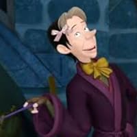
I enjoyed this! I think I like the illustration in this one better than the first volume! I absolutely adored the way Dex, Edaline, and Biana were drawn. Keefe’s hair looked a little goofy though 😂 And Grady looked like a blonde version of Flynn Rider XD
A very quick and easy read, super fun and got me excited again for book ten to finally release soon! (It is soon right? No more delays I haven’t heard about?)
Overall a solid graphic novel and a must read for keeper fans! ═════════════════ ╰┈➤ Content review
➸ Age Rating - 12+
➸ Language - None
➸ Romance/Sexual - Some crushing and teasing but that’s it, Alvar mentions he has three girlfriends and Keefe calls him his hero
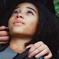
➸ Violence - Sophie and Dex are kidnapped, Sophie’s arms are burned when she won’t tell the kidnappers what they want, she also accidentally burns herself a couple times, and she has an allergic reaction which causes her to pass out
જ⁀➴ Sophie, I love this girl she’s so strong and gos through so much! I want to hug her and give her Ella while eating Mallow-melt!
જ⁀➴ Fitz, I have respect for him, after reading all of the physical books I lost my love for him along the way. but he’s such a good friend to Sophie. and honestly I think it’s his dad who’s the problem not him.
જ⁀➴Keefe WHERE DO I START I LOVE THIS MAN I WANT TO MARRY HIM! he’s so snarky and sweet, I feel so bad he can feel Sophie’s feelings go Fitz!
જ⁀➴ Dex, I want to be Dex’s friend so bad. He reminds me of a cinnamon roll. He’s AN AMAZING friend of Sophie’s she’s so lucky she has him.
જ⁀➴ Bianna, my girly loves her sparkles and I respect it! She doesn’t have much character development and or page time in book one but I love her!
જ⁀➴Grady, he’s the father figure Sophie needs in her life, I love how he calms down both Sophie and Edaline.
જ⁀➴ Edaline, I feel like I’m spelling her name wrong ngl. But she’s just an emotional little thing ain’t she. I love her despite it tho! My girly loves is traumatized for all the right reasons.
────୨ৎ────────୨ৎ────────୨ৎ────
✩₊˚.⋆☾⋆⁺₊✧Plot/ World Building ✩₊˚.⋆☾⋆⁺₊✧ the world building in this is unmatched, the setting the way she describes things is literally amazing! I love this world and I wish it was real.
────୨ৎ────────୨ৎ────────୨ৎ──── ✩₊˚.⋆☾⋆⁺₊✧Unfiltered Thoughts ✩₊˚.⋆☾⋆⁺₊✧ Dex is a cinnamon roll and a marshmallow. My girly Sophie goes through so much even just from book one but she’s a strong cookie! The art in this book WOWWWW shout out to the artist who drew this because it was amazing and it really brought the story to life. I was reading this for my February reading goal but I ended up really liking it. I’m not a huge fan of graphic novels but this was VERY enjoyable and entertaining!
────୨ৎ────────୨ৎ────────୨ৎ──── ✩₊˚.⋆☾⋆⁺₊✧Spoilers✩₊˚.⋆☾⋆⁺₊✧ THE FACT THAT THIS WAS A CHILDREN BOOK IS CRAZY! When Sophie was getting tortured by her kidnappers and I had to see it painted out in front of me (literally) almost brought me to tears. I love these characters so much they feel like real people. When Sophie threw up on Fitz I cringed I really did I felt so much second hand embarrassment… I loved this and the art was so beautiful!
4.5 stars I’ve been so excited for this to come out since June *SPOILERS* This was perfectly adapted from the book! I was reading it slowly cause I didn’t want it to end lol. The scene when the pyrokinetic interrogates Sophie was more intense than I thought they would show. A detail that was realistic was how she drew Sophie’s cape and sleeves being ripped the whole time they were in Paris, I never thought of though while reading the book. All the characters designs are perfect! except Sophie and Dex look a little older than Keefe and Fitz for some reason.
Other little critiques: Sophie’s eyes look red instead of brown the whole book Stina’s hair is red in the first chapter, then brown after that?? After sophie fades from the light leap, she’s supposed to be kinda transparent, I don’t know of they couldn’t do that with whatever art program they were using, or if they just decided against drawing and editing that. Also she’s supposed to be really pale when Fitz finds her, why are her cheeks red??
Also my friend pointed out how similarly Sophie and Oralie are drawn…😯
Similar to my reviews of the original KOTLC books, I won't be fully giving my opinion on this book because I've read it so many times that it feels unfair to judge (especially considering this series has a special place in my heart, even if there are some parts I really struggle with now). Instead, I'll include a list of the notes I took while reading below, and I also just want to mention a few things that really stood out to me about this adaptation.
The first big thing I noticed has nothing to do with the story itself: my imagination has no windows? Having read KOTLC #1 upwards of a dozen times, I know these scenes and settings by heart, and seeing them drawn out for the graphic novel was an experience because I realized that my imagined version of the settings has no windows. I'm not sure why, it's just a fact, and it's too late to fix it now.
The other major thing I wanted to highlight was the way the abilities were rendered on the page. I haven't reread the first graphic novel since its release, so forgive me if it was a thing in that one, but most of the abilities were visible on the page. I know this is probably for the sake of adaptation (how else are you supposed to show empathy), but I've been in a glowy magic mood lately, so seeing it rendered in this way was super cool to me. I really like how Sophie's inflicting was drawn because it really reinforced how powerful the ability is and why it's something to be feared. The other abilities we see with glowing are empathy and telepathy, which I liked but didn't find as meaningful, but I just really like the idea of the glowing to visibly render the abilities, especially in a world that relies so heavily on light.
As far as adaptations go, I think it was very faithful to the original and captured Sophie's emotional turmoil from the second half of the book. I found the art to be great and less distracting than book 1 (fish-eyed Fitz, I'm sorry, but I cannot focus on the plot when you exist), and I'm glad I finally have a Sandor to picture that isn't just one of the goblins from The Rainbow Fairy books.
Anyway, here are my notes for the graphic novel. I don't have original page numbers or anything (I'm not that committed). They will contain SPOILERS for the graphic novel and for the rest of the KOTLC series because I'm a nerd and I've read it too many times. So, without further ado:
- they really captured Sophie being in denial every other sentence - Marella’s hair is kind of giving Maysilee Donner vibes and I like it - So I didn’t realize the Vacker dining room has windows … that’s on me y’all - Alvar does not have a straight bone in his body - Update: none of the rooms have windows in my imagination … I don’t know why - Apparently one of Forkle’s alter ego is just Legolas - Having Oralie’s empathy be visible is a choice … I kinda like it though - The goblins standing beside the councilors is hilarious imagery to me for some reason - Apparently Terik lives in Oz - Not the Shannon Messenger star in Hollywood - Imagine you take your student on a field trip and she just stays trauma dumping and then brings up your situationship from like 20 years ago - I love the librarian’s design so much - Yo the Offish is huge - Guys it’s a mail person they’re real!!!! - Also its interesting that elves build their cities out of light since they all have blue eyes and blue eyes are weaker to bright light - I think I’ve said it before … but do elves have anti-depressants? - Alvar now is not the time for a saucy door lean - Seeing this illustrated makes the Neverseen look twice as overdramatic - Forkle really be looking like the disguised king at the beginning of BotW - Can the elves light leap at night? Am I stupid? - I love the random shots of Fitz being emo eating breakfast while Sophie is fighting for her life -I know she was in danger and dex was dying but like if Sophie took a moment to peek under those hoods this series would be 5 books shorter - Honesty I love the design choice of making Sophie’s eyes glow when she inflicts - Why is Keefe eating a burger in the middle of the tribunal? - The way alter-ego Forkle and Tiergan could be twins - This is the first time I’ve seen an elf with a mustache and it’s a jumpscare
I don’t think I’ll ever get tired of reading and re-reading this series. It holds so much nostalgia for me: once I read it aloud to my kids, now they read it themselves, and seeing these memories come to life in graphic novel form feels like magic all over again.
Watching Sophie’s kidnapping unfold visually pulled me right back to the first time I experienced it. The tension, and the wow of it all. I’m absolutely biased, but truly, Shannon Messenger can do no wrong in my eyes.
A beautiful adaptation of a story I love, and one I’ll keep on the shelf to revisit whenever I need a little hit of elvin nostalgia.
Aaaah so many emotions. If it wasn’t for two characters looking a bit too similar to my taste (Alvar and Alden), and a few other minor things, it would be perfect. A very good, relatively faithful adaptation of the novel that I found more agreeable and prettier than part one because of the brighter colors and overall smoother and finer character design. The key elements were there and OMG some scenes still hit so hard and others hit even harder when you know some hidden truths (I read up until book four as I write this review) and I don’t think I'm mistaken when I say that I'll probably get hit by a few other truth-slaps as I keep reading further.
I'm usually not a Graphic novel fan, but this? Heck yeah. If the other books ever get adapted, count me in.
Omg this book was soooooo good. I mean, I’ve already read the novel, but still, all these ideas coming to life in pictures is AmAzInG 🤩 The best bit was probably the kidnapping bit. Yes, it is a kidnapping, It’s not good for the characters, but some of the pictures were put together so beautifully. Especially in the bit where Sophie‘s trying to pull herself back together. LOVED IT!!!! 👏👏👏👏👏👏👏👏👏👏👏❤️❤️❤️❤️❤️❤️❤️❤️
This entire review has been hidden because of spoilers.
They straight up traced Laura’s art of the councilors LOL Literally. Which like, I guess I can get tracing the chairs, they’re pretty complicated, but like really? Same poses, same outfits… even Laura’s handwriting on the thrones is preserved.
Also Della’s dress at the end is straight out of Laura’s Vacker family portrait. I KNEW I recognized it
The art is pretty cute but I kinda hate the colors. I hated them in the first book too. They’re not great, makes the whole thing feel cheap, honestly. I have trouble articulating why exactly I just dislike them.
It’s interesting that they hired another artist and got started on this before the first one was finished!
This series really does start out fun. Well kidnapping isn’t fun. Whatever
Why is Fitz so tan man
Councilor Emery looked like a girl. Literally kept thinking he was a girl but he’s a grown elf man. He didn’t look like a girl when Laura drew him just saying
Ok but the school was SO LAME. It’s magic elf school why does it look like a generic middle school. Booooring
Grady and Edaline’s house is also boooooring
It looks way way cooler in my head. It’s so generic and lame
Always wondering how the elves haven’t been spotted on Google Earth
The Grady and Edaline adoption bits made me tear up <3 they’ve always been one of my favorite parts of the series. A really great adaptation of one of my favorite series.
Before reading: DEXY IS ON THE COVERRRRRRRRRRRRRRRRRRRR ............ but why does he look 15 ....... he's supposed to be 12 ?!! I can't wait to see Alvar, Sandor, Terik, Sir Austin and the neverseen cloaks!! And Cassius too...even tho I hate him 😭 !!!!!!!!!!! SPOLIERS FOR THIS BOOK AND THE REST OF THE SERIES !!!!!!!!!!!!!!! I read it! And it took 4 days 🤪 I didn't want it to end This one is better then the 1st part The art is also better for ALMOST all the characters Expect Grady and Elwin Something looked so off about Grady 😭 😭 And Elwin looked so old...in some pictures his hair looked gray.... But everyone else looked awesome. (Keefeeee 🫶) And one thing I'm super confused on....WHY IS GENTHENS HAIR BROWN?????? It showed a flashback of him when Sophie looked at his scar and his hair was brown 😭 😭 😭 😭 😭 And when Sophie was looking at his scar his skin was SO pale, but not in the flashback So... I'm confused Anyways PLEASE SHANNON BOOK 10 PLEASE IM BEGGING YOU Some of my thoughts while reading: Everyone got HUGE glowups, the art is wayy better Oh wow….Terigen…..wow……..(he’s so good looking, I’m dying 😭🙏) Sophie asking about project moonlark 😭 😭 😭 😭 😭 Oh god, cassius looks freaky Keefes hairrrrr 🫶🫶🫶 ALVARRRRRRRRRRRRRRRRRR Isn’t Alvars and Dellass hair supposed to be darker? *checks the official art* IT IS Alvar telling Alden that the black swan isn’t real hits different 😔😔😔 Ooh the librarian is an ancient Omg a a drawing of joile 3 Elwins pajamas 🤣 IM DYINGGG WHY DOES AUSTIN LOOK LIKE THAT? I THOUGHT HE WAS TERIGEN AT FIRST 😭😭😭 HELP. (Did mr forkle make Austin look like Terigen on purpose?? hmm) Ngl thats how I imagine Fintan Erm why are there only male goblins protecting the council …? 🤔 I thought goblins had gray skin Yess Bronte looks so much better than the 1st one. If you told Sophie she was standing next to her bigocal mother 3333 I rlly want to know whats going on in the councils minds when they talk telepathically together, prob Bronte screaming EXILE HERRRRRRRRRRRRRRRRR and everyone else telling him to be quiet 💀💀 Aw Terigen and Sophie are so cute <333 WAIT what if he’s her biological father…… No way sophie cried this much in the chapter book Bro why does Elwin look so old 😭😭😭 YA ALVAR CALL HER SIS THEN KIDNAP AND TORTURE HER LATER Oh god, i didn’t think seeing Sophie getting burned would be so mentally painful 😔 GO DIE BRANT-oh wait U DID DIE MWHAHAHAHAHAHAHAH Oh my-Genthen is SO pale 😭😭😭 bro is a corpse WAIT HELP IM SO CONFUSED-WHY IS GENTHENS HAIR SO DARK??? ITS SUPPOSED TO BE BLONDE!!!! SOMEONE HELP SANDORRRRRRRRRRRRR!!!! Alden used to be one of my faves 3 The only elf to ever have facil hair: One of Sophies teachers (i 4got his name 😭) I was NOT prepared for that Oh god bronte looks SO mad I did NOT ask for a close up of Brontes face 💀💀💀 ALSO he’s supposed to have blue gray eyes NOT blue purple eyes !!! The ending is so corny 🫠
⭐⭐⭐⭐⭐ 5 stars! Content warnings: Violence: Characters get burned and tortured, and are knocked out and have to be revived. Mentions of a character that died in a fire. Romance: Little implications of crushes. 10/11+
quick lil review for a graphic novel Personally, I feel like this adaptation was a step up from the previous one. I liked the art style more, the panels were more interesting, and it conveyed the story better. The art in some of the scenes was really emotion-triggering and I really liked it. It brought back all the memories of reading this book for the first time when I was younger, and it was a faithful adaptation.
Le scénario colle toujours bien avec l'intrigue du premier roman ! Je trouve ça vraiment chouette, parce que j'ai vraiment l'impression de relire le roman, mais avec les images en plus, et pas simplement une adaptation 🥰
J'ai été très surprise au début de voir la différence avec le style de dessin de la partie 1. Je n'avais pas remarqué que l'illustrateurice n'était pas lae même. Mais j'ai quand même apprécié (malgré que je préfère le style de la partie 1...).
Je suis impatiente de découvrir la suite quand elle paraîtra, bien evidemment !! Mais ces deux romans graphiques m'ont donné envie de relire toute la série pour rafraîchir ma mémoire sur la suite plus rapidement !
ALL THE SCEEEENEEESSS SANNNNDOOOOORRRR its SO COOL to see them all!!! The art was AMAZING . Dont think i didnt notice the Shannon messenger on the Hollywood star tho. Okay, but thr scene where dex was trying to carry Sophie to Elwin was SO MUCH MORE HILARIOUS THAN I THOUGHT. and Grady pulling an Anna and begging Sophie to let him in her room was freakin heartbreakinnngggg I KNOW ALL OF THIS IVE READ THE BOOK BUT STILL and Igggggyyyyyyyy Igggggy hes so cuteeeee 😭😭😭😭 ALSO how come alden looked cuter than Fitz in this. *eyebrow raise* Anyways all in all it was peak THANK U FOR LETTING ME BORROW THIS EM!!
This entire review has been hidden because of spoilers.
Dude I love this book. The art was great, the story was spot on, (or as close as you can get when you shorten it) everything was just amazing.
I loved seeing the characters come to life. The only one I had a problem with was Jensi. His hair was waaaaaaay to tame. Dex was so cute to me. Keefe was... well... Keefe. (He didn’t change much) Fitz... y’all know how I feel about Fitz. 😒 Grady and Edaline where amazing. And Sophie was great.
So, yeah, over all this was a great book, and I will highly recommend to new and old fans.