In 1964, DC Comics enlisted artist Carmine Infantino to introduce the "new look" Batman. As he had with The Flash and Adam Strange before, Infantino came up with a slick, modern look for the series, making the Dark Knight a creature of the shadows once more. These stories and especially their cover illustrations showcase Infantino's powerful design sense, one that influenced DC's cover artwork for years to come. In addition, Batman's many battles against crime in the streets of Gotham City paralleled the action on the 1966 Batman TV series.
Collects various covers and stories from issues of DETECTIVE COMICS #327-347, 349, 351-371, and 500 and BATMAN #166-175, 181, 183-184, 188-192, 194-199, plus THE BRAVE AND THE BOLD #174, 183, 190 and 194, and DC COMICS PRESENTS: BATMAN #1.
Carmine Michael Infantino was an American comics artist and editor, primarily for DC Comics, during the late 1950s and early 1960s. https://en.wikipedia.org/wiki/Carmine...
In the early 1960s, Batman wasn’t selling well. The Caped Crusader was still time travelling and fighting monsters and aliens in his solo titles, Batman and Detective Comics. His stories were becoming outdated. So, it was left to editor Julius Schwartz to do something about the sales dip. And the first thing he did was get an artist to breathe new life into one of DC’s most popular characters. That artist was Carmine Infantino.
A penciler since the since the 1940s, Infantino is perhaps best known for co-creating Barry Allen, the second Flash in 1956. He and Robert Kanigher updated the Golden Age character and, in doing so, ushered in the Silver Age of Comics. Infantino was a natural fit, then, for revitalizing Batman. To mark the “New Look”, as it was promoted, he added a yellow oval to the bat symbol on Batman’s chest. This change made its debut in Detective Comics 327 from May 1964, when Batman stories went back to being grounded and detective-centric.
This book collects nearly all of Infantino’s 1960s Batman work: 21 stories from Detective Comics plus covers from Detective and Batman. He gives Batman and Robin a sleek look; the sense of movement in his action scenes is fluid. What’s more, Infantino is creative with angles in his panels; an overhead shot here, a side shot there, a superimposed shot of two figures talking. It shakes things up and makes for a visually interesting read.
His pencils capture emotion quite well. In fact, there are many panels where Bruce and Dick are in costume with their cowls removed. I haven’t really come across this yet in Golden and Silver Age stories; usually, when I’ve seen Bruce and Dick’s faces, they’re completely out of costume. I think what Infantino does humanizes them in an important way: even in crime-fighting garb, these two heroes are relatable as people.
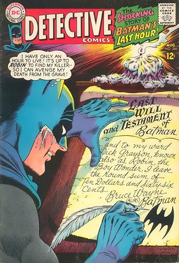
Infantino’s covers are just as great as his interior art. Take the cover to Batman 184. Comic book cover art at the time would generally highlight a crazy situation from a story within, leaving readers to ponder just how such a thing could happen. This particular cover has a black background with stark horror-esque lettering. The faces of Batman and Robin are covered in cobwebs, with these words on either side: “Where are Batman and Robin?” And then, at the bottom: “Not even they know!” It’s creepy and striking; how could you not want to know what happens? I could go on about covers, but this is one of my favorites.
As for the stories themselves, they certainly have a more detective-in-Gotham feel. Right out to gate, in “Mystery of the Menacing Mask” from Detective 327, Batman and Robin investigate criminal activity in a run-down neighborhood. Some of the early stories have zany villains, like Weather Wizard (a Flash nemesis), Make-Up Man, and Bouncer. There’s also a mind-controlling gorilla and an excursion to an elephant graveyard. But for the most part, the Dynamic Duo face straightforward criminals. And the stories are decent.
Because Infantino’s tenure on Detective Comics coincided with the 1966-1968 TV show, his comics inevitably reflected the series. We get the first “holy” on the cover of Batman 183 (“Holy Emergency!”). And of course, the comics couldn’t escape the amplified sound effects that the show unashamedly utilized. In earlier Silver and Golden Age issues I’ve read, sound effects were mostly inked in black and took up little panel space. But here, we get words like “Kzowie”, “Whap”, and “Krak” – large, in charge, and in color. For better or worse. I think it’s interesting that elements of the show crept into the comics, which the show was itself adapting.
Infantino co-created the iconic Barbara Gordon (Batgirl) during this time period. Betty Kane, the previous Batgirl, was discarded when the “New Look” era began. Infantino’s costume design for the new Batgirl is stellar: the dark purple suit with yellow detail and red hair is just a cool look. Her skills as a librarian and familial ties to a certain police commissioner make her all the more interesting. I loved her first issue. Despite Batman’s initial dismissal of Batgirl, she more than proves herself capable as a crime-fighter, taking on Killer Moth and saving The Dynamic Duo from his clutches.
Also included in this collection are Batman stories Infantino came back to draw during the early 1980s, plus a special from 2004. The 80s ones, four of which come from the team-up series The Brave and the Bold, see Infantino drawing characters he regularly drew during the Silver Age, like Flash and Adam Strange. “What Happens When a Batman Dies?” from Batman 500 is a superb and emotional story, heightened by pitch-perfect penciling. There’s a sequence in this story where Bruce Wayne speaks with his parents that will likely remain one of my favorite Batman moments.
The Dark Knight’s revitalization in the 1960s owes a lot to Carmine Infantino. He drew Batman at a time when the character became a TV icon, and helped set the stage for the show’s success with his designs and stories. Infantino’s contributions cannot be overlooked when talking about this, or subsequent eras, of Batman.
Stray observations:
There are two team-up issues with Elongated Man, another Infantino creation. Elongated Man (Ralph Dibny) began having backup stories in Detective when Infantino came on board. It made perfect sense to have him team up with Batman and Robin, and the stories where they do are a lot of fun.
While popular villains of the TV series like Joker, Catwoman, Riddler, and Penguin don’t appear in any of the 1960s stories in this book, it’s my understanding that they showed up in other issues of Detective Comics and Batman.
Ever hear of Aunt Harriet? She worked at Wayne Mansion during this time period. Although, unlike Alfred, she’s not hip to Mr. Wayne’s and Mr. Grayson’s crimefighting identities.
Cluemaster, Blockbuster, and General von Dort are other villains co-created by Infantino to appear in this book.
This is the first time I’m seeing artists formally credited on a Batman comic book. I’m not sure when this started, but it’s great to finally see.
A few choice quotes from this collection:
"Out of the moon-bathed shadows hurtles the dark form of Batman, cloak flying, mighty fists clenched to strike a blow for law and order.”
Robin: “Neat-o, Batgirl! You ought to call that your bat-back break-away flip!”
“You don’t have to play, Batman! Nothing says you have to do it!” “The decision was made a long time ago, Lt. Hansen, the first time I put on this cowl.”
DNF, maybe I'll finish it another day, but even though I really enjoyed the first story, after that I kept having to look at covers for stories that actually sounded interesting and every time I saw a cover that made me think "I hope that's just a cover" I'd have to read the story.
I read this very quickly. A lot of the stories are reasonably mediocre in terms of the writing and I was concerned I might get bogged down in it, and yet I had a blast blasting through it. Strange how this happens. Carmine Infantino's art on Batman is quite lovely. it's just a shame he doesn't get his dues so much now because it's from an era where Batman stories are considered, still, to be a little silly and yes they are somewhat throwaway, although contrary to popular belief they aren't all WHAM, POW ZAP inline with the TV show; despite a lightness of tone there's a very distinct look and feel to these comics that went down a slightly different route. At it's best it's pure children's pulp at its finest. I enjoyed Castle of Danger, for instance - which is exactly as you'd think it is, - Batman going on a hunt for an elephant, or the neanderthal man who gained powers being frozen in a block of ice. It's wacky but compelling. There are a few good tales from the 80s here, as well, in particular one where Batman has to team up with the Riddler to follower a mysterious trail of clues.
The real star, though, is Infantino's cover art. Every Batman cover he drew (and many more are included that we don't get the contents for, sadly) is not just exquisitely balance, but tells its own story and teases the events of the issue inside with some extraordinary imagery.
Not gonna rate it, 'cause I didn't really give it my full attention. But I am nostalgic about the '64-'68 "new look" Batman (soon to be displaced by the Denny O'Neill return to a grittier Batman). This was before my time, but a lot of sixties DC was around in the seventies for kids who loved comics. This story haunted me:
... Because for years, I only had part one of the story, and didn't know the clue in the Last Will and Testament. (Spoiler: the whole thing is super silly.)
Also of note, of course, is the "new look" Batgirl, whose creator ( or is it co-creator?) was, wait for it, Carmine Infantino.