

What do you think?

Salvage: A Graphic Novel
In this heartwarming graphic novel romance from the adaptor and illustrator of The Handmaid’s The Graphic Novel, two young artists' paths intertwine as they navigate the complexities of love in a world where sea levels have risen and society is sharply divided.
Paolo lives in the Flats, a dangerous, water-logged community where families survive by salvaging materials from skyscrapers hidden just beneath the ocean’s surface—remnants of a world before sea levels rose. Scavenging the depths comes with its risks, but when Paolo discovers a suitcase of designer clothes, he decides to fulfill his To spend one night in the Uplands, a place of privilege, excess, and freedom. There he meets Jules and her friends, and what begins as a single night of reckless adventure turns into a secret double life—and a seemingly impossible romance that forces Paolo to reckon with who he is, where he belongs, and the importance of being honest.
Rendered in vibrant watercolor illustrations that bring every scene to vivid life, Salvage is as much a visual masterpiece as it is a moving tale of love and self-discovery. Renée Nault’s atmospheric and luminous hand-painted art draws readers into Paolo and Jules’ world, promising an unforgettable coming of age story.
Paolo lives in the Flats, a dangerous, water-logged community where families survive by salvaging materials from skyscrapers hidden just beneath the ocean’s surface—remnants of a world before sea levels rose. Scavenging the depths comes with its risks, but when Paolo discovers a suitcase of designer clothes, he decides to fulfill his To spend one night in the Uplands, a place of privilege, excess, and freedom. There he meets Jules and her friends, and what begins as a single night of reckless adventure turns into a secret double life—and a seemingly impossible romance that forces Paolo to reckon with who he is, where he belongs, and the importance of being honest.
Rendered in vibrant watercolor illustrations that bring every scene to vivid life, Salvage is as much a visual masterpiece as it is a moving tale of love and self-discovery. Renée Nault’s atmospheric and luminous hand-painted art draws readers into Paolo and Jules’ world, promising an unforgettable coming of age story.
256 pages, Paperback
First published July 21, 2026
About the author
Renée Nault
9 books170 followersRenee Nault is a Canadian artist, illustrator, and graphic novelist. She is known for her vivid watercolor and ink illustrations. Her work has appeared in books, magazines, newspapers and advertising around the world.
Ratings & Reviews
Friends & Following
Create a free account to discover what your friends think of this book!
Community Reviews
Displaying 1 - 30 of 119 reviews
April 2, 2026
SUCH A GOOD COMIC BOOK INSTANT 5 STARS
March 16, 2026
Thank you to NetGalley and the publisher for giving me an ARC of this graphic novel in exchange for an honest review!
4.5 stars. This was so cute!
The art style was phenomenal. It was so unique. I loved the colors that were used.
The characters were so distinct. I loved the friendships they each shared with each other.
I would definitely read more in this world! It was set up very well how the Flats and the Uplands people lived.
I loved Paolo and instantly connected with him. Kappa was great too! Even Paolo’s parents were cool, even if they weren’t the main focus.
Felix was my favorite of the Uplands friend group, but I liked them all! Felix was the funniest and the nicest. I really liked how their friendship was believable. You could tell how much they liked each other. Even the group introducing Paolo into their friend group, we saw them hang out a little bit, but even without going super in depth you could tell their friendship was real.
Paolo and Jules’ relationship was cute too. It wasn’t my favorite part of the novel, but they were still sweet. I was angry with her for posting the picture of Paolo because that just seemed overly cruel, especially for how mean everyone was to him in the comments. But Paolo shouldn’t have lied either! So I get how she would feel betrayed.
It had a great little message too. I liked how it talked about how art was important, and just because people live differently doesn’t mean you can’t get along or are stuck in one place forever.
This graphic novel tied together really nicely. I really would love to see more of these characters!
4.5 stars. This was so cute!
The art style was phenomenal. It was so unique. I loved the colors that were used.
The characters were so distinct. I loved the friendships they each shared with each other.
I would definitely read more in this world! It was set up very well how the Flats and the Uplands people lived.
I loved Paolo and instantly connected with him. Kappa was great too! Even Paolo’s parents were cool, even if they weren’t the main focus.
Felix was my favorite of the Uplands friend group, but I liked them all! Felix was the funniest and the nicest. I really liked how their friendship was believable. You could tell how much they liked each other. Even the group introducing Paolo into their friend group, we saw them hang out a little bit, but even without going super in depth you could tell their friendship was real.
Paolo and Jules’ relationship was cute too. It wasn’t my favorite part of the novel, but they were still sweet. I was angry with her for posting the picture of Paolo because that just seemed overly cruel, especially for how mean everyone was to him in the comments. But Paolo shouldn’t have lied either! So I get how she would feel betrayed.
It had a great little message too. I liked how it talked about how art was important, and just because people live differently doesn’t mean you can’t get along or are stuck in one place forever.
This graphic novel tied together really nicely. I really would love to see more of these characters!

Review of advance copy received from NetGalley
Classic social divide love story set in futuristic world.
Lots of great things, such as the beautiful drawings, the bright colours, the environmental aspect, the art talks, the friendships, the good intentions all around.
A few not great things, the relationships and plot is a little simple, I think this is definitly YA more than new adult and I don't particularly like the "poor communication" plots so I found that a little frustrating.
But this is a fast and pleasant read, perfect for teens searching for themselves and looking for their place in the world.
Lots of great things, such as the beautiful drawings, the bright colours, the environmental aspect, the art talks, the friendships, the good intentions all around.
A few not great things, the relationships and plot is a little simple, I think this is definitly YA more than new adult and I don't particularly like the "poor communication" plots so I found that a little frustrating.
But this is a fast and pleasant read, perfect for teens searching for themselves and looking for their place in the world.
March 6, 2026
Thank you NetGalley for this graphic novel the colorful cover really caught my eye and I didn’t read synopsis before requesting and im glad I didn’t because i really enjoyed this book and the artwork this novel follows 2 characters but mostly our main character and the life he lives down below and how people make ends meet and community and then we have his love interest who he meets when he travels to the other place ABOVE from them which is definitely more advanced and more privileged then the town we see our main lead in and then we see him catch feelings and her catch feelings however she doesn’t know that he’s from down under basically and its very looked down upon and people are very rude about it and so we just see him come up to her town and stuff and making friends and also some people in his town feeling betrayed because he’s going up there more and not being around much i thought the colorful artwork in the other town was BEAUTIFUL and so pigmented with so many artsy colors and i enjoyed the artwork from his town as well and the characters overall it was a great graphic novel!
August 16, 2026
Visually stunning, but I feel like it missed its own point? In this story, sea levels have risen and the city we explore here has recreated wealth disparity in its construction, but with scifi twists. A kid from the outer edges of society, a town literally built on nothing that floats at the edges of the town, makes friends with a group of extremely wealthy, spoiled/jaded teens.
There’s a place in here where a side character points out that the wealthy elite of the city have continues the behaviors of extraction and overconsumption that got the world to this point in the first place. And yet, none of this seems to matter. This is never addressed. The story seems to treat human connection between people living in extreme wealth and those living in poverty as being something that’s canceled out my the power of friendship. It’s a weirdly privileged hot take that seems to ignore its own core thesis. I could go on but I’ll just get into the weeds.
The art is fantastic, and I lined what the author seemed to be trying to do. I just didn’t think the themes and implications were fully thought out.
There’s a place in here where a side character points out that the wealthy elite of the city have continues the behaviors of extraction and overconsumption that got the world to this point in the first place. And yet, none of this seems to matter. This is never addressed. The story seems to treat human connection between people living in extreme wealth and those living in poverty as being something that’s canceled out my the power of friendship. It’s a weirdly privileged hot take that seems to ignore its own core thesis. I could go on but I’ll just get into the weeds.
The art is fantastic, and I lined what the author seemed to be trying to do. I just didn’t think the themes and implications were fully thought out.
September 15, 2026
5 stars for the absolutely gorgeous art, 3 stars for the story. Even taking into account that this was a ya graphic novel, I found the 'solution' overly simplistic. There's no real resolution to the differences between Paolo and Jules and the power of love or friendship wasn't enough for me to cancel out the divide. Also: consumerism caused the big flood that destroyed all the houses and resulted in people living in the Flatlands. The fact that Jules, her friends and everyone else living in the big city just continued that life was never addressed, which was a missed opportunity, in my opinion. But again: the art was beautiful.

August 15, 2026
Beautiful. I could go for another 200 pages.
September 16, 2026
Loved the watercolor artwork and storyline. Super immersive I wanna visit the uplands and the flats


September 1, 2026
In a futuristic world with wide class divides our young protagonist wants to escape his low existence but finds the same human struggles on the other side.
March 28, 2026
Received an early copy from Net Galley! Really enjoyed it. A classic story of falling for someone you shouldn’t. But the world was intriguing, the characters interesting and the art beautiful. I have so many questions for this world and hope to see more of it!
Review of advance copy received from NetGalley
From working on the graphic novel adaptation of Margaret Atwood's The Handmaid's Tale, Renée Nault imagines an alternate dystopia, one where sea level elevation only exacerbated class inequalities but where love can still bridge differences.
Salvage: A Graphic Novel brings us to a world deeply divided by a climate catastrophe. The sea level has now overtaken skyscrapers, leaving fewer lands habitable to the world population. Climate refugees from diverse origins settled on coastal communities raised on shallow seawaters called the “Flats”, similar to the communities in Sulu and Tawi-Tawi, Philippines. They live on salvaging valuables from the cities that have become submerged underwater and selling them on weekly market days. We meet the protagonist Paolo here, a dutiful son and great artist with big dreams.
On the other hand, the “Uplands” is home to buildings unaffected by water, where social media influencers – somehow still a thing – are basically running the world as their opinions can make or break businesses. Enter our other protagonist who’s an artist as well: Jules, daughter to a famous actress slash absentee mother. Jules finds companionship with other ‘influencers’, some also children of already established names in culture and entertainment.
Their worlds meet when Paolo, on a regular diving expedition, finds a vintage jacket from the old world. Vintage items in good condition are scarce and are treated as a class symbol. He sneaks out to the Uplands, using his new-old jacket as a shield to blend in without raising suspicion, and runs into Jules’ friend group where he is accepted as the newest member. With this, he creates a double life: his regular routine in the morning then his newly-found city life overnight. When Paolo and Julie start to develop feelings for each other, the risk of Paolo getting caught only increased exponentially.
Salvage features magnificent vivid hand-painted watercolor visuals that elevated the story in many ways. My favorite details are the differences between the art style in depicting the Flats and the Uplands. The Flats, as we typically see in day time, is colored in a solid teal-red-orange palette while the Uplands is bathed in artificial, bright, fluid neons. As Paolo goes back and forth between these two worlds, Nault masterfully utilizes these differences to add subtext to his state of mind.
The author chose to not reveal everything in this world so in my mind there are still many questions including: How does the production of necessities function if most of the world, presumably including flat farmlands, are already underwater? If the ultra-wealthy still exist without having to worry about manual labor, where does the wealth come from? The Flats and the Uplands are the extremes of society so what does life look like for those in between? Despite these ambiguities, I still really love the thought and creativity put into illustrating the pages that made both of the worlds feel alive and dynamic. All details from the diverse locations to the wardrobe of filler characters are well thought of.
The romance, under the trope tradition of cross-class love, is well developed as the graphic novel dedicated a large portion of the page count to show what Paolo and Julie like about each other and their eventual special companionship. This is why I couldn’t look past the weakness of the conflict resolution where it felt like Paolo had more to compensate for despite both of them having faults to each other.
While the ending resolved everything nicely, I still felt like there was another, better way to show how two people can reconcile their differences that felt fair to both characters.
In the end, Salvage is a beautiful post-apocalyptic, cross-class romance that is elevated by its mesmerizing art that features its well-developed world but is slightly brought down by how it resolves its central conflict. Nevertheless, I would still recommend Salvage to fans of the medium and genre and will be on the lookout for more of Renee Nault’s art.
Thanks to NetGalley and Ten Speed Graphic for an e-copy of the book in exchange of a review.
Salvage: A Graphic Novel brings us to a world deeply divided by a climate catastrophe. The sea level has now overtaken skyscrapers, leaving fewer lands habitable to the world population. Climate refugees from diverse origins settled on coastal communities raised on shallow seawaters called the “Flats”, similar to the communities in Sulu and Tawi-Tawi, Philippines. They live on salvaging valuables from the cities that have become submerged underwater and selling them on weekly market days. We meet the protagonist Paolo here, a dutiful son and great artist with big dreams.
On the other hand, the “Uplands” is home to buildings unaffected by water, where social media influencers – somehow still a thing – are basically running the world as their opinions can make or break businesses. Enter our other protagonist who’s an artist as well: Jules, daughter to a famous actress slash absentee mother. Jules finds companionship with other ‘influencers’, some also children of already established names in culture and entertainment.
Their worlds meet when Paolo, on a regular diving expedition, finds a vintage jacket from the old world. Vintage items in good condition are scarce and are treated as a class symbol. He sneaks out to the Uplands, using his new-old jacket as a shield to blend in without raising suspicion, and runs into Jules’ friend group where he is accepted as the newest member. With this, he creates a double life: his regular routine in the morning then his newly-found city life overnight. When Paolo and Julie start to develop feelings for each other, the risk of Paolo getting caught only increased exponentially.
Salvage features magnificent vivid hand-painted watercolor visuals that elevated the story in many ways. My favorite details are the differences between the art style in depicting the Flats and the Uplands. The Flats, as we typically see in day time, is colored in a solid teal-red-orange palette while the Uplands is bathed in artificial, bright, fluid neons. As Paolo goes back and forth between these two worlds, Nault masterfully utilizes these differences to add subtext to his state of mind.
The author chose to not reveal everything in this world so in my mind there are still many questions including: How does the production of necessities function if most of the world, presumably including flat farmlands, are already underwater? If the ultra-wealthy still exist without having to worry about manual labor, where does the wealth come from? The Flats and the Uplands are the extremes of society so what does life look like for those in between? Despite these ambiguities, I still really love the thought and creativity put into illustrating the pages that made both of the worlds feel alive and dynamic. All details from the diverse locations to the wardrobe of filler characters are well thought of.
The romance, under the trope tradition of cross-class love, is well developed as the graphic novel dedicated a large portion of the page count to show what Paolo and Julie like about each other and their eventual special companionship. This is why I couldn’t look past the weakness of the conflict resolution where it felt like Paolo had more to compensate for despite both of them having faults to each other.
While the ending resolved everything nicely, I still felt like there was another, better way to show how two people can reconcile their differences that felt fair to both characters.
In the end, Salvage is a beautiful post-apocalyptic, cross-class romance that is elevated by its mesmerizing art that features its well-developed world but is slightly brought down by how it resolves its central conflict. Nevertheless, I would still recommend Salvage to fans of the medium and genre and will be on the lookout for more of Renee Nault’s art.
Thanks to NetGalley and Ten Speed Graphic for an e-copy of the book in exchange of a review.

Review of advance copy received from NetGalley
“I was so jealous of you guys. But it wasn’t ever really about clothes and parties. It was because…because it’s like there’s a shorter gap between you and your dreams. You get what I mean, right? You and me…we don’t live in the same world.”
In a post-climate-change world, there are two kinds of people: those who live in the Uplands—the expensive postmodern world filled with bright lights, parties, and everything you can possibly imagine—and those who don’t. Beyond the Uplands, there are the Flats—a village on stilts, built on the remains of the drowned world. It’s in these Flats that Paolo helps his parents by swimming through the wreckage and salvaging any “vintage” items to sell to the Uplanders. On one such trip, he finds clothes that will help him blend right in with the Uplanders. His curiosity and his dreams of being a painter get the better of him. In Paolo’s mind, the only way to experience the Uplands is to become one of them. It’s there that he meets new friends, including Jules, a beautiful but shy artist who opens the Upland-world to Paolo. The seductive Uplands change Paolo, and as he gets closer to Jules, she gets closer to the truth. Because, despite every effort, sometimes you can’t hide where you come from.
I don’t read many graphic novels, but I really enjoyed this one. The way Renée Nault built this world—both through dialogue and imagery—was spectacular. There was a vastness to Salvage, yet it was defined by two main characters and the goings-on in their lives. Jules and Paolo were great characters; their romance was so sweet, and the discourse throughout the novel about poverty and dreams was so interesting. In the past, whenever I’ve read graphic novels, I’ve flown through the story, and there hasn’t been much depth. This wasn’t true for Salvage. Beyond the star-crossed lovers’ romance, there was commentary on poverty, climate change, and how these factors impact people’s dreams, specifically the dream of becoming an artist. It added so much to the story that I just gobbled it up. It was also intriguing because of the color design between the characters and the world. The Flats were muted tones mixed with greens and such, whereas the Uplands literally embodied bright light, big city. Overall, a great read, and I honestly would recommend it to both veteran graphic novel readers and those just starting out with the format.
Salvage releases on July 21st, 2026.
Pine Reads Review would like to thank NetGalley, and Ten Speed Graphic for sending us an ARC in exchange for an honest review. Any quotes are taken from an advanced copy and may be subject to change before final publication.
Follow us on Instagram, Twitter, TikTok, and Facebook @pinereadsreview, and check out our website at www.pinereadsreview.com for reviews, author interviews, blogs, podcast episodes, and more!
In a post-climate-change world, there are two kinds of people: those who live in the Uplands—the expensive postmodern world filled with bright lights, parties, and everything you can possibly imagine—and those who don’t. Beyond the Uplands, there are the Flats—a village on stilts, built on the remains of the drowned world. It’s in these Flats that Paolo helps his parents by swimming through the wreckage and salvaging any “vintage” items to sell to the Uplanders. On one such trip, he finds clothes that will help him blend right in with the Uplanders. His curiosity and his dreams of being a painter get the better of him. In Paolo’s mind, the only way to experience the Uplands is to become one of them. It’s there that he meets new friends, including Jules, a beautiful but shy artist who opens the Upland-world to Paolo. The seductive Uplands change Paolo, and as he gets closer to Jules, she gets closer to the truth. Because, despite every effort, sometimes you can’t hide where you come from.
I don’t read many graphic novels, but I really enjoyed this one. The way Renée Nault built this world—both through dialogue and imagery—was spectacular. There was a vastness to Salvage, yet it was defined by two main characters and the goings-on in their lives. Jules and Paolo were great characters; their romance was so sweet, and the discourse throughout the novel about poverty and dreams was so interesting. In the past, whenever I’ve read graphic novels, I’ve flown through the story, and there hasn’t been much depth. This wasn’t true for Salvage. Beyond the star-crossed lovers’ romance, there was commentary on poverty, climate change, and how these factors impact people’s dreams, specifically the dream of becoming an artist. It added so much to the story that I just gobbled it up. It was also intriguing because of the color design between the characters and the world. The Flats were muted tones mixed with greens and such, whereas the Uplands literally embodied bright light, big city. Overall, a great read, and I honestly would recommend it to both veteran graphic novel readers and those just starting out with the format.
Salvage releases on July 21st, 2026.
Pine Reads Review would like to thank NetGalley, and Ten Speed Graphic for sending us an ARC in exchange for an honest review. Any quotes are taken from an advanced copy and may be subject to change before final publication.
Follow us on Instagram, Twitter, TikTok, and Facebook @pinereadsreview, and check out our website at www.pinereadsreview.com for reviews, author interviews, blogs, podcast episodes, and more!

Review of advance copy received from NetGalley
This isn’t Renee Nault’s first work, so I really shouldn’t be surprised that it was so great, but it is her first solo graphic novel and I wasn’t expecting to be so thoroughly blown away by both the stunning artwork and the amazing story.
Nault’s style is gorgeous hand-painted watercolor illustrations that you can *feel* emotion and warmth (and its absence, in some scenes) from, even in its digital format. To be able to convey the soul of a work regardless of the format takes a level of skill that is admirable. What is even more admirable are the levels of poignant social commentary Nault was able to weave into the story without it feeling preachy or forced. Truthfully, I would love to see this graphic novel used in schools because a lot of the social issues were stark lessons, but packaged in a pretty art form, in an easy-to-understand way. There were great messages about things like class disparities and how (projected) public perception and wealth don’t matter in the grand scheme of things, nor do they guarantee happiness. There were also lessons in friendship and the importance of apologies and owning up to your mistakes, as well as sticking by the people that show they care about you. There was a romance subplot tied into the coming-of-age plot too, of course, but it felt like their friendship was the more important part of their blossoming relationship — which I think is so important in YA stories.
I loved that there were so many creatives in their friend group and that they were all so supportive of each other. There was such a heavy emphasis on art being valuable and meaningful even if it wasn’t marketable/sellable, which I think is a crucial message right now when hustle culture has taken over so thoroughly and so many people think its a waste of time if you can’t make money off it. The way Nault frames their conversations about art felt like she was speaking artist to artist, like a friend gently reminding you that what you create is important; I felt very seen (which might seem like a silly thing to say about a YA comic, but if you get it, you get it).
I thoroughly enjoyed this graphic novel and I hope that it is well-received and gets the attention that it deserves. Thank you to Netgalley, and the publishers, for the advanced copy! 💙
Nault’s style is gorgeous hand-painted watercolor illustrations that you can *feel* emotion and warmth (and its absence, in some scenes) from, even in its digital format. To be able to convey the soul of a work regardless of the format takes a level of skill that is admirable. What is even more admirable are the levels of poignant social commentary Nault was able to weave into the story without it feeling preachy or forced. Truthfully, I would love to see this graphic novel used in schools because a lot of the social issues were stark lessons, but packaged in a pretty art form, in an easy-to-understand way. There were great messages about things like class disparities and how (projected) public perception and wealth don’t matter in the grand scheme of things, nor do they guarantee happiness. There were also lessons in friendship and the importance of apologies and owning up to your mistakes, as well as sticking by the people that show they care about you. There was a romance subplot tied into the coming-of-age plot too, of course, but it felt like their friendship was the more important part of their blossoming relationship — which I think is so important in YA stories.
I loved that there were so many creatives in their friend group and that they were all so supportive of each other. There was such a heavy emphasis on art being valuable and meaningful even if it wasn’t marketable/sellable, which I think is a crucial message right now when hustle culture has taken over so thoroughly and so many people think its a waste of time if you can’t make money off it. The way Nault frames their conversations about art felt like she was speaking artist to artist, like a friend gently reminding you that what you create is important; I felt very seen (which might seem like a silly thing to say about a YA comic, but if you get it, you get it).
I thoroughly enjoyed this graphic novel and I hope that it is well-received and gets the attention that it deserves. Thank you to Netgalley, and the publishers, for the advanced copy! 💙

September 8, 2026
This review was posted on Young Creative Press if you like this review check out my other reviews and posts at youngcreativepress.com
Salvage is a beautiful graphic novel about discovering being true to yourself and finding friends that care for you no matter what – it’s a lovely story, but I read it weeks ago and failed to make any review notes (typical) so bare with me.
I wasn’t expecting to enjoy Salvage quite as much as I did. I knew it would come with miscommunication due to Paolo hiding his true identity, but I actually didn’t mind it. He had good reason to hide that he’s from the Flats. Prejudice against everyone that lives there has him worried about not fitting in with his new friends, which yeah you shouldn’t feel the need to hide who you are, but don’t worry, everything sorts itself out in the end. I won’t say much more as I don’t want to spoil the story.
The art style of Salvage is a gorgeous watercolour. I loved how when Paolo was in the Flats the colours were, well flat. Whereas when he arrives in the Uplands, the colours burst into life and everything becomes more vibrant. This was a very nice distinction that told you where you were without actually having to tell you.
The character designs were also very fun. Each character had unique features and they changed their hair and clothes every time you saw them. Other than Paolo who only had one set of designer clothes for wearing in the Uplands.
One part of Salvage that I wasn’t sold by was the romance. It’s obvious from the get-go that Paolo and Jules were written to be a romance but I wasn’t quite convinced. I think they had the solid beginnings of a romance, but I was enjoying watching their friendship grow first. Their shared love of art is what built their connection but the constant lies made it difficult to root for their relationship.
I do like that these characters felt real though. They’re all flawed, and aware of it, and these shades of grey are what made them interesting.
I’d highly recommend checking out Salvage. It’s a stunning graphic novel with a compelling story.
Salvage is a beautiful graphic novel about discovering being true to yourself and finding friends that care for you no matter what – it’s a lovely story, but I read it weeks ago and failed to make any review notes (typical) so bare with me.
I wasn’t expecting to enjoy Salvage quite as much as I did. I knew it would come with miscommunication due to Paolo hiding his true identity, but I actually didn’t mind it. He had good reason to hide that he’s from the Flats. Prejudice against everyone that lives there has him worried about not fitting in with his new friends, which yeah you shouldn’t feel the need to hide who you are, but don’t worry, everything sorts itself out in the end. I won’t say much more as I don’t want to spoil the story.
The art style of Salvage is a gorgeous watercolour. I loved how when Paolo was in the Flats the colours were, well flat. Whereas when he arrives in the Uplands, the colours burst into life and everything becomes more vibrant. This was a very nice distinction that told you where you were without actually having to tell you.
The character designs were also very fun. Each character had unique features and they changed their hair and clothes every time you saw them. Other than Paolo who only had one set of designer clothes for wearing in the Uplands.
One part of Salvage that I wasn’t sold by was the romance. It’s obvious from the get-go that Paolo and Jules were written to be a romance but I wasn’t quite convinced. I think they had the solid beginnings of a romance, but I was enjoying watching their friendship grow first. Their shared love of art is what built their connection but the constant lies made it difficult to root for their relationship.
I do like that these characters felt real though. They’re all flawed, and aware of it, and these shades of grey are what made them interesting.
I’d highly recommend checking out Salvage. It’s a stunning graphic novel with a compelling story.
Review of advance copy received from NetGalley
2026 reading challenge category: A book in a different format than your usual
Thank you to Ten Speed Graphic & NetGalley for the ARC.
What a lovely debut graphic novel! The story is a fairly simple YA one of two teens from what seems like different worlds (figuratively speaking; they are very much in the same literal world) meeting and falling in love while both holding back from each other at the same time. But the world design, with the Flats and the Uplands, is beautiful. It's a setting that is very obviously impacted by the climate crisis and could maybe even be called post-apocalyptic? But there is a very distinct social and geographical divide between the "haves" and the climate refugee "have nots." There are two distinct color palettes used for these different areas which works so well; the Flats, while less privileged, has a beautiful warm-toned palette that evokes the sense of community the people there share, while the Uplands are bright and vibrant but also colder in color tones. I loved the art and character design overall, but I found the color palette selection in particular so striking and perfect that I think it's worthy of a specific call-out. Nault has some notes on the art at the end, none of which I found surprising but all of which I thought were a lovely glimpse into her thought process in designing these characters and this version of the world. There were a few sections where I found the panel layout a bit confusing in relation to how the dialogue was flowing and had to go back figure out how it was actually supposed to go. But overall I found this really enjoyable and I think it's a great entry for her into the original graphic novel space. I would recommend this to people who liked the setting of The Morningside (there is no plot similarity, but definite setting vibes) and to those who have been waiting literal years for the next panel of the Everblue webcomic.
Thank you to Ten Speed Graphic & NetGalley for the ARC.
What a lovely debut graphic novel! The story is a fairly simple YA one of two teens from what seems like different worlds (figuratively speaking; they are very much in the same literal world) meeting and falling in love while both holding back from each other at the same time. But the world design, with the Flats and the Uplands, is beautiful. It's a setting that is very obviously impacted by the climate crisis and could maybe even be called post-apocalyptic? But there is a very distinct social and geographical divide between the "haves" and the climate refugee "have nots." There are two distinct color palettes used for these different areas which works so well; the Flats, while less privileged, has a beautiful warm-toned palette that evokes the sense of community the people there share, while the Uplands are bright and vibrant but also colder in color tones. I loved the art and character design overall, but I found the color palette selection in particular so striking and perfect that I think it's worthy of a specific call-out. Nault has some notes on the art at the end, none of which I found surprising but all of which I thought were a lovely glimpse into her thought process in designing these characters and this version of the world. There were a few sections where I found the panel layout a bit confusing in relation to how the dialogue was flowing and had to go back figure out how it was actually supposed to go. But overall I found this really enjoyable and I think it's a great entry for her into the original graphic novel space. I would recommend this to people who liked the setting of The Morningside (there is no plot similarity, but definite setting vibes) and to those who have been waiting literal years for the next panel of the Everblue webcomic.

Review of advance copy received from Netgalley
This was my first time reading a graphic novel on NetGalley, which caught my attention while scrolling because of its cover. Art is an important theme in Salvage, both for the plot and the book itself. It is beautiful and eye-catching and made me appreciate the panels for longer. However, what gave Salvage its charm and wonder was the use of colour. The first thing I noticed when I started reading was how the colours changed depending on which of the two main characters, Paolo and Jules, you were looking at, affecting them and their surroundings.
Although I found the overall story predictable, Salvage still gives an important message about society and its people. From what I understand, the story is set in the future, yet it shows how everything is different, yet the same, including mankind—each person’s family dramas, our friendships, how we judge others, our need for the latest brands, and how we treat our environment.
Throughout the story, Paolo joins Jules and her friends in visiting all kinds of otherworldly places full of colour, activities, food, and opportunities to explore. However, as the author says at the end of the book, if you look closely at the panels with views of the city, you’ll see that it’s not that much different from ours today. Another example is the extremely small number of animals and greenery that there actually is, showing the results of how we treat the environment.
The only negative points I have about Salvage are how predictable the plot is and how, although understandable, Paolo kept the truth from his friends, which is something I always find frustrating.
Even though I loved many of the panels, the first one I admired was in the first chapter, where we see Paolo swimming for the first time. Seeing all the abandoned buildings we have today was what fascinated me the most. In general, the scenes of Paolo swimming were something I always enjoyed and would have loved to see more of, especially considering how swimming to salvage underwater scraps was the main way people in the Flats made money.
Although I found the overall story predictable, Salvage still gives an important message about society and its people. From what I understand, the story is set in the future, yet it shows how everything is different, yet the same, including mankind—each person’s family dramas, our friendships, how we judge others, our need for the latest brands, and how we treat our environment.
Throughout the story, Paolo joins Jules and her friends in visiting all kinds of otherworldly places full of colour, activities, food, and opportunities to explore. However, as the author says at the end of the book, if you look closely at the panels with views of the city, you’ll see that it’s not that much different from ours today. Another example is the extremely small number of animals and greenery that there actually is, showing the results of how we treat the environment.
The only negative points I have about Salvage are how predictable the plot is and how, although understandable, Paolo kept the truth from his friends, which is something I always find frustrating.
Even though I loved many of the panels, the first one I admired was in the first chapter, where we see Paolo swimming for the first time. Seeing all the abandoned buildings we have today was what fascinated me the most. In general, the scenes of Paolo swimming were something I always enjoyed and would have loved to see more of, especially considering how swimming to salvage underwater scraps was the main way people in the Flats made money.

Review of advance copy received from NetGalley
"Salvage" got my attention with its beautiful cover as much as the synopsis.
I requested it because Renée illustrated the graphic novel adaptation of The Handmaid's Tale. It was one of my best decisions because the art is not only gorgeous, but the way Renee uses colour to show us the character's inner world and emotions, and the background to give her character's more complexity and context is such an integral part of the storytelling and worldbuilding, and absolutely beautiful at the same time, even when what's happening is heartbreaking or tragic.
This is a very hopeful story due to it being YA, even if both characters have plenty of sadness in their lives, and a very triggering and heavy story since it can be shelved as climate fiction, and it is set in a not-too-distant future, and so everything that we see on page will probably happen soon, if it isn't already happening.
The character's youth, innocence and self-centredness protects them, and younger readers from understanding the scope of the tragedy, but the setting around them and more especially the little conversations the adults have on page, reveal a lot more about the state of the world, what was lost and the worse future ahead.
The book's focus on the younger characters, their hopes and dreams, and sense that things can get better if they believe in a better world and try to do something about it, even if it is finding small moments of happiness, allows it to end on a more optimistic if not happy note, but even then I really appreciated that throughout the story, even amongst the younger characters, there was a very stark difference in their personalities, ways they saw the world and their place in it depending on their class. This was a great analysis of privilege, economic disparity and discrimination and how all of those things affect people's day-to-day lives.
I can't wait to read more by Renée Nault.
Thank you to NetGalley, Clarkson Potter and Ten Speed Press for this DRC.
I requested it because Renée illustrated the graphic novel adaptation of The Handmaid's Tale. It was one of my best decisions because the art is not only gorgeous, but the way Renee uses colour to show us the character's inner world and emotions, and the background to give her character's more complexity and context is such an integral part of the storytelling and worldbuilding, and absolutely beautiful at the same time, even when what's happening is heartbreaking or tragic.
This is a very hopeful story due to it being YA, even if both characters have plenty of sadness in their lives, and a very triggering and heavy story since it can be shelved as climate fiction, and it is set in a not-too-distant future, and so everything that we see on page will probably happen soon, if it isn't already happening.
The character's youth, innocence and self-centredness protects them, and younger readers from understanding the scope of the tragedy, but the setting around them and more especially the little conversations the adults have on page, reveal a lot more about the state of the world, what was lost and the worse future ahead.
The book's focus on the younger characters, their hopes and dreams, and sense that things can get better if they believe in a better world and try to do something about it, even if it is finding small moments of happiness, allows it to end on a more optimistic if not happy note, but even then I really appreciated that throughout the story, even amongst the younger characters, there was a very stark difference in their personalities, ways they saw the world and their place in it depending on their class. This was a great analysis of privilege, economic disparity and discrimination and how all of those things affect people's day-to-day lives.
I can't wait to read more by Renée Nault.
Thank you to NetGalley, Clarkson Potter and Ten Speed Press for this DRC.
Review of advance copy received from NetGalley
2.75 ★
Thanks, NetGalley, for giving this to me!!!
It was cute, tho I believe the pacing was a bit off for this sort of story. We spend half the book establishing ambience, the two main characters barely talk, and after a few short encounters, they're head over heels for each other. Then, when the third-act breaking point comes, it leads to a lack of communication (even their friends tell them). On the brighter side, the art was stunning, the watercolour gave it such a good feel, especially with the coastal town and light-filled city. I really hope it gets a good quality print as it deserves. I found some speech bubbles reading order a bit messy, but the full art pages were stunning.
Now, since I'm not the biggest romance fan, I wanted to do a little spoiler area of plot stuff I find iffy.
SPOILERS AHEAD
Their relationship sprouted out of thin air to me. Half the book, and I was wondering when they'll address their feelings and how they'd build it. Took them a hot minute to just connect over their love of art. For then, the part that pissed me off, fell into a miscommunication, or lack of communication thereof. The characters were selfish, the lack of empathy from Paolo to his family and friends in his hometown, and from Jules to Paolo (girl, what do you mean you post the fact that he's poor even tho he's hardworking on a photo to humiliate him, then to fix it by exposing his art without his consent or knowledge to everyone??). I feel there should have been a bit more insight into their personal issues. Paolo's acceptance of his background and embrace of culture, and Jules fixing her trust issues (her mom was only addressed as a plot device without ever trying to fix their relationship).
I think a better distribution would have been better, with more time to address interpersonal issues and relationships outside their own.
Thanks, NetGalley, for giving this to me!!!
It was cute, tho I believe the pacing was a bit off for this sort of story. We spend half the book establishing ambience, the two main characters barely talk, and after a few short encounters, they're head over heels for each other. Then, when the third-act breaking point comes, it leads to a lack of communication (even their friends tell them). On the brighter side, the art was stunning, the watercolour gave it such a good feel, especially with the coastal town and light-filled city. I really hope it gets a good quality print as it deserves. I found some speech bubbles reading order a bit messy, but the full art pages were stunning.
Now, since I'm not the biggest romance fan, I wanted to do a little spoiler area of plot stuff I find iffy.
SPOILERS AHEAD
Their relationship sprouted out of thin air to me. Half the book, and I was wondering when they'll address their feelings and how they'd build it. Took them a hot minute to just connect over their love of art. For then, the part that pissed me off, fell into a miscommunication, or lack of communication thereof. The characters were selfish, the lack of empathy from Paolo to his family and friends in his hometown, and from Jules to Paolo (girl, what do you mean you post the fact that he's poor even tho he's hardworking on a photo to humiliate him, then to fix it by exposing his art without his consent or knowledge to everyone??). I feel there should have been a bit more insight into their personal issues. Paolo's acceptance of his background and embrace of culture, and Jules fixing her trust issues (her mom was only addressed as a plot device without ever trying to fix their relationship).
I think a better distribution would have been better, with more time to address interpersonal issues and relationships outside their own.
April 19, 2026
Salvage is a touching heartfelt story about two people that weren't meant to meet, but somehow did. And it changed both of their lives. And also of those around them.
I barely read the synopsis of the book because the cover and its elements was enough to intrigue me. I knew I would probably like the story not knowing what it would exactly be about. But we can see the theme of two different worlds, a separation, between a bright, visually dynamic, colorful up, and a blue darker, calmer, underwater down, and two characters that seem opposite.
"I know it's not an easy life here.
But we have every-thing we need.
And we take care of each other.
That's a lot. Don't you think ?"
This graphic novel is really beautiful. The artwork and illustrations are mastered, well executed. The drawing and colors are expressive and hold the ambiance, the context and the emotions in it.
Paolo is a diver, and he lives in the Flats. It's where the climate refugees ended up, right at the contact of water, barely above it. The residents built houses on stilts. Half of the time they are on boats.
Part of the inhabitants of Flats make a living by salvaging objects from the past. Relics made before the big flood. They dive, they recover, they clean and they sell it at the Vintage Market.
Paolo admires the Uplands that he sees a glimpse of through social media. And one day he decides to go there...
"It's pretty, isn't it ? It's hard to believe the whole world looked like this once. Things growing everywhere.
- Wait, what is this place ? It's amazing !
- Just a shortcut.
- Can anyone come here ? Like, anytime they want ?
- Sure, but it's just plants."
There's clearly a critic of this type of life of appearence. It seems fake and superficial for the reader, for an exterior eye. This upper society is focused on technology, fashion, experiences. Always changing. There's an excess of ressources. They live on social media, through social media. With their ridiculous rating system, and reviewing everything in a excessive way. I felt Black Mirror vibe from some scenes. If you know, you know.
While down there they lack of everything. Shelter, food, and safety.
"I mean... Art doesn't exist just to make money. It exists to make people feel things. To say all the things we can't say with words."
It's a criticism of overconsumption. People up there are following so many new trends that change every few days. The high speed of things, fashion, tech bars, artsy stuff, but everything is fake. (Kind of unauthentic. Meaningless). It's consumed just for fame, to be seen as cool and trendy.
It kind of reminded me of the elite of the Capitol from the Hunger Games.
"This is what I keep telling people - you gotta be prepared because no matter how clear the sky looks you just never know when something awful is going to happen."
I love how Renée Nault uses her colors when Paolo goes to the Uplands. There's a clear shift. Everything looks dreamy and vibrant. You feel like it's a very different world, almost unreal. Dreamlike. Intense. Almost artificial. Extravagant. Everything is extravagant and over the top up there. There's too much technology. Everything is done through connections. It's so easy to find a job. Poeple up there don't struggle to make ends meet. You have an interest in something ? Someone you know will pull some strings for you.
"I was so jealous of you guys. But it wasn't ever really about clothes and parties. It was because it's like there's a shorter gap between you and your dreams."
In contrast, when we go back to the Flats, the colors are more faded, brownish. You can almost smell the salted water, the humidity and the warmth of the sun. It looks more like real life. Where they really have to struggle to make ends meet, unlike up there.
I've learned to appreciate Jules as the story went on. She's a sensitive person, artsy and curious. Though she's also partially part of the product of the society she grew up in. Her mother, a very famous actress, is too absorbed by her work to really pay attention to her daughter. She lets her down, doesn't even know what her daughter likes, and Jules is kind of abandonned. She has anxiety, feeling the world is too much. Maybe that's what drives her to Paolo, now knowing why.
"Sometimes you can overwrite a bad memory with a good one."
At first, I had trouble getting into the story. I connected with Paolo more quickly than with the Highland characters. He felt more real, anchored in reality, relatable, like we could connect with him. Authentic. But the more I read the easier it got. I learned the challenges, the matters, the preoccupations of the different characters. Not only the main two, but also the people around them. The friends, the family, the group. They all have their own brighter side, positive input to bring.
I was truly charmed by our two main characters, Jules and Paolo. They are adorable. They carry the plot of this story. They bond over interests they have in common and... If you read Salvage you will see what more.
The storytelling is masterfully handled, seamlessly weaving together different points of view, the characters' memories and thoughts, and the present-day action. There's a lot of back and forth between the different point of view and it's very well done.
"I think art is how we show people who we really are. I mean, everyone's so focused on what we look like or how we talk or where we come from.
And they judge us based on that.
But when we make art--create things--it's like we can say, "You're wrong, this is me. The real me.""
The more I read, the more I realized that the Uplands reminded me of the Capitol from The Hunger Games. Not storywise but the aesthetics of these two worlds. The contrast between the over modern rich top and the simpler harder life of below. And their constant juxtaposition ultimately reminded me of the contrast between the Capitol and the poorest districts of Panem in The Hunger Games.
Moreover, just as I finished Salvage, the trailer for Sunrise on the Reaping was released just a few hours later. And yeah, now that I have seen it, there is that same game of contrasts to illustrate how opposite they are.
"Maybe it's all just random anyway, and the only place we belong is where we decide to be."
I really enjoyed reading Salvage. It's a nice story with beautiful artwork and well-crafted narration. I picked up a lot of quotes as I was going through the pages. It's a whole journey in which you feel a lot of emotions. It's serious, dark, funny, comforting, sad and hopeful. I do recommand reading it.
"Art should be seen by everyone.
It shouldn't just sit in the dark."
What a great piece of art Renée Nault created for her first original graphic novel !
Thank you to Ten Speed Graphic and Netgalley for the digital ARC in exchange for an honest review.
I barely read the synopsis of the book because the cover and its elements was enough to intrigue me. I knew I would probably like the story not knowing what it would exactly be about. But we can see the theme of two different worlds, a separation, between a bright, visually dynamic, colorful up, and a blue darker, calmer, underwater down, and two characters that seem opposite.
"I know it's not an easy life here.
But we have every-thing we need.
And we take care of each other.
That's a lot. Don't you think ?"
This graphic novel is really beautiful. The artwork and illustrations are mastered, well executed. The drawing and colors are expressive and hold the ambiance, the context and the emotions in it.
Paolo is a diver, and he lives in the Flats. It's where the climate refugees ended up, right at the contact of water, barely above it. The residents built houses on stilts. Half of the time they are on boats.
Part of the inhabitants of Flats make a living by salvaging objects from the past. Relics made before the big flood. They dive, they recover, they clean and they sell it at the Vintage Market.
Paolo admires the Uplands that he sees a glimpse of through social media. And one day he decides to go there...
"It's pretty, isn't it ? It's hard to believe the whole world looked like this once. Things growing everywhere.
- Wait, what is this place ? It's amazing !
- Just a shortcut.
- Can anyone come here ? Like, anytime they want ?
- Sure, but it's just plants."
There's clearly a critic of this type of life of appearence. It seems fake and superficial for the reader, for an exterior eye. This upper society is focused on technology, fashion, experiences. Always changing. There's an excess of ressources. They live on social media, through social media. With their ridiculous rating system, and reviewing everything in a excessive way. I felt Black Mirror vibe from some scenes. If you know, you know.
While down there they lack of everything. Shelter, food, and safety.
"I mean... Art doesn't exist just to make money. It exists to make people feel things. To say all the things we can't say with words."
It's a criticism of overconsumption. People up there are following so many new trends that change every few days. The high speed of things, fashion, tech bars, artsy stuff, but everything is fake. (Kind of unauthentic. Meaningless). It's consumed just for fame, to be seen as cool and trendy.
It kind of reminded me of the elite of the Capitol from the Hunger Games.
"This is what I keep telling people - you gotta be prepared because no matter how clear the sky looks you just never know when something awful is going to happen."
I love how Renée Nault uses her colors when Paolo goes to the Uplands. There's a clear shift. Everything looks dreamy and vibrant. You feel like it's a very different world, almost unreal. Dreamlike. Intense. Almost artificial. Extravagant. Everything is extravagant and over the top up there. There's too much technology. Everything is done through connections. It's so easy to find a job. Poeple up there don't struggle to make ends meet. You have an interest in something ? Someone you know will pull some strings for you.
"I was so jealous of you guys. But it wasn't ever really about clothes and parties. It was because it's like there's a shorter gap between you and your dreams."
In contrast, when we go back to the Flats, the colors are more faded, brownish. You can almost smell the salted water, the humidity and the warmth of the sun. It looks more like real life. Where they really have to struggle to make ends meet, unlike up there.
I've learned to appreciate Jules as the story went on. She's a sensitive person, artsy and curious. Though she's also partially part of the product of the society she grew up in. Her mother, a very famous actress, is too absorbed by her work to really pay attention to her daughter. She lets her down, doesn't even know what her daughter likes, and Jules is kind of abandonned. She has anxiety, feeling the world is too much. Maybe that's what drives her to Paolo, now knowing why.
"Sometimes you can overwrite a bad memory with a good one."
At first, I had trouble getting into the story. I connected with Paolo more quickly than with the Highland characters. He felt more real, anchored in reality, relatable, like we could connect with him. Authentic. But the more I read the easier it got. I learned the challenges, the matters, the preoccupations of the different characters. Not only the main two, but also the people around them. The friends, the family, the group. They all have their own brighter side, positive input to bring.
I was truly charmed by our two main characters, Jules and Paolo. They are adorable. They carry the plot of this story. They bond over interests they have in common and... If you read Salvage you will see what more.
The storytelling is masterfully handled, seamlessly weaving together different points of view, the characters' memories and thoughts, and the present-day action. There's a lot of back and forth between the different point of view and it's very well done.
"I think art is how we show people who we really are. I mean, everyone's so focused on what we look like or how we talk or where we come from.
And they judge us based on that.
But when we make art--create things--it's like we can say, "You're wrong, this is me. The real me.""
The more I read, the more I realized that the Uplands reminded me of the Capitol from The Hunger Games. Not storywise but the aesthetics of these two worlds. The contrast between the over modern rich top and the simpler harder life of below. And their constant juxtaposition ultimately reminded me of the contrast between the Capitol and the poorest districts of Panem in The Hunger Games.
Moreover, just as I finished Salvage, the trailer for Sunrise on the Reaping was released just a few hours later. And yeah, now that I have seen it, there is that same game of contrasts to illustrate how opposite they are.
"Maybe it's all just random anyway, and the only place we belong is where we decide to be."
I really enjoyed reading Salvage. It's a nice story with beautiful artwork and well-crafted narration. I picked up a lot of quotes as I was going through the pages. It's a whole journey in which you feel a lot of emotions. It's serious, dark, funny, comforting, sad and hopeful. I do recommand reading it.
"Art should be seen by everyone.
It shouldn't just sit in the dark."
What a great piece of art Renée Nault created for her first original graphic novel !
Thank you to Ten Speed Graphic and Netgalley for the digital ARC in exchange for an honest review.

Review of advance copy received from NetGalley
I was absolutely bowled over by Renée Nault's Salvage. It is a beautifully presented and gracefully told story of class disparity and romance in a future where rising tides have changed society. The story centres on Paolo who lives in the Flats, the town closest to the rising sea levels. During one of his routine diving exhibitions Paolo finds a cache of upmarket clothes. He suits up and travels to the Uplands, the privileged world above where the tides are a distant concern. Here he meets Jules, and from here a story of identity, longing, and sense of place emerges.
The star of the show is Nault's flat-out stunning watercolour artwork. The watercolour medium is so perfect for this future setting where water itself has transformed the world so drastically. We're given so many explosions of colour and textured pages where the watercolours truly come to life, and especially tell a story of contrasts between the Flats and the Uplands.
Alongside the gorgeous explosions of colour is the wonderful story. Nault weaves a narrative of people longing for more, and of art as an expression of identity within an uncertain world. It's also a story about the commodification of art within class structures, and how this plays into how we portray ourselves. Overlaid across all of this is a romance that sincerely moved me by its end. The relationship between Paolo and Jules is an affecting one that is perfectly elevated by such passionate art.
Books like Salvage are why I read graphic novels! It uses the medium to the highest level with such beauty that demonstrates so strongly why this art form is worth celebrating. I recommend this book to any comic readers or readers in general, and can't wait to explore more of Renée Nault's work.
A massive thanks to Ten Speed Press for the review copy of this one, what a delight!
The star of the show is Nault's flat-out stunning watercolour artwork. The watercolour medium is so perfect for this future setting where water itself has transformed the world so drastically. We're given so many explosions of colour and textured pages where the watercolours truly come to life, and especially tell a story of contrasts between the Flats and the Uplands.
Alongside the gorgeous explosions of colour is the wonderful story. Nault weaves a narrative of people longing for more, and of art as an expression of identity within an uncertain world. It's also a story about the commodification of art within class structures, and how this plays into how we portray ourselves. Overlaid across all of this is a romance that sincerely moved me by its end. The relationship between Paolo and Jules is an affecting one that is perfectly elevated by such passionate art.
Books like Salvage are why I read graphic novels! It uses the medium to the highest level with such beauty that demonstrates so strongly why this art form is worth celebrating. I recommend this book to any comic readers or readers in general, and can't wait to explore more of Renée Nault's work.
A massive thanks to Ten Speed Press for the review copy of this one, what a delight!
Review of advance copy received from NetGalley
Thank you to Netgalley and Ten Speed Graphic for this e-ARC.
Oh my this art was absolutely stunning!! This was a lovely graphic novel about people from different worlds coming together, overcoming differences, forming friendships and celebrating art.
The setting of a climate ravaged semi-dystopian world was very interesting, with the ideas of the ‘Uplands’ and the ‘Flats’, which were very distinct and vibrant.
It was both bleak and hopeful at the same time, climate change has devastated the world, and there was still rampant disparity between the climate refugees and the wealthy. Even in this ruined word there was still inequality of privilege and life, with the rich caring little for others, and instead prioritising online personas to real friends, despite having the ability to truly provide equality for all. An all too near and imaginable future.
While I liked the characters and their relationships, they did not do much to actively improve peoples lives and their world, they brought light and art to their friends and family which is still immensely important, but I would say I prefer sci-fi/dystopian stories with a little more activism.
At its core, this was a romance. And while it was lovely, I might have enjoyed it just slightly more if there was additional social commentary, but it was also nice just to see characters engaging with their worlds and making the most of it, finding the ability to live and laugh despite whatever life threw at them.
Overall this was a sweet and hopeful story, I would have appreciated a little more activism and drive to improve the world, but it was great as it was. I would recommend this to anyone who likes light climate fiction, positive romance and friendships, and incredible art. The art alone is completely worth it to read! A big thank you to the incredible Renée Nault!
Oh my this art was absolutely stunning!! This was a lovely graphic novel about people from different worlds coming together, overcoming differences, forming friendships and celebrating art.
The setting of a climate ravaged semi-dystopian world was very interesting, with the ideas of the ‘Uplands’ and the ‘Flats’, which were very distinct and vibrant.
It was both bleak and hopeful at the same time, climate change has devastated the world, and there was still rampant disparity between the climate refugees and the wealthy. Even in this ruined word there was still inequality of privilege and life, with the rich caring little for others, and instead prioritising online personas to real friends, despite having the ability to truly provide equality for all. An all too near and imaginable future.
While I liked the characters and their relationships, they did not do much to actively improve peoples lives and their world, they brought light and art to their friends and family which is still immensely important, but I would say I prefer sci-fi/dystopian stories with a little more activism.
At its core, this was a romance. And while it was lovely, I might have enjoyed it just slightly more if there was additional social commentary, but it was also nice just to see characters engaging with their worlds and making the most of it, finding the ability to live and laugh despite whatever life threw at them.
Overall this was a sweet and hopeful story, I would have appreciated a little more activism and drive to improve the world, but it was great as it was. I would recommend this to anyone who likes light climate fiction, positive romance and friendships, and incredible art. The art alone is completely worth it to read! A big thank you to the incredible Renée Nault!
September 15, 2026
3 stars = it was okay!
Beautiful and fascinating exploration of life in a world that has flooded, with people living in the glamorous Uplands, or on the outskirts in the Flats, diving into ruins to salvage goods from a bygone era for a living.
It's a sweet coming of age story that covers themes of identity, friendship, belonging, and art.
Things I liked
• absolutely gorgeous artwork and watercolours. I loved the colour contrast between the bustling Uplands and muted neutrals of the Flats and the sea.
• fun character design and fashion. Also really liked that the outfit arent static, and is woven into the plot, with one of the main characters even questioning how many times he could reasonably wear an outfit.
• very positive messaging - it's nothing new or groundbreaking, but good messages to reiterate and promote to youths today. For example : "the only place people long is where we decide to be." And "Just because we can't sell [artwork], doesn't make them worthless!" As a former artist, this one really hit home.
• I like how the conflict was resolved. Even if the cause was frustrating to me.
Things I didn't like so much:
• Quite a predictable, unsurprising, and safe plot?
• There were many themes introduced could have been interesting to explore, such as the environment, the social divide or even the consumerism or media.
• I would've liked to know more about...almost all of the characters? Even the main characters are enigmas to me, particularly Jules. A lot of the other friendships and characters feel secondary or even background to Paulo and Jules.
It wasn't anything that really grabbed at my heart strings, but it was a solid coming of age story that I would recommend to young people that enjoy and connect with graphic novels.
thank you to NetGalley, Clarkson Potter/Ten Speed Press and Renée Nault for this eArc in exchange for my honest review!
Beautiful and fascinating exploration of life in a world that has flooded, with people living in the glamorous Uplands, or on the outskirts in the Flats, diving into ruins to salvage goods from a bygone era for a living.
It's a sweet coming of age story that covers themes of identity, friendship, belonging, and art.
Things I liked
• absolutely gorgeous artwork and watercolours. I loved the colour contrast between the bustling Uplands and muted neutrals of the Flats and the sea.
• fun character design and fashion. Also really liked that the outfit arent static, and is woven into the plot, with one of the main characters even questioning how many times he could reasonably wear an outfit.
• very positive messaging - it's nothing new or groundbreaking, but good messages to reiterate and promote to youths today. For example : "the only place people long is where we decide to be." And "Just because we can't sell [artwork], doesn't make them worthless!" As a former artist, this one really hit home.
• I like how the conflict was resolved. Even if the cause was frustrating to me.
Things I didn't like so much:
• Quite a predictable, unsurprising, and safe plot?
• There were many themes introduced could have been interesting to explore, such as the environment, the social divide or even the consumerism or media.
• I would've liked to know more about...almost all of the characters? Even the main characters are enigmas to me, particularly Jules. A lot of the other friendships and characters feel secondary or even background to Paulo and Jules.
It wasn't anything that really grabbed at my heart strings, but it was a solid coming of age story that I would recommend to young people that enjoy and connect with graphic novels.
thank you to NetGalley, Clarkson Potter/Ten Speed Press and Renée Nault for this eArc in exchange for my honest review!
Review of advance copy received from NetGalley
Thank you to NetGalley for this ARC!
This graphic novel takes two completely different lives and makes them meet. Paolo is from the Flats, which is considered the poorer community, while Jules is from the Uplands, which is the wealthy community. I very much enjoyed the ideas of wealth and society, as well as how one's upbringing not only impacts their future but their relationships with other people. Paolo and Jules are likeable characters, but I wish they both had more depth. I enjoyed seeing a lot of Paolo's home and backstory but I still feel like it could be developed further. Jules is seen more in Paolo's interactions with her rather than her own character development, which isn't bad, but again I just wanted more.
The world they live in is beautiful and has such a strict societal division, which is tackled by the end of the story. I really enjoyed the way it was dealt with and thought it offered up a good message of friendship and love coming from anywhere even if it is unexpected. The other side characters weren't super present, but all had enough of a defined personality in their few scenes, which was good. I do wish we got to see more of Paolo's diving adventures, since I thought those were some of the coolest scenes. It would be nice to see more of what is underwater, though that did not really have too much impact on Paolo's actual story line.
The art style was gorgeous and had a water color feel to it. I really enjoyed the contrast between colors of Jules and Paolo, it really helped to more clearly show the difference between them, since the Uplands had more bright, vibrant colors, while the Flats had more earthly, mellow tones. Overall it was a cute, fast read with a nice message of societal relations and how to move past differences.
This graphic novel takes two completely different lives and makes them meet. Paolo is from the Flats, which is considered the poorer community, while Jules is from the Uplands, which is the wealthy community. I very much enjoyed the ideas of wealth and society, as well as how one's upbringing not only impacts their future but their relationships with other people. Paolo and Jules are likeable characters, but I wish they both had more depth. I enjoyed seeing a lot of Paolo's home and backstory but I still feel like it could be developed further. Jules is seen more in Paolo's interactions with her rather than her own character development, which isn't bad, but again I just wanted more.
The world they live in is beautiful and has such a strict societal division, which is tackled by the end of the story. I really enjoyed the way it was dealt with and thought it offered up a good message of friendship and love coming from anywhere even if it is unexpected. The other side characters weren't super present, but all had enough of a defined personality in their few scenes, which was good. I do wish we got to see more of Paolo's diving adventures, since I thought those were some of the coolest scenes. It would be nice to see more of what is underwater, though that did not really have too much impact on Paolo's actual story line.
The art style was gorgeous and had a water color feel to it. I really enjoyed the contrast between colors of Jules and Paolo, it really helped to more clearly show the difference between them, since the Uplands had more bright, vibrant colors, while the Flats had more earthly, mellow tones. Overall it was a cute, fast read with a nice message of societal relations and how to move past differences.
Review of advance copy received from Netgalley
"You can tell me the truth. There's something you've been hiding, isn't there?"
Young and in love in a world where society is deeply divided.
Salvage is due for release on July 21, 2026.
🎶Uptown girl
She's been living in her uptown world
I bet she's never had a backstreet guy
I bet her momma never told her why
I'm gonna try for an Uptown girl🎶
-Billy Joel 1983
Jules sparkles in the Uplands, the glamorous daughter of a movie star, while Paolo scrapes by down in the Flats, where stilt houses teeter above the restless sea and every day is a hunt for treasure among the trash. When Paolo discovers a suitcase brimming with vintage clothes, he transforms himself and slips into the world of the rich, where he is swept up by both the dazzling lifestyle and Jules herself. Soon, Paolo is juggling two lives, torn between his roots and the allure of the Uplands. How long can he keep his secret? What will happen if Jules and her friends uncover the truth? Dive into this stunning graphic novel, where every watercolor panel is a dream-like, gorgeous work of art.
This story is irresistibly charming. But I thought some of the dialogue and storyline were a little too juvenile and basic for a YA book; some of it leans a tad more towards middle grade. The artwork steals the show. The lush illustrations invite you to lose yourself in their enchanting world.
A big Thank You to Renée Nault, NetGalley, and Ten Speed Press for gifting me this advanced copy. It was an absolute pleasure to read and review this graphic novel.
Young and in love in a world where society is deeply divided.
Salvage is due for release on July 21, 2026.
🎶Uptown girl
She's been living in her uptown world
I bet she's never had a backstreet guy
I bet her momma never told her why
I'm gonna try for an Uptown girl🎶
-Billy Joel 1983
Jules sparkles in the Uplands, the glamorous daughter of a movie star, while Paolo scrapes by down in the Flats, where stilt houses teeter above the restless sea and every day is a hunt for treasure among the trash. When Paolo discovers a suitcase brimming with vintage clothes, he transforms himself and slips into the world of the rich, where he is swept up by both the dazzling lifestyle and Jules herself. Soon, Paolo is juggling two lives, torn between his roots and the allure of the Uplands. How long can he keep his secret? What will happen if Jules and her friends uncover the truth? Dive into this stunning graphic novel, where every watercolor panel is a dream-like, gorgeous work of art.
This story is irresistibly charming. But I thought some of the dialogue and storyline were a little too juvenile and basic for a YA book; some of it leans a tad more towards middle grade. The artwork steals the show. The lush illustrations invite you to lose yourself in their enchanting world.
A big Thank You to Renée Nault, NetGalley, and Ten Speed Press for gifting me this advanced copy. It was an absolute pleasure to read and review this graphic novel.

Review of advance copy received from NetGalley
I love that my recent comic ARCs are such good picks that I just feel so satisfied after reading them.
This fell into my lap right before I finished the Lazarus anime which also deals with melting of the Arctic in a way and definitely with warnings about nature and our future. There were several overlaps that my brain connected and maybe just helped to make this comic more alive in my head, imagining it as anime. Did I also read this while there was a storm raging outside with 120/kph winds and did it help to set the atmosphere? Yep.
Firstly, I need to say how much I loved the art style and finding out at the end of the comic how the author styled both Paolo and Jules. I loved how the characters looked, the dress style and the color palettes of the entire comic. The reality of the Flats and the dreaminess of the Upper world, so much was expressed just by using all the right colors.
Secondly, as far as the story goes, it's a pretty typical story but I loved the setting - everything from the Flats to the richness of Jules' world, the differences between salvaging stuff to survive and everyone else buying it only to show off and then find something else for the next day. The society contrast and remarks were sometimes on the nose but most of the time subtle enough and shown only through Paolo's reactions (the fireworks for example).
Lastly, the love story was predictable but very sweet. The fish, the art, the quiet realizations... it all fit well.
Thank you to author and NetGalley for the ARC. All opinions expressed in this review are voluntary and my own.
This fell into my lap right before I finished the Lazarus anime which also deals with melting of the Arctic in a way and definitely with warnings about nature and our future. There were several overlaps that my brain connected and maybe just helped to make this comic more alive in my head, imagining it as anime. Did I also read this while there was a storm raging outside with 120/kph winds and did it help to set the atmosphere? Yep.
Firstly, I need to say how much I loved the art style and finding out at the end of the comic how the author styled both Paolo and Jules. I loved how the characters looked, the dress style and the color palettes of the entire comic. The reality of the Flats and the dreaminess of the Upper world, so much was expressed just by using all the right colors.
Secondly, as far as the story goes, it's a pretty typical story but I loved the setting - everything from the Flats to the richness of Jules' world, the differences between salvaging stuff to survive and everyone else buying it only to show off and then find something else for the next day. The society contrast and remarks were sometimes on the nose but most of the time subtle enough and shown only through Paolo's reactions (the fireworks for example).
Lastly, the love story was predictable but very sweet. The fish, the art, the quiet realizations... it all fit well.
Thank you to author and NetGalley for the ARC. All opinions expressed in this review are voluntary and my own.
July 17, 2026
Arc provided by Netgalley
Two young artists grow up on opposite ends of a world reshaped by rising sea levels.
Paolo lives in the Flats, home to the low level dwellers who survive by salvaging the flooded waters below, diving for valuables to sell as antiques, a trade that comes with no shortage of danger. One day, he finds a bag of designer clothes, and for the first time, he's tempted to leave the only world he's ever known and venture into the Upland, if only for one night.
The Upland is the city above the water, where the elite live untouched by the flood below. There, Paolo meets Jules, a fellow artist, and her circle of friends, and what was meant to be a single night begins to unravel into a double life. Slowly, romance blooms between Paolo and Jules. But they come from two entirely different worlds, and that difference can't stay hidden forever.
What happens when Paolo's Upland friends discover where he really comes from? And Jules, will she ever find out the truth? And if she does, what then?
Honestly, I opted for this book for its luminous and colorful cover image, but then the whole book was even better. The author, who is also an illustrator, has done an excellent job. The graphics were so colorful that I got lost in its entirety. The storyline was good as well. The characters illustrated, especially Paolo and Jules, were my favourites. The world-building was exceptionally well built. It's been ages since I read a graphic novel, and I was not disappointed at all. I would 100% recommend this to everyone. I would rate this book a 4.5/5.
Two young artists grow up on opposite ends of a world reshaped by rising sea levels.
Paolo lives in the Flats, home to the low level dwellers who survive by salvaging the flooded waters below, diving for valuables to sell as antiques, a trade that comes with no shortage of danger. One day, he finds a bag of designer clothes, and for the first time, he's tempted to leave the only world he's ever known and venture into the Upland, if only for one night.
The Upland is the city above the water, where the elite live untouched by the flood below. There, Paolo meets Jules, a fellow artist, and her circle of friends, and what was meant to be a single night begins to unravel into a double life. Slowly, romance blooms between Paolo and Jules. But they come from two entirely different worlds, and that difference can't stay hidden forever.
What happens when Paolo's Upland friends discover where he really comes from? And Jules, will she ever find out the truth? And if she does, what then?
Honestly, I opted for this book for its luminous and colorful cover image, but then the whole book was even better. The author, who is also an illustrator, has done an excellent job. The graphics were so colorful that I got lost in its entirety. The storyline was good as well. The characters illustrated, especially Paolo and Jules, were my favourites. The world-building was exceptionally well built. It's been ages since I read a graphic novel, and I was not disappointed at all. I would 100% recommend this to everyone. I would rate this book a 4.5/5.

Review of advance copy received from NetGalley
Salvage is beautiful in its sadness. Paolo lives in the Flats, which is the result of the sea level rising. He and his family survive by diving stuff underwater after the flood and then selling it. Basically it's the slums on water - a dangerous place, but at the same time heartwarming communal togetherness. Being poor doesn't really mean you lack anything fully. Paolo finds a suitcase full of awesome clothes, but instead of selling the, he decides to wear them and goes up in the city, where rich people live. In Uplands he meets Jules and her friends and he keeps coming back. Of course this cannot go on, since he is lying about who he really is. But falling in love makes it harder to tell, since that's youth. Both Paolo and Jules are artistic too, which is nice and a somewhat different approach. Perhaps I wanted more pages and more understanding why everything is like it is. We only get a glimpse of what has happened, but I wanted more.
The art looks really nice and wonderfully wonky with bright beautiful colors. I liked that the characters are credible and dumb. Also the ending is good and proves that we aren't so different. It would've been great to understand Jules' situation better, since we only get glimpses of that too. Salvage is a good and interesting comic that could be even better. I do recommend it for teenagers, since it should resonate in them. It's a hopeful comic and we need that in this time.
The art looks really nice and wonderfully wonky with bright beautiful colors. I liked that the characters are credible and dumb. Also the ending is good and proves that we aren't so different. It would've been great to understand Jules' situation better, since we only get glimpses of that too. Salvage is a good and interesting comic that could be even better. I do recommend it for teenagers, since it should resonate in them. It's a hopeful comic and we need that in this time.
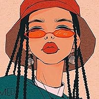
Review of advance copy received from NetGalley
Loved loved loved it!!! Thank you so much to NetGalley and the publisher for the eARC copy, because I don't think I would have found this story otherwise, and that would have been a big shame. This story is a great, bright dystopian exploring the effects of climate change and its subsequent home insecurities, classism, elitism, overconsumption, and forbidden love.
Stories like this can sometimes be a hit or miss for me, depending on how the material is handled, and I am ecstatic that I loved the execution of this story. Right away, you can tell that the author was intentional with the designs and portrayals of each character, and it pays off. Paola is Brazilian and Vietnamese, and in the back of the book, Nault brings attention to her inspirations in the design of the Flats, naming the floating neighbourhoods from Vietnam, the Philippines, and Nigeria.
The growth of all the characters, including June's friends, was something I really appreciated. On top of the art and the relationship between June and Paolo, it was one of my favourite aspects of the story. It's so easy to make characters like that one-dimensional and incapable of learning from outside experiences (which I see time and time again), forcing characters like June to choose, but that was not the case, and I really loved it.
I can't wait for the official release so that I can have a physical copy of this book.
Stories like this can sometimes be a hit or miss for me, depending on how the material is handled, and I am ecstatic that I loved the execution of this story. Right away, you can tell that the author was intentional with the designs and portrayals of each character, and it pays off. Paola is Brazilian and Vietnamese, and in the back of the book, Nault brings attention to her inspirations in the design of the Flats, naming the floating neighbourhoods from Vietnam, the Philippines, and Nigeria.
The growth of all the characters, including June's friends, was something I really appreciated. On top of the art and the relationship between June and Paolo, it was one of my favourite aspects of the story. It's so easy to make characters like that one-dimensional and incapable of learning from outside experiences (which I see time and time again), forcing characters like June to choose, but that was not the case, and I really loved it.
I can't wait for the official release so that I can have a physical copy of this book.
Review of advance copy received from NetGalley
Wow! This was such a beautifully written story alongside wonderful and jaw-dropping watercolour art. The concept and execution of this book was so unique and very well done, and The graphics in this graphic novel were coloured so exquisitely with such vibrant and unique elements, and with such added detail that i couldn’t help but just stare at until i saw everything on every single page.
This is very much set in a dystopian world, but it still touched on themes of class and how that affects everything we do and think about ourselves. I thought it took a fun spin on social media and the “modern times” we live in while still being a different and diverse world from our own.
The book was filled with such eccentric characters and the friendship aspect really blew my socks off. But let’s not forget the sweet and touching romance. There were so many small and intimate moments that i really look for in a romantic graphic novel, that had me rooting so hard for them. This book is YA, so it gave me those feelings of giddiness and excitement when all the characters did was look at each other. And i think it was all tied together by Renée Nault’s glowing art.
I hope she’ll continue future projects on this world, because if so, i can’t wait to jump back in.
Special thanks to NetGalley and Ten Speed Graphics for giving me the opportunity to read this e-arc in exchange for my honest review!
This is very much set in a dystopian world, but it still touched on themes of class and how that affects everything we do and think about ourselves. I thought it took a fun spin on social media and the “modern times” we live in while still being a different and diverse world from our own.
The book was filled with such eccentric characters and the friendship aspect really blew my socks off. But let’s not forget the sweet and touching romance. There were so many small and intimate moments that i really look for in a romantic graphic novel, that had me rooting so hard for them. This book is YA, so it gave me those feelings of giddiness and excitement when all the characters did was look at each other. And i think it was all tied together by Renée Nault’s glowing art.
I hope she’ll continue future projects on this world, because if so, i can’t wait to jump back in.
Special thanks to NetGalley and Ten Speed Graphics for giving me the opportunity to read this e-arc in exchange for my honest review!
Displaying 1 - 30 of 119 reviews