There are hundreds of watercolor paints on the market, with widely varying characteristics, appearances, and names. This easy-to-use book cuts through the confusion. In this informative, 128-page book, author Jan Hart covers pigment properties while providing helpful information on combining colors on the palette for optimal effect. The full-color book features an array of step-by-step painting demonstrations and a must-have glossary of pigment equivalencies for the most popular paint manufacturers.
This is a beautiful and useful book dedicated to understanding colours as used in watercolour.
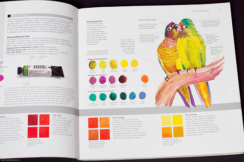
It's split into three parts. Section 1 is on understanding pigment properties. Section 2 touches on the colour palettes and schemes. The last section looks at how you can use colours on different subject matters that range from landscapes to portrait drawings.
The text is informative and written in a way that's easy to understand. The pages are nicely laid out with beautiful examples from the author Jan Hart as well as other watercolour artists. You can get to check out different styles and the versatility of watercolour.
I like that the examples show the many possibilities of using colours, especially on putting colours on subjects that you don't normally associate them with. There are a couple of cool demonstrations on how different colour schemes can produce different moods even with the same subject.
There are many tutorials and little exercises scattered around, with lots of tips, ideas and techniques on the different ways you can experiment on your own.
This is an interesting and inspirational book. Even if you're not into watercolour, you might have second thoughts after reading this.
I got a copy of this book, hot of the presses, from Jan herself when I was attending a workshop at her home in New Mexico. I have many many watercolor instruction books, and this is one I keep going back to, dipping into for info and inspo (inspiration). Jan really is an expert in color; you'll learn a lot of usable things and be amazed! For example, I never knew that there were "organic" and "inorganic" paints, and that they behave differently on the paper. The book also has beautiful, true reproductions of Jan's gorgeous watercolors.
This book has been a toil, and I gave up towards the end and returned it. It has lots of useful information, which for some brilliant reason is mostly presented in a very small font indeed. The most useful feature of the book is its colour-wheel, which the author has named after herself, which is based on three bright and transparent colours that correspond to the printer's colours: magenta, cyan and yellow. She mostly uses these three, and to great effect. Every other book I know remains with the usual red, blue and yellow. The colour theory is also well presented, but is better done by James Gurney, in his Colour and Light. Three stars.
One of the best guides to pigment selection I've come across. Good explanation of glazing, staining, sedimentation, transparency etc., and where best to use which pigment.