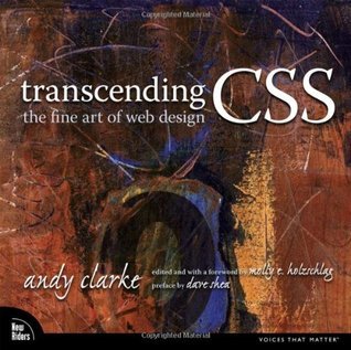
I enjoy reading Andy Clarke's blog, and really identify with people like Andy who are trying to bridge the gap between visual, graphically oriented designers and people who are technical, code-based, linear thinkers in the Web development field. I even hate using that distinction, because I never fit it in any either/or fashion.
I picked up this book in part because it really is a beautiful book: rich, elegant, luxurious. Reading through it, though, I'm finding that, as someone who has done page layout in the past, I would have really liked to have been there during the design meeting and shot down a really bad idea.
How to explain? The book reads like a typical book, nothing new here. But there are places in the book where Clarke takes a detour, a related detour, but nonetheless he's breaking out of the flow for what we'd call a "sidebar". Problem is, once you realize that's what's happened, you've turned the page to read the rest of the paragraph, only to find you're in a sidebar that wasn't as clearly signaled as it could be.
Normally, a sidebar is placed near the main text to which it is connected. Often, it's on a right-facing page, and it's often set off by a different color background or perhaps a "did you know?" box with borders. Often, there's a preface or introduction to a book that will help you understand how to actually read the book, with a little map or key to what the symbols and boxes means.
In Transcending CSS, the detour is on the right page alright, but the left facing page is not text, but images. I found this more than a little confusing. Sometimes there's a page and half between a signal to go read a sidebar and the actual sidebar.
OK. It's a pet peeve and may just be peculiar to me.
Also, in case my husband's boss, Zach, is reading: Yes, I did run out to the garage where R was puttering and said, "See. Zach is god. Zach is having you do microformats." I was compelled to do this because of a conversation at our monthly WSUUG meeting where my husband, forever the contrarian, felt he had to argue against microformats. Why? Because. In Transcending CSS, Clarke lists the principles of Transcendent CSS and one is using semantic naming conventions and microformats. He doesn't just point to semantic naming conventions, but specifically calls out microformats.
At any rate, as folks who read me know, I love to run off and write about what I'm reading, as I'm reading, rather than wait to do a big bang review. I'm heading back out to my porch for more reading.
---
So, on to a more useful review. Aside from the design glitch I noted above, the book is very useful to anyone who comes at CSS and standards-based design from a designers perspective. If you have a lot of standards-based design work under your belt, have been doing this for a few years, etc. -- the book is a little bit too simple. But if you're fairly new -- i.e., you aren't really sure you understand what semantic naming conventions are or think that the whole discussion about how to mark up the page is a lot of folderol -- then you should read this book.
Clarke's main focus seems to be on semantics, which is fine, because he's right that too much web development ignores semantics -- and I certainly have been guilty of this. No, I don't use the paragaph tag to obtain the white space I want these days, but I'm still getting the hang of it and sometimes feel I'm using more divs than I need to use.
So, what am I talking about -- especially if you're a n00b and it feels like I'm talking in some s00per sekrit language? Consider the imaginary Cookr site Clarke uses to walk readers through semantic-based development principles and processes. The page is a recipe page, with the recipe on the left. On the right is a box containing suggestions for related recipes. For each suggestions, there's a photo of the dish, the name of the dish (linked to the recipe), and a teaser paragraph to entice the user to click and learn more.
I would never have looked at the block of related items -- photo, title, description -- and seen it as a list item in an unordered list -- until I read this book. I would have looked at it in terms of a design problem and thought about it in terms of how to mark up the page to get the visual effects I wanted.
Hence, I would have seen two columns, one containing photo of the dish, and the other containing text-based information -- which would have comprised a table row in the old table-based design days. But, as Clarke points out, it's actually a list item in an unordered list .
By the way, he also points out that these are not "strictly definition terms and descriptions, so using a definition list would be stretching the semantic use of the element." [p 146 -- I had to quote that to throw a certain contrarian's way. :)]
And because I saw that content visually and thought of it terms of how I'd style it to get the visual effect I wanted, I was overlooking what would be more meaningful -- particularly to search engines or applications that might make use of semantic markup to parse the contents of a page like this.
The unordered list of related recipes, then, constitutes what are called XHTML coumpounds:
"combinations of two or more elements in XHTML that each have their own meaning. When combined, the elements create a more precise meaning together than they do separately. The concept of XHTML cmpounds emerged from the microformats community rather than the W3C." [p 147]
OK. So now that I've read this book, I will pay closer attention to the ways I can use meaningful markup -- much more than I have been. Work to be done. But now I want to go re-write all the Web sites I've developed. Ah well.
More anon....

