I never knew I needed to read a book on fonts, until I read this book on fonts.
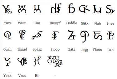
You’ll start to see fonts the way you never, ever have before; you’ll start to notice them constantly, to an almost maddening intensity. Everywhere you go, everything you do- fonts, fonts, fonts. This one, that one, every font.
I loved learning the history of fonts in general, and of specific fonts. It’s so cool to realize that font experts can watch films and point out all the anachronism—using fonts created in the 1970s in an 1890s movie, for example—that I wouldn’t have thought about. (Honestly, it never even really occurred to me that modern fonts are created by humans, that a “typeface engineer” (font creator) is a full-time job).
There are also some incredibly cool names in the history of fonts. The name Wynkyn de Worde, for example. Not only is his name apropos for a font-maker (“word”), it’s just an all-around great name. I also like the surname of the da Spira brothers. So elegant.
The book itself is set in a font called Sabon, excluding the “font breaks” (between chapters are a few pages which focus on a particular font’s history, and typically are set in that font). Sabon is considered one of the most readable of all book fonts and looks very familiar to my eyes, so I’d wager it’s used in many books for the sake of its clarity. And clarity, for us bookworms, is certainly commendable.
----------INTERESTING THINGS I LEARNED----------
1. The word “font” is an Americanization of the European “fount” (presumably, similar to the color/colour, labor/labour, and neighbor/neighbour disparities).
2. In traditional serif fonts, the dot of the lowercase “i” isn’t centered; it’s slightly to the left. And the stem of a lower-case “t” is slightly thicker at the base to avoid the appearance of frailty.
3. The majority of books printed in Germany before WW2 were in blackletter (that heavy, gothic font you typically see on signs for German-style biergartens or Ye Old Towne Pub-type places) and were considered a sign of German nationalism. For a while, Hitler heavily encouraged everyone to use only blackletter fonts, and Nazis used them exclusively. However, after invading other countries, blackletter fonts got too difficult to use(other countries didn’t have presses set up for blackletter fonts) so Hitler decided that now, blackletter was a Jewish thing, and only Roman letters (standard fonts we see today) were allowed.
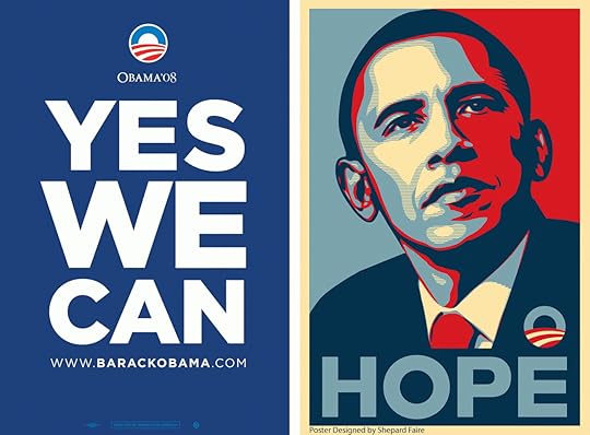
4. A font called Gotham is the trendy new font of the 2000s. It’s used everywhere from the Discovery channel logo to, most iconically, Barack Obama’s presidential campaign.
5. The “Lion King font,” which is called Neuland, is also found on the brand for American Spirit cigarettes AND for Jurassic Park! I don’t know why I never connected those three things before, but realized it was totally true as soon as I read it.
Neuland was created in 1923, which is way earlier than I’d have guessed. It has a distinctly safari vibe (or at least, pop culture has imbued it with that). And there’s definitely some squickily weird racial undertones in the way this font is used in some cases.
----------MY FONT PREFERENCES----------
In case you were wondering. I’m sure you weren’t! But, after all, you are reading a review for a book about fonts, so you might be interested.
I’m quite fond of the following:
--LUMOS, which is recognizable as the font used for titles of chapters in Harry Potter books (Garamond is used for the regular typeface in HP books): it still gives me a friendly little thrill whenever I see it
--BASKERVILLE (whose creator was a friend of Benjamin Franklin): an elegant academic look with fancy Qs
--UNDERGROUND (the font used in the London Underground signs): a gloriously unique, highly recognizable, and perfectly round font
--DIDOT: just a nice, elegant, 19th-century literature-looking font
--CENTURY SCHOOLBOOK: my default font. Oddly, doesn’t get much mention in this book.
--FUTURA: designed in the 1920s, this font was previously used by IKEA; it stirred up quite the ruckus when IKEA switched from it to the relatively ugly Verdana. It was also the font on the plaque left on the moon by Apollo 11.
--AUNT MILDRED: it looks like it was written by Wednesday Addams. How can you not love this font?
I abhor these:
--HELVETICA: this is the most common font seen around the world today. It’s the default for signs, advertisements, everything. Once, a type designer tried to spend a day without Helvetica (whenever he saw it, he had to avert his eyes; he couldn’t take any Helvetica-signed transport or buy Helvetica-branded products or wear clothes with tags in Helvetica or read websites in Helvetica—eliminating most websites, since this is a default web font; he couldn’t use certain cash bills, as Helvetica is on the new US $1 bill; he couldn’t use credit cards with Helvetica, which eliminates nearly all the major cards). Suffice it to say, he didn’t do well. It’s ugly, it’s everywhere, it’s so, so easy to hate.
--TIMES NEW ROMAN: it’s just hideous. Why is this a default font? Get it out of my face.
--ARIAL: it’s weirdly small and devoid of anything suggesting personality. It’s like a serial killer. It’s the Ted Bundy of fonts. Ditto CALIBRI, which is the bane of my existence.
--VERDANA: it’s just boring
Anyway, 10/10 recommend, will change the way you see our font-saturated world for sure.


![Profile Image for laurel [the suspected bibliophile].](/_next/image?url=https%3A%2F%2Fi.gr-assets.com%2Fimages%2FS%2Fcompressed.photo.goodreads.com%2Fusers%2F1645808644i%2F7494844._UX200_CR0%2C6%2C200%2C200_.jpg&w=128&q=75)


