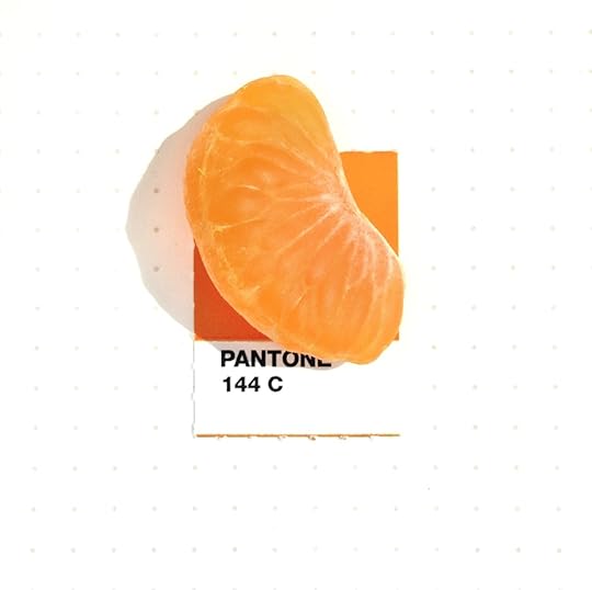
Tiny PANTONE Objects is the perfect exploration of PANTONE colors in the everyday world. Inka Mathew has spent years photographing miniature objects that perfectly match the hues of the PANTONE rainbow. In this book, inspired by her Tiny PMS Match Tumblr, Mathew takes readers on a visual journey by pairing these objects—some found in nature and some man-made—with their exact PANTONE color, giving life and depth to the PANTONE colors we’ve all come to know. With objects that range from fruit to candy to toys to replicas of famous landmarks—and even more whimsical items such as a tiny rubber chicken—Tiny PANTONE Objects is a beloved treasure trove of the colors that make up our lives.
For painters and poets - or just someone who loves to see all the color around us. Colors add so much to the beauty of things; often feel that the same object in different colors can add/detract from the way we feel about the object. This is a wonderful reference book with a lot of application in design and inspiration.
Sono più di trent’anni che i colori Pantone fanno parte della mia vita, ben più della metà, quindi, come dire che non ho ricordo di come fossero i colori prima di incontrarli. Con i Pantone tutto è più brillante, tutto è più vivo (anche quando sono colori cupi, come il marrone, o il grigio), tutto è più pulito (nessuna inutile miscela con un dieci percento di nero, o di cyan, a sporcare tutto). La prima volta che ho visto un colore Pantone dal vivo (e non sto parlando né del libro da cui staccare i tasselli, pre fustellati, per permettere di collocarli direttamente sugli esecutivi per la stampa, né delle mazzette da consultare in tempi di povertà), la prima volta, dicevo, è stato durante il mio viaggio alle Maldive: correva l’anno 1996 e, quand’ero prossima alla partenza, il mio capo di allora mi disse “Guarda con attenzione, riempiti gli occhi di tutto, perché stai per andare in un posto dove i colori Pantone esistono per davvero, in natura: vedrai i colori Pantone e non li dimenticherai mai più”. Ed era vero, naturalmente, dal colore del mare, a quello del cielo, a quello incredibile dei pesci e delle conchiglie, tutto, o quasi, era in colori Pantone. Ecco perché, quando ho scoperto questo piccolo libro, che nasce da un progetto dell’artista Inka Mathew su Tumblr, non ho potuto resistere alla tentazione di ordinarlo per averlo nella mia libreria.
Ma se il progetto è divertente (Inka fotografa con il suo iPhone ogni tassello Pantone identificandone il colore in uno degli piccoli oggetti che quotidianamente le passano fra le mani - un biscotto, un fiore, una conchiglia, una caramella, un batuffolo di cotone colorato), dall’altro la resa di stampa (che ahimè non è fatta né con colori Pantone, né curata con l’attenzione che si riserva alla stampa d’Arte), è di molto inferiore a quella del monitor, che, al contrario, ne esalta brillantezza e tridimensionalità.
E quindi, dieci e lode al progetto e sei meno meno alla realizzazione (anche se, insomma, per meno di dieci euro non si poteva davvero pretendere di più, ma peccato): speriamo che la Pantone inc. la scopra e decida di ristamparla per riconoscerle il valore che merita.
Sometimes I call things by colors that other people call other colors (hello, green wall at work, er, I mean "blue" wall). But I find looking up the PANTONE color so exhausting (sooooo many choices!!). LOL, ok, exhausting in a fun way. So I extra appreciate the fruits of somebody else's laborious PANTONE matching skills. Well done!
As a fellow graphic designer, I️ was impressed by the author’s proficiency in color matching. Upon first glance, this book seems like a nice addition to any coffee table. However, after looking through the entirety of the book, the book can be use as a resource and reference when exploring color options in design. Good stuff!!