Jump to ratings and reviews
Rate this book

Batman

Batman: Ölümcül Tasarım

Rate this book
Batman ve Joker tekrar buluşuyor. Ama bu sefer yeni bir misafirleri daha var. Bu hikayenin ilham kaynağı, yaşanmış iki gerçek olaydır: 1963 yılında orijinal Pennsylvania İstasyon Binası'nın yıkılması ve 2008'de Manhattan'da bir inşaat vincinin yerle bir olmasından dolayı ölümle sonuçlanan korkunç kaza. Bu iki kaza arada geçen yıllara rağmen bir şekilde bağlantılı olsaydı ne olurdu? Ya da Gotham Şehri'nde, ihtişamlı, altın bir çağda gerçekleşmiş olsalardı? Ünlü çizer Dave Taylor'un karakalem ile çizdiği bu muhteşem Batman hikayesine bayılacaksınız.

112 pages, Paperback

First published June 5, 2012

17 people are currently reading
1199 people want to read

About the author

Chip Kidd

70 books287 followers
Chip Kidd is an American author, editor and graphic designer, best known for his innovative book covers.

Born in Reading, Pennsylvania, Kidd grew up in a Philadelphia suburb, strongly influenced by American popular culture. While a design student at Penn State, an art instructor once gave the assignment to design a book cover for Museums and Women by John Updike, who is also a Shillington native. The teacher panned Kidd's work in front of the class, suggesting that book design would not be a good career choice for him. However, Kidd later received professional assignments to design covers for Memories of the Ford Administration and other books by Updike.

Kidd is currently associate art director at Knopf, an imprint of Random House. He first joined the Knopf design team in 1986, when he was hired as a junior assistant by Sara Eisenman.

Publishers Weekly described his book jackets as "creepy, striking, sly, smart, unpredictable covers that make readers appreciate books as objects of art as well as literature." USA Today called him "the closest thing to a rock star" in graphic design today, while author James Ellroy has called him “the world’s greatest book-jacket designer.”

Ratings & Reviews

What do you think?
Rate this book

Friends & Following

Create a free account to discover what your friends think of this book!

Community Reviews

5 stars
577 (26%)
4 stars
713 (32%)
3 stars
639 (29%)
2 stars
199 (9%)
1 star
55 (2%)
Displaying 1 - 30 of 281 reviews
Profile Image for Sud666.
2,330 reviews198 followers
April 7, 2021
"Death by Design" was excellent on all levels. Kudos to Chip Kidd for crafting and writing a great story and Dave Taylor's art is wonderful. What a wonderful Batman volume.

Kidd bases his story on two incidents: (1) The 1960s demolition of NYC's Penn Station and (2) The 2008 NYC crane collapse. He asks "What if the two incidents were related? What if they happened in Gotham City instead?" and viola! We have the basis for this superb GN. Kidd wisely reached out to Dave Taylor who did a wonderful job with the penciled artwork and the minimalist color palette. This vision of a 1950's gothic style is prevalent. Even Batman's gear and look have that look. The gorgeous penciled panels and the striking use of a few colors (greys, reds, and blues) make each panel a beauty and some of the splash pages are worthy of art.

The story? The Wayne family station is coming down and due to its historic significance, Bruce is facing pushback. As Bruce gives a speech a crane collapse nearly kills him. This mystery revolves around a conspiracy based on the architecture of Gotham. Batman must use his detective skills to solve this mystery. It's a good tale of corruption, obsession, and hubris.

From Kidd's smooth prose with well-placed elements of dark humor to Taylor's gorgeous panels-this is a truly wonderful GN. Deserving of 5 stars. Even if you aren't a Batman fan you will appreciate the beautiful artwork inside. If you are a Batman fan then this is a gem and worthy of your collection.
Profile Image for Shannon.
929 reviews276 followers
July 29, 2016
This is a different focus on Batman. First off, he acts like Peter Parker with his insecurities and wisecracking humor to himself. The tale deals with an aged train depot that has seen better days and a movement in Gotham to rebuild it. Of course there's more to the tale and author Chip Kidd brings in some NYC history to add flavor to the overall story.


But the real attraction is the amazing artwork and the focuses on architecture and the like. Artist Dave Taylor, according to the commentary in back, did the artwork in pencil. First in blue and then “inked” in graphite.


Appearance by an aged Joker. Look for it.

The graphic novel has an Old School feel to it, echoing 1930s or 40s. You've got the mob boss, the wronged architect, high society in Gotham and several other elements. Batman's outfit even looks like the old Batman comics. Bruce Wayne's mannerisms reminded me somewhat of Michael Keaton's acting of Bruce Wayne in “Batman”.


STORY/PLOTTING: B minus to B; CHARACTERS/DIALOGUE: B; ARTWORK PRESENTATON: A minus to A; OLD SCHOOL HITS: B to B plus; OVERALL GRADE: B to B plus; WHEN READ: end of August 2012.
Profile Image for Scott.
2,253 reviews272 followers
December 6, 2017
Somewhat ordinary Dark Knight story that is elevated by the unique, almost monochrome-type artwork and apparent late 30's/early 40's setting. (It was as if DC wanted it to appear like an old Warner Brothers' gangster movie.) Set during our hero's early years, the crime story has more style than substance - there's not much of a mystery, and Joker's appearance was incongruous - but it was an agreeable way to kill an hour before an appointment.
Profile Image for Greg.
1,128 reviews2,147 followers
July 25, 2012
I got to meet Chip Kidd, and he signed my copy of this book. That was pretty cool. Getting to meet Chip Kidd was better than reading this book though. Opps. I enjoyed the story and the retro-version of Batman, this is the Batman with some modern sensibility but definitely not the dark vigilante of the post Year One / Dark Knight era.

The big problem I had with this comic was the drawing style. I was sort of expecting a really amazing looking Batman book. Chip Kidd is probably my second favorite book designer, and I thought there would be a great physicality to the book, something that has a unique feeling to it, sort of what a Chris Ware designed superhero book could be. Granted the cover and the end papers are very nice looking, but the rest of the book just feels like almost every other superhero graphic novel, and I wasn't crazy about the drawing style of Dave Taylor.

I did find it kind of charming that Chip Kidd was drawn into the story as one of the main characters.

I don't have too much to say about this, I never really know what to write about super-hero graphic novels most of the time.
Profile Image for Michelle.
625 reviews89 followers
January 26, 2018
This seemed like a fun Elseworlds-esque experiment (what if Batman/Bruce Wayne existed in the 1930s?), but this was ultimately a flop for me.

Gotham is undergoing an architectural boom and Bruce Wayne is spearheading the renovations of an old train station his old man had built decades earlier. However, accidents begin happening - faulty machinery, collapses, etc - that are too frequent to be accidents.

Sadly, the underlying mystery I've described above is just *boring*. The Joker makes several appearances in this story that felt our of place and like he was thrown in simply because he's a popular villain, and it was easy to guess how everything would wrap up.

Another problem I had is with how Kidd wrote Bruce Wayne. For some reason, he's written as wry and self-deprecating which didn't feel right at all. The Bruce I know is a broody pile of angst. I can appreciate Kidd trying to go for a different interpretation, but this felt like a completely different person to me.

Lastly, I honestly didn't find the art to be that great. The soft pencils certainly fit the period and atmosphere, and Taylor is obviously good at drawing architectural elements, but the way he draws people looked.. off. I also found that Bruce's face was drawn very inconsistently - he would have a hard, chiseled jaw one moment, then a rounder and softer face in the next panel. He often didn't even look the same page-to-page. Mileage may vary on this point, but I was personally disappointed on this front.

(Also, this is kind of a stupid complaint, but that whole scene on the giant glass floor that's like a million stories up? that was the dumbest looking club I've ever seen in my life, even for something that is complete fiction. There were no walls!! Perhaps could easily fall hundreds of feet to their death if they weren't careful and it was supposed to be a CLUB. Just, why???)
Profile Image for M. Tatari.
Author 36 books304 followers
July 19, 2016
Batman: Ölümcül Tasarım, muhtemelen sizin de duymuş olduğunuz gibi, tamamen karakalem çizimlerden oluşan, sıra dışı bir Kara Şövalye macerası. Sırf bu bile onu eşsiz kılmaya yetiyor. Ama o bundan çok daha fazlası.

Her şeyden önce konusunu iki gerçek olaydan alıyor ve her ikisini de zekice birleştirmeyi başarıyor. Bu da ortaya okurken gayet keyif veren, güzel bir dedektiflik hikâyesi çıkarıyor. Bu da yetmiyormuş gibi işin içine bir de Joker dahil oluyor ve işler hepten karışıyor.

Ölümcül Tasarım, bu merak uyandırıcı dedektiflik macerasının yanı sıra bizlere eski mimari yapıların yıkılıp yerlerine yenilerinin yapılması, tarihin korunması gibi konularda da çaktırmadan yerinde eleştirilerde bulunuyor.

Ve çizimler… O şahane, baktıkça bakılası çizimler. Bu serüvende Batman’i son yıllardaki modern hâliyle değil de 1950-60’lı yıllardaki versiyonuna çok daha benzer bir şekilde görüyoruz. Kostümü, aletleri, bilgisayarları… hepsi o yılların izini taşıyor. Dahası çizgi romanın sayfaları arasında karşılaştığımız diğer teknolojik şeyler de yine bilimkurgunun altın çağında hayal edilen, Batman ve Star Trek dizilerinde sık sık gördüğümüz çok ışıklı, bol düğmeli tasarımlara sahip.

Yine de arada sırada bir karakterin, mesela Bruce Wayne’in bir karede harika görünürken bir diğerinde tam çizilemediğine, bazen yüzlerinin birbirini tam olarak tutmadığına da şahit oluyorsunuz. O yüzden okurken az da olsa canınız sıkılıyor. Ama son sayfaya gelip de çizerin elinden şu paragrafı okuduğunuzda esere olan hayranlığınız bir kat daha artıyor:
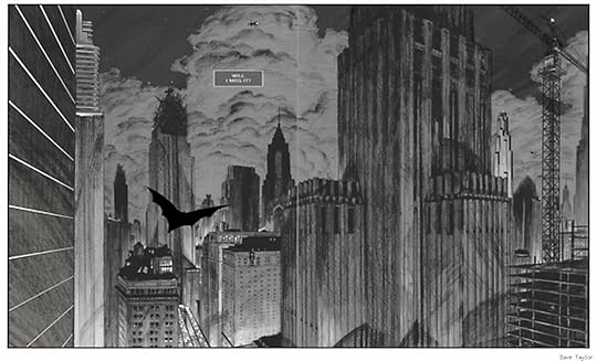
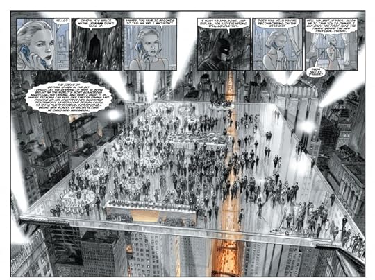
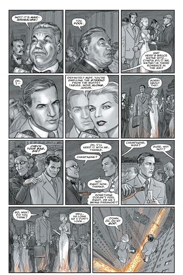
“Bu kitaptaki bütün çalışmalar babadan kalma karakalem usulüyle ortaya çıkarıldı. Önce maviler, ardındansa grafitle ‘çinileme.’ Silgiyle hiç düzeltme yapmadım; ne çizdiysem yayınlandı. Gölgelemeyi ve renkleri bilgisayarda yerleştirdim. Bu benim ‘dürüst’ işim!”

Ölümcül Tasarım kaçırılmaması gereken bir tecrübe.
Profile Image for Garrett.
270 reviews14 followers
February 15, 2017
One of the most boring comics books I have ever read. Also Joker looks like Albert Einstein! Wtf
Profile Image for Sam Quixote.
4,801 reviews13.4k followers
July 20, 2012
The award winning graphic designer Chip Kidd turns his hand to writing his first graphic novel and what a subject to land on for your debut - a Batman book! And while the book looks great from its pleasing cover material texture and interesting charcoal print of Batman's head, to Dave Taylor's cool artistry, the book feels a bit flat to read.

The story is about architecture in Gotham. Specifically a transportation hub that has fallen into disrepair that is due to be torn down and rebuilt. But way back when it was intended to be something better than the wreck it became, shady union bosses and their dealings led to the building being shoddily made, a hazard to the public, and the downfall of its idealistic lead architect. Years later the architect's son tries to enact revenge on those union bosses by (of course) dressing as a superhero - "Exacto" - while Batman deals with Joker who's messing around with his awfully named belle du jour Cyndia Syl.

I thought Kidd and Taylor made some nifty choices in setting this book in the Golden-Age era allowing for some cheesy-yet-cool designs of Batman's gadgets, Batcave, and overall appearance of Gotham. And Taylor's artistic choice to draw the book in black, white and grey with the occasional appearance of colour suitably dulled so it's not too intrusive, has Gotham looking awesome like you're looking at grainy old pictures of the past with the mysterious bat-like silhouette flying among them. Batman looks far from the muscle-bound menace that Jim Lee perfected and is far more like the Batman of the 40s and 50s; in a word, normal. And yet it's a refreshing incarnation.

But - and this is purely a personal preference - architecture and Batman don't really mix. It's not enough to base a book around as it's not really exciting, even though Kidd tries to make it exciting by throwing Joker into the mix so Batman has something to do. It's mostly Bruce Wayne who gets the most action here sitting in board rooms or having meetings with journalists and architects.

As a physical book it's really lovely, well designed, and the art is different enough to make it stand out from the vast majority of Batman books but I think the story unfortunately left me underwhelmed and a bit bored. The book is probably only for Batman fans who must read everything or fans of Chip Kidd.

SPOILERS

Y'know what didn't make sense? When Joker fell off the top of the glass plate suspended over the city, who knows how many stories up, how the hell did he survive?! Batman didn't catch him. And then when Exacto seals Batman, the union boss, and the journalist in the crane, it turns out Exacto was just a hologram - how the hell can holograms weld physical objects when they're basically just ghosts? All that hologram nonsense played too big a part in the book anyway, that and Batman's magic power shield, whatever that was. Waaaay too anachronistic.
Profile Image for Kayıp Rıhtım.
375 reviews299 followers
Read
July 28, 2016
Chip Kidd ve Dave Taylor ikilisinin yarattığı Batman: Ölümcül Tasarım tamamen karakalem çizimlerden oluşan, sıra dışı bir Kara Şövalye macerası. Cildin sayfalarında yer alan her bir kare, her bir sayfa, her bir karakter ve her mimari tasarım babadan kalma yöntemlerle, siyah-beyaz olarak çizilmiş.

Ölümcül Tasarım’da karşımıza çıkan çizimler 1950-60’lı yıllardaki görsel tasarımları, çizgi romanların “altın çağını” yaşadığı yılları anımsatacak bir şekilde tasarlanmış. Baş karakterimiz Batman son yıllardaki modern hâliyle değil de en eski kostümlerinden biriyle, göğsünde eski sembolü ve maskesiyle çıkıyor karşımıza. Aynı şekilde aletleri, mağarası, arabası, bilgisayarı… hepsi o yılların izini, “Na-na-na Batman!” jeneriğiyle gönlümüzde ayrı bir yer eden televizyon dizisindeki görünümlerini taşıyor.

Hikâyemiz Bruce Wayne’in eski Gotham Merkez İstasyonu’nu yıkmak ve yerine daha modern bir tanesini dikmek istemesiyle başlıyor. Ancak bu iş hiç de sandığı kadar kolay olmayacaktır. İstasyon babası tarafından, şehrin simgelerinden biri olmak üzere inşa ettirilmiştir; bu yüzden başta Cyndia Syl adlı gayet hoş bir bayan olmak üzere pek çok kişi bu projeye soğuk bakmaktadır. Richard Frank adlı mimari bir eleştirmen çalıştığı gazeteye vinç kazasıyla ilgili yazdığı bir makale sonu kendini ister istemez bu soruşturmanın ortasında bulur. Kötü şöhretli sendika başkanı Bart Loar gazetecinin bu işe burnunu sokmasından pek memnun kalmaz ve onu ortadan kaldırmaya niyetlenir. Öte yandan Exacto adlı gizemli bir adam da Loar’ın peşindedir. Tüm bunlar yetmiyormuş gibi işin içine bir de Joker dahil oluyor ve işler hepten karışıyor.

Hikâyenin en sevdiğim yanlarından biri tüm bu ayrıntıları başarıyla bir araya getirip ortaya okuması gayet keyifli bir macera çıkarması oldu. Takdir ettiğim bir diğer yanıysa okuyucuya büyük resmi vermekten kaçınmaması ve farklı bir açıyla olayları ele almasına izin vermesi. Örneğin Exacto’nun “kim” olduğunu sizden saklamıyor, ama Batman ve diğer karakterler bunu bilmiyor. Bu da gerçekte karşılarında kim olduğunu bilmeden kurdukları diyalogları okurken farklı bir haz almanızı sağlıyor. Katilin kim olduğunu bildiğiniz, başarılı bir polisiye dizisi izlemek gibi…

Hikâye sizi ne kadar içine alırsa alsın bu cildin başrol oyuncusu kesinlikle karakalem çizimler. Shadow of the Bat serisinden tanıdığımız Dave Taylor her sayfada sizi kendisine hayran bırakacak, şahane kareler koymuş ortaya. Çoğunlukla siyah-beyaz olan sayfalara arada hafif bir mavi veya altın sarısı ton katılması da bu görsel şöleni bir kat daha yukarı taşımış.

Ölümcül Tasarım çizgi roman okurları için kaçırılmaması gereken, eşsiz bir tecrübe. Ne yapın edin, bu cildi mutlaka okuyun.

- M. İhsan TATARİ

İncelemenin tamamı için:
http://kayiprihtim.com/inceleme/batma...
Profile Image for Mike.
1,586 reviews149 followers
March 9, 2014
Chip Kidd conjures some very subtle characterizations, with dialogue to match. I'm entranced by the natural quality of the drama here, even with periodic insertions of a chunk of exposition to drop a bunch of details off (like the stork bringing in a new baby).

Batman is good - man of few words, stays on target and gets to the point. Joker is awesome - a blend of Cesar Romero and Heath Ledger, he's everything I need in a psychotic supervillain - smart, brutally honest and not afraid to do something off the wall.

This story gets off to a good start, keeps moving towards a not-too-unpredictable climax, and doesn't suffer from it. In fact, this feels instantly classic because the story is balanced, thought through from start to finish (well, save the moments that fellow Goodreads reviewer Sam Quixote points out), and makes me feel satisfied that it was done right, with a clear simple voice from each creator (no meddling). Leveraging Gotham's history always makes me feel like the author doesn't just riff on his favourite Batman villains, but took the time to get the setting right as well. Setting this book *in* Gotham's history is odd but gives us lots of retro gadgetry to look at.

Dave Taylor is a genius with the art. His pencils and layouts are dynamic and inspired, his shading with that graphite effect is suitably moody, and the daubs of spot colour really nail the noir/deco feel and the use of emphasis. It's hard to find an artist who can pull off the entire page, and do it for an entire book - I have mad respect for Mr. Taylor.
Profile Image for Aslı Dağlı.
Author 126 books378 followers
August 27, 2015
Çeviri editörlüğünü yaptığım ilk çizgi romanım:) Ay lav Batman demiş miydim? :)
Profile Image for Dimitris Papastergiou.
2,524 reviews85 followers
May 2, 2020
This one's not your usual Batman story!

It's mainly a crime story that has pretty much 2 things happening now and in the past at the same time, with Bats being there helping and saving the day, and all of that, based on true events.

I liked it, it's an old timey tale with a great story and great B&W artwork. Great dialogue and characters! Solid story overall.

I'm a fan of Chip Kidd's covers and of his work in general, so I was surprised when I found out that he actually WROTE this one.
Profile Image for Dave-O.
154 reviews13 followers
June 19, 2012
BATMAN: DEATH BY DESIGN joins the bargain bin right next to BATMAN: DIGITAL JUSTICE from the 1980's. BATMAN: DEATH BY DESIGN suffers from surprisingly low ambition mixed with pretentiousness. As I zipped through the uncomplicated story with its giant blocks of forgettable text, I was wondering who on earth would all this claptrap appeal to? Comic nerds will (rightfully) scoff at the lackluster artwork, tedious story, and boring characterization of Batman. Design nerds will roll their eyes at the persistent jabs made at star-chitect Rem Koolhaus and at Chip Kidd for inserting himself as a character. History nerds will... aw, forget it. I wish I could.
Profile Image for Drew Canole.
3,168 reviews43 followers
February 14, 2017
Argh. This could have been good! The artwork is fantastic, but unfortunately is let down by Kidd's lackluster story. To be honest, I would have preferred there to be no story at all and just have the whole book be an exploration of Batman's world focusing on architecture in Gotham.
Profile Image for John Hefner.
12 reviews7 followers
June 14, 2013
First off, I think attention should be paid to this story's editor, Mark Chiarello. As director of creative operations at DC, Chiarello has spearheaded some of the most interesting and daring projects at DC, including Darwyn Cooke's New Frontier, the star-studded newspaper comic-strip tribute Wednesday Comics, and Batman: Black and White, a series of short stories by a vast array of diverse comic talent, all of whom experimented with Batman to varying degrees of success. When it was good, it was amazing, and when it failed, the failures were at least interesting.

This brings us to Batman: Death by Design, which feels like one of the interesting failures from Batman: Black and White stretched to full length. It's an atmospheric, art-driven tale that attempts to mix old-fashioned Bat-action with big ideas about important real-world matters. Unfortunately, its ambitious focus is largely on the latter, making Death by Design read less like a cohesive story and more like a polemic by a fanboy of architecture who thought that it would be best to posit his theories via a thin pretense of a Batman comic.

Honestly, it barely even counts as a Batman tale. Oh sure, Bruce is our POV character, but the real movers and shakers who move the plot along are all original characters. As if realizing that a story featuring architects and journalists would hardly be action-packed, Kidd shoehorns in a pointless Batman vs. Joker subplot just to give the story some gratuitously superheroic action.

There's no point to any of the Joker stuff, as it has nothing to do with the main plotline, and what's worse is that both Batman and the Joker are written in ways that vary from bland to tone-deaf. Batman is written in ways that would work just fine if this were Dick Grayson behind the cowl, but as it is, one would be hard-pressed to imagine Kevin Conroy being able to perform Batman saying things like "nuts" and "yikes." As for the Joker, he's a character who has to be at least one of two things, funny or menacing (ideally at the same time), and his appearance here is neither.

It doesn't help that Mr. Kidd is not an experienced comics writer. I've long been a fan of Kidd as a designer of books, and I think he's one of the very best cover designers in the business, but he's still rusty when it comes to the art of sequential storytelling. Besides the flat dialogue, his storytelling leaves much to be desired as he relies too much on expositional info-dumping rather than letting the story unfold organically. There are also a few plot holes along the way, most notably involving a missing character whose eventual fate is discovered and instantly ignored by everyone who was looking for him.

He also has a rough time with scene transitions, as which can get especially confusing with the pretty-but-samey art by Batman veteran Dave Taylor. Still, Taylor's work here is a vast improvement from his earlier work on stuff like Batman/Riddler: The Riddle Factory, and the fact that he drew it all in pencil without any eraser corrections is incredibly impressive. Between his subtle use of grays and his tastefully limited use of colors, Taylor's work defines Death by Design as an artist's book first and foremost. Without it, the story would fall apart just like... well, like a badly-designed building.

This isn't the first Batman story to deal with Gotham's architecture, as there have also been the 1992 storyline Destroyer (from Batman #474, Legends of the Dark Knight #27, and Detective Comics #641) and Scott Snyder's recent mini-series, Batman: The Golden Gates of Gotham. Like Death by Design, both these stories feature the appearance of a mysterious costumed architecture enthusiast who is obsessed with the history of Gotham's buildings, a history which involves Bruce Wayne's family. What sets Death by Design apart is that it's the first to try and make a real statement about the importance of historic architectural preservation, which is great but doesn't exactly make for riveting reading unless you're interested in the subject matter.

As such, I would primarily recommend Death by Design to people interested in the world and politics of architecture, as well as those who love the technical aspects of sequential art. As for Batman fans, I'd only recommend it to those of you who like reading ambitious, oddball stories that try for something different, even if the execution leaves something to be desired.
Profile Image for #ReadAllTheBooks.
1,219 reviews93 followers
May 6, 2012
I got this through Amazon Vine, so I want to be up front about that. Unfortunately due to issues with my postal office, I wasn't able to post this on Amazon until its release date.

There's both good and bad things about this comic. Batman will always have a certain level of coolness, so this was still an enjoyable comic for the most part but I'd be lying if I said that the Batman series didn't have better to offer.

The shining gem in this comic is the artwork. The comic is set in an unspecified time period in the 20s-40s, with the black and white penciled artwork working incredibly well in this context. Occasionally there's a few glimpses of soft color in various scenes, which really does come across nicely. My only complaint about the artwork would be that occasionally we get some strange angles that do strange things with the characters' eyes, making them strangely large or in one case with Bruce Wayne, makes one eye dark and the other so light that he looks like he has a cataract. This is a minor quibble though, as by large the artwork is beautiful.

Where the comic comes up short is in the story. It deserved more, as this feels more like a rough outline than an actual fully fleshed tale. I can't help but think that if this *hadn't* been a Batman story and had been an original tale that focused on the character of Exacto, this could've been a lot more interesting. Batman is more just "there" than anything else, and because the comic must focus on its titular character, Exacto wasn't really given more than the very basics of development. This is a shame, since the character and the broader story had a LOT of potential. The same goes for the female character Cyndia Syl. She never really developed enough for her to be a truly interesting character, although her interactions with Exacto (and his alter ego) were decent.

I really wanted to like this more than I did and if they'd worked more on the story, this could've been something really great. This is still good and it's enjoyable enough as a casual read, but I admit that I was a little disappointed by it and probably would've been more so if I'd paid the full $24 price tag for the hardback.

(ARC provided by Amazon Vine)
Profile Image for Ill D.
Author 0 books8,594 followers
April 5, 2020
Death by design is certainly a design of sorts. Yet not much more like designed mediocrity really. In fact the architects of pen and pencil have drafted one of the biggest Batman related disappointments of the last decade.Pleasant on the outside yet unsound from the inside, this design upon a foundation of sand erodes into the sand of time upon a mere glance of critical inspection.

Particularly damning because of the visuals are such a pleasant surprise of decadent eye candy. Really pretty and expertly applied pasteled pencils form a stunning trifecta of blues, oranges, and the occasional purple prove a Sin City likened effect of contrasts that are as effective as they are dazzling. As ensconced with the muscled blacks of various intensities and opacities the world building by the pencil are outrageously strong and courageously creative against a long tradition of inky characterizations and garish landscapes.

No complaints here. However the successes of the pencil cannot cover the multitudinous sins of the pen.

Voluminous, stuffed with filler and densely swathed in unabashed verbosity, the pen fatally contradicts the successes of the pencil herein. Shifting the balance from overall excellence the barometer of quality becomes further diluted by an irritatingly banal plot. The awkward choice of a mystery by way of a broken crane (yup!) is a far cry from the cataclysmic successes of of a more grandiose Batman series such as No Man’s Land. Sure, as a singularly contained narrative that stars weren’t trying to be reached here, but from such a germ of banality, hardly any tension could have been significantly generated for our interest.

All in all, such a stellar hook of superbly well done artwork can hardly gravitate a third eye toward anything exceeding mere mediocrity. With the vast majority of the dialogue utterly skippable, a dull villain nouveau, one of the weakest plots in Batman history perfectly matches this stew of salty pathetic-ness. No matter how dazzling above, below the content is anemic at best and utterly forgettable at worst.
Profile Image for Stephen.
846 reviews16 followers
September 10, 2016
Holy shaftjob! Two irrefutible facts: Chip Kidd can't write and this illustrator can't render.

Kidd very unwisely chose to make unionized workers and craftsmen of America the villians -- the very backbone of our middle class -- what the hell? And by proxy he also makes Bruce Wayne's father weak and asleep at the wheel regarding a major construction project bearing the Wayne family name.

This book sports an architect vigilante -- and let the stupendous stupidness of that concept linger for a moment please -- a man who goes out to kill to right the wrongs of those who would harm the hallowed field of...architecture. Sheesh!

There are also ultra futuristic gadgets we won't see 500 years from now all miniaturized and bouncing around in the utility belt, and they appear in a story that wants to borrow visuals from the 1930s -- this juxtaposition has been done before in Batman stories, but never to such extremes.

The characterization of the Batman character is almost uselesss here, but I can't say the character himself is harmed in any way herein.

I picked up this hardcover book after just a quick glance at some of the pencil art and it looked pretty good at first peek, it almost reminded me of some of Steve Rude's work. But once you get into it it is painfully obvious that this artist is so unskilled that every time he draws a character in a new panel the character looks different from his last drawing, and yet most all of the male characters of the same relative age all look the same. This artist should have had years more practice before he was given this opportunity.

Overall, I highly recommend you avoid this hot mess of a book.
Profile Image for William Thomas.
1,231 reviews2 followers
July 7, 2012
Although I respect Chip Kidd and his aesthetic sensibilities, I don't think he was in full control of them during the creation of this book. Everything inside is flat and lifeless, emotionless and dull. Aside from the cover (which is what Kidd is known for, anyway, his covers) there isn't much redeeming about 'Death by Design'.

Flat and washed out gray tones dominate the artwork. Instead of utliiziing heavy contrasts and deep shadows, Kidd trades in all of that for the light and airy pencils in each panel. Its absolutely infuriating. Obviously Kidd is a better graphic designer than a graphic storyteller. Although the story is easy to follow and severely linear, its a ridiculous bore. It looks and reads more like story boards than a finished product.

As for the plot, well, it just doesn't matter. Really. It doesn't matter. While I am typically head over heels for those writers who prefer to use Batman in his detective capacity as opposed to a physical bruiser, Kidd makes me long for a real back alley rumble. Damn book reads like Madmen where the Joker shows up for a page and then leaves. Boring. Boooooooooooring.
Profile Image for Larry Zieminski.
89 reviews10 followers
April 24, 2012
I'm a bit torn with this book. The artwork is great. The mostly black and white drawings feel like they were done with charcoal. It creates a great look that stands apart from the traditional comic book look.

The story is good, but there-in lies my problem. It isn't a great story. It certainly doesn't stand out as one of the "Great Batman Tales." I like the setting (1930s or so Gotham City) and the style, but the story itself feels like a good episode of the old Batman cartoon, rather than "the great epic Batman film from the 1930s that never got made" that DC is trying to position it as.

I'd give this book 3.5 stars out of 5.
Profile Image for Tomás.
271 reviews25 followers
December 20, 2015
La historia transcurre durante los primeros años en los que Batman sale a la calle a vistiendo el traje. El guión está bastante correcto pero lo que gana en este comic son los tremendos dibujos de Dave Taylor que dan un aire retro a Gotham que queda muy bien.

Una conspiración tras otra y personajes bien construidos, con unas pequeñas apariciones por parte del Joker para lo más fanáticos con aires, vuelvo a repetir, muy clásicos y evocadores.

Ninguna obra maestra, pero tampoco un comic olvidable.
Profile Image for Corey.
70 reviews29 followers
March 21, 2012
This is my first comic book, and I have to say I really loved it. Short, fast-paced, action packed story with a little flair from writer (and designer) Chip Kidd. If all comics are this fun, I may become a big nerd.
Profile Image for Tom Meade.
270 reviews8 followers
January 7, 2019
This is a fun little adventure that mixes together a lot of different periods in the series's history. It seems to take place in a Neverland 1932-going-on-2012, the Joker acts more like the classic mad robber than the arch criminal of more recent stories, and Batman has the uneasy relationship with the police of the early comics. At the same time the story is a fairly adult one dealing with fairly ordinary problems such as union corruption and the role landmark buildings play in the psyche of a populace. But then Bruce Wayne has a far lighter demeanor in this than modern Batman stories prefer, one which I actually found vastly more appealing. As someone who hasn't read much Batman, and found a lot of it to be far too self-consciously dark and deconstructionist, I found myself enjoying that Kidd decided to go almost entirely in the other direction, openly embracing the goofier elements of the mythos while still committing to telling a smart, engaging story. Ultimately, no-one needs to know what makes Batman tick. Anyone with half a brain can figure that out for themselves. And why the hell should Batman be tortured? If he possessed that level of self-awareness, he never would have dressed as a bat to begin with.

I was however disappointed that the Joker was a principal antagonist yet again. The Joker is great, we get it. Use the Penguin or Catwoman or omething next time, acclaimed bestselling comics authors. I liked that the Joker wasn't hatching any morality a challenging schemes, though. I much prefer him as a directionless madman.
Profile Image for drown_like_its_1999.
517 reviews3 followers
August 20, 2023
Bruce Wayne is spearheading urban renewal projects in Gotham in an effort to revitalize the city's reputation but fateful accidents on these new constructions keep undermining this endeavor. Batman investigates these occurrences and brings the sinister forces responsible to justice.

This work seemingly attempts to make a statement on how architecture shapes the soul of a city and tries to integrate this pursuit into a conception of why Gotham is the way it is. The art does a good job of executing the first goal by depicting Gotham's dynamic skylines and imposing landmarks in intricate detail. The duotone color palette is spartan but pleasing and the use of bloom-filled lighting and long crosshatched shadows gives the work a unique aesthetic.

Sadly, the writing falls rather short with pretty homogenous characterization, contrived scenarios, and overwrought architectural commentary. The characters all feel like an expression of the writer, the dialogue can be awfully wooden, and much of the plot feels illogical. 6.25/10
Profile Image for Tony Laplume.
Author 53 books39 followers
October 16, 2021
An interesting curiosity. Chip Kidd is a well-respected designer who’s done some logo work in comics, things of that kind. As artists of any extraction are likely prone to be, he’s obviously interested in architecture, so for this story to hinge on buildings is not surprising. I don’t know what kind of actual writing experience he has, but this story feels pretty rough, and the unusual art from Dave Taylor, intending to evoke the golden age, keeps the reader equally off-balance. But the concept itself is interesting and unique for Batman, and that’s always good. It’s enough of an excuse to be okay with this existing, flaws and all.
Profile Image for Aidan.
433 reviews5 followers
Read
October 14, 2021
Bonkers good artwork, wish it was longer. Batman, the Waynes, and Gotham are great pieces with which to talk about the politics and ramifications of infrastructure and architecture in exciting ways, shame it’s not an idea pursued more often.
Profile Image for Kyle.
54 reviews
September 29, 2017
Excellent premise. Both the art and the writing lack a certain finish you can expect from a batman book that complains about poor craftsmanship.
Displaying 1 - 30 of 281 reviews

Can't find what you're looking for?

Get help and learn more about the design.