The book attempts to extract principles which make works of art beautiful and restful to the human eye – such as colours, balance and harmony – and apply them to everyday life, from dress-making to interior decorating.
I generally agree with the sentiment. I've read the 1929 version, and I don’t think there's anything that can redeem 1920’s women’s fashion. My issue with Art in Everyday Life, and the reason why I skipped through it by the end, is that it reads very much like a textbook for students.
Now, unfortunately, I went to school. Consequently, I was forced to read many school textbooks. My takeaway from that experience is that school textbooks are universally written by people who assume they’re addressing idiots.
To be fair, textbook authors don’t have an easy fare in life. Shunned by friends (inevitably), abandoned by spouses (almost certainly), these patronizing zealots turn their unfulfilled eye-of-Mordor upon one group, which can neither escape, nor avert their eyes – school children. Yes, writing textbooks is a dark path, taken up by authors who'd like people to read their books, but know they won’t.
If I were a college student, I would have been put off by the rules and proscriptions. But, my middle-aged self, making peace with my middle-aged body and having just gone through a major home renovation, can see these rules come out of sound design principles.
It's a good book for learning the 'best practices'. Then one can decide whether to follow or break the rules.
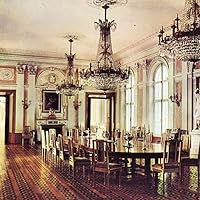
The pictures are low-res black and white scans. The text is vernacular for the age and quite amusing.
I look forward to reading the home design chapters when I have more time.