The legendary Norwegian pop artist Pushwagner’s scathing comics masterpiece—lost for decades, and never before published in the U.S.—is an epic vision of a single day in a world gone a brightly smiling, disturbingly familiar dystopia of towering skyscrapers, omnipresent surveillance, and endless distant war. “CLEAN BOMB THE HAPPY-HAPPY WAY,” blares the morning paper. “Heil Hilton!” barks an overlord on the news.
Welcome to Soft City. Now don’t be late for work.
This NYRC edition is a giant-sized hardcover extra-thick paper and spot-color throughout.
I can't believe I finally stumbled on to this classic, done between 1969-1975, lost for decades, and in 2008 reprinted in oversized format. It's like Fritz Lang movies, and 1984, Chaplin's Modern Times, a futuristic urban nightmare sketched in black and white, maybe a little Saul Steinbergish sketchy, and then meticulous in its evocation of an urban nightmare and the proliferation of sameness and aridity in urban architecture. On acid, as they say.
And Pushwagner was on acid, so it also is part of that literature, beginning with Aldous Huxley's Doors of Perception, so many Beats/hippies, and a lot of music, of course, much of it not very good at all, but this! This recalls the acid-turn in R. Crumb's work, too, which was also strange and wild. This is an amazing artifact of paranoia where people all do the same thing at the same time, in a drugged-out ("one pill make you larger, and one pill makes you small, and the ones that mother gives you, don't do anything at all") existence. The feel of it is not 1984 dark, exactly, in Pushwagner's rendition, as with the large wide spacious format and the thin pencil lines, it is more exhilarating than I expected, given the subject matter. I call it surrealism, too, in the best sense of that word, as amazing political/cultural commentary.
It's stupid for me to say any more about it, as you should just read this review that follows, which became the book's introduction, written by Chris Ware, one of the top comics artists AND comics critics ever on the planet, who just kills it. If you read that, you will find the book asap, especially of you are interested in alt comix and dystopia and architectural comics.
I just noticed that the Cortelyou branch of the Brooklyn Library seems to contain half the comics I'd been meaning to read lately but hadn't actually sprung for, so someone seems to be doing a good job or curating, or else another local has been ordering them sent to this location. Hence all the reviews of such lately. Here's another, a massive work of densely repeat detail: the absolutely conformist consumer-military-industrial dystopian machine of Soft City. These images take on strength through sheer scale and obsession, each page capturing endless corridors of skyscrapers with infinite windows looking onto eternally interchangeable lives. And then in the midst of the numbing beautiful horrible sameness, we suddenly break out into the varied details of a scene like the soft-consume tableaux caught in supermarket security cameras, and it's both a relief and a hammering blow of repetition-through-variation. A nightmare of modernity.
Almost prophetic - the traffic jams remind me of the SF Bay Area today. The singularity of the horror this GN examines will leave you wondering: are we already in Soft City? When everything becomes so closed in is it any wonder that 'we' start to close ourselves from society? There are 'vibes' in this book that come from some of the theories of Adorno...quite a trip!
A beautiful, oversized book containing a masterpiece of surreal comics, made in the late 1960s and early 1970s, but not published until the 21st century.
Story/concept: The story takes place in a dystopian future, as seen from the perspective of the late 1960s, where everything is controlled by one gigantic corporation, everyone looks the same and does the exact same things in a modern city of skyscrapers. The story follows the day of a man, a husband and a father, who wakes up, goes to his job, goes home and goes to sleep, at the same time as thousand of similar husbands does the exact same thing, in synchronisation. At the same time, his wife, who looks exactly like all other wives, leaves her baby at the nursery in synchronised manner with all other women, and goes to shop her day away.
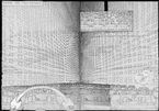
Art: The art is absolutely gorgeous. Everything is drawn with a thin pen line, without any crosshatching, black areas or colours, reminiscent of the works of another great artist: Saul Steinberg. This leaves every page very white and clean, which is suitable for the futuristic setting of the story. Most panels are whole pages or even spreads, without any margins, and crammed full with details, until your eye looses itself in all the minutiae. Today, this would hav been done with a copying tool in a computer, but here it's all hand drawn, with constant slight variations that makes you stay in each image for a long time. It's all breathtakingly beautiful and harrowing at the same time.
Critique: That this book, which feels avantgarde today among the comics that are produced across the world, was actually done more than forty years ago is staggering. It's even more strange when you consider the backstory of the artist loosing the original artwork, and himself during several decades, only to have it reemerge decades later, being picked up and published to international acclaim.
Reading this book can be done rather quick, as it is almost silent, with few, short and often surreal dialogue and some captions, mostly reading like orders that makes all the identical persons act in a synchronised manner, and whole-page images. You soon get lost in the images, though, and after having read the whole book, it sticks in your mind. On one hand it is a rather obvious critique of the world of the 1960s, with common targets of the time of the hippie era such as warmongers and consumerism. On the other hand, the whole dystopian, fit-in or die theme feels eerily contemporary and makes you stop and think. The art is also full of small details, such as one of the drivers of the endless caravan of cars driving home form work, thinking about flying an aeroplane, och the fact that among the thousands of men going to work, there's ONE recurring woman. Things like that makes you stop and look again and wonder what the artist was aiming at, as the often wordless pages leaves much open to interpretation.
The world of Soft City is run by a man speaking with German accent and the whole fascists setup reeks of Nazism. In the 1960s, WWII was still very much alive in the minds of people and that should make this story feel dated. Sadly, it doesn't. What with Putin and other world leaders actually regressing the road towards democracy and the Internet making us all more and more alike in culture and consumer habits, Soft City feels strangely modern and up to date.
This book is a true masterpiece and one that should be read by everyone seriously interested in comics, it's potential and history. As a complement to the book, there's the biography Pushwagner by Petter Mejlæner, which I will read next.
When graphic novels are almost exclusively told through their visuals, it's hard for me to get past an unpleasant aesthetic.
The dystopian narrative was probably a bigger deal when this originally came out, but it's kind of bland to read now, and the writing itself is very cold and distant, putting even more emphasis on the visual style, which I hated.
I don't know. Probably someone else would like this much more.
Wow. This thing is amazing. I just found it at MoCCA, which is an indie comic book expo here in New York City. This book was sitting amongst a bunch of great books at the Norwegian table, and after a few minutes flipping through the pages and drooling, I decided I had to have it. And I'm happy I bought it because it's amazing. Hell, just look at some of these images.
Hariton Pushwagner has been a part of my life for quite some time. It all began in my mid-teens, when my father came into my room and told me about a program that he had listened to on the radio; it was about a guy called Axel Jensen, and my father thought that his books might be of interest to me... And he was certainly right about that!
And through Jensen I was introduced to Push, through his powerful illustrations in the Oblidor-books (Epp, Lul, Lem, etc. - all collected in the volume "Resten Står Skrivd i Stjernene", one of my favourite books of all time), as well as the wonderful (and sadly unfinished) comic book "Doktor Fantastisk", which was also one of my earliest encounters with 'Pataphysics (although I believe that a Bringsværd book was my first exposure to THE science).
When I moved to Oslo in my early twenties, I used to see Pushwagner in the streets all the time, especially up in the Torshov area, where I believe he used to live (or at least hit the pubs). He was never walking, like ordinary people, no... he was dancing! Seeing him really made an impression - here was someone who was truly different, and whose life and art was one and the same thing.
And what about "Soft City"? Oh dear, it's a very frightening book... a horror story if I have ever read one. A very clear-sighted and accurate vision. This is science FACTion indeed... A lot of things in his life (and ours) make more sense after reading this book. It is a depressing, but quite necessary exercise. Thank you, Push!
This is a re-read, it's a quick book. Essentially a day in the life of an anonymous man in this dystopian city. He's got a wife and a child... so does every other of the thousands of identical men in his living complex. They all drive in their own cars to an anonymous looking office building and work all day long, until they come back home and go to sleep beneath a starless night sky.
Apparently this was drawn in the early 70s by Pushwagner and was lost before it was published. Later discovered in the 2000s and finally published. It's a brilliant lost comic.
It reminds me of the opening scene from Metropolis. It's quite eerie. Certainly nightmare fuel for me.
100517: somehow the freehand, primitive, repetitive, simple images, all work to envision this dystopia. very much of its time (early '70s), even earlier, clearly defined, regimented gender roles, coats, hats, cars, housewife cooking, husband office drone. huge expanses only emphasize diminishment of the human, not celebration of scale. no story to distract. just great images...
Roger Ebert famously said: "It's not what a movie is about, it's how it is about it.”
This applies 100% to Pushwagner's magnum opus. It's quite impressive, actually, to literally witness such vast amounts of detail, on every single page. It must have taken a long time to draw (too). I kept thinking this the entire time. And I "appreciate" this. But I also wanted to stop looking at the work as a piece of research (like I do with all the books I read) and wanted to just try and enjoy it.
Well, you can't really enjoy something like this. And I don't think you're supposed to. In retrospect, thinking about it all a little bit later, it really reminds me of my own work. Trying to say something and using a vehicle that, on the surface appears to be one thing, but deep down, in reality, is really something else. For instance, in this case, Pushwagner uses the visual medium of the graphic novel (even tho this wasn't really that rampant back then) to create a sort of awareness and mind expansion that is wholly necessary for us as a people. Why do we so often just keel over and accept our fate? Why are we so totally fine with the way of things, over and over and over again? This is the sort of work that requires you to remain alert the entire time, while experiencing it. There's a lot going on, and it begs to be revisited (3 maybe 4 times again). It's not mindless drivel (tho the manner in which it is presented can certainly hypnotize and cause the mind to wander, which is brilliant, btw).
In the end tho, it really isn't about the story, at all. There really is no story. It's pretty much, 3% story, 97% what's-really-going-on. The year is uncertain. Everyone is a family of three (the "nuclear family"). The man goes to work. The woman cares for the child. Rinse, wash, repeat. Simple. Done. But that's just the 3%. Where this book shines, is in the remaining 97%! The stuff that's happening off the page. Think about this...
I was ready to give this work a 3 (maybe a 4). What made me give it a 5? I read Chris Ware's introduction and Martin Herbert's afterword. Absolutely essential.
Juhtus, et mul oli vaja New Yorgis paar tundi raamatukogus veeta. Mõned postkaardid kirjutatud, seadsin sammud graafiliste romaanide sektsiooni. Lootsin et seal võiks olla just see - Pushwagneri „Soft City”, outsider-kunsti kauakadunud koomiksiformaadis meistriteos.
Lugesin raamatu sealsamas läbi ja elamus oli hea! Lihtsalt mastaapne töö: Lõputud autoummikud keset lõputuid kõrghoonete aknaruute, kust on meestele head tööd lehvitamas lõputu hulk identseid naisi, süles samasugused beebid. Lähim raamat Fritz Langi Metropolisele, ainult et see kõik ongi juba selline absurdne normaalsus, kus mingit revolutsioonisädet ei ole ega tule. Ja samas on see stiililt nii põnev. Mitte üldse lõputult rõhuv brutalistlik hall, vaid värisevate joontega popkunstniku happetrip. (LSD-l oli Pushwagneri loomingulises protsess ääretult oluline koht)
Erilist võlu lisas see, et lugesin seda igati sobivalt keset Manhattani pilvelõhkujaid:
What is our perhaps most impressive about SOFT CITY (putting aside the sheer physical size of the NYRC edition) is how much it anticipates, both culturally and socially: Terry Gilliam’s BRAZIL and 1984, the alternating close ups and long shots of Stanley Kubrick, the five minute car journey scene in Tarkovsky’s SOLARIS (mentioned in Chris Ware’s introduction). Also, out-of-town shopping centres, giant on-line fulfilment warehouses, and FaceTime.
But, of course, it also owes much to pre-existing ideas: to the high rise landscapes in Fritz Lang’s METROPOLIS, and the city sized panopticon in Yevgeny Zamyatin’s WE, and the cut up techniques employed by William Burroughs.
Full disclosure, I am a friend of the author’s daughter. But that did little to alter the impact of reading this visionary and overwhelming work.
As noted in the introduction, this obsessive, minimalist graphic work would have been right at home in the pages of Art Spiegelman's RAW back in its day, had SOFT CITY not been lost (or mislaid) for many years. Read today, it's both a memento of a time when hippies dreamed of an agrarian counterpoint to urban nightmares and a prophetic picture of the internal state of our present existence. The illustrations, especially the commuting sequence, may be capable of inducing unpleasant emotional or mental states, like a mandala of crushing conformity.
One of the most fully realized and haunting pieces of art I've ever encountered. It's also quite hard to describe.
Like many works of art, you have to take the time to absorb the various components and allow yourself to feel them.
I saw another review that said something like "not enough words," but I strongly disagree. One of the tensions in graphic novels is the balance between the amount of attention between the words and the pictures. The language is so sparse and careful here you are forced to really look at every frame and every page, including the pages that are agonizingly similar to neighboring pages. You feel the crawl of traffic through frame upon frame of a world of identical cars barely "moving." You feel the oppression of a workplace packed with buttons and screens, and how frighteningly blank the Boss looks with his barely sketched features. The epilogue uses the word "minimalism" for this style, but it's not minimalist in labor. Hundreds of nearly identical windows and people are drawn with obvious effort. One of the benefits of pre-digital illustration is you can imagine the artist sitting and hand drawing these painful details that, thematically, represent meaninglessness.
I said it was hard to describe. It's not hard to feel; for me, I had a near-physical reaction to the crowdedness of some frames and spare beauty of others. The use of barely communicative words reminded me of other mid-to-late 20th century artists such as Ed Ruscha and Jenny Holzer.
I borrowed this book from the library and a previous patron had left post-its with their thoughts on certain pages. This was an unexpected bonus, an anonymous smoke signal of communication in a work about isolation. I may add my own when I return this book to the library.
Soft City is a comic that epitomizes the notion that less is sometimes more. It shares some of the spirit of classic dystopian novels like 1984, Brave New World and Fahrenheit 451, but compared to them it’s radically stripped down. There are no protagonists, no intrigues, no dramas, no romances, no attempts to overthrow the system, no elaboration or exploration of the regime’s ideology – indeed, some might say that there’s no plot at all. Instead, this comic presents a day in the lives of the dystopia’s denizens, following the rhythms and routines of a society where every moment is regimented according to a centrally determined schedule.
Hariton Pushwagner (né Terje Brofos) worked primarily in the world of fine art, and I think it's best to view Soft City through this lens: it makes more sense as an art project than as a traditional narrative-driven comic. In his introduction to my edition, Chris Ware likens it to a poem, and I think that’s very apt: it’s mesmerizingly rhythmic, characterized by repetition and regularity. The art style is pared down and minimalistic, with thin lines and copious white space, but its brilliant use of perspective and symmetry and its monumental sense of uniformity and scale make it truly hypnotic.
The dystopian ideas at the heart of this work will be familiar to most readers: an omnipotent state-corporation, the drudgery of monotonous labour, a society sapped of individuality, the oppressive power of totalitarian architecture. However, Soft City tackles these themes in such a unique, visceral, intuitive way that it’s utterly arresting – almost suffocating – prompting the reader to take a long, hard look at the state of the world.
Apparently it is a miracle that this book even exists. Considered lost for thirty years, it was then wrapped up in legal disputes for at least fifteen more, and now has finally been published to less than commercial fanfare, but to the joy of graphic artists and comic connoisseurs across the globe. This is the city high-rise, middle manager, version of Solzhenitsyn’s “One Day in the Life of Ivan Denisovich”. We see the actions of one family as they go through their regular day of wake up, commute to work, do their job, shop, TV, sleep. This is reflected by thousands of people about them doing the same actions. The commuting parts I appreciate, as they go on for pages and pages, accurately reflecting the tediousness of going to and from work, and just how much of your valuable life is eaten up in this activity. One might discuss the action (or perhaps non-action) of this book in terms of the banality of existence, the dehumanization of the individual in corporate society, the purposelessness of modern Western first world life, but it is more than that. The people here aren’t mindless drones. We see snatches of their dreams and fantasies popping up in the urban landscape. These are of the escapist sort: desert islands, beautiful women and men, flying aces in an old war. These are people with dreams not just drones.
A forgotten classic from 1969 now found (believed to be lost until 2002). Soft City is a look at the monotony of life, the repetition of the daily grind. It is similar to 1984 or brave new world in comic form. The perspective is the star here, the book is over sized and it lends to the massive perspective Pushwagner created. The story is one single day in the life of a city, family, or person that is caught in the rat race we all know all too well. It is startling, sad, and sort of eye opening to step back and see how similar it is today. The idea of "soft" is used a lot and it really emphasizes the idea of how safe society can be and how its meant to protect us from the adventure of life, its a great theme. The art it self is bold with simple line work and no color, I think it fits the book well.
A librarian friend recommended this to me. I had no idea what it was about, making this a cold read. It's a story about mindless drones with generic families going to work every day as their interchangeable wives do the shopping, with some not too subtle social commentary. It makes as strong impact. The story of the book is interesting too. Pushwagner worked on it for several years, only to lose it for decades and fight an art dealer for some years to get it back and publish it. Well worth a look.
One Norwegian artist from the early 1970s saw the future - and it was us (or US). The only thing 2020 changed was to cut out the commute...
The sort of haunting book that will be with you for a long while. Soft consume! Needs to be experienced rather than described, and my library had the hard cover New York Review Comics edition. Yours probably does also - go get it!
I picked this book up on a whim and was not disappointed. The paralells between this distant dytopian corporate hellscape and modern times can not go unnocticed. The real kicker is that while this could be considered a modern commentary on daily life in 2024, it was created in 1969 (before graphic novels evem existed). A brief, but excellent read!
An artpiece of a graphic "novel" that as Chris Ware's introduction states, is more of a graphic poem than a novel. It is simple in its presentation, yet portrays a vastness inside of this dystopian landscape. It's like all those dystopian sci-fi novels if there was no protagonist to incite change and if the devastation of the stripping of mankind's individuality was able to see its uninterrupted end. It's horrifyingly representative of a future we all see in our nightmares if we let ourselves lose what makes us us.
Shout out to the single family that has the male and female roles reversed. Even them existing shows how long you can soak up these gigantic sprawling pages of cells that are all the same at a glance, but upon closer inspection show different poses, hairstyles, etc. to express despite doing this line dance of existence, those traces of individual humanity peak through, which kind of shows that rebellion is still possible. That we are still people even inside a universe where we live out the same lives copied and pasted over and over. That a break in the system is possible, even when it feels like everything has been softened.
Incredible comic that hits different when you have a stupid corporate job. Visually stunning, overwhelming, & claustrophobic.
When I think about how this was drawn in 1969 and then I think about where we are now as a society, it makes me feel uneasy.
Particularly enjoyed the afterword by Martin Herbert. I liked the line that Soft City "is nothing more or less than a massively warped children's story, a fable aimed at adults who themselves have been made childlike."
Hariton Pushwagner seems like a made-up name. That's because it is... Pushwagner turns out to be the pseudonym of Norwegian artist Terje Brofos—and I kept wanting to say "Pushtwanger" instead, anyway. But you should not allow the silliness of Pushwagner's chosen pseudonym to mislead or deter you... Soft City is a serious work of art, a graphic portrayal of urban dystopia whose antecedents reach as far back as Fritz Lang's Metropolis and E.M. Forster's "The Machine Stops." And, despite its age, this lost-and-found graphic novel—completed in 1975 but not published until 2008—remains a relevant and accessible artifact today.
The plot is extremely (and deceptively) simple, as Chris Ware's Introduction acknowledges. (I suspect, by the way, that Ware was also responsible for the sideways title font on the cover, which looks at first like an alien alphabet.) Soft City follows a day in the life of a typical family, from sunrise to sundown. Father drives to work; Mother does the shopping; and Bingo, the baby, explores the apartment which is his world. The devil, as always, is in the details... our viewpoint varies from close focus on Bingo to vast vistas full of nearly-identical windows, each of which shows nearly-identical families performing nearly-identical tasks, the subtle variations among them only highlighting the hellish uniformity of their lives. This is the city as anthill, a meaningless reiteration of mundane architecture inhabited by nearly-interchangeable functionaries.
Nearly.
However, every window in every building in Soft City is its own portal into an individual life. Pushwagner was unable to use electronic cut-and-paste, and evidently unwilling to take whatever shortcuts might have been available to him while rendering these multitudes. Every car, every driver, every passenger is individually drawn. Although the majority of Soft City's commuters are men, for example, Pushwagner shows the occasional woman scattered among them—without explanation, subverting what might otherwise appear to be a totally gender-separated society.
Pushwagner's stunning sustained effort forces us to acknowledge that every single person in Soft City, even those who appear as a mere sketch on the periphery of the page, must in fact be a unique human being. His choice to focus on Bingo and his mama and papa therefore becomes a matter of convenience, rather than privilege; although every other apartment contains an equally important family, all of whom must have an equally insistent point of view, it's just not possible to portray all of them at once. The one must stand in for the many... which is a lesson well worth relearning, or so it seems to me.
The large and handsome New York Review edition of Soft City that I read, with supplemental material (dated 2016) from Ware and biographer Martin Herbert, is well worth picking up as well.


