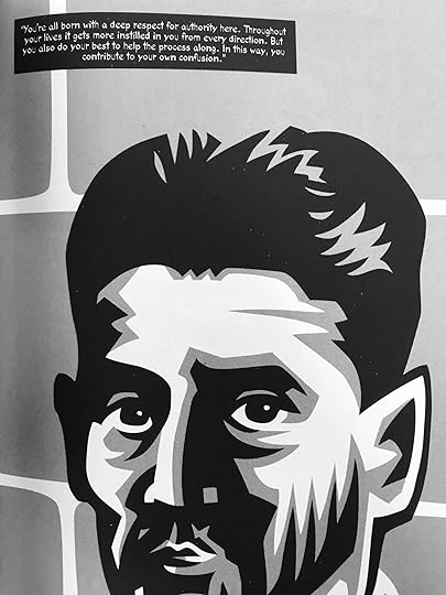
Der Landvermesser „K“ kommt mitten im Winter in ein tiefverschneites Bergdorf mit einem bedrohlichen, in Nebel eingehüllten Schloss darüber. Der Versuch, Kontakt zu den Bewohnern des Schlosses aufzunehmen und zu den Beamten, die die Bürokratie über das Dorf leiten, führt zu immer neuen Missverständnissen und K. übertritt eine Vielzahl von verwirrenden und widersprüchlichen Vorschriften, die den Dorfbewohner ihr tägliches Leben diktieren. Diese schneidend scharfe Studie über die Sinnlosigkeit ist Franz Kafkas letztes Meisterwerk – wie sein Leben selbst endete sie mitten im Satz. Die besondere Art der Illustration verbildlicht die düstere Welt der absurd-grotesken Bürokratie auf beeindruckende Weise.
Mairowitz is a writer who studied English Literature and Philosophy at Hunter College, New York, and Drama at the University of California, Berkeley.
He is the author of the plays "The Law Circus" (1969 and "Flash Gordon and the Angels" (1971). Other works include "BAMN: Outlaw Manifestos and Ephemera 1965-70," "The Radical Soap Opera: Roots of Failure in the American Left," "Kafka for Beginners" and "Introducing Camus."
An absurd nightmare filled with stark rimmel-black & bleak, flawed, tattered whites. I had a really colorful Prague bookmark aptly between slowly simmering pages (the vivid colors of the astronomical clock fighting against the forces of evil--I know this because I was THERE this summer you guys!). This unfinished novel by the father of the opaque is very literally portrayed, but this is one of those unfilmable, un-photographable projects, really. So it comes with a lot of head scratches and a plethora of So-whats(?).
Kafka's "Castle" is basically like anything written by Beckett.
Mein erstes Graphic Novel-Buch, von Comics natürlich mal abgesehen. Kafkas letzter Roman über die Sinnlosigkeit der Bürokratie, wo Kafka draufsteht, ist auch Kafka drin. :D
Just like the art installation in the Kafka Museum in Prague I once visited and all oft Kafka's writing I've read so far, this leaves me somewhat shaken, and unsure about reality. The graphic rendition is raw, and beautiful.
Tento typ maľby mi veľa nedáva a otvorene sa priznávam, že lúštit, ktorá postava je ktorá, bolo dosť náročné. Text k obrázkom je občas tak voľne v priestore, že si ostávam domýšľať.... Čo ma najviac asi prekvapilo, bola akási rozkúskovanosť, tuto časť príbehu, potom príbeh tej postavy (z prosta do prosta) a potom sme zase niekde v príbehu (tom hlavnom), preskok k inému príbehu ďalšej postavy.... Malo to byť krátke prečítanie, ale ťažko sa lúskalo sivočiernymi stránkami, kde príbeh bol takmer ako v Kocúrkove, a nič sa poriadne neudialo. Teda ak nerátam fakt, že K. prišiel a všetky ženy naňho letia ako muchy na med..... Komiksy milujem, len tento mi dal zabrať viac ako som tušila a vôbec nie s pozitívnym výsledkom.
Prvá veta: Bylo už pozdě večer, když K. dorazil. Posledná veta: Mluvila s obtížemi: bylo těžké ji rozumět, ale to, co říkala...
The trouble with a book like this is that you can read it in under an hour whereas Kafka's source material is much more detailed than the sparse prose and artwork here could possibly represent. For that reason I didn't find this particularly satisfying. It's also hard to imagine how someone coming to the book without having read "The Castle" could formulate even the barest of storylines from it. On this occasion, I think the density of the source material undermines the book. However the artwork is excellent in itself and the key scenes are well represented, but it makes Kafka's "The Castle" appear a shallow work when in fact it is an undisputed (by me) classic.
vyprávění ve formě komiksu mi nesedlo, nemám však srovnání s knihou Kafky. tíživá atmosféra je kresbou skvěle navozena. hrubka na klopě je děsivá: "První čtenáři byly v rozpacích..." – já jsem také.
I didn't really connect with the art-style or with what I assume is a very truncated version. It did make enough of an impact to make me curious to read the whole novel, well...the whole incomplete novel. And now I wonder why I'm doing this to myself. I will come back and re-rate after I read the novelization if I feel a change is warranted. This may just be that this particular graphic adaptation is for those who have already read this work...
The Castle is an adaption of Kafka's unfinished story of the same name. I really liked the art style, which added to the gloomy and mysterious atmosphere of the storyline. As the story was coming to an end it became more and more confusing and obviously ended very abruptly. I would have been interesting to see how the tale ended but I guess we will never know.
I really liked the art in this one. Very gloomy with a woodcut kind of feel. The story did get more incoherent towards the end and just breaks off in an awkward place. This might be due to the source material (haven't read it), but it was still unsatisfying.
Skoda tych ilustracii. Aj ked dotvaraju atmosferu, crty postav su len hrube a velmi tazko sa rozpoznavaju, cize zneprehladnuju pribeh, ktory svojou podstatou v komiksovej podobe potrebuje prave viac jasnosti. Ale aspon som trochu pochopila, o com Zamok je, lebo literarna predloha je tazke susto.
I actually liked the art, it was gloomy and beautiful at the same time. But i didn't understand the story at all, maybe i should read it another time in future but for now i didn't enjoy the story.
Adaptações literárias em quadrinhos são um grande problema. Geralmente as editoras produzem ou adaptam publicações em outras línguas para aproveitar as benecesses de programas culturais de compra de livros do governo, como o PNBE. Então surgem coisas que até o diabo desconfia, de tão ruins que são. É o caso desta adaptação de O Castelo, de Franz Kafka, talvez a mais kafkaniana das obras do autor. Mas por ser kafkaniana não quer dizer que tenha de ser inteligível. Esse quadrinho é assim. Tem problemas em vários sentidos. Desde a conversão do texto original para um texto de diálogos de quadrinhos, na narrativa visual dos quadrinhos feita pelo artista que não parece conectar a linearidade dos acontecimentos e, por fim, na diagramação das letras nos balões feita pela L&PM aqui no Brasil. Chega a ter balão que não se enxerga o que está escrito porque o texto correu. Isso deixa a obra mais feia, menos agradável de ler. Parece ter sido editada às pressas, sem cuidado. Bem triste ver como o catálogo de quadrinhos da L&PM tem ficado e como tem tratado graficamente suas HQs, uma editora que já foi sinônimo de ótimo catálogo e ótimo tratamento de seu material, principalmente quarinhos, agora parece ser apenas movida pela venda.
Text románu Zámek (i když ho mám rád, zvlášť úvodní scénu) je pro mě často dost složitý: postupem četby románu vždy silně klesá moje schopnost se v knize dr. Kafky orientovat. Grafická adaptace je tak pro mě výtečnou pomůckou, jak si příště lépe prožít četbu plného textu Zámku, protože mi poskytlo jednoduchou strukturu několika příběhových linií, kterých se budu držet. Článek na blogu: https://goo.gl/x8mDj7
Predlohu si vobec netrufam citat, lebo Kafka bol pre mna vzdy neuchopitelny, no predsa len si myslim, ze som aspon trochu nazrela do podstaty Zamku cez tento komiks. No myslim si, ze by to islo aj lepsie...2.5*
Kafka's disjointed plotting, confusing dialogue and general indefinable weirdness don't seem to lend themselves to the sequential art format. The woodcut-style art is a little boring in places too.
The woodcut-esque style is initially striking but ultimately becomes an impedement. Then again, I feel that way about Kafka's writing in general, so maybe this is a good adaptation.
I like this style of illustration but the book doesn't adapt well to a graphic format. I'd be surprised if anyone who read this was keen to go on to the novel.
With it being one of Kafka's unfinished works it does finish fairly abruptly, but even before then I found it to be very hard going - the art is solid, monochrome and brutalist, but the story, what there is of one, is contradictory, sometimes fairly surreal, but even within the same panel the dialogue flip-flops very confusingly and all in I found it an extremely frustrating read. Obviously, that could be the point, highlighting the frustrations of bureaucracy, aristocracy and stratified society, but it didn't have an internal logic that I found satisfying in any way.
Drop dead gorgeous black & white artistry overflows in this graphic novel. Of the graphic novels I have read, so far I very much prefer those with black & white artwork. Side Note: While I'm sure the artist here was trying & suceeded in evoking the likeness of Franz Kafka in picturing the character K in The Castle, the images reminds me more of George Orwell.