Jump to ratings and reviews
Rate this book

Picture This: How Pictures Work

Rate this book
Molly Bang's brilliant, insightful, and accessible treatise is now revised and expanded for its 25th anniversary. Bang's powerful ideas--about how the visual composition of images works to engage the emotions, and how the elements of an artwork can give it the power to tell a story--remain unparalleled in their simplicity and genius. Why are diagonals dramatic? Why are curves calming? Why does red feel hot and blue feel cold? First published in 1991, Picture This has changed the way artists, illustrators, reviewers, critics, and readers look at and understand art.

154 pages, Kindle Edition

First published September 1, 1991

677 people are currently reading
5223 people want to read

About the author

Molly Bang

53 books86 followers

Ratings & Reviews

What do you think?
Rate this book

Friends & Following

Create a free account to discover what your friends think of this book!

Community Reviews

5 stars
2,276 (46%)
4 stars
1,625 (33%)
3 stars
741 (15%)
2 stars
181 (3%)
1 star
70 (1%)
Displaying 1 - 30 of 498 reviews
Profile Image for H (trying to keep up with GR friends) Balikov.
2,125 reviews819 followers
February 11, 2019
How does composition of a picture affect the viewer? Molly Bang's study of color, shape, position, etc., using the story of Little Red Riding Hood as the subject worked for me.

What I mean by that is that it made me look at paintings, photos and other graphic material with some new insights as to what the artist was trying to convey or why the work affected me the way it did.

I believe it will also make me a better photographer as I, more consciously, employ some of her insights.
Profile Image for Brent.
374 reviews188 followers
May 17, 2020
An excellent and systematic exploration of shape, composition, and the fundamentals of visual language.

Over and over the author would lay out a basic rule ("shapes with sharp edges feel threatening, shapes with curves feel comforting") and a lightbulb would come on. And at least for me, things I had seen all my life but not really noticed, were suddenly put into words.

Especially effective were the pictures on every other page, patiently illustrating the concepts one element at a time.
Profile Image for Mir.
4,974 reviews5,331 followers
December 21, 2019
Not a review, just a few notes:

contrast enables us to see both patterns and elements.

The movement and import of the picture is determined as much by the spaces between the shapes as by the shapes themselves.

Space implies time.

In nature, when we look at an object against a dark background, our eyes create a nimbus of light around it, while the edges of an object look darker against a light background.

The bottom half of a picture feels more threatened, heavier, sadder, or constrained; objects placed in the bottom half also feel more grounded.


A few exercises are suggested at the end:
--Pick a favorite painting and recreate it using only rectangles, circles, and triangles. Use only three or four colors.
--Represent a situation that evokes a strong emotion.
--Illustrate a poem or series of poems, using the same three or four colors but representing different moods.
--Illustrate a book cover or movie poster. How can you most effectively use the letters to enhance feeling?
--Illustrate a folk tale using limited colors. Try to make the first and last picture similar to each other but with changed feelings.

Push the pieces of your picture around. Cut new ones. Replace one element with a piece of the exact same shape but another color.
... Do not glue down the pieces until the whole picture really works. "Okay" is not good enough.
Profile Image for Jane Dugger.
1,187 reviews55 followers
August 18, 2011
I discovered this book on Penelope Trunk's website. I don't usually go for books like this and almost didn't read it before returning it to the library. But I am sure glad I did. And be sure to read the whole thing (i.e. the introduction) it explains it all.

This was such a fascinating book and you will never look at art, pictures, etc. the same. I inhaled this book. I wish I could renew it to be able to read it again and again and refer back to it. It's that amazing.

It's not difficult reading but there are some serious concepts in it that will change how you think about perspective.

Seriously, one should read this in grade school, high school, college, our 30s, 40s, 50s, etc.

This would make a great book club pick. It's not a long read but thought provoking. Everyone could bring one of their favorite pictures, artwork whatever and talk about how it speaks to them and how they think about it after reading the book. Wouldn't that be a fun book club, different than the usual stuff?

If your library doesn't own this book buy it - it's only $11 on amazon.
Profile Image for Diz.
1,860 reviews138 followers
September 7, 2018
This book takes a deep look into how we respond emotionally and psychologically to pictures. It is written in an easy to understand way, so it is very accessible. I would recommend this to anyone who is interested in art or graphic design.
Profile Image for Maia.
Author 32 books3,632 followers
September 23, 2025
A short but extremely information rich book about how the size, shape, color, and position of objects in an image can be shifted to create emotional force in illustrations. This is an extremely thoughtful look at composition and a very valuable read for anyone working in the visual arts. I picked it up because Molly Bang illustrated a picture book I loved in my childhood and love to this day (The Grey Lady and the Strawberry Snatcher) and while this is nothing like that book I enjoyed and next time I start developing a picture book pitch I will refer to it!
Profile Image for Kaśyap.
271 reviews130 followers
March 6, 2020
The best book on composition. Simple but profound.
Profile Image for Jeanne.
1,260 reviews99 followers
January 10, 2021
Molly Bang deconstructs images and how their shape, size, orientation, and color affect our emotional responses to an image. Bang starts small: a red triangle representing Little Red Riding Hood. Here, she reflects on the feeling inherent to this simple shape.

The figure is not exactly fraught with emotion, yet I knew I felt things about it that I didn't feel for others.

It isn't huggable. Why not? Because it has points. It makes me feel stable. Why? It has a flat, wide, horizontal base. It gives a sense of equanimity, or balance, as well, because its three sides are equal. If it were sharper, it would feel nastier; if it were flatter, it would feel more immobile; and if it were an irregular triangle, I would feel off balance. What about its color? We call red a warm color, bold, flashy; I feel danger, vitality, passion. How can one color evoke such a range of disparate, even conflicting, feelings?
(p. 4).

Bang describes a number of simple, but increasingly complicated thought experiments. How does changing the wolf's size, rounding its points, and changing its color impact how we see it?


From Picture This

Bang's simple experiments are effective, more so than only talking about the roles of shape, size, orientation, and color. She encourages her readers to continue to play with images, recognize and use the underlying principles of illustration, and deconstruct what makes them effective.

If I taught in introductory art history course, I would use this book for the first several weeks of the semester, then move to more complicated pieces. What makes these effective? And, with PhotoShop – or other apps – how can we change an image to understand both it and what makes art effective? Are there other versions of an image that would be more effective?


Four versions of the Mona Lisa: by Leonardo da Vinci, Bernardino Luini, Philippe de Champaigne, and a version stored by the Prado Museum in Madrid

I am currently taking a teaching workshop that I think is fairly ineffective and disappointing. Part of the difficulty is that the presenter talks too much and has us experiment too little.

Both Bang and this workshop presenter teach me the same lessons: sometimes less is more, sometimes doing is more important than talking. I will try to remember.
Profile Image for Neil.
1,007 reviews757 followers
October 29, 2022
I mentioned in a recent book review that I have subscribed to photographic community in which my two favourite photographers (Valda Bailey and Doug Chinnery) mentor us, the subscribers, in creative ways to use the camera (a lot of multiple exposure and Intentional Camera Movement). The community splits into two sections: the first concentrates on process and technique and the second, far more interesting to me, focuses on “finding your creative voice”.

As part of this second half, we read some books together. And Molly Bang’s “Picture This” is the first of these books.

There’s something of the ring of genius in this book. It is written in very simple language. I almost think I could read it to my 2-year-old granddaughter and she would understand most of the words. But it communicates brilliantly. So brilliantly that I have immediately recommended the book to all the members of my local camera club of which I am the chair.

Molly Bang takes the story of Little Red Riding Hood (she becomes a Little Red Triangle here) and gradually explores how the size, shape, colour, position etc. of an object in a picture affects our emotional response to that picture. Then she expands on this by illustrating a whole series of principles, starting with the way gravity, which we live with every day of course, affects how we look at pictures (it’s why we think a level horizon is stable and calming and why we think tall trees are less stable and more dynamic, for example).

It’s a short book, made shorter by the fact that alternate pages are a picture illustrating what the facing page talks about. But I would heartily (or h-art-ily) recommend it to anyone who is interested in art.
Profile Image for Ahmad Hossam.
288 reviews84 followers
November 19, 2017
I've recently become interested in the world of graphic design. The first thing I found out that it's not about what tools you use, it's about how you see. So this is my entry book to the field, and indeed it delivers. After going through its simple illustrations and insightful comments, I don't think the way I see the world will ever be the same again.
Profile Image for Sylvia.
Author 7 books148 followers
August 18, 2014
In this deceptively simple book, Molly Bang uses basic geometric shapes to show how pictures work: how simple principles of design can shape emotions and tell a story. Using cutout shapes to explain abstract statements such as "smooth, flat, horizontal shapes give us a sense of stability and calm" or "diagonal shapes are dynamic because they imply motion or tension," Ms. Bang walks the reader through the psychology of a picture. She shows how Little Red Riding Hood can be illustrated using these principles and simple shapes. She analyzes the emotional impacts of design elements such as composition, shapes, colors, contrast, and space. While much of this is intuitive, having it articulated in simple graphic form is invaluable to any visual artist.
Profile Image for Stephanie Jobe.
356 reviews10 followers
May 2, 2012
Thrown in the midst here I have a book about how picture books work. Though the theatre voice in my head says that this should be required reading for every design and directing student to teach them about how stage pictures work because the concepts are the same and Bang communicates it so well. She uses Little Red Riding Hood to demonstrate many of the key points. She keeps on track with very little tangents and the points she gives cut straight to the core. No you’re not going to run off and publish your picture book after reading it but you will look at the books you read and other pictures you see in a different way.
Profile Image for Kony.
448 reviews260 followers
June 6, 2018
An elegantly simple intro to visual design, exploring how different shapes, sizes, colors, and spaces evoke the emotional responses they do, and how to tell a story with the barest of materials (i.e. colored paper and scissors). Tracing the author's journey of experimentation and discovery, the book invites readers to become newly curious about their intuitive responses to various images, and to imagine tweaks that might induce different responses. All pretty fun and eye-opening. Perfect for a new designer-in-training, or for anyone who appreciates the strategic use of images.
Profile Image for Allie.
1,426 reviews38 followers
October 15, 2018
Definitely a must-read for anyone who makes their living reading picture books. There is so much interesting analysis that is implicitly known, but I hadn't quite put my finger on it before. I haven't been a fan of Molly Bang's illustration before, but I am definitely going to revisit her books with fresh eyes.

This reminds me so much of What We See When We Read (for adults), Another Book about Design: Complicated Doesn't Make It Bad (the better of Gonyea's two design books, for kids), and Go: A Kidd's Guide to Graphic Design (also for kids).

Profile Image for Shawn Thrasher.
2,025 reviews50 followers
August 22, 2017
There are wonderful books, and lovely books, and delightful books. There are also valuable books that satisfy intellectual cravings and hunger. Molly Bang's Picture This falls into that valuable category. I can admit that I know next to nothing about art and illustration; now I know a bit more. The book is really amazing because Bang tries - and I think succeeds- in teaching you how to look at a painting or picture, and really understanding what it going on. Not necessarily the intention of the painter or illustrator - although that is still certainly true - but also why, when you look at a painting, certain things going on in the painting make you feel and react the way you do. Bang does this cleverly and in such a way that you get it; she's never talking down, nor does she ever dumb anything down. A remarkable book!
Profile Image for Ahmed.
4 reviews1 follower
September 9, 2018
I've never encountered such a precise simple book on composition. When I was in art school, we experimented with composition with our teacher saying "just draw shapes". It was very frustrating because I didn't know why certain shapes worked and others didn't, and so I never got anywhere. For years I struggled with composition and knew something had to be done about it. After reading this book, I finally understand composition! When you first open it it looks so simple you get worried you already know everything in it, but Molly explains everything so perfectly, showing you both examples of what works and what doesn't, and most importantly, why. There are also exercises at the very end of the book to put your knowledge to the test. This book should be mandatory in any art major!
Profile Image for Albert Yee.
60 reviews3 followers
February 12, 2010
A book taking apart what we perceive to see using simple construction paper cut outs. Simple shapes depicting emotions like you've never really imagined. As a photographer, I felt this book reinforced basic principles and made me look at layout more critically than before.

I highly recommend this quick read to anyone involved or interested in any visual art. You can be an amateur photographer, film director or doodler - this applies to all of us at some basic level.
Profile Image for Maddie.
237 reviews69 followers
May 7, 2018
As I get more and more passionate and excited about my chosen career path (game art), I’ve been shelving some books that I’ve heard through the industry to be beneficial and thought provoking. I decided to start with this one (solely because it was the shortest, page count wise). Even though it reiterated what I’ve been taught before in previous fine art classes, I found reading it to be helpful in hammering in those core elements and principles.
Profile Image for Sassy Sarah Reads.
2,334 reviews305 followers
September 17, 2024
3 stars

This is a fascinating concept in looking at shapes and structures and how our minds interpret shapes, colors, and storytelling to make meaning. A shape is never just a shape to a human mind.
Profile Image for Quiver.
1,134 reviews1,354 followers
November 20, 2018

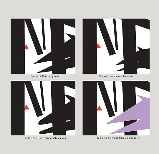
This book is the result of my “search for structure,” it does only one thing. It describes picture structure in terms of our feelings.


A unique exploration of form and colour that Kandinsky would have been proud of.

Molly Bang breaks form down to the basics: circles, triangles, rectangles, blobs, hilly and sharp terrain, vertical and horizontal lines, diagonals, combinations and compositions, regular and chaotic. She uses four colours: black and white, red and purple. By playing with the sizes and shapes, with their colours and their positioning, Bang illustrates the principles behind our feelings for structure.

Smooth is stable; pointy is scary. Verticals are active; diagonals are dynamic. Larger is stronger. The upper half of picture plane is freedom and happiness; the bottom half is heavier and sadder. Contrast enable perception; wide spaces engender tension. Chaos is alarming; regularity is reassuring, until it becomes too persistent and tips into horrifyingly mechanical. I particularly enjoyed her paraphrase:


Either extreme is terrifying. I think of a remark made by the Japanese novelist Akutagawa, that for him the worst hell would be an unending forest of cherry trees in full bloom.


The language is simple, the conclusions seemingly simple, though actually fundamental. This is be a book a child could read, and I'd offer it to one, but it is a book every adult should read: it explains the world of visual representation in undeniable terms.

P.S. To anyone who has also read Lakoff and Johnson's Metaphors We Live By : thoughts on similarities with Molly Bang's observations? I think the similarities are there and stem from similar underlinging thought processes. I'd be curious to see a study investigating the subtle differences between visual and verbal metaphors. Know any such studies? Send them my way!
Profile Image for Spindrift.
20 reviews11 followers
January 8, 2015
This is an interesting book, and it does a good job at explaining the effect of (some!) shapes and colors on our emotions - but I found that the book offered me nothing new. There's something to be said for having all the underlying principles in an overview, but these only fill a small section of the book. Most of it is a case study of one image in a number of stages/variations (though admittedly the principles are used in that).

For illustrators who never considered the way shapes and colors effect us it might be an interesting read. But since it's kind of an essential chunk of knowledge in our work the chance is small that you aren't already familiar with everything in the book unless you are new to the field.

For more experienced designers this book is too superficial and the examples to narrow to gain a deeper and more practical understanding of the topic (which is what I hoped for when I purchased it).

Also, the author presents most of the conclusions in the book as facts while a some of it is open to interpretation (for instance, I didn't think the addition of the red shape for the tongue in the case study made the image more scary at all, to me it made the wolf look dopey/tired and even more playful, while the all black shape to me was more mysterious and thus more scary)
Profile Image for Nostalgia Reader.
867 reviews68 followers
February 6, 2020
A great introduction to picture composition and structure. I thought it was a little too simplistic in parts, and it used some sweeping generalizations (at least it felt that way to me), but it also is just enough info to grasp the basic aspects of what makes pictures work, especially in kids lit and picture books.
Profile Image for Katie.
588 reviews5 followers
September 11, 2025
This book was given to me by a friend (thanks, Stephanie!) and I believe was part of a college course she took? It sat on my bookshelf for um, probably a decade (whoops) before I pulled it off and decided to read through it with my 5 year old as the main source for our art curriculum. I was not prepared for how voraciously that kid was gonna gobble up the content! A testimony to how good it is at showing the principles it is teaching in a clear and easy to digest way. My kiddo made me read through the Red Riding Hood section multiple times and has also gone on to flip through narrating it, discussing it out of the blue with adults on car trips, and so on. We finished The Principles section yesterday which was definitely more textbook-y and I did a lot of skimming and abbreviating for my kiddo. That section is really good, so I'm sure we will revisit in the future. For now we had enough baseline concepts to enjoy our trip to the art museum discussing color and composition and thinking about artist intent.
Profile Image for Barbara.
14.9k reviews316 followers
September 7, 2016
Back in the day when I read the original version of this seminal work on illustration and how pictures work, I raved about this book, and I found it incredibly insightful and important in how I reacted to images. Today, twenty-five years after it was published and with expanded elements, I have not changed my feelings at all. It is still one of the most important books that anyone studying children's literature and/or children's picture books can read. Using simple shapes such as triangles and circles as well as colors, Molly Bang demonstrates how moving those elements or changing them slightly can evoke different reactions in readers. The examples speak powerfully, and the supporting text enhances what she has drawn. Visual literacy surely got its start in this book, and I felt honored to be taken on a tutorial of the essential elements of illustration. Fans of picture books will find their appreciation of the format enhanced after reading this book, which has multiple uses for young readers, academics, and artists as well as those of us who marvel at the creative process of authors and illustrators.
Profile Image for Samantha.
4,985 reviews60 followers
January 30, 2015
Introduces readers to the structural elements that make the pictures we view so emotional for us.

Topics covered include: horizontal vs. vertical vs. diagonal shapes, object placement in the top half vs. the bottom half vs. the center of a picture, edges and corners in artwork, background colors, pointed shapes vs. rounded curves, size, association between objects based on color and shape, contrast, and space.

Extension activities can be found at the end of the book. Each concept is supported by computer generated graphics using basic shapes and colors.

This book is incredibly useful for parents and educators who spend a lot of time reading picture books. It adds a depth to a reader's understanding of the artwork whether they have much formal art training. Highly recommended read for all ages!
Profile Image for Miss Kelly.
417 reviews8 followers
February 9, 2015
interesting enough. i actually wish that the book went through the entire story of little red riding hood. i wanted to see how key points in the story were crafted from the simple shapes.

although, i have to agree with some other goodreaders who say that her arguments lack...well...argument. she does a good bit of "this shape makes you feel like this...see?" without much to back it up sometimes.

when she talked about the color red, she mentioned that psychologically red does something to humans. i liked that.

i do not want an academic paper, but some sort of academic reference would be nice for context.
Profile Image for Joshua Rigsby.
200 reviews65 followers
March 7, 2015
This is a decent little book for someone just getting started in graphic design or visual art. It presents some general psychological principles regarding how the things we see translate into emotions we feel. Some of the topics discussed came across as interesting and illuminating, some of them as a little too theoretical/culture-based/subjective, and a few I believe are completely wrong.

However, there is enough here for the beginner to get her feet wet, and start thinking about visual presentations in a more nuanced way. Not a waste of time.

http://joshuarigsby.com
Profile Image for Rachel.
2 reviews
July 22, 2022
A manual for communicating beyond words

This is a deceptively easy read that will completely transform the way you look at art, design, and the world around you.

The simplicity of this book is what makes it so impactful in demonstrating the power of graphics as a communication tool. Molly Bang uses basic shapes to reveal complex concepts about the cognitive and behavioral processes that exist behind the scenes of our experience of the visual world.

I loved this book when I was new to the design world and still love it today - over half a decade into my design career.

Profile Image for Jenna.
112 reviews14 followers
November 28, 2012
This is an amazing read for anyone interested in the arts. Extremely short, but packed with great information. Molly Bang challenges us to take three colors of paper and using just those three colors recreate or create emotional scenes using geometric shapes. I can't wait to play with this idea more!
Displaying 1 - 30 of 498 reviews

Can't find what you're looking for?

Get help and learn more about the design.