The leader of the abstract expressionists "If you pick up some paint with your brush and make somebody’s nose with it, this is rather ridiculous... It’s really absurd to make an image, like a human image, with paint, today." —Willem de Kooning
Dutch-born American painter Willem de Kooning (1904-1997) was a leader of the abstract expressionist movement. Inspired by Arshile Gorky to abandon the realist style that had dominated his work in the 1930s, he began experimenting with abstraction in the 1940s and quickly gained critical success. His monumental Woman series of the 1950s—characterized by wild color and aggressive overtones— was received with both controversy and acclaim. He continued to paint until the late 1980s, leaving behind a vast and impressive body of work. About the Each book in TASCHEN’s Basic Art series
This is a very nice little book, or at least a very nice introduction to de Kooning. Barbera Hess is apparently the wife of Thomas Hess, and so writes with some authority. The text is clear and jargon free and while favorable, she is not fawning. The reproductions cover the whole range of de Kooning's work -- from a still life done in Rotterdam at the age of 16 to the fluid and beautiful late work.
Still Life. 1921. Conte crayon and charcoal on paper. Metropolitan Museum of Art
[image error] Untitled XIII. 1985. Oil on canvas. Cleveland Museum of Art
Reviewing these paintings has taught me a lot about modern art. For the first time, really, I have found myself saying - I really like this squiggle - or that smudge -- without regard to the representational aspect of it.
There was one picture, however, that bothered me -- one of the Woman pictures (Woman I, 1961. Oil on paper with collage. Private collection -- I can't find it on-line) that has a photo of a typically 1960's glamour woman's head cut out from a magazine and then pasted on top of one of de Koonings patented Woman paintings. It's Pop….
… and when I come up against Pop (or whatever we call it) -- magazine covers cut out and pasted on paintings, Warhol, etc. -- something in me rebels…
So I've tried to figure out what the issue is….
Presumably, the problem lies in me - something that I see when I look at American pop culture is different from what de Kooning and many other artists saw when THEY looked at it. And I think that the fault lies in neither of us, but is a function of experience… experience and time.
In a BBC interview with David Sylvester (1962), de Kooning described how he liked to drive out of NYC…, over the roads and highways (which were fairly new at that point): "They are not very pretty, the big embankments and the shoulders of the roads and the curves are flawless -- the lawning of it, the grass. This I don't particularly like or dislike, but I wholly approve of it. Like the signs. Some people want to take the signs away, but it would break my heart. All those different big billboards. There are places in New England where they are not allowed to put those signs, and that's nice too, but I love those grotesque signs."
I am old enough to remember what the Henry Hudson Parkway looked like on a "September Morn" in 1962, or my first impressions on driving away from the airport, through a vault of palm trees, in Los Angeles, on a bright spring morning in the early 70's… and American culture was new and bright and shiny and optimistic and progressive… That is what, I think, in part, de Kooning saw… in 1961.
But it hasn't worn very well. From Jack Parr and Johnny Carson and the novelty of a bright and sparkling L.A., or New York a-borning (most of the large skyscrapers you see in Midtown weren't even a glint in their architect's eye in 1962) -- we have come to COPS, and Jerry Springer, and Reality TV, and a nation whose people and infrastructure increasingly look like Detroit -- from the bright optimism of Pop to cultural decay of an increasing dismal sort… Having seen the San Fernando Valley in 1973 and then again in 2006 -- well…, it was very depressing….
And so I wonder if what people saw in it - and what I see in it now when I look at it -- isn't to some extent colored by the fact that Pop culture and the whole American 'spectacle' simply hasn't worn very well. What once was bubbly and full of snap now increasingly appears to have been hollow, shabby, and ersatz… all along.
Of course - these are only impressions…
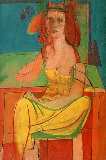
One last picture that I want to comment on is this:
Seated Woman. c. 1940. Oil and charcoal on Masonite. Philadelphia Museum of Art
Painted in 1940, by a Dutchman, it strikes me as a perfect metaphor for Europe… in that year.
I’ve always disliked de Kooning’s work. Now, I realize that it was rather like my early dislike of Edith Wharton when I had yet to read anything but Ethan Frome. I realize that it is probably not common consensus, but I find his “Woman” paintings as different from much of the rest of his work as Frome is from Wharton’s. And I have always disliked those paintings. Looking at the reproductions in Hess’s book, I find most of his abstractions and near abstractions to be gorgeous. I had closed de Kooning off without seeing most of his work. Now I think I am primed to go see the retrospective. Hess’s brief essay is a good introduction but as usual with these short Taschen books, the reproductions are the important part.
I love Tuschen books because the reproduction prints are of high quality. They are meant as an introduction to the artists but some are written better than others. I thought the style of writing was good and it was informative as well. But I don't feel Barbara Hess delved enough into the artist himself. Little is know of the type of person he was and I feel more could have been said about the way he worked. On saying that it is still a good book to read and I am sure I will refer to it on many occasions in the future.
A concise but lucid introduction to de Kooning's life and art. Other books may afford a deeper dive into the work, but this generously illustrated 95 page book is a great 101. The language is free of art-critic jargon and flights but isn't dumbed down either.
As for de Kooning, I still don't know if I even like his grotesque but deeply abstracted Women - but I like everything else, especially once he started letting elements of external landscapes - always filtered through abstraction - seep into his art. The sculptures are powerful, and the very late art a kind of transcendence.
Helder en indrukwekkend overzicht van het werk en de ontwikkeling van ‘ de Rotterdamse jongen’ Willem de Kooning die uitgroeide tot een van de belangrijkste 20e eeuwse kunstenaars. Hij brak door in Amerika en schilderde tot op hoge leeftijd, ook nog toen hij geestelijk achteruitging maar toch nog de taal van het beeld beheerste. Een mooie inleiding tot zijn oeuvre,