Okay, so I probably had this a bit overrated but the setting and idea of the series is gonna have me leave this four stars.
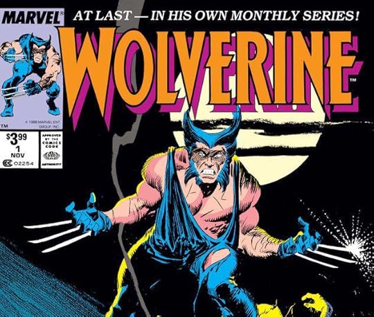
I don't hide the fact that I generally don't care for the character of Wolverine, but it is a tad more complicated then that. I try not to dislike him because he is popular, but truth be told I have a feeling that is part of it. I do dislike his popularity affecting the way he is written. In a group book dynamic it is really painful because the character is just pushed to the ideal in too many ways which negatively affects the balance of a book. However for the beginning of the series collected in this book they do something that makes me actually enjoy this character.
There's no team, there's no silly costumes, just a dirty old Singapore-esque made-up city called Madripoor and some heavy noir trappings. Now if there's a setting where an overly macho character fits, it is a noir. It should be known, the Wolverine-Madripoor matchup first began in Marvel Comics Presents stories. I have not read those, but I know they at least started with John Buscema penciling and Claremont writing just as these do.
Claremont starts out the book, then Peter David steps in to have a so-so Indiana Jones wannabe adventure. A little too blatant though. He does the best noir first person narrative of the bunch though. Practicing up for voicing a certain Mr. Madrox. And this book wraps up with Archie Goodwin doing a take on a South American dictatorship in the midst of revolutionary conflict. It felt kinda like Tintin's "The Broken Ear" adventure, though I'd probably rather read that story.
One of the best things about this book is the art though. If you want a study on inking, this would be an interesting start. John Buscema starts out the art duties, as I mentioned, but he goes through three different inkers: Klaus Janson, Al Williams, and Bill Sienkiewicz. Then John Byrne takes over the penciling duties and Klaus Janson comes back for inks. Now John Buscema's art is great for the style of this book. Lots of black, a little ugly. I really enjoy it. But when Bill Sienkiewicz does the ink the art gets transformed. It is obvious that they were giving Sienkiewicz free reign on inking, and it is fun to watch him work, while being balanced by Buscema's structure. As for Byrne and Janson... this pairing is interesting. Byrne is famous for his X-Men work, but Janson so transforms his art that at times you'd think you are looking at Frank Miller. (Janson was a long time partner with Miller) It is interesting to see a different take on Byrne's art. I have never read these issues in color, but I think I almost prefer reading it in the black and white of the essentials. It fits the noir and it shows off the talent of these artist.