The definitive book on the use of colour and paint in interior decoration over a three-hundred year period, The Anatomy of Colour is certain to appeal to both amateur and professional restorers, renovators, enthusiastic decorators and all those with an interest in interior decoration and design.
Drawing on his huge specialist archive, Patrick Baty traces the evolution of pigments and paint colours together with colour systems and standards, and examines their impact on the colour palettes used in interiors from the 1660s to the 1960s. He first charts the creation in paint of the common and expensive colours made from traditional earth pigments between 1650 to 1799. Next he examines the emergence of colour systems and standards and their influence on paint colours together with the effect of industrialized production on the texture and durability of paints. Finally, Baty turns his attention to 20th-century colour standards, including those developed originally for the purpose of identifying flowers, such as the Répertoire de Couleurs des Fleurs, des Feuillages et des Fruits, each incarnation of the British Colour Standard cards, Walpamur paint swatch cards and Parson’s Tint Book of Historical Colours.
Throughout the book reproductions of interiors highlighting the distinctive colour trends and styles of painting particular to each period and room accompany the in-depth analysis of the history of colour and the development and use of paint colours in interior design.
This book is amazing! Based on the history of interior paints in historic homes and buildings, this book includes a well documented history of pigments and paints, color theory, and popular historical trends in interior decorating. The photographs and illustrations are beautiful, making this a fantastic book to just flip through and enjoy.
So, I liked this book but it is not what I expected. I expected, especially from the title, a book about color theory. While that’s certainly part of it, it might best be titled “a history of house painting in Britain”. If you like to know how people in Britain painted their houses historically and the technology and trends that lead to that, you’ll love this book.
Book is organized by historical era but not overly organized other than that. I never knew what I’d find turning the page. Would it be info about grinding a pigment? Pages of color swatches? Some cool color wheels? Reviews of painters manuals from the era? Who knows. It was a fun surprise and I enjoyed the book but it left me wondering who this book is for.
I can’t name a region of the world that doesn’t have its own strong artistic tradition and unique relationship with color and I would have loved to learn more about those but this book ignores what is happening outside of Britain.
І хоча дуже довго я читала цю книгу, бо це все ж таки не художня література, вона є величезним джерелом знань, з якого можна копати у тему вивчення фарб і кольорів дуже і дуже глибоко.
This book is a 300-400 level equivalent on historical paints, paint colors, and interior design.
Favorite Pages: Any pages with images of actual color sample documents like 32-33, 112, 135-6, and 187-231.
Fun Part: All of the iterations of the color wheel.
Alternative Title: “Color 400: The Prettiest and Most Complete Guide to Color”
Add to your own library: if you are a design professional, painter, or artist-yes! If you are looking for just a pretty coffee table book-no.
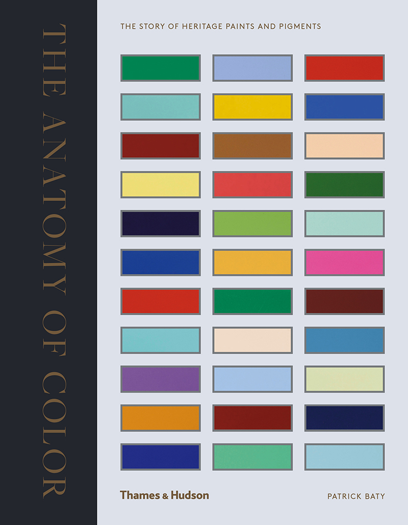
I rated this book 3/5 because the colors at the beginning of each chapter are so small you can barely see them let alone try to match them with a fan deck. This book was however extremely informative and will be helpful in my work as an interior designer.