Just when you thought that nobody could create something new in the comic medium, here comes Metronome - a 64-page debut graphic novel by Véronique a “silent”, erotically-charged visual poem, an experimental non-linear story using a palette of iconic ligne clair images. Symbolism, visual puns and trompe l’oeil conspire in a visual mantra that could be described as “existential manga” if it wasn't for the fact that there is a very human and elegantly-structured tale of a doomed relationship providing a solid foundation to the cutting-edge storytelling. A gorgeous art book/graphic novel from a mysterious new artist. An experience not to be missed!
Thank you to those who explained who created this for my shelving purposes. Why such a complicated pseudonym? A British male who decides he wants the reader to think of a female with a French mother and Japanese father? It is simply an annoying distraction that takes away from the work.
I've read many wordless and this is one of the more sterile depictions despite having plenty of emotion happening within.
The art sucks- especially the faces. The thickness of the lines is often incongruent and the grayscale is garbage. It looks like it was made with computer and printer in the 1990s.
The sex and playful genital symbolics are the only entertainments.
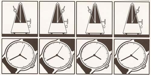
There's something to be said for how stylistic limitations bring out the best in artists. Think Donald Westlake's impeccable four part structure to his classic Parker novels or Dogme 95. You either summon your inner virtuoso or come across as a pretentious gasbag. Bryan Talbot comes off somewhere in between the two antipodes I am proposing. This is a wordless graphic novel of 64 pages, four rows and four columns on each page. It seems to chronicle a clueless man -- a dude busy composing music -- who doesn't really comprehend the nature of the relationship he's in. He's merely passing the time, as the numerous panels of lava lamps dripping and metronomes clicking hammers home. Unfortunately, there's really not a lot of depth to any of this. Bryan Talbot, operating under an apparent nom de plume, doesn't have a great deal to impart here and whatever emotional poignancy he tries to summon through focusing in on the details doesn't really land. Still, this is a somewhat arresting experiment in comics. I just wish the panels had been more devoted to insightful clues of the relationship dynamic rather than belabored repetition.
Despite the claims of being "ground-breaking" and establishing new ways to use the comics medium made on the book's back cover, Metronome is pretty basic in its use of the medium. Tanaka does a nice job establishing a rhythm, using 4x4 grids on every single page and repeating certain motifs to get the reader moving at a certain pace. Storywise, it's decent but not exceptional - a silent picture-poem, about the dissolution of a relationship. Some erotically charged imagery, Tanaka's otherwise enjoyable, clean visual style, and the distinct pacing of the narrative make the overall experience worthwhile, though not exactly timeless.
this is a short read, if you could call it that, more a graphic novel featuring the beginning and end of a torrid relationship with no words at all, drawn by Bryan Talbot (apparently he admitted to drawing it after it came out under the Tanaka name). Interesting but not essential.
I needed a well-scrubbed, de-cluttered, pristine flat before I could appreciate this fine graphic novel, which had been lying around in a pile of clutter for several months until today.
The author is Bryan Talbot, who was a comic artist with, I am told, a god-like reputation in England at the time he decided to publish this under a pseudonym. It was a departure. But if you are familiar with Bryan Talbot's work you will know that he doesn't fit comfortably into any genre and that he likes to take risks and go off at a tangent even within a single work.
This story is very focused, though. I like it a lot. It's wordless and told in crisp, black and white images that are playful, repetitive and poignant. I found it very moving. It's the story of a man and a woman whose natures make it impossible for them to be together. Some people might see the story as simplistic but I like the simplicity of it. It strips down the relationship to its essential constituents of erotic need and emotional isolation. Some of it is funny. I laughed out loud on page 52 and my flatmate dashed across the room and started reading over my shoulder. "Let me scan it and post it on Facebook!" she said.
"No, certainly not!," I cried. "It's important to protect the artist's revenue potential! This has not been a big earner for him."
I read the rest of it in silence in my bedroom, which was most appropriate given what happens on pages 66 and 67.
I'm intrigued by successful artists and writers who, at the height of their fame, publish quirky little books under a pseudonym. On page 35, in panels 13 and 14, the shadows behind the bridge crossed by the lovers spell HOAX. This hoax may not have made much money for Bryan Talbot, but it has made me want to read more of his work. He's still alive, I think, so I hope he'll get a little frisson of pleasure when he gets his next royalty cheque and notices a slight uptick thanks to the largesse of a certain erotically inclined Asian by the name of Vanessa Wu.
This is a brilliant graphic novel. The type of effect I was looking for in Graphic Witness. She manages to make a cinematic depiction that could no way be cinema. Using the panels to create that momentary lapse at the pace of a metronome, that could almost be accomplished with panning--except in graphic novels, the whole frame can be exposed at one time and cut up into moments. The spacing is the genius and it tells the story, hence just one of the reasons for the name of the story. A giant swathing metaphor, he makes all the objects into her. The statue on the wall, the bird in the window, the painting of a tree, and spilled coffee. ***SPOILERRALERT*** What is mind-blowing is that he is masturbating at the end. I couldn‘t tell before. As Kelly said, Tanaka--who had to experience a shitty relationship to write this--was probably satisfied to show the asshole alone and frustrated, the jerk-off jerkin‘ off, come the end. the coffee dripping opposite of the metronome…“it couldn’t drip forever” --Kelly.
Metronome, watch, fly, telephone, painting, lava lamp, piano, plant, fan, a man, a woman and a tribal mask comprise the bulk of the repeating imagery in this experimental, silent, black and white graphic novel. Each page features sixteen equally-sized panels, which set a meditative pace. While the story is not as compelling as the technique, the many surprising moments and visual tricks make this graphic novel well worth the read. Tanaka’s focus shifts from object to object, frequently switching to circles, abstract shapes or blacked-out panels. Close-ups and varied scale blend objects together or compare them to each other, as with the opening scene that switches between the metronome and the watch’s second hand. Tanaka uses her format not only to set pace, but to explore the space of the setting, the mood of the characters, and the possibilities of the panel as a unit of expression.
It's meant to be clever, but doing a wordless story or using panels to set a regular tempo of time are hardly new ideas- in fact they are as old as the comic art form. But the real problem (apart from the lame story and the endless repetitions of the same image often reversed on photoshop) is that the characters are very stiffly drawn. Strange because, apparently, Tanaka is the pen name of Bryan Talbot, a gifted artist. No signs of that here. The 'experimental' style can't cover up poor art and, sorry to say, it doesn't work.
This has been out of print for a while but is now available on the iPad via the SEQUENTIAL app. In the digital version you can read Metronome 4 ways -- page-by-page, in panel mode, in one long vertical sequence or as an animation of the frames… Also includes interviews with Bryan Talbot and Veronique Tanaka.
A very clever comic which tells a touching story completely without words. I love the way that the panels relate to each other, tricking you into thinking you're looking at one object when you're actually looking at another.
A quick, wordless GN set at a seconds-ticking pace, basically a sordid little tale of erotic love gone wrong - a bit of the Sun-Woo Jang film "Lies" and, what..? Some visually arresting stuff, esp at the beginning, as the artist plays with pans and resolves and pacing.
What a novel idea (no pun intended!)- a book with no words! I only had a quick flick-through, and would probably benefit from another look, but I really liked it! I didn't feel a rhythm when reading, but the story flowed well.
Comics have a language of their own and unfold in various rhythms much like music. This unique comic ticks by at the pace of monotonous, constant quarter notes. This would potentially make it dull, but it fits so perfectly with the narrative that I wouldn't want it any other way.
Derik Badman's review of the work is well written. + a panel -- which is a unit of the comics -- as a unit of the time. http://madinkbeard.com/archives/metro...