Jump to ratings and reviews
Rate this book

Info We Trust: How to Inspire the World with Data

Rate this book
How do we create new ways of looking at the world? Join award-winning data storyteller RJ Andrews as he pushes beyond the usual how-to, and takes you on an adventure into the rich art of informing. Creating Info We Trust is a craft that puts the world into forms that are strong and true.  It begins with maps, diagrams, and charts ― but must push further than dry defaults to be truly effective. How do we attract attention? How can we offer audiences valuable experiences worth their time? How can we help people access complexity? Dark and mysterious, but full of potential, data is the raw material from which new understanding can emerge. Become a hero of the information age as you learn how to dip into the chaos of data and emerge with new understanding that can entertain, improve, and inspire. Whether you call the craft data storytelling, data visualization, data journalism, dashboard design, or infographic creation ― what matters is that you are courageously confronting the chaos of it all in order to improve how people see the world. Info We Trust is written for everyone who straddles the domains of data and people: data visualization professionals, analysts, and all who are enthusiastic for seeing the world in new ways. This book draws from the entirety of human experience, quantitative and poetic. It teaches advanced techniques, such as visual metaphor and data transformations, in order to create more human presentations of data.  It also shows how we can learn from print advertising, engineering, museum curation, and mythology archetypes. This human-centered approach works with machines to design information for people. Advance your understanding beyond by learning from a broad tradition of putting things “in formation” to create new and wonderful ways of opening our eyes to the world. Info We Trust takes a thoroughly original point of attack on the art of informing. It builds on decades of best practices and adds the creative enthusiasm of a world-class data storyteller. Info We Trust is lavishly illustrated with hundreds of original compositions designed to illuminate the craft, delight the reader, and inspire a generation of data storytellers.

272 pages, Hardcover

Published January 17, 2019

25 people are currently reading
452 people want to read

About the author

RJ Andrews

6 books10 followers

Ratings & Reviews

What do you think?
Rate this book

Friends & Following

Create a free account to discover what your friends think of this book!

Community Reviews

5 stars
50 (42%)
4 stars
37 (31%)
3 stars
19 (16%)
2 stars
9 (7%)
1 star
3 (2%)
Displaying 1 - 25 of 25 reviews
Profile Image for Mara.
413 reviews310 followers
February 2, 2019
Because RJ Andrews is immensely talented, the beauty of Info We Trust: How to Inspire the World with Data (the book itself) may trick you into thinking it is to be put on a table (coffee or otherwise) for casual consumption — and, don't get me wrong, it can be! But, in so doing, you would be denying yourself something that is so much greater than the sum of its parts. It is as Andrews writes of the art of data-storytelling:
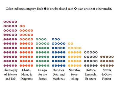
Do not allow the allure of the reward to supersede the journey itself.
Everything about this book has been artfully considered and crafted. The bibliography (which brings together so many great works I've loved, but would never have connected without Andrews' keen eye) is its own data visualization of sorts.
“What is this magical wonderland of which you speak so highly?” you may be asking yourself at this point. And I stutter, because it's hard to describe something that has already captured so much in so little space (which I mean in the best of ways). It is, as its title suggests, inspiration (in the Latin, past-participle sense of breathe life into, excite, enflame), but also practical wisdom. The narrative, a trip through the British Museum, say, is interwoven with things you as a data storyteller will also need to know — artifacts to be taken home with you. You're not told that "information overload" is something to be avoided, Andrews lets you — leads you — to discover this by his side:
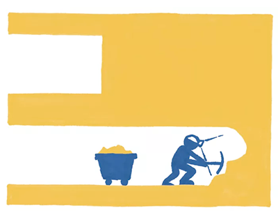
Satiation occurs from repeated exposure to too much of the same thing. Distraction occurs when you are overrun with stimuli begging for your gaze.
Andrews' use of marginalia and hand-drawn illustrations gives you both simple lessons to take away, and insights into where to find out more (I told you, the bibliography is magnificent). That hand-drawn feeling demonstrates just how much care was taken with you, dear reader, in mind.

You will turn the final page both sated, and energized and equipped to go forth and do more.
Profile Image for Tim Roast.
786 reviews19 followers
May 22, 2019
This book is categorised on the back "computers/Data Visualisation" so I thought it might be useful for my day job as a statistician. However if you do indeed want to learn about data visualisation then this isn't the book to get. That's because this book contains very little on it. It does include a nice visualisation on helmets and their development through the centuries near the beginning to fool you into thinking that this is what the book is going to be about, and there are a couple of chapters at the end with a worked example of a good visualisation relating to the orientation of French Gothic cathedrals, but in between is just a lot of preamble.

This book is essentially about telling a story and different ways of doing that, and is also about the component parts of telling a (data) story. For example, how to curate a museum to tell a story is featured. If I wanted to curate a museum this book would have been useful. And how advertisers do their work or authors tell their stories are featured. Likewise if I wanted to do that then this book would have been useful. It tries to relate these to data but I don't think it does very well.

Also it goes right back to basics with early chapters on the science of how we see colour, e.g. how our eyes work, and the early history of the development of numbers, all stuff that experienced data-crunchers won't learn anything from.

All this is disguised in flamboyant language and a rough narrative about how the data storyteller is a hero who saves the world through their craft. At least the book is well-presented (which is part of the reason I got it after scanning the Amazon Look Inside feature). The book features plenty of hand-drawn illustrations along the way (a chapter dedicated to emotion says that "roughness connects us to the unique individuality of the creator, appealing to us as social creatures" so presumably the design has this in mind). Indeed no graphically software is mentioned and charts don't look like they were made from any particular software. "This book does not offer any chart-choosing decision-tree flow-map."

The pages also feature margin notes that have quotes in them. However these were distracting breaking up the flow of the main text for me, and weren't always, in my opinion, relevant.

Having said the above though the summing-up part does sort of justify the inclusion of all these other areas of storytelling - "the data storyteller's success comes from straddling many data fields. To operate in all of them, you must learn from many different kinds of experts." Overall though this book wasn't for me. I would have liked to see more chapters like the worked example of the data visualisation of cathedrals.
210 reviews3 followers
November 15, 2019
I purchased this book after it received accolades from a few data visualization thought leaders that I respect. I completed it out of stubborn determination (it's hard not to finish a book that you pay for). Perhaps I'm the wrong audience. Although there were some redeeming qualities, the majority of the book was incredibly dense, without being insightful or informative. Many times, it felt like the book took itself too seriously, with deep metaphors and a narrative of a hero's journey into data. None of this landed for me.

One particularly annoying feature is that the margins of the book are lined with quotations from experts, leaders, and practitioners. It made for a very disjointed reading experience, which is ironic for a book about storytelling. If a quote is important and germane to the narrative, why not include it in the main text? If the quote isn't important, why keep it at all? The decision to include these quotations was perplexing, and had the ring of a 5th grade book report that had to hit a certain word count to be considered complete.
Profile Image for Eivind.
30 reviews
Read
January 6, 2020
Er det bra og nyttig, eller unødvendig pompøst og selvhøytidelig? Jeg er usikker. Må se om det lar seg anvende i praksis.
Profile Image for Chris Esposo.
680 reviews58 followers
January 17, 2021
This book is unique, although it is technically a text on 'data visualization', it's much more 'holistic' in its approach to the topic. In a way, one can characterize Andrews' text as the "philosophy of data visualization". The book does not approach the subject matter in a step-by-step or formulaic manner. Nor does it link data visualization to a more technical topic, such as dimensional reduction, or information compressibility. Instead, the book starts off harkining to Joseph Campbell’s "The Hero's Journey", and contextualizing the process of visualizing data to storytelling. In essence, this book is about the art of data, both figuratively and literally.

With respect to the “art’, Andrew’s “theory of the case” is that successful visualizations are those that take the intuition of the human senses and thought (which are culturally unique up to the crafter’s society), and constructing a ‘bridge’ to your visual artifact. Basically, crafting an analogy. This is also what makes good visualizations hard, especially in an era where most visualizations are derived automatically via templates from computation. Andrew's focus is really on how one would create bespoke visualizations to communicate the ‘story’ or the data. Though, he does also review basic visualizations (line charts, bars, scatters etc.), and explains why one would want to use one kind of variation of these basic visuals relative to another. This part was helpful for a practitioner, as often “intuition” is not something imbibed by a data visualizer who may have learned the craft via practitioning.

What I found most interesting was Andrew’s commentary on how spatial intuition informs good visualization, and how one conveys temporal information in space. Especially if one is actually attempting to analyze or visualize spatial data, thinking about these sorts of things can be useful, and they are also useful when attempting to visualize abstract spaces (say a low-dimensional topology of a data-space), although in my experience much of those analogizing tend to be more ‘verbal’/conceptual than spatial in the literal sense, as one attempts to grapple with the meaning of data being placed in one region of a ‘space’ relative to another in these abstract settings.

Overall, I really liked this book. I would recommend one get both the audiobook and physical hardcopy. The physical book is very handsome, and could definitely be a good “coffee table” book after it’s served practical use. It’s definitely a ‘supplemental’ book if one were using it to build skill for a formal course, but one that will definitely fill holes in one’s mental map of the subject. Highly recommended.
3 reviews
January 15, 2022
The way I see it, creativity is a spectrum between abstract and logical. Creating the right algorithm for a specific problem is a form of logical creativity (creating something with patterns). Creating something new like art is more like an abstract creativity (creating something that goes beyond the patterns).

RJ Andrews would definitely go more towards the abstract creativity for me. In his references we also see that he cites philosophy WAY more than any math book. That means this is no how-to book on how to create the best data visualization. Instead he asks what we want to do with the data visualization? What kind of message do we want to send, and how is the message perceived? How have we as human conveyed data before and why is this important? In doing so, he must use a lot of metaphors to try to convey this message about human perception and behavior.

If you want to know what the best plot is for your dataset, this is not that book. If you want to challenge your view on data visualization as a more abstract form of creativity, as a way of storytelling and a metaphor, this is the book for you. The language is inspiring, the stories are great, the illustrations are beautiful and easily conveys RJ Andrews message.
The reason I give this book 4 stars is because even though I enjoyed the story about data story telling, it often became very vague and hard to follow his mind steps. Maybe someday I will read this again and have more time to dwell on all the metaphors and give 5 stars :)
Profile Image for Bartley Sharkey.
82 reviews5 followers
May 25, 2020
This is a really intriguing book, not at all what I expected before reading and it could easily get on someone's nerve if they were looking for something a bit more succinct and applicable to the task of data visualisation or analysis. As it happens, Andrews places much more emphasis on the philosophy behind thorough data analysis and thoughtful story telling through visualisation. It seems to be a rejection of the necessity for speed / efficiency when coming up with stories about data. He speaks about the practice of taking lots of time to take in, digest and contemplate data before starting the process of trying to explain it. Of course, that's a luxury not everyone will have but that's not a concern for this book.

There's a slight element of preachiness, harking back to a time when everything had to done manually and praising the quality of slowness when it comes to each aspect of data story telling. Now, the reason I gave it four stars is that there are still plenty of useful ideas for anyone that perhaps isn't particularly experienced with data analysis and want to understand how they should be thinking about the process. For instance, he speaks about the importance of representing data in a way that accurately allows people to make the appropriate comparisons without having to be familiar with the ins and outs of chart building themselves - an example commonly used by newspapers that want to generate interest would be moving the axis of a chart so that a small relative change appears huge.

The take away from this one is that constructing and telling stories from data isn't so much a mechanical process but a form of art. Yes, you need to understand and be able to use various tools to manipulate data the way you want but as a data analyst, you basically have a blank canvas that you can colour in as you choose. Doing so requires thought, creativity, imagination and yes, time.
416 reviews
May 18, 2022
This is definitely different than I was expecting. The title implies a "How To" but it is technology and tool agnostic and does not give specific insights on data visualizations like the book "Storytelling With Data" does. It is about data visualizations and storytelling but is a much more philosophical and metaphorical journey. Andrews goes to the barest ways of how we process shapes, colors and lines and the implications for good design. The most impactful chapter for me was the similarity between the museum curator and the role of the data communicator. You can't possible show all the data just as museums typically only show a portion of their total collections. How you design and layout an exhibit in a museum to create a narrative and experience is no different in concept from how you craft a powerful data story. This is probably not the book for a general reader but if you want to think more deeply about how we communicate information to others, this is the book for you.
Profile Image for Sanjida.
486 reviews61 followers
April 24, 2019
I read this book very slowly and carefully for professional purposes, as I'm now working on leading product design for genome visualization. A lot of philosophy, psychology, and anthropology which I found insightful, and hopefully inspirational. I dropped a star because I usually didn't find the side quotes that littered most pages to be helpful or necessary, and I think the "UX" of this book on design would have been better without them. :)

Recommended to anyone who has to do presentations, user design, or any sort of data analysis, that is, most of us.
15 reviews1 follower
June 9, 2019
Andrews gave me a completely new perspective on data. I began to appreciate his insight around page 40 as he described how a pile of books on a table provided little information until you organize the books on a shelf. Categorizing the books puts them "in formation". Chapter 6, Infuse Meaning, is a must-read for anyone who values data visualization. I am grateful to Andrews for inspiring me to think differently about data.
Profile Image for David.
391 reviews5 followers
February 5, 2020
I really enjoyed the delivery of data literacy through story and prose. "All data is a shadow of what has flowed before. Data is reality distilled with intention." It goes much deeper into the history of numbers and data, and how we've used them to represent ideas and information throughout time. It's not as concise as a "How To" book like DataStory or Story Telling With Data, but its a much richer read and a nice companion to those books on the bookshelf.
Profile Image for T.
8 reviews
March 17, 2019
This is a meaty book that must be slowly digested.

I was drawn to Andrews work when I was looking for examples of data storytelling. His work is nothing short of beautiful. I have really enjoyed this book and marked several pages for later reference. It is richly detailed and a good buy for a person past the beginning stages of data visualization and data storytelling.
Profile Image for Salomé Esteves.
481 reviews20 followers
September 11, 2019
I once read (don't remember when or where) that once you've read a book on Data Visualisation, you've read them all. Well, I thought it was quite true until I read "Info We Trust". RJ Andrews knows how to inspire and how to tell a story. That's why this book is so good, because he knows what he is teaching you and he does so differently from others who've written about how we communicate Data.
334 reviews9 followers
December 29, 2021
This was a really great book. I suspect the book is even better as a physical copy, and I know the effort into making these illustrations is huge. Andrews shares the concepts he's learned over the years in the field, and they will be in my mind when designing my own visualizations of data. I definitely recommend this book.
Profile Image for David.
68 reviews2 followers
February 28, 2025
A good book if you work in data analytics or data visualization and want to feel inspired and excited about your craft. There's a somewhat underlying feeling in it that you have a choice regarding what your content or questions are, which is often not the case in many jobs, so the author's messages may not be as impactful as he would like.
Profile Image for MorganJac.
591 reviews4 followers
June 6, 2021
This book was a little more in depth on information that I was expecting. I lost interest there in the middle but I paid more attention in the second half and found it educational. I kind of want to read more on this subject now.
Profile Image for Carrie.
44 reviews3 followers
April 4, 2022
As a data analyst, I was hoping this book would help with my daily visualization design.

I was disappointed. The book is pretty, but information-dense, and light on action. It has some innovative ideas for graphic design, but very little that is immediately applicable to business intelligence.
Profile Image for Aslan Umarov.
37 reviews
September 26, 2020
Это не про визуализацию данных и не про стори теллинг. Это неудачная попытка показать крутой сторителинг и визуализацию данных. Много пафоса и рандомных цитат читать было скучно.
1 review
October 2, 2020
That is a brilliant book. All the illustrations makes it entertaining and the text very informative. A must read to understand more about data and visualization!
Profile Image for Lisa.
17 reviews
May 12, 2022
One of my favorite intro to data visualization fantasy books--or the only book in this genre (data viz fantasy) in existence!
Profile Image for Julian.
25 reviews2 followers
April 2, 2021
The book is a joy to read and the illustrations help ease the journey. It is not a ground breaking book for people deep into the fields of data analytics or data visualization but it’s a beautiful retelling of all the tools and ideas people that work in the field use in a daily basis and to be honest a reminder of the magic in data and in the craft is needed every now and again.

I’ve read this book twice. The first time the notes in the laterals didn’t bother me. The second time I found the extremely distracting.

Overall is a great book for a data viz library!
Profile Image for Arvilla.
265 reviews1 follower
August 28, 2021
Informative, thoughtful, well-designed. A pleasure to see design and data come together.
Displaying 1 - 25 of 25 reviews

Can't find what you're looking for?

Get help and learn more about the design.