Jump to ratings and reviews
Rate this book

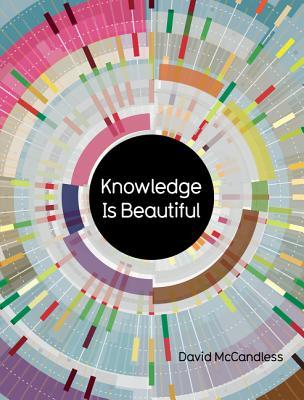
Knowledge Is Beautiful Epdf: Impossible Ideas, Invisible Patterns, Hidden Connections--Visualized

Rate this book
Impossible ideas, invisible patterns, hidden connections--visualized

Deepen your understanding of the world with these mind-blowing infographics from the bestselling author of The Visual Miscellaneum

256 pages, ebook

First published November 6, 2012

82 people are currently reading
2252 people want to read

About the author

David McCandless

19 books86 followers
McCandless is the founder of the visual blog Information Is Beautiful. Early explorations into the synergy between data visualisation and his work as a journalist led to the development of Information Is Beautiful and the subsequent publication of his book of the same name (titled A Visual Miscellaneum in the United States).

McCandless began his career writing for cult video game magazines such as Your Sinclair and PC Zone in the late 1980s and 1990s before moving on to work for The Guardian and Wired magazine. Since the publication of Information Is Beautiful in 2009, his information design work has appeared in numerous publications, including The Guardian, Wired, and Die Zeit, and has also been showcased at the Museum of Modern Art in New York, the Wellcome Trust gallery in London, and at the Tate Britain. His second book, Knowledge Is Beautiful, was published in 2014.

source: Wikipedia

Ratings & Reviews

What do you think?
Rate this book
Friends & Following

Create a free account to discover what your friends think of this book!

Community Reviews

5 stars
413 (43%)
4 stars
348 (36%)
3 stars
131 (13%)
2 stars
40 (4%)
1 star
11 (1%)
Displaying 1 - 30 of 88 reviews
Profile Image for Diane.
1,115 reviews3,183 followers
April 4, 2017
This is a beautiful and fascinating work of data visualizations. I became interested in this book after seeing David McCandless speak at a conference, and some of the visuals he showed in his presentation were included here.

McCandless is a British journalist who specializes in "data viz," which means he takes large amounts of information and figures out how to design it in a meaningful way. The resulting artwork often makes the data more compelling and easier to comprehend.

Some of my favorite visuals in this book were:


* common "mythconceptions" and falsehoods

* popular dog breeds (including overlooked and overrated types)

* the most ethical companies (Starbucks & Whole Foods scored well)

* geniuses and how progressive or oppressive their views were (The author has a good sense of humor, and my favorite example of this was a description of Francis Galton: "British polymath. Pioneer of eugenics & all-round prick.")

*the average peak age of genius for men and women in different careers

*an estimate of the number of intelligent civilizations in our galaxy (Holy shit, there are potentially 6.9 trillion communicating civilizations in our universe)

*a chart of the different kinds of power in use around the world (the United States is arguably a kleptocracy, which is "corrupt rule by thieves for personal power and wealth")

*the most common cliches used by journalists

*a word cloud of the best relationship advice

*the nonfiction books everyone should read (In Cold Blood ranked highly)


I really enjoyed looking through this book of trivia and data visuals and would highly recommend it to others.

Good Quote
"Understanding really is the key. When you understand something, you're able to perceive its structure: its connections, its relationships, its significance relative to everything else. How it fits ... Context, I'm realising, is the field of these connections, the network we plug any new information into. That explains why, when something is contextualised, we can suddenly get it. It feels 'meaningful' to us because it fits into the network of what we already know and understand and can relate to. Our knowledge."
Profile Image for Caroline.
556 reviews720 followers
May 10, 2017
The human mind is curious, often in a peck-around-the-bushes, magpie sort of way. This book of facts and statistics is perfect for magpies - packed with lots of delectable dollops of information. You have to admire the scope of McCandless's analyses - he brings all sorts of unexpected topics into this book, and this really adds to the pleasure.

Now for the downside..... A lot of the text was much too small and much too light. In the end I read it with a magnifying glass beside me, but sometimes, even with this aid, I couldn't see what was written. Another issue is the index. This sort of book needs a good index - but the author has chosen to use pictures instead of words. The index pages are packed with matchbox-sized pictures of the charts in the book, along with the quirky headings given to each chart. The result is just a cacophony of symbols. Finally, the page numbers are weird. All the numbers are given on the left hand pages, and the lower numbers are prefixed with a zero, eg 034/035. I found this pretentious and irritating.

But all in all this was a hugely enjoyable book. Each set of facts is presented so enticingly. It's like being in the very best of candy stores. The artwork is a delight, and the cleverness of McCandles's designs is extremely satisfying. You have to pause briefly at each new chart to learn the codes of the new format, but that is a pleasure as well. One has a lot of tiny "Ah ha" moments, as each new chart suddenly makes sense. This is not only a fascinating book, but a fun and playful book as well.

As usual, and purely for my own records, I shall end with some facts from the book that I found particularly compelling.

PS: Re my spoiler....I find it interesting how very dry and boring my presentation of the above statistics is when compared to McCandless's genius. Nothing could be a greater contrast to the glorious pirouetting graphics that he gives us. He is an excellent example of the adage 'the medium is the message', even just working with straight statistics, his work is pleasurable, exciting and hugely more-ish.
Profile Image for Paul.
2,228 reviews
April 7, 2016
This is the second of McCandless’s infographics book that I have read now, and this one is as spectacular as the first. They are a vast depositary of data and information that he has reformed into easy to read and simple to understand layouts. The range of subjects covered is vast, there are graphics on everything from the amount spent of drugs to oil, personal transport to movie plots, antibiotics to plant varieties.

There are fascinating comparisons on numerous subjects between the four largest economic powerhouses of the world, the USA, Europe, China and India, with clear graphics on the subject being studied and a winner for each of the categories. As with the first book, he has taken the details of his subjects and made them understandable and interesting to look at.

Like the first book, I am not convinced that the data he is showing is 100% accurate, but this is a book to show what can be achieved with infographics. The layouts are superb too, but I think that the choice of font colour sometimes was wrong, a dark grey font on a pale grey background is not the easiest to read. It is a good follow up to the first volume.
Profile Image for E.
392 reviews87 followers
December 29, 2014
A few brilliant graphics that prove the wonders of the form, alongside some very mediocre ones.

McCandless argues in the foreword that Knowledge is one step beyond Information - you get the former once you've properly processed the latter. But in so many of his graphics, "knowledge" looks a lot more like mere opinion. Instead of demonstrating the radical originality of the post-modern movement, as he did in his first book, he instead reveals its dark underbelly - i.e., indulging and advertising lifestyles. Factoids about meditation, tips on health, platitudes about good relationships and other things he's into all converge to look like he's trying to pass off his Pinterest boards as enlightenment. In this way, the medium becomes irritating, because you can't engage in reasoned debate with a graphic.

The best ones in the book (the story of evolution, UK pay gaps by occupation) seem to better fit McCandless's definition of "information" than "knowledge." He's tried to do something different, but should've stuck to what he did so well.
Profile Image for Joseph.
572 reviews1 follower
February 18, 2025
This book is gorgeous, but far too busy for me to retain a lot of the information. I do much better with words.

My favorite graphs were: Movie Lens, Types of Meditation, Buddhism: States of Consciousness, Cash Crops: Most Lucrative, Divas (vocal range and octave chart), and Luckier Dip: Best. Episode. Evah?

According to this book published in 2014, the highest above average episodes of The Office were (chronologically) The Injury, Casino Night, The Job, Dinner Party, Goodbye Toby, Stress Relief, Broke, Niagara, Threat Level Midnight, and Finale. The most below average episodes (chronologically) were The Banker, Christening, Gettysburg, Fundraiser, and Here Comes Treble. Seasons 8 and 9 had the longest streak of below average episodes, most likely coinciding with Michael leaving.
This entire review has been hidden because of spoilers.
Profile Image for Jesse Richards.
Author 5 books14 followers
June 26, 2016
These folks definitely favor the beautiful over the knowledge. I love me a good infographic, but half of these are inscrutable. The hallmark of bad design: the medium obscures the message.
Profile Image for Sarah.
215 reviews2 followers
July 18, 2015
there are some pretty graphics in this book and if you are willing to seek out the tiny, greyscale print you MAY be able to decipher what it means. I thought a great deal of McCandless's rankings were based on subjective information that was not spelled out. I found charts with aspects, like colors or shapes that did not appear to be defined. I thought the scope as well as the details of the information reflected definite bias. It should not be this hard to extract meaning from an infographic, it should be simple, like a subway map, to quickly glean the information offered. One might hope that a given graphic might illuminate something about the information that might not be immediately evident in another format. I fear few of these graphics fulfill either of these aims.
Profile Image for Dawn.
324 reviews9 followers
June 27, 2017
An engaging book that demonstrates data visualization in a way that is unintimidating to those new to the topic. McCandless shows how huge amounts of information can be conveyed in visual images that are quickly taken in and processed. As a librarian, the topic of data visualization is quite popular right now. I am interested in learning more about using these techniques to help people organize and make use of the sea of data we are all treading in. My only complaint about this book is that the print is quite small in many places and hard to read for those of use who don't have the best vision. Also, some of the images are hard to make sense and would benefit from some verbal description to assist the reader in understanding the images more fully.
203 reviews10 followers
January 28, 2025
This book has a lot of engaging and beautiful ways to illustrate different collections of data. It is an excellent way to show what "data visualization" is.

A few of the examples just don't work. On page 43 there are several demographics of four "superpowers" (China, the EU, India, the USA). One of them is "Degree of migration (migrants per 1000 people). China's is -0.32, EU's is 1.8, India's is -0.05, USA's is 2.5. What does this mean? How can you have a negative number of migrants per 1000 people? This book will not tell you.

The most frustrating problem with this edition is how much information in the beautiful two-page spreads is lost in the gutter.
Profile Image for Joe Butt.
25 reviews
January 31, 2021
Maybe a bit harsh but I found most of the data visualisations made it harder to understand the information (like 75% of the time lol). I like the creative ideas though and it's given me some inspiration..
Profile Image for Holly.
1,188 reviews9 followers
Read
February 13, 2020
It's real neat although the data is VERY small! I especially liked the pages on sandwiches.
Profile Image for Fifi.
524 reviews20 followers
February 28, 2021
'when something is contextualised, we can suddenly get it.'
#DeZinVanHetBoek #ThePointOdTheBook
Profile Image for Karina Kratochvílová.
13 reviews3 followers
June 16, 2021
I like infographics a lot and some of these are inspirational but the limitation of the book is that there is only one author of all - therefore there is not much variety in approach and design.
Profile Image for Koen Van den Eeckhout.
Author 1 book95 followers
December 30, 2014
Pro: Many beautiful visualizations, colors and icons. Several infographics with a lot of depths, with lots of goodness to explore. Hours of fun!

Con: Too many mistakes and inaccuracies, in a field where getting the details correct is so important! Some infographics feel biased, or the conclusions are drawn too quickly. And oh, I hate the title font. Sorry :-(
Profile Image for John.
54 reviews
July 8, 2019
BUY THIS BOOK It's so beautiful, not a book that you sit down and read like a novel, but it's so nice to just flip through the pages and take in the (sometimes slightly useless) information. It's well organised and designed, and overall just a pleasure to look at.
Profile Image for Modi123.
109 reviews
May 12, 2017
A great bulk book on different ways to visualize data. Would be a great reference book or idea fount.
2 reviews
June 26, 2025
This is a follow-up to the best-selling “Information is Beautiful” and is certainly beautiful with seemingly unlimited knowledge contained therein. The book is a set of graphics each one being an imaginative attempt to distil large quantities of data into attractive single- or double-page forms.
There is so much information on some of the graphics that it is obvious that you have to spend quite a lot of time and thought understanding them and working out the implications, pages 34-37 on Digital Capacity for example. However, I often judge a non-fiction book simply on how many thoughts and ideas it generates in my head, and on that score this book scores very highly.
This is not the place to carry out a statistical review of every graphic, suffice it to say that not all of them are obvious. Pages 38-41 on Heretics are extremely interesting, but it will take you quite a while to work out what the personal time axes indicate. Pages 150-151 show Fertility by country, but each plot appears to be just a straight line connecting the 1950 and 2010 values, and as such seems to be a waste of space since most of the area show no additional knowledge at all. The very nice pages 108-109 on Aircraft Safety rather cryptically include “average fatalities per crash”, by year, but only three figures are shown over 20 years. So every graph must be read critically to separate the substance from the style, but take time to understand them thoroughly and they will repay your effort, and give you food for thought in abundance. Try page 177 on Influenza for instance.
Just because the graphics condense huge amount of information in an attractive way does not mean that the information is actually accurate or true. So on pages 82-85 we see famous people judged to be “True Genius” graded on their “progressive-oppressive” nature. Thus for Edmund Burke we read “Founder of modern conservatism, and all that entails.” Whatever that means. And for Francis Galton, a brilliant scientist, statistician and thinker, we get “British polymath. Pioneer of eugenics and all-round prick”. I am afraid that is not “knowledge” but rather propaganda or plain prejudice on the part of the author. These pages also demonstrate the subjectivity behind some of this “knowledge”. You know it is all very dubious when you see Jesus, Gandhi and Buddha at the top, and Churchill, Martin Luther, Newton and Plato near the bottom! Similarly on pages 102-103 we read “Racists are stupid. Low childhood intelligence predicts greater racism in adulthood, usually via a right-wing ideology”. Oh dear.
Some graphics are quite hard to understand because the titles, headings and axis labels are virtually invisible. On page 33 I cannot read the text at all, whilst on pages 175 and 176 on Action Film actors the colour contrast is really poor. Pages 50 and 51 showing the Composition of Galaxies are certainly visually attractive but I am unable to work out from the keys what type of star they are, because not all combinations of colour and shape seem to be included.
As for the correctness of the data, on page 78 we see the well-known graphic showing the “Countries not invaded” by Britain shows that we apparently invaded Brazil and Poland at some point in time. For that to be true you have to use a definition of “invaded” which is so wide as to be meaningless.
Demographic indices such as population size and death rates would be standard data for reference sources, but this book includes many lesser-known areas: like page 120-123 apparently showing us what Sandwich Ingredients go together, although some indication of frequency (popularity) of each combination would have been useful! On pages 220-221 we see a graphic of Philosophical Reality which is probably new to most readers, certainly to me.
And some of the graphics are seriously funny. Take the popularity of Computer Passwords on pages 60-61. Amongst the most popular, “bond007” seems fairly unsurprising, but what about “whatever” and “passw0rd”?
An entertaining production, but read it critically. The reader should be not be dazzled by the pretty pictures, and must always bear in mind the author’s aforementioned bias. Data presenters always show data in such a way as to emphasize the aspects they want to emphasize!
Graham Healey, Aldwincle, Northants
Profile Image for Rodrigo Domínguez.
105 reviews10 followers
October 22, 2022
oh David, do I find you #mildlyinfuriating.

I tried, I really tried to focus on the data visualizations and not on the not-so-subtle progressive politics this book proudly (yet dorkly) upholds.

I managed, until I didn’t. The tipping point was the viz on “True Genius”, which ranks notable individuals on how “ahead of their time” they were. It’s not so much that he describes Saint Paul, the Jewish founder of universalism, as “anti-Jew, anti-woman, and pro-slavery”. It’s not even the snarky bios about “oppressive” thinkers. It’s the sheer ridiculousness of the graph from a purely technical perspective. Allow me to nitpick.

The axis goes from “oppressive” to “progressive” as if those two were opposites. The score on the axis seems to be determined by little dots spanning across five categories: race (race what?), religious tolerance, homosexuality, women’s rights, social mobility, children and education (?), and violence and war. I say “seems” because the number of dots doesn't match the data points’ position: Gandhi (wait; didn’t he say black people are dirty and behave like animals?) has more dots (16) than Jesus (15) yet is a bit lower on the graph. Are the dots weighted differently? Plus: what does a dot represent? All this is simply impenetrable without seeing the author’s “analysis”, which I did.

Indeed the number of dots is just an arbitrary score the author gives to his poor subjects. There is a “justification” and a source, both somewhat arbitrary. There’s a scoring system which attempts to legitmize the metric but falls short in doing so (for instance, one criteria is “supported gay rights”...does that even mean anything to a Greek who 1) didn’t have a concept of “rights” and 2) didn’t have a social taboo on homosexuality?). There is also a disclaimer: “scales are all RELATIVE TO THE MODERN WORLD & not the genius's historical context”. This clearly skews the results in favor of more recent geniuses as it was easier to be closer to modern sensibilities in 1965 than in the first century AD. Yet this is not reflected in the unfortunate chart which depicts Paul as a proto-fascist compared to the forward-thinking Carl Sagan.

The wording on the axis is also very misleading: “ahead of their time”. The author seems to imply a multidimensional but unidirectional linear progression from past to present, a conceptual mistake which puts someone like Nietzsche at the very bottom of the graph. But was Nietzsche “in line” with his time? Absolutely not, Nietzsche was revolutionary, scandalous even, for the society of his time. The author can only see --and depict- the distance between dogmatic 19th century Christianity and 21th century secular humanism, but has no grasp of the (also enormous) distance between 19th century Christianity and the neopagan Atheism that Nietzsche preached.

Did I need to go into such details critiquing a single viz in a book which features hundreds (some really good ones like “Best in Show”, “Train Wrecks” and “Recycling”)? Yes, because this chart is an extreme example of a failure not only of political/historical acumen but of good information design. Throughout the book you can find charts with weird axes and scales, poorly designed metrics, interesting assortments of sources (to say the least), and highly selective about what they show versus what they leave out. I guess we were warned; the book does start by saying the difference between data, information and knowledge is that the latter (which this book is dedicated to) includes “context” in order to tell a broader, deeper story. While I do believe in storytelling; I do not believe in beating up the data to tell the story that you personally want to be true, nor in presenting mere opinions in the authoritative language of statistics. Yes, the book is visually stunning, but its underlying message to data enthusiasts and professionals is not one I can agree with.
Profile Image for Jordan Munn.
207 reviews6 followers
August 28, 2017
This book does nothing to add value beyond browsing the informationisbeautiful website itself.

Admittedly it's probably a mistake to consume data visualizations in a flat, static book rather than in their native online and interactive formats, but McCandless couldn't even be bothered to include any enlightening organization, commentary, or synthesis. It's literally just some printed-off posts from the website. As such, it feels like more of a cash grab/coffee table/mood book than anything else.

Addressing the visualizations themselves, most are indeed fairly beautiful, but many are also fairly illegible and so terse with orienting features or explanatory annotations that the viewer is left to guess at what elements mean. I'm a fan of informationisbeautiful's "What Makes a Good Visualization?" heuristic framework, but feel that many of the visualizations in this book aren't successful, no matter how well they are "designed".
Profile Image for Mysteryfan.
1,895 reviews23 followers
July 24, 2022
Infographics aren't artwork. They are supposed to make complex information more accessible and understandable to the readers. While this book is helpful in some ways, it doesn't achieve either goal.
To be fair, the book was produced in 2014 and the field of data visualization/infographics has changed.

Considering the information, there are some quirky choices. The lists of presentation and myth-conceptions were fun. Some of the data is outdated.

Considering the presentation of the information: really not good in most instances. Tiny print made a lot of the labels unreadable. Bad contrast - orange print on black backgrounds, light gray on white - make graphics unreadable. Using color as a cue can make information inaccessible to those with vision issues.
Profile Image for Petr.
437 reviews
April 13, 2018
An inspiring piece of art with data. I would not take it as a data book per se, but a lovingly interesting art book based on data (even the table of contents or collaborators list).

I liked how data sources are listed (although maybe a list of links, datasets on github or something similar would make it even better). Some of the diagrams are a little more about style than useful representation in my view. However, in general, they give new insights and perspectives. This book contained also classics like "Common MythConceptions".

I loved especially:
* Timelines of the far future
* Codebases
83 reviews1 follower
February 28, 2023
Wonderful book packed with visualisations of statistics and numbers but very surprisingly a much wider range - philosophical beliefs, intrinsic biases and beautiful word clouds. The designs are magnificent and even the data on irrelevant topics are brilliantly engaging. The colours and display are beautiful.

My favourites are the scale-of-things visualisations which show just how large what we take for granted is - particularly the visualisation about the number of lines of code required to build a variety of computer programs as well as the related one on data storage (always refreshingly shocking to see how much data is produced/stored daily by humans).
9 reviews
January 22, 2019
Très beau livre mais dommage que ce qu’il contienne relève plus du sensationnel que du réel. Attention, je ne dit pas que tout est faux. Cependant, j’y ai trouvé quelques erreurs.
Je dirais qu’il faut prendre ce livre pour ce qu’il est, c’est à dire un exposé des méthodes qui peuvent être utilisées afin de simplifier la compréhension d’un flot de données conséquent, plutôt qu’un manifeste d’anecdotes bonnes à savoir. En effet, comme dit plus haut, certaines de ces “anecdotes” sont fausses et d’autres, de part leur aspect sensationnel, me semblent douteuses.
Displaying 1 - 30 of 88 reviews

Can't find what you're looking for?

Get help and learn more about the design.