I enjoyed the Dark Tower series, so I looked forward to getting back to some places and characters I missed through the graphic novels. I might read the next one, to give them a second chance, but I'm not chomping at the bit, that's for sure.
The writing in The Gunslinger Born is dull--an overdone mimic of the language King uses in the original series. Still, although King's writing is enjoyable, he's no great word-master (great story-teller, yes). So I wasn't expecting miracles in the writing department from a spin-off graphic novel.
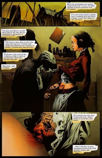
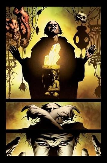
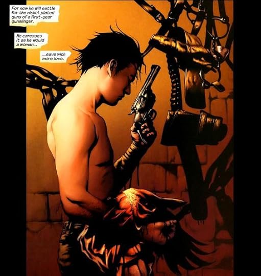
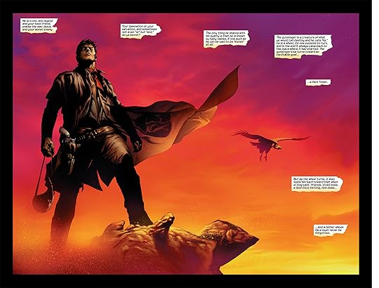
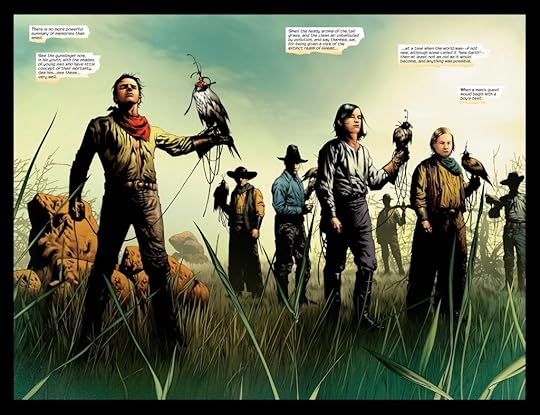
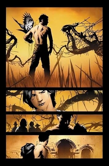
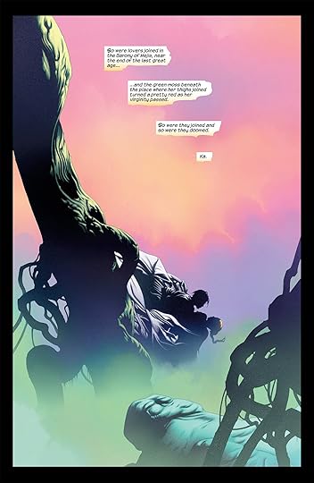
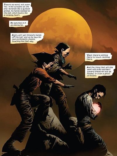
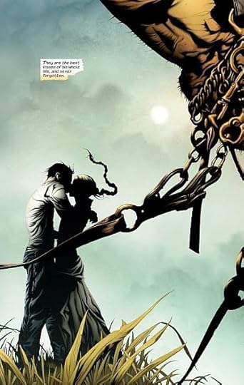
But the art is a let-down as well. At first, Lee's and Isanove's pictures are striking and elegant: strange, dark, gothic, twisted, shadowy . . . but as I turn the pages, that's all they are. Over and over. Strange, dark, gothic, twisted, shadowy. No longer striking, just repetitive. Half-way through, I barely looked at the artwork and just read with a mind to finish the book. In fact, the limited palette of muted tones (with infrequent bursts of bright red) muffle the imagination rather than stimulate it. The restrictive color scheme and absence of texture lull the reader into a mental doze. And, while in many cases simplicity is best, the lack of detail in the frames is just that: a lack. There's nothing to look for in the pictures, so the reader might as well stop looking. Nothing new to see; just more back-lit silhouettes, close-ups of intense faces, and smooth-'n-sinewy everythings (rock formations, cloth, horses, you name it).
For the first chapter or so, I enjoyed seeing a graphic depiction of familiar characters, but the novel quickly lost its charm.