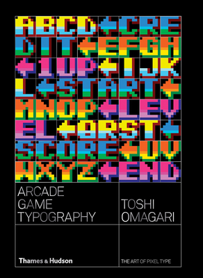
The definitive survey of ’70s, ’80s, and early ’90s arcade video game pixel typography. Arcade Game Typography presents readers with a fascinating new world of the pixel typeface. Video game designers of the ’70s, ’80s, and ’90s faced color and resolution limitations that stimulated incredible creativity. With each letter having to exist in a small pixel grid, artists began to use clever techniques to create elegant character sets within a tiny canvas. This book presents typefaces on a dynamic and decorative grid, taking reference from high-end type specimens while adding a suitably playful twist. Arcade Game Typography recreates that visual aesthetic, fizzing with life and color. Featuring pixel typefaces carefully selected from the first decades of arcade video games, Arcade Game Typography presents a completist survey of a previously undocumented outsider typography movement, accompanied by insightful commentary from author Toshi Omagari, a Monotype typeface designer himself. Gathering an eclectic range of typography, from hit games such as Super Sprint, Marble Madness, and Space Harrier to countless lesser-known gems, Arcade Game Typography is a vivid nostalgia trip for gamers, designers, and illustrators alike. 300 color illustrations
This is a definitive collection of the 8x8 monospace typefaces used by arcade games from 1970 through about 1992. It acknowledges that it does not cover proportional fonts, other sizes, or other platforms in order to reduce the scope of the project. That's a good choice, because the book is already quite large even with these restrictions. Yet, I hope that Omigari or others produce further volumes covering other cases because there is a rich set of material available.
The presentation of the typefaces themselves is good. It would be improved by consistently showing the pixel grid on all of them and eliminating the useless full-screen characters; they are too blocky to appreciate at that scale. Showing some of the fonts with the in-game context is terrific and I wish there were more.
Omigari's evaluation of the effectiveness of the typefaces and notes on the relationships between them are both excellent. This adds significant value and shows his scholarship. There are many typefaces that differ by only a few pixels, and having the changes called out is terrific. It is also very helpful to not just see the typefaces but have a professional evaluation of their strengths and weaknesses. This criticism helps develop the reader's eye and appreciation, and for pixel artists it is great guidance.
The multiple introductions are all embarrassing. First, they are set in a light, sans serif font that is hard to read--this is a ridiculous mistake for a book about typography. (This is the editor's and publisher's mistake, not the author's...but that is small comfort to the reader.)
Second, they demonstrate ignorance of pixel art challenges, conventions, and successes. Statements such as "a minimum of five vertical pixels are required" are obviously wrong. There have been successful pixel art fonts as small as 3 pixels high through clever use of diagonals or antialiasing. Further incorrect or vacuous statements join that one.
Furthermore, there is a missed opportunity to discuss the unique challenges of pixel typography, such as: characters with central bars in even-styled widths; accented capitals; squeezing the gaps into &, $, and %; fitting descenders; italics; perceived weight difference between diagonals and horizontals/verticals; making the dot on i and j suitably small or low in tiny fonts; distinguishing zero and capital O; fitting the curl of an "a" without making it the height of an ascender; and the challenges of non-Latin characters, including the extreme challenge of many Asian language characters. It is clear that the authors did a good job of researching the fonts and are knowledgable about vector typography, but are also ignorant of the specifics of pixel art and inexcusably didn't perform the simple exercise of trying to design a several pixel fonts on their own to deepen their appreciation for the form.
I find the rainbow dust cover of the paperback garish. The actual cover of the paperback is sublime with white gloss on white matte embossing. The hardcover limited edition has a beautiful cover (but is unfortunately sold out.)
In conclusion, this book is required reading and ownership for pixel artists and arcade game developers. Despite the infuriating introductions, which are best skipped, I hope this is the first of a long series of volumes on pixel typography.
Toshi Omagari knows typography, and in this gloriously niche book, he focuses his weaponized OCD at organizing and presenting fonts he's python-extracted from video games. Somehow, he presents and discusses 200+ fonts without monotony, having something insightful to say about each. I was surprised to find that I remembered many of these, and could probably identify quite few of the games from the characters sets alone (especially Venture, 1981). Was interesting to see that a few of the arcade games didn't bother implementing complete fonts when the game text didn't require it (Depthcharge (1977), Comotion (1976), Stratovox (1980)).
Sometimes, you find something so unbelievably niche that you have to conclude it was created just for you.
I am smack right in the middle of this gloriously geeky arcade game/typography Venn diagram so of course I loved it. I'm actually annoyed I didn't think of making it myself first. I'll even forgive that the author got Galaxian and Galaga mixed up.
Excellent scholarly book on 8x8 fonts during the height of arcade games in the 80s and 90s. Blurbs on each game along with the typeface is given, along with notes on particular characters of interest. Recommended for video game and typeface fans :)
While a slow and sometimes hard read. This is a very good analysis of an artform that is not very taken inn count when designing video games.
What we have here is a collection of the many typographies, and many interpretations of them, used in arcade video games from the 70´s all the way to the 90´s.
To see something as simple as a letter or a little drawing represented in many possible ways, all in the small canvas of 8X8 pixels, taking in count not only the shapes but the colors, is nothing but a remarkable, amazing and hard job. My personal favorites being the Namco style and the one used for The Simpsons arcade game.
Sadly the book does have some issues, mainly with presentation. While I understand having all of the alphabet, per game, all crammed up together does get you the idea of how well, or terribly bad, the style is designed. It can sometimes be confusing rather than educational. And some of the game explanations feel more like mini one-sentence reviews instead of a little explanation on the typeface being used.
Other than that, no more comments. Great book, I'll keep it in my collection for a long time.
A really lovely look at a very small, specific, yet essential part of the low resolution type format I spent many hours looking at as a kid. I was really impressed and intrigued by the work designers were able to accomplish within such stringent limits (8 x 8 pixels). The author’s essays were my favorite parts, as they provided some deep dives into the technology of the period in which these fonts were developed.
Most of the book, however, consists of brief font + game profiles, which seemed a bit too short to me, and frequently displayed the fonts on backgrounds or at sizes which made it difficult to appreciate them.
Overall though, it’s a beautifully designed book (particularly the hardcover edition), and really the only resource available to dig into this topic in detail.
Arcade Game Typography is a tip top book, its got you covered for all thing pixel type and computer games… you will be taken back through super times remembering games that you played. The attention to 'pixel' that Toshi Omigari has created is brilliant, not only has he crafted this book but his typographic style is amazing! I love the interpretations within each typeface and the design overall… Now I only hope that it will become digital (eg… that you can use some of these fonts irl) ha!
Incredibly well-researched and well-organized study on classic arcade game fonts and really on the history of pixel art typography. The book is designed in a way that is easy to move through hundreds of examples without fatigue. It works as an art study, art resource, or coffee table book. Honestly the first and last book you’ll need on the subject. It is beautiful.
Nobody really pays much attention to the old pixel fonts from video games, except Toshi Omagari, who revels in his joy of such a unique and outdated method of creating fonts and typesets for video games. The blocky style is ubiquitous now but there's a simple beauty in these fonts and how much artistic expression designers got out of a simple 8x8 grid. Truly remarkable.
An *extremely* niche topic, presented in exquisite detail and approached lovingly. If you love typography, golden-age arcade games (or, ideally both!) then you’ll love every beautiful page of this deep dive into the immense creativity possible in only 8x8 pixels.
Love this hell of a scholar work. Love the criticism and analysis in each of the example usage. However, I really wish the book could delve more into the "Display" font realm.
An excellent nonfiction read and collection if you appreciate either arcade game history or typography. Buyer beware that, while there is substantial commentary, you are largely getting captioned arcade game letters, numerals, and images. I expected that and wanted it, but it could throw someone off who is expecting a more traditional "book". I agree with other comments that some decisions about image backgrounds leaves something to be desired, but I think leniency is warranted considering these "images" were intended for a very different medium. If the author were to publish a second book, I would be strongly pulled to buy it.