AMERICAN JESUS returns with THE NEW MESSIAH. A virgin pregnancy in '70s New York leads a young couple to flee for their lives, as evil forces close in to destroy them. Yet more bloodshed lies ahead for their daughter, Catalina, who refuses to accept her destiny as the savior of mankind.
Mark Millar is the New York Times best-selling writer of Wanted, the Kick-Ass series, The Secret Service, Jupiter’s Legacy, Jupiter’s Circle, Nemesis, Superior, Super Crooks, American Jesus, MPH, Starlight, and Chrononauts. Wanted, Kick-Ass, Kick-Ass 2, and The Secret Service (as Kingsman: The Secret Service) have been adapted into feature films, and Nemesis, Superior, Starlight, War Heroes, Jupiter’s Legacy and Chrononauts are in development at major studios.
His DC Comics work includes the seminal Superman: Red Son, and at Marvel Comics he created The Ultimates – selected by Time magazine as the comic book of the decade, Wolverine: Old Man Logan, and Civil War – the industry’s biggest-selling superhero series in almost two decades.
Mark has been an Executive Producer on all his movie adaptations and is currently creative consultant to Fox Studios on their Marvel slate of movies.
I know Millar can really be a bit cheesy and a lot of you don't like him because he's basically writing screenplays now instead of comics. That's fair. Especially considering this is going to tv show (The Chosen One) that hits Netflix at some point in the near future. But I always find his stuff...tolerable. Even when it's not amazing, it's decent.
Same goes for this volume of American Jesus. It held my interest without being anything that I'm going to run out and buy. Spoilers for the previous volume below!
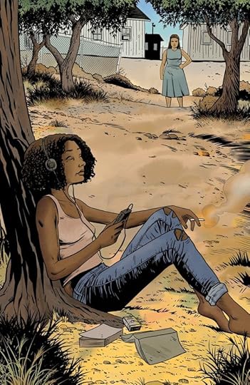
The New Messiah is exactly what the title leads you to believe. This time around you learn the origin of the actual reincarnation of Jesus. A young woman whose mother and stepfather are highly devoted to God and very invested in making sure she comes into her powers. Unlike our little Anti-Christ from the last volume, she knows right off the bat who she is and what she is expected to do. Unfortunately, due to the legions of evil pursuing her, she grows up on one of those wack-a-do compounds and eventually comes to the conclusion that everyone around her is nuts.
After making a run for it, getting a taste of freedom, and then having her whole world go tits up, she finally has to confront the reality of who she is. But can she figure it all out in time to save herself and the people she loves from the forces of Satan? Recommended. <--for fans of this kind of stuff
I don’t know about you but I’ve read a few books and seen a few shows/movies about the second coming of Jeebus so I’m familiar with the setup. And maybe that’s partly why I was so bored with American Jeebus: The New Mess, because it doesn’t add anything fresh to this subgenre, but it’s also just a really boring and unimaginative comic, like a lot of Mark Millar’s recent work.
So it’s the usual routine: virgin birth, angel Gabriel, antichrist, oh god I’m yawning already… anyway this time Jeebus is a black girl! That’s really it for the “plot”. Millar weaves recent history into his dull narrative - Waco was really about an attempt at taking out the new messiah and 9/11 was part of the antichrist’s devious plan to get the ball rolling on having us all microchipped or something astoopid.
The story is plodding and never engaging. Nothing interesting happens until the generic bad guy shows up at the end for an X-Men 2 rip-off scene. The art is fugly - Millar’s worked with some of the finest comics artists around today on his Image titles; Peter Gross is definitely not among them.
A dreary slog from tedious start to tedious finish. Now that you can ignore American Jeebus the comic you can soon ignore the TV show when it arrives on Netflix. Another Gross Millar crapfest!
Like most of Millar's stuff nowadays this is just decent.
After 15+ years of waiting we get the second of the three part series of American Jesus. After the twist of the last one you'd expect them to go back to that character but instead we get a brand new character. I actually enjoyed the idea here, as a new character who is the new "Jesus" can counteract what happened in the last volume. So the idea was solid and the art was decent.
But the dialogue is all over the place. Outdated slang at parts, super rushed execution for the 2nd half, and the villains be...well shit to be blunt.
So overall a decent action followup to the 1st book but nothing special. Hopefully ends good.
This is a very short installment in Millar's take on the second coming and everything that hangs around it. That doesn't make this bad, unfortunately that does not make this great either.
This time around we get the brief version of our other main character's life (conception to about 18).
Worth it for seeing where the story is headed, but frustrated with this being short a short (digital floppies - 3) series.
I enjoyed the first installment but why skip all the action of what the parents went through or how they were hidden/socialized? I was right there with them at the end of that first one and this seems weak in comparison.
They get points for Catalina being a black alternative-music enjoying, well-read teenage girl but that's about it. Curiosity might make me fall into the third installment one day, won't be soon tho.
Nesse volume intermediário deixamos um dos protagonistas para conhecermos a história de seu espelho. Aqui não temos um plot twist surpreendente como no primeiro volume, não temos tantas surpresas e a história segue mais linear. Por outro lado temos um arcanjo mais dado a teorias da conspiração do que o usualmente imaginado, o leitor certamente vai reconhecer várias delas. A escolha feita para o protagonista não é de todo inesperada, mas certamente incomodará alguns, inclusive talvez incomode mais do que a última ação dele nesse volume, uma reviravolta no mínimo bem curiosa. Vale ainda dizer que causa alguma estranheza a forma como o protagonista passa de uma total descrença para uma percepção absoluta de seu papel na trama. Seu despertar é abrupto e estranhamente satisfatório. Complementa a HQ novamente o diálogo/entrevista entre os autores, que enriquece ainda mais a experiência da leitura.
Há 16 anos atrás estreava o selo MillaWorld, entre algumas de suas publicações estava Chosen: O Escolhido, escrito por Mark Millar e desenhado por Peter Gross. Todo esse tempo depois, a continuação da série que apresentou a gênese do Anticristo agora traz, sob o novo título, American Jesus, uma nova encarnação do Messias, que ira combater as forças do mal. É um sinal dos tempos, portanto que o novo Jesus Cristo seja uma menina negra. Se fossemos pensar isso dezesseis anos atrás esse fato teria levantado tanta polêmica que a revista seria cancelada. Atualmente passou praticamente despercebida por fundamentalistas religiosos graças a trabalhos na cultura pop como Dogma, O Auto da Compadecida, Deuses Americanos e Second Coming, que dizem que o divino pode assumir a aparência e o comportamento que quiser. O trabalho de Millar e Gross está longe de ser o melhor dos dois, mas é um dos melhores, visto que Millar não tem produzido obras de fôlego há muito tempo sem apelar para certas excentricidades. Agora é esperar a conclusão da trilogia e o embate entre a Messias e o Anticristo que vem por aí. Torcendo pelo melhor (para os quadrinhos), é claro!
Oh dear. In belatedly catching the first American Jesus book by Mark Millar I mentioned his modern-day habit of starting a story to make a franchise and not to make a full story, and how he managed to produce an ending-that-was-a-beginning to that book that really satisfied. Well, here's the sequel, and it really can be said to be the sequel that nobody wanted. Last time round we had a kid with an easy way with miracles, and the world seeing him as the new messiah. Here we get a girl due a virgin birth, and eighteen years later a bratty offspring, who doesn't think she could possibly be the second coming of anything.
The problem is, neither can we. The 'angel' – for this story needs a Gabriel figure for the annunciation – yacks on about the satanic will, but comes across as about as sensible as David Icke. The book crams every crack-pot idea in, pretends that religion is just as good, and then proceeds to the new Bethlehem, which happens to be Wako. Wako, ffs. Now, I'm as much of an atheist as the next man, but even I don't get why the religious side of things here get belittled in such asinine, cheesy ways. The first book at least had a respect for religious thought.
It carries on from there – the people in the compound looking after "Catalina" speaking like no religious person ever would, and coming on like stooges for the world's worst conspiracy writer. "[Priests] have no idea the Vatican is a serpent cult" indeed. Also, it soon becomes clear there will be a third part of this whole shebang, which might actually provide a good-versus-evil story with some kind of heft or purpose to it. For this volume, with such an attitude about it, and with such a boring must-get-plot-A-to-point-B-ready-for-the-sequel raison d'etre, is just a waste of time. A waste of time that still demands I try and come back for the conclusion, but that would be courtesy of what the first book did, and not what this limp stepping-stone of a "story" did. Sinful.
Wow, v2 releases 15 yrs after v1. Millar tells the story of Jodie Christianson's opposite number, a product of virgin birth, raised in secret on a Texas compound by a cadre of true believers. Catalina doesn't believe in her own divinity, however, and can't wait to escape and start a normal life in the real world.
Not awful, and the story is still promising conceptually, but I just found nothing compelling here. Wooden characters going through the motions.
Short and straight forward. A set-up for the next book really. More like an extended introduction. Last time we met the antichrist in an awesome twist. This time we meet the second coming. Next time they meet each other hopefully. 4 stars but only cause I’m happy to finally get more of this story.
Achei o Vol 2 melhor que o primeiro. A jornada da Catalina é mais interessante, talvez por ser pessoal, enquanto que a do Jodie foi mais sobre as reações externas. A entrevista com os autores no final me deixaram curiosa sobre como seria/será a segunda temporada da série, pois aparentemente vão mudar o cenário em que se passa a trama também (e eu aprovo essa mudança).
La premisa de que un Nuevo Mesías nace de nuevo es, para empezar, contradictoria con los comentarios al final del Primer Volumen, en donde recalcan que, como dice en la Biblia, Jesús regresará ya no como niño, sino en toda su Gloria. Dentro de todo, fue mil veces más interesante la historia de Joddi que la de Catalina, y es un alivio que hayan dicho que Joddi retomará el control en el último volumen. Por último, tengo miedo de que Netflix vaya a lanzar una adaptación de American Jesus. El 90% de sus adaptaciones de otras obras son un ASCO
Millar isn't one of my favorite writers, he has some great tropes to develop and great ideas, that he ends up developing either too over the top or too shallowly. Curiously this falls just in the middle. This second book on the American Jesus series brings out a lot of heavy-handed criticism on the way American media and American Christianity cherry-pick passages of the bible to create a myth that has nothing to do with the actual scriptures. Drawing from the obvious things like, "Jesus was a middle-eastern Jewish immigrant" to create this neo-myth of the son of God, Millar creates the obvious parallel, both to his previous book and the traditional scriptures, interpreting this New Jesus (TM) as a black-latina girl born from an immigrant mother and a black parent, who have to go into hiding when people begin trying to kill this Neo-Virgin-Mary. (It's not exactly a spoiler it is the premise). It goes to great lengths to make the distinction between American Jesus and New Messiah, whereas one was a privileged white boy embracing his "godliness", this girl falls on the opposite end of the American experience. I won't elaborate because those are spoilers.
Regarding the art...
It is simple, square, big pannels with slow beats that don't match the urgency of the most important scenes. The palette is mostly warm, I would say sandy both in color and somehow reminds me of the texture. I guess it sort of makes sense. But the art is incredibly dull as well, lacking inspiration in most of the design except for the cover pages. Both American Jesus and The New Messiah are by the same artists, Peter Gross (art) and Jeanne McGee (colorist), but... The first volume, ten years ago, layering was more dynamic, the line-art and the inking accentuated the watercolor. Here, I am not entirely sure of the technique, but the colors are really flat, like she forgot how to paint people of color. Most of the time the shading is purely ink, which is one of the techniques in the previous one, thing is, it fits There and it doesn't fit Here mostly because the colors in the skin feel like they were filled with the little bucket-tool from all the digital programs. It looks more like a comic. And that's not a compliment. Can't say I am a fan of the artwork. On the other hand. That Ending tho'. Spoilers of the final lines. "Teach them that love always wins in the end" "I taught them that lesson two thousand years ago, it's time to see if they were listening". On writing, it gets a 7.5/10 On art, it gets a 5/10 Overall it gets a 6.5/10 A generally good reading that inspires some introspection about culture and religion, but it still lacks an ending.
The long overdue sequel to Chosen, we now get to see the upbringing of the actual second coming.
This relatively short sequel is fine, as far as it goes, but suffers from the lack of suspense, or indeed the final big reveal that it's predecessor had. We know that Catalina is the reborn child of God, the real power of the story would have been not knowing if everything that was being told to you was true - were her parents just indoctrinated into some paranoid isolationist Texas cult, or are they indeed the real deal? what powers does Catalina have as the second coming? Did her mother see visions from an angel or not? Is he actually an angel?
With it's short length there isn't enough time to really develop much of what Millar throws out, indeed Catalina's entire childhood is glossed over, explained in asides. There are nuggets of narrative that could be intriguing if expanded upon, but that never happens. The real brilliance of Chosen was putting the second coming story into a modern day setting. How would family and friends react to an immaculate conception? Would they believe it - would people be ready to accept such an event as a reality? The best feature of The New Messiah is exploring the nature of faith, ironically the new Jesus being an unbeliever until faced with proof. When 'the bad guys' finally show up Catalina instantly switches on her godlike powers with no previous hint of them - she goes from non-believer to Christ child in a heartbeat, and one who is happy to 'smite' her enemies on mass. Gross's artwork is serviceable, his straightforward style adding to the isolated, mundane setting that most of the book has.
I think this is still a good story, but obviously we need the final part to fully judge that. Hopefully that one will be more fully developed, of greater length and will be able to explore the full potential of this tale.
Events in this volume happened fast enough that I was hoping for the final battle to be included. Sadly, it's in volume 3 that has yet to come out. Just my luck, I can't even stumble on limited series that are standalone or completed. This is why I stay away from ongoing series. Oh, well, I guess this is another series I'll never return to.
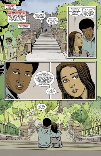
Even though she is still a virgin, Luciana finds she is pregnant after dreaming about an angel. Her mother is appaled, but promptly schedules an abortion without her strict husband knowing about anything. Out of the blue, several things happen that postpone the abortion. Then she meets a man who looks just like the angel from her dream. He reveals that her child is supposed to prevent the occurance of a dystopian future, but she and her boyfriend Eddie must go into hiding. There are forces that are hunting for them.
Man-o-man, never before have I ever seen something so dynamic as this series in regards to how people look as the messiah. In the last issue we find that the traditional traits of the messiah actually has more to do with the anti-Christ. But even then, he ends up isolated from human feelings sometimes because of his awakening out of survival and because humans can't reach him spiritually anymore. But for Catalina and her family, you really have to wonder what people actually need in their lives. After her mother's virgin pregnancy she has to give up everything to raise their daughter in a gated community that functions more like a cult. As someone who also felt how forced and isolating Christianity can be, this hit very close. Catalina was essentially raised like a child all her life and ended up hating all of it. She feels that she never earned anything and with the community's gated attitudes it was hard to blame her. In fact the community act like how some devout Christians who have made news act. Not the smiting sects like the KKK but the socialistic ones who are more or less militant hippies. They see the world as corrupt per its foundations in greed and entropy. And the method in which Catalina gains her power and her mom's attempts to convince her are absolutely terrifying. She straight up points a gun at her new friends, who are actually pretty decent. And Catalina's powers evoke images of a vengeful god instead of someone who inspires others. It really brings up the question is that if she's supposed to be the savior of the world, does that mean Catalina has to destroy it first?
Diejenigen, die über den zweiten Band der American Jesus Trilogie berichten, stehen vor der Frage, ob sie das Ende des ersten Bandes spoilern oder nicht. Zwingend notwendig ist es meines Erachtens nicht, weshalb ich versuche, ohne auszukommen. In einem direkten Zusammenhang stehen die beiden Bände so oder so nicht (weshalb ich davon ausgehe, dass die Zusammenführung beider Handlungen im dritten Band erfolgt).
Der zweite Band hat mir tatsächlich auch weniger gut gefallen als noch der erste, was mehrere Gründe hat. Zum einen ist dieser Band sehr gradlinig erzählt und es fehlen einfach die Überraschungsmomente. Zusätzlich verhalten sich die Haupt- und Nebenfiguren etwas befremdlich und schaffen es nicht, Sympathien beim Leser zu wecken. Immerhin wurde die unbefleckte Empfängnis in die Gegenwart verfrachtet und es hat viel Potential gegeben, wie diese in der modernen Welt aufgenommen wird, das aber einfach nicht genutzt wurde.
Gut begonnen wurde die Geschichte, in dem die Geburt ähnlich dem biblischen Vorbild unter keinem guten Stern steht und in dem der neue Messias eine schwarze Frau ist. Aber dann verließen sie ihn. Das Markanteste, was fehlt, ist die Verbindung von ihr zu Gott, die ja essentiell wichtig ist. Erst zum Ende hin entwickelt sich diese, dann aber ein wenig zu dick aufgetragen.
Fazit
Die Kombination aus Mark Millar und Peter Gross funktioniert auch im zweiten Teil der Trilogie, aber diesem fehlt einfach der letzte Kick. Viele Kleinigkeiten fallen störend auf und am Ende fehlt einfach eine Pointe, die den letzten Teil “antriggert”. Nichts desto trotz wird es spannend, wie die beiden Teile im dritten Teil zusammenfinden werden.
Fifteen years ago, when everyone was first losing patience with Mark Millar, he did a book with Peter Gross called Chosen, about the second coming. Except - psych! - the twist was that we'd actually been following the Antichrist all along. This was moderately clever, but really not helped by the amount of gruesome detail ladled on for the reveal. Now, finally, we get the second volume (cf my previous comments about Millar being a lot quicker to begin stories than continue them). This time there's no real curveball, unless you count the way the eventual miracles look a lot like standard superpowers, exactly the sort of shock and awe stuff Jesus pointedly refused to do first time around (well, unless you count some of the loopier apocryphal gospels). Our heroine has grown up in a Waco-style cult compound, her life rigorously controlled, told she's the messiah - and she is. She's been told she's not allowed near mass media because the world outside is under the sway of her Adversary - and it is. Really, the main interest lies in wondering: given that Millar is Christian, one of comics' few out Brexiteers, and also all for Scottish independence, might he actually believe some of this Satanic world government, 'RFID chips are the Devil's mark', David Icke-meets-Left Behind lunatic eschatology? Is he planning to use his Netflix millions to turn free Caledonia into a stronghold against the Beast? Because if so, that might make for a considerably better story than this.
What Mark Millar has done with American Jesus is to create an extremely overpowered female protagonist. The character technically fits the Mary Sue label but unlike most of the characters that fit the description, Mark has taken the time to establish the how and why the character is this powerful and has given her an actual purpose rather than being a walking plot device. He also sets up a compelling path forward for her and the setting.
Anyone that came of age in the '90s can take a wild guess as to what happens to the cult in this issue. What Mark does next takes all of the disparate themes established in this series and blend them with the current state of how information is disseminated.
What sets the real world apart from the setting of American Jesus is that none of the members of this particular cult are portrayed as dangerous at all. The situation is fantastical due to the particular nature of this story but I remember being a kid and seeing the still images of David Koresh, followed by the images of the burning compound and after putting down this comic it makes you wonder, what if?
I'm not the biggest fan of his art style but It works really well with this series. He's a great storyteller and although his style is definitely different than my preference he gets the emotional beats of the story and never detracts from the narrative.
Mark Millar's belated follow-up to "American Jesus" isn't quite as thrilling as the first, in part because so much of it is a foregone conclusion from issue one. After the big twist in the first volume, we spend much of the second volume playing catch-up. But his character work is still impeccable, the comedy is as pitch-black as ever, and that fantastic blend of reverence, irreverence and cosmic horror is still hard to find anywhere other than in Millar's comics and the short-lived "The Exorcist" TV series. But will we ever get to see Volume 3?
the second volume of #americanjesus #americanjesusthenewmessiah #thenewmessiah by #markmillar #petergross @mrmarkmillar @petergrossart published in 2020. Over a decade in the making. Slightly different approach focusing on the opposing child’s mother in the first issue rather than mirroring the first book. Plenty of fun with conspiracy theories in this volume tying in real world events to the mythology of the book. Another interesting choice having Jodie in the first book experience his powers at 12 and catalina not having hers at 17.
Yo it's not bad but it just isn't GOOD you know? Can't say the art pops. Can't say the writing surprises me. Can't say it gave me anything to think about. It didn't drop sudden edgy rape bombs like the first volume (the antichrist casually telling us 'Satan laughed. He laughed and he laughed while he raped me with his three dicks for weeks on end') but it also does very little to surprise or astonish us.
3.5 La lectura rápida de esta saga (3 revistas por entrega) hace que uno la sienta como una mini maratón de Netflix, muy apropiado ahora que este título va a ser lanzado en streaming. El arte ha mejorado muchísimo pero al mismo tiempo se logra reconocer al autor del libro original. Y, haber cambiado la perspectiva de la historia hacia el personaje opuesto hace que todo quede listo para un desenlace muy interesante.
It’s good! kinda. It’s very ok. I love where it’s going but it was a little bit anticlimactic. Not much happens apart from set up...set up...set up...something cool happens, end. It’s obviously a set up volume before the main event but realising that kinda sucks given the vast chasm between volumes. Just waiting for the bomb to finally drop.
Rendimientos decrecientes con respecto al anterior volumen. Lo más interesante es que la reencarnación de Jesús es mujer y de raza negra y el final promete, pero hay puntos de la trama que se sienten forzados y se ven venir a kilómetros de distancia como lo relacionado con la matanza de Waco. Veamos si en la tercera parte recupera nivel.
Seems a bit redundant to criticise a Mark Millar book for bad taste, but I found its "all the lunatics were right all along" element a bit hard to enjoy. The new Jesus was cool, though. Hope it isn't such a long wait for book three.