What do you think?
Rate this book


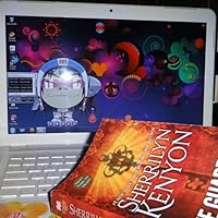
256 pages, Paperback
First published January 1, 2014
Fan Run International Sites:
Argentinian FB Page
Fans de Sherrilyn Kenyon en Columbia
Fans de Sherrilyn Kenyon en Chile
Filipino Fans on FB
France/French
Italy/Italian
Portugal
Soy Fans de Sherrilyn Kenyon
Dark-Hunter Spain
Spanish


“she’s the human equivalent of an extremely spoiled and pampered young adult.”
“Psst,” Simi whispered to Leucious. “The term now is ‘new adult.’
I am Cadegan Maboddimun... son of no one. Wanted by none. Conceived for evil intend. I entered this world alone and that it was how I was destined to stay in it. I will not ask you to sacrifice yourself for me.


Let me just check …is this book written by Sherrilyn Kenyon? Yes, CORRECT!!! … she did?
.So why doesn’t it feel like a SK’s writing style? And is SON OF NO ONE a Dark Hunter book? Hell Chaser…what the hell is that?????
The hero is not a DH, he’s some kind of demon/god trapped for thousands of years in Hell and fighting to go over to the evil side and stay a good demon!!!!!!
Jo, the heroine and her dreamboat will do anything to save each other so they can be together, FOREVER,
And where are the gorgeous Dark Hunter, the fabulous Were Hunters and Nick Gautier? Hey, nodding off somewhere
Wake up Alex, you can’t give up on a SK book!!!!
Did I read this right or are my eyes bad???? <
This is too confusing for me….