In 1976, Twentieth Century Fox bought a screenplay by Dan O'Bannon entitled Star Beast . Three years later with Ridley Scott at the helm, Alien was unleashed on unsuspecting filmgoers.
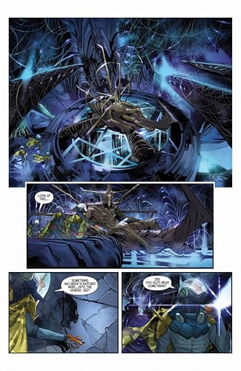
En route to back to Earth, the crew of the starship Snark intercepts an alien transmission. Their investigation leads them to a desolate planetoid, a crashed alien spacecraft, and a pyramidic structure of unknown origin. Then the terror begins . . .
Writer Cristiano Seixas and artist Guilherme Balbi have attempted to stay true to the characters, settings, and creatures described in O'Bannon's original screenplay--without replicating the famous designs of Ron Cobb, Moebius, and H.R. Giger. A new experience, but still terrifying!
This is a really cool idea; to base a comic on Dan O'Bannon's original Alien screenplay before any rewrites of H.R. Giger's designs entered the picture. For the most part it follows the path of the shot movie with small differences.
Alien is my favorite horror movie. That may have something to do with the fact I watched this at 7 years old from behind the couch when I was supposed to be in bed. I was terrified my parents would catch me in addition to being terrified by the movie. This lacks the tension of the film. I think that has to do with the art. While technically, Balbi is a capable artist, I couldn't make heads or tails of the action sequences. They didn't flow together in a coherent manner. There was none of the panic or paranoia.
Received a review copy from Dark Horse and Edelweiss. All thoughts are my own and in no way influenced by the aforementioned.
A solid comic-book adaption of late Dan O'Bannon's original screenplay before Walter Hill and David Giler edited it, a proto Alien ante litteram very similar to William Gibson's Alien III from Dark Horse.
Not bad at all for an author debut, I enjoyed the artworks, and this was a cool original take on the classic storyline everybody knows and loves, with different characters (android Ash, one of best things in the 1979 movie wasn't in the script) and without the iconic xenomorph from artist H. R. Giger.
An entertaining read, but the final product, who made me a sci-fi/horror fan since I watched it for the first time when I was a kid, is so far better thing in my opinion. that best parts of this adaption were for me the ones left in Ridley Scott's flick.
I would say the original Alien is in my top five favourite films, and I've been avidly reading Dark Horse's Alien comics through the years. I do feel Dark Horse has let the franchise slip, especially in their output in the last couple of years, with writing that repeatedly seems to miss the point of the xenomorph.
But this is something different. It's a new comic adaptation of Dan O'Bannon's original screenplay, before it was tightened up and rewritten considerably by David Giler and Walter Hill. This alone makes it a fascinating artifact, a "what could have been", so far as that is possible, of course. In the introduction to the book, Dark Horse's VP of Publishing Randy Stradley remarks how he would send artist Guilharme Balbi back to the drawing board when a design would resemble the film's design too much.
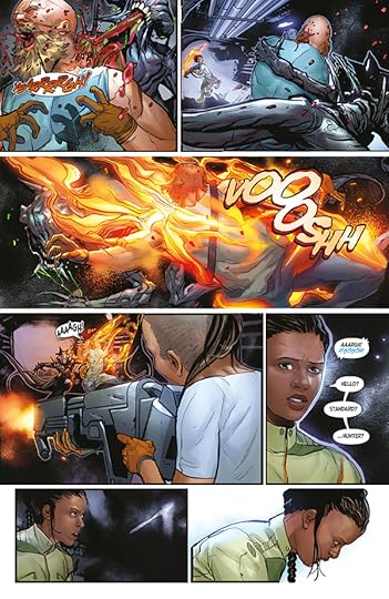
At first I found myself constantly comparing the comic to the actual film, and for some reason there are little pops of joy when the dialogue is the same as in the film. And the comic is quite different, narratively. There is also a lot more visceral gore, where the film uses quick shots or keeps the violence off camera.
I did find myself forgetting about the film after a while, and following the comic's story. I will say it's not nearly as suspenseful as the film, but that's an incredibly hard act to follow.
The look of the xenomorph loses to Giger's design (but again: how could it not), but I was impressed by the new Navigator. Overall I think the art doesn't handle action scenes that well, I found them to be quite confusing.
One interesting aspect of O'Bannon's screenplay, is that it takes the acidity of the xenomorph's blood much more seriously, where in the film it is noted and then sort of forgotten about - in the comic, again and again characters fret over how the blood will punch a hole in the ship, leading to decompression.
The book is an interesting experiment, and that alone makes it a worthwhile read.
3.5 stars
(Kindly received an ARC from Dark Horse Comics through Edelweiss)
I said it in my review of "William Gibson's Alien 3", I really like the concept of revisiting old scripts and re-imagining them as comics.
This is very similar to "The Star Wars", the comic adaptation of an early script for Star Wars. The art in this book is very unlike the eventual film "Alien", as it was written long before Ridley Scott, Moebius or H. R. Giger got involved. It helps that all of the characters have different names too, so there's less direct comparisons with the final film.
If you've seen "Alien" then this will all be quite familiar, the plot is mostly the same with some changes. The character names are different, although their charaterisation remains mostly intact. There is no Ash, the android. And the name of the starship is "Snark", presumably a reference to the poem written by Lewis Carroll; as opposed to the named used in the film: "Nostromo", presumably a reference to the novel by Joseph Conrad.
The design of everything from the planet, the uniforms, starship and the alien itself are all quite different from the final film, so there's a novelty in reading this alternate universe version of "Star Beast".
This isn't one of those cases where I dream of what might have been. The film is a masterpiece in science fiction horror and all elements come together beautifully. It is nice to see this as a first draft, as how with a few tweaks a good script can become an amazing film.
I do think there is a lot of merit in making these “what could have been” books, especially something like the OG Star Wars book that Dark Horse put out a few years ago.
Mostly it just shows how much collaboration on these projects brought out the best from the bones of the original idea and this is very much in that category.
There isn’t really enough changes to feel like a new take (or old take I guess??) and for the most part it hits all the beats of the film but not as hard or as masterful.
The artwork is lovely. Reading the foreword, I assumed the Alien would be really out there compared to the Scott version but it actually is a cross between that and something from one of the AVP games.
I don’t think this is as memorable as something like the Star Wars book but enjoyable enough for an afternoon/morning read.
There really wasn't enough of a difference between the screenplay and the movie to make this interesting, and the art was bland and often incomprehensible, especially in the action sequences. A decent idea, but the execution was decidedly lacking.
Le doy 4 estrellas porque el dibujo es bueno y porque la peli es cojonuda (¿la peli? Sí). PERO el guión es EXACTAMENTE el mismo que la peli (por eso mola), excepto la pequeña parte que persiguen al alien y pillan y ya. Lo recomiendo si eres MUY fan (como yo) y te da igual que sea lo mismo pero con diferente envoltorio.
Nice drawings, terrible visual storytelling. Nearly impossible to tell what is happening in pivotal action scenes. The artists slavish recreation of posed digital characters and/or photo references make a lot of the action look like hilarious pantomime with zero subtlety and little though about page layout and design. It’s a good idea for a book but I suspect it was done quickly and cheaply for a buck and it shows. An interesting way to revisit the original material though, I’d love to see it done more thoughtfully.
Dan O'Bannon's original screenplay was a bit different than what was seen in theaters in 1979 with different names, places, and no androids (there was still a cat though) - Here we have the crew of the Snark setting down on a planetoid in relation to a distress signal of unknown origin and then it goes pear-shaped. The end result is the same but how we get there is a very different route.
If you are a fan of the Alien universe, this is something you need to have on your shelf.
The plot is essentially the same as the movie with slightly different characters. None of the designs are as good as what ended up in the movie and the pacing isn't nearly as good either. Worth a look for only the biggest fans of the Alien films.
It is pretty clear that the writer and artist were not communicating with eachother as much as they should have. Much of the visuals simply does not match with the dialogue.
2.75 stars So, I can give this work props for two things: first, the colors are pretty, really pretty, and I take no criticism in that regard, because I loved them; on the other hand, the redesigns for the alien and the chestbuster where very interesting, certainly far more bio than mechanic in comparison to Giger's ideas, still aiming for a gross/violent erotica, but in a more slimy direction, and the design of Poor Yorick was just lovely. Everything else? Eh, I just don't think this version needed an adaptation in any medium. Sure, it's pretty, but the only thing left out from the end result that was 1979's Alien was the Wayland-Yutani subplot, and the only things that were added were some expansions to the background of the alien lifeform (which has been and is being developed anyways) and more gore to the death scenes, but that's about it. And being entirely honest, the divergent backdrop of the alien is the only appealing one out of the two aspects, and that may be because I'm a sucker for the idea of inherently different, but also oddly similar in certain ways, sentient lifeforms to what we are. The deaths, however, were just plain, well, plain? There was no tension at all to the chestburster beat, and the remaining deaths are kind of shoddily done, feel near weightless, and in some cases come off, not only as some sort of shock value, but also like the actions in the panels are disconnected from one another. I don't think the characters need any in depth analysis. The characters of the film aren't stricly speaking the most depeloped examples in the history of horror (cinematic or otherwise), but they feel distinct and they convey genuine feelings. This being a piece framed in a different medium (and rather short, for that matter), a genuine comparison between both would be moot, but, boy, did it not translate well. And I don't know, maybe I'm just being picky and overly opinionated because Alien is one of my top three favorite movies of all time. Really, I've read much worse than this, and the colors are pretty, darn it.
Star Beast doesn't quite sounds tense, does it? Luckily, O'Bannon and Shusett decided to change it to Alien somewhere down the line. Simple, yet chilling. Having bought O'Bannon's screenplay, Walter Hill and David Giler decided to do some rewrites and some 8 drafts later we got Alien, the movie which gave us all nightmares and one of the best SF movies out there. O'Bannon was pissed with changes, yet having read adaptation of his original screenplay as Dark Horse published comic book, I have to disagree with him. Changes did it good, and besides, pretty much everything is left except they've added Ash and cut some scenes on the alien planetoid.
Maybe one of the reasons why movie version is much superior than this comic book adaptation is the lack of suspense, there is no that feeling of claustrophobia and panic. Even though Balbi is a good artist, action scenes are a mess. Puff and xenomorph is there, out of thin air. And no matter how much they've tried, it still resembles H.R. Giger's design.
All in all, it is a decent adaptation. Story of Alien we all adore is still there, even the cat is present. Scenes are pretty much the one we saw in the movie, just that dread feeling is missing. Better than adaptation of Gibson's "Alien 3" original screenplay by a long shot.
Барбаршопні персонажі туплять посеред сюжету про Чужого, інколи стаючи в жахливі, майже нелюдські пози. Там, де класичний фільм розкривав персонажів, тут навіть не замислюються про таке. Весь дизайн з отими величезними ЕПТ-моніторами, сяючими кнопками та ручками кудись викинули. про інтригу з таємним андроїдом забули. про зловісну корпорацію забули. Виходить, не дарма відмовилися колись від оригінального сценарію, де не було місця Гігеру.
Сюжет від релізної версії додатково відрізняється тим, що персонажі стали дійсно тупими. Якщо в фільмі всі дослухалися до офіцера безпеки, то тут і мови про таке не йде. Ніяких протоколів. Ніяких костюмів хімзахисту! Так, знімай кисневу маску у приміщенні, де може бути повно інопланетних мікробів! Так, стій прямо у дверях шлюзу і вимагай, щоб його закрили дистанційно, тобі не завадить роздвоєння!
Get to see the original alien script come to live on the pages before the Alien movie we all love and care for was created.
And it's pretty solid.
A lot of the major points stick. The chest bursting scene, the very end, even the initial mission idea and going on to the planet. There's a few major changes, like taking away the Android COMPLETELY which I absolutely loved in the movie but understandable here. Also the designs are way different, and while I think the designs in the movie are perfect, I actually really enjoyed the designs here, slimy and nasty which is pretty awesome. Also Ripley is not here, instead it was Roby, a young Black Woman who hits most of the notes from the movie but a cool difference none the less.
It won't cover much new ground, but seeing it come to life before the movie was formed is pretty cool as a original script becomes a comic. A 3 out of 5.
Been wanting to read this for a while and was hoping it wasn’t as bad as the adaptation of William Gibson’s Alien 3 (hooboy was the layout and art in that one a stinker). The art here is fine, though the creature design as interpreted from the script felt mostly uninspired. I liked that each character, while not at all fleshed out, felt distinct based on their look and profile. I think this will prove the most entertaining for anyone (crazy like me) who had watched Alien, the scenes from the Director’s Cut of the film, Prometheus, and then read the Alan Dean Foster novelization of Alien. It blends together aspects from all four (inclusion of pyramids, the ship design as insect-like the Snark/Nostromo lander, the scene in the food storage area, the accidental venting issue) in a way that isn’t necessarily better but does provide a slightly different vision of the story. I think when it’s all settled, the original theatrical cut of Alien stands supreme as the strongest iteration on this story, but this graphic novel interpretation remains a worth inclusion for those really obsessed with the growth and adaptation of O’Bannon’e original Star Beast script.
Turning Dan O'Bannon's original Alien screenplay into a graphic novel is a fun idea. This isn't like the original Star Wars where it is a completely different world. Alien the screenplay and Alien the classic film are very, very similar. The major differences are in where the alien was found and what the alien looked like. Otherwise all the classic story beats are the same, though a few of the film's siblings are missing.
Anyway, should be a fun time. But the artwork is just... Lacking. Though the artist has real skill with the human figure, most of the backgrounds seem to be heavily reworked photos. However they were done, they are quite detailed. But they never really mesh with the characters, making them appear like paper dolls laid on top of a pre-rendered background.
And while the artists skills at drawing people are excellent, the visual storytelling is pretty flat.
It's a fun read. You can zip through the whole thing in the time it would take you to watch the movie. Not a bad way to spend two hours. But there was the opportunity to do more.
From the perspective of a 30 yo that has never seen the film: meh.
For starters, why the heck would the captain have chosen to board with the parasite in the first place? It just...makes no sense. Try to heal the guy in the other spaceship, eject the lifeboat and try in there, or just cut your losses and gtfo of there.
The timeline also seemed a bit off with transmission times and arrival times, but what do I know?
Points for cool art, the fact that there's a cat and the fact that at least the woman that had common sense can now apparently afford an island.
This is a weird one. The differences between this adaptation and the final film are large and small. It’s a well enough made comic, but it ends up raising more questions than answers. I’m going to have to track down the screenplay itself, which I wish had been printed here.
The original script has more “science-fictiony” texture than the film but the plot is not as developed as the film (which is already fairly light). It’s still good to see how much OBannon and his ideas are in the film
Interesting to read original version of Alien. Surprised that aside from extra scenes from planet and names being changed, it follows the film quite close.
Instead of adding, it subtracts a lot of important elements from the film's plot. However, it approaches the genesis of the Alien in a more interesting way and has more sympathetic characters.
This is pretty cool. It's like if you watched "Alien" in a different dimension. The alien looks different and the characters are different, but overall, it's pretty much the same story. We get a cool look at the alien's home world with pyramids and heiroglyphics. At the same time, there were big chunks of the original movie that apparently weren't in the original script, especially missing is the story of the company they're working for and its own agenda.
While I enjoyed reading this, my biggest problem with the book is that it felt like it was presenting the vision of the artists and adapters more than the original script. According to the introduction, all of the characters were originally men, but they gave us a multi-racial mix of men and women that had a more modern look (not late '70s). I'm not one of those people that complain about that kind of stuff, and it actually helped to distinguish characters from each other as their different personalities didn't shine thru. Also according to the introduction, while the life cycle of the alien is described in the script, what the alien looked like wasn't. So what we get here is the artists vision of what the alien might have looked like had H.R. Giger not been involved. That being said, I loved the art.
I like the idea of graphic novels based on an unproduced original script. I had previously read Planet of the Apes: Visionaries, which is the same concept, but for the original Planet of the Apes. That one worked a bit better, likely due to the script being more different and, let's face it, Rod Serling being a genius.
While this isn't essential reading, I did enjoy it. I would recommend this to any die hard Alien fan or anyone that is curious what Alien would look like in a different dimension.