Welcome to the 'more is more' world of decorating, or as it's more commonly know in the business, Maximalism. A style that embraces the beautiful colour palettes, luxurious textiles, patterns and embellishment. Maximalism is the epitome of passion, one in which Scandi-style, stripped bare and pared-back interiors have no place. Abigail Ahern guides us through the sea change in the world of interiors as the pendulum swings away from minimalism, over to our increasing desire for self-expression and optimism. Learn how to break the 'rules' of interior design, play fast and loose with different periods in a single room and have fun. Maximalism allows you to dip into colour palettes and any decade or style, with the effect of stirring up emotions and creating a bedazzling space you'd never want to leave. Chapters Developing a Sense of Research tips and how to begin, from trawling Instagram and tearing sheets from magazine. Expressing Learning which rules to forget and which guidelines you would do best to remember to make your decorating foolproof. All-Important Learn to create a story whereby every object in the room supports the same vision. Identifying Your Experiment with thinking outside the box and be curious with colour – what matters most is not the colour but the tone. Creating a Sense of All homes should have a soul and you should be the mixologist, taking risks and mixing up furniture styles with aplomb. Creating Ambience with Lighting is key and enables you to set a mood that is instantly tangible and has a direct impact on mood and energy. Styling Your The secret ingredient to making a maximalist home work, and not feeling like a cluttered mess. Challenge the Harness beauty and oddity, sensuous and the macabre, to create a decorative melting pot where elements vibrate with energy. Little Black Take a peek inside Abigail's little black book where we find the best global decor stores not to be missed.
The author and I obviously have differing definitions of the word maximalism. For me, the word defines a decorating style that exemplifies the anti-Marie Kondō look: everything you love on display, and hanging on the walls. It means surrounding yourself with the things that "spark joy. "
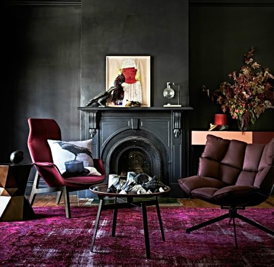
The author seems to think it means any look that isn't minimalist. Don't get me wrong; there are some rooms pictured here that are definitely maximalist: artwork hung floor-to-ceiling, collections and knick-knacks, books, books, books, some of them even not arranged by color. But, many of the photos feature rooms with bare, or nearly bare walls. And, speaking of walls - what's with all the dark colors?
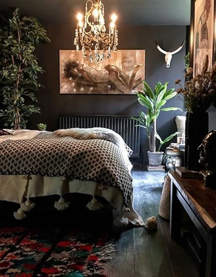
When I look at these rooms, I don't notice the furniture, or the artfully arranged items. I see a DARK WALL.
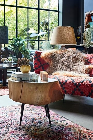
On the plus side, I loved all the textures.
Bricks, wood, plants, and fuzzy throws make a room cozy and inviting.
But, on the whole, there's really nothing here that sets Ahern's book apart from a dozen other home decorating books I've seen.
It’s hard to overstate just how truly excellent this book is. It strikes the perfect balance between being incredibly informative and yet not overpowering in detail. Through gentle repetition of fundamental design principles Ahern instilled both knowledge and confidence in the reader to undertake their own project. I can’t recommend this book enough.
I love Abigail Ahern's style but her books have too many of her own place repeated and others too. I wanted to see lots of different examples. Never the same interiors repeated.
I knew going in that I'm not really a maximalist, but as a self-proclaimed interior design hobbyist, I wanted to be informed about a significant design trend going on right now.
It's helpful to realize that some things are design constants: using both symmetry and asymmetry to create dynamic spaces, the art of using "vignettes" to create thoughtful spaces, avoiding catalogue-set-type approaches to decorating that can look too "cookie cutter," etc. and have their place in maximalism as much as in minimalism.
I wouldn't have dinged my star rating simply because the design concepts featured don't jive with my own sense of style, but I have dropped my rating down from my standard 4-star rating (5 stars are given out rarely... reserved for things that I truly, truly love) because there were no captions for the images chosen, and in many cases, the images did not seem to coordinate with the discussions in the text. When I read a design book, I like the images to be "Here is this principle in action." This was set up more as a lookbook in which the pictures have their own flow, and the text has its own (separate) flow. Which has its place, I suppose. But when I wanted to be taught about maximalism, the lack of cohesion between the principles discussed in the text and the images shown was a little frustrating.
I got this book for Mother's Day and what a delight it's been! As someone who has always been a maximalist when it comes to interior design without realising it, I really loved Ahern's way of articulating the best approach to making rooms sing - without a sense of overwhelm. And the glossy pics were absolutely gorgeous. Certainly not for everyone, but just my style. Thanks family!!!
No, no NO. "Trust your eye" says this chick. "Don't be afraid to break the rules." Well good show, that's my motto, and I'm certainly a "maximalist" let's take a look....oh wait. There is ONE RULE in decorating that you SHOULD follow, and that is to avoid hideousness. That rule is definitely broken here. The eye of the decorator was not trustworthy. I winced at 90% of these rooms. (And I would say that the majority were not remotely "maximal", some were quite stark.) Others were indeed filled up with stuff, but oh so badly put together. Just a mess, and this book gives "maximalism" a bad name.
To me, there were a couple helpful tips on combining patterns, repeating colours (or patterns) to make things cohere, and the 60/30/10 rule for colour (base colour/accent colour/pop… and you can use this ratio to determine colours for your big pieces/accent pieces/artwork and objets).
I also got the sense that working with neutrals can be quite interesting if you use varied hues, textures, finishes, and patterns.
I really liked this book - interesting pictures and text worth reading (which is not the case with all interior design books). It was the pictures though, that could be improved. Firstly, they bore no relationship to the text - I would have liked to see photo examples of the writer's tips. Secondly, although they seemed quite varied at first, as you go through the book you realise there are multiple photos of the same rooms, just taken at a slightly shifted angle.
Marked down from a 5 to a 4 for two reasons: firstly, more than a few distracting typos (naughty copy editor) and second because it repeats many of the style tips dished out daily on her socials. I do love her aesthetic and she has inspired me to decorate my house in dark and moody tones, even if some of the layered patterns are a bit OTT for my taste.
A bit chaotic and all over the place with ideas and inspiration for a maximalist decor style. Some of the tips mentioned were useful but overall, I felt like there wasn't much useful information there. And to be honest, most of the photos of the styled rooms were ugly (maybe maximalism just isn't for me).
"Everything" boasts a nice collection of pictures showing the maximalistic design. Some of them do not really correspond to the actual opposite page text by Abigail Ahern. The text being my main concern; the book is quite repetitive in its narration and instructions – one might think that the whole thing could have been a two-pager.
Pretty pictures. About 50 pages in I realized that she was just stringing words together. "Forever trend", too many colors is jarring but just add whatever colors you want. She was trying to speak to me, I know it! Some pretty rooms in here but mainly it was just a nice book to laugh with my supervisor about on a slow night at work. You too can achieve her looks if you're rich enough.
I love maximalism, but this book was not for me. I didn’t get much info out of it and it was too stuffy anyway. And what’s with all the example rooms being so dark?