The Thinking Eye 4. 1 Meaning And See With Fresh Eyes, Question Everything, Remodel Conventional Models 6. 2 Content-Responsive Typography, Redesigning Sentences, Paragraphs, Labels 49. 3 Graphical Nouns And Verbs, Structure And Function 64. 4 Data Analysis When Truth On The Relationship Between Evidence And Conclusions. Remodeling Statistical Practice And Teaching 81. 5 Explanatory Words, Numbers, Graphics, Images, Organized By Content-Responsive Local Grids. Is Thinking Just Annotating The World? 121. 6 Instructions At Point Of Need 131. 7 Theory And Practice 141. 8 Smarter And Shorter Remodeling Nonfiction Presentations 150. 9 A Visual Index, A Quilt Of Sources And Remodeling The Back-Matter In Books 162.
Edward Rolf Tufte (born 1942 in Kansas City, Missouri to Virginia and Edward E. Tufte), a professor emeritus of statistics, graphic design, and political economy at Yale University has been described by The New York Times as "the Leonardo da Vinci of Data". He is an expert in the presentation of informational graphics such as charts and diagrams, and is a fellow of the American Statistical Association. Tufte has held fellowships from the Guggenheim Foundation and the Center for Advanced Studies in Behavioral Sciences.
Tufte currently resides in Cheshire, Connecticut. He periodically travels around the United States to offer one-day workshops on data presentation and information graphics.
Note: Some books by this author have been published under the name Edward Tufte.
Compared to his other books, this one feels scattered and disjointed. The layout is a hot mess, and the content itself seems like a patchwork of b-side ideas left over from the previous books. It also seems unbalanced - the “science crisis” chapter drags on forever, while others feel like a short sketch.
As usual, one takes away a few nice anecdotes, and some good quotes and intriguing visuals, but overall, it seems more like a collage of loosely connected thoughts, than a coherent narrative or argument.
This book made me angry. Which is sad, because Tufte's other books made me so happy.
Most of all, the design. "Nearly every paragraph in this book is deliberately visually unique," he writes on page 59 of "Seeing with Fresh Eyes"...and they really are. And I did not like that.
I got distracted from the content by - the different line heights/text column widths (often way too wide)/typefaces - the sloppy alignment - the crammed pages - the bad editing (extra spaces and capital letters where they don't belong, etc.)
Design is not used well in this book to lead the reader's eye, motivate them to read, or give them a sense of structure/hierarchy. It's easy to miss chapter headlines when skimming the book.
But even with a great design, the content wouldn't have made me recommend this book. The only testimonial on the book is by Stewart Brand, creator of the Whole Earth Catalog. And that's how Tufte's new book feels like in design and content: A not-so-well-done Whole Earth Catalog, with some interesting bits, but many of them not well-enough explained, and with no strong overaching concept.
Tufte always creates gorgeous books. To me, The Visual Display of Quantitative Information, is still his masterpiece. Seeing with Fresh Eyes has interesting thoughts but is a bit more messy, less clear cut. Some pages feel too cluttered. And how chapters and texts relate to each other is not exactly clear. See my blog (Twitter thread) for some examples where Tufte does not practice what he preaches (do note: I'm nitpicking because of his own high standards and great work).
Tufte’s other four main books have been five stars for me. This has elements of that greatness that makes me think it also frequently lost me on what was being demonstrated. This is partially just due to execution. Wide bodies of text is not enjoyable to read. Stacklists seem more enjoyable to create than effective sentences one actually wants to read. It's a mixed bag here.
I had the immense joy of visiting Edward R. Tufte’s compound in Connecticut and experience his artwork on my birthday this year. I so enjoyed his vision and the amazing scope of his art. While there, I attended a lecture gave, using this book. I purchased a copy and have been reading it ever since, taking my time with each chapter.
Each page is full of spectacular art and an introspective look into philosophy, design and communication.
I freely admit a LOT of it was over my head. But I still found it accessible. I admit this book isn’t for everyone. But those who are interest in graphic design, sculpture or the process of one who creates, it’s a most interesting read!
Los libros de Tufte han ido perdiendo interés gradualmente desde aquel memorable "The Visual Display of Quantitative Information". En este caso se trata de un trabajo muy desestructurado e irregular en el que más que iluminarnos con verdades nos deslumbra con manías y ocurrencias. En varios capítulos Tufte, básicamente, descubre algo tan simple como hacer esquemas o separar las frases con sentido. En otro se embarca en una cruzada posiblemente cierta pero muy aburrida sobre la certeza tras las publicaciones científicas. En muchos otros introduce sus puntos de vista sobre el arte sin demasiada justificación. Además, en esta ocasión, su habitual puesta en práctica de sus teorías en la propia maquetación del libro tiene un resultado mucho peor: desordenado, descompensado, caprichoso. También culto, bien escrito y enternecedoramente personal, eso sí, pero justo esa personalidad era la que Tufte siempre clamaba por eliminar de los artefactos comunicativos. Al final, que sus consejos sobre cómo mantener reuniones eficientes y realizar presentaciones para un gran público -contenido basado en su amplia experiencia y más cercano a la productividad y la gestión que a la visualización de datos- resulten el material más útil dice todo sobre el valor de este nuevo trabajo.
I don't know what I think of this book. It has some gems, but it's not a cohesive work. If I were to retitle it, I would name it, "Short essays on things you should know Right Now because the world is falling apart." Topics include:
-typography, -the role of whitespace and layout on the page and in the universe, -how to conduct better meetings, -scientific and medical research inaccuracies and fraud, -how to make a doctor's appointment more efficient....
None of it is wrong. Some of it is delightful. It's an experience.
I wish Tufte would come to my parties, have a drink, and talk. It would be very interesting.
Edward Tufte’s new book is a marvel. I’ve attended at least three of his traveling workshops and have read his four earlier books, so I am pretty familiar with his ideas. But in just 176 pages, he shares a lifetime of wisdom and deep thinking on how to improve the way we share (and consume) data-rich information. Every page brings insights. This is a must-read for any analytics professional.
Iread anything that Edward Tufte writes. This “father of data visualization” has taught classes at Yale on the subject for decades. His books have also taught the reading public how to present data more effectively in the digital age. This work represents his fifth book. While his other books focus on getting the data right, this one’s subject meanders around transforming presentations into a form of art that provokes an audience response.
I enjoyed this book, and it certainly compares favorably with other authors’ books in the field of information visualization. Nonetheless, it’s not as compelling and paradigm-shifting as some of Tufte’s earlier works. Of course, the earlier works changed the entire landscape of how the material was taught, so that bar represents a high standard.
Nonetheless, it offers more tips on how to create a positive, lasting effect through a data-filled presentation. Some of Tufte’s earlier hallmarks are present: He shows ways to deviate around a work culture fascinated with Microsoft PowerPoint. Instead, he suggests handouts and reading time during the start of meetings. He even suggests that such an approach will cut down on meeting times by 10-20%!
Science and data geeks, like me, who spend their lives trying to express what they’ve learned in the depths of numbers, can benefit from anything Tufte writes. This book is no exception. He reminds us that as readers and listeners, we have to look at the finer points of any presentation; as presenters, we have to make sure our presentation actually conveys what we intend to convey. White space, placement, annotations, and the like – all expounded on clearly in this book – can teach us to see the world more clearly as the title suggests… with fresh eyes.
Very very very weird book. Totally different from all of Tufte’s other books. I would rather read all his other work again. I guess it’s beyond my current level of understanding.
Another classic from Tufte. Quite a bit about evaluating scientific publications, but also about "content-responsive typography" and intellectual honesty in writing and designing. He goes into the principles he follows in his courses and his books, including how the books are "self-exemplifying." Time with Tufte is time well-spent. Expect some frustration when you try to explain his ideas to others who haven't read his books, especially when you tell them what they are doing wrong. Better just to tell them to read his books, all of them.
In this book review, we explore how we can all start seeing with fresh eyes especially when using data.
Edward Tufte is a living legend in the field of Data Visualisation. His book “The Visual Display of Quantitative Information” literally opened my eyes to the importance of this field. As a young analytics manager, back in 2003, his writing helped me see the importance of taking care with our use of graphs. I have much to thank him for in the impact that has had on my career.
Over the decades that have followed, I have learnt more about what works and what does not. About the reality of improved data visualization in practice in large organisations. But alongside that pragmatism and compromise, Tufte continued to rage against poor design & misleading presentations of data.
Built on the foundation of Tufte’s works to date His latest book “Seeing with fresh eyes Meaning Space Data Truth“ is built on the body of work that preceded it.
In 2001, Edward Tufte self-published “The Visual Display of Quantitative Information“. This outlined principles for better graphical practice and educated a wider audience on a theory of data graphics. He also walked through some great historical examples of data visualisation, including famously Minard’s map of Napoleon’s defeat in Russia. He wrote with such clarity and authority it was like receiving the commandments of data viz fresh from Mount Sinai.
Despite the success of that seminal work, it was not Tufte’s first book on this subject. He published “Envisioning Information” in 1990. There he explores many of the principles he will keep advocating, especially data density, careful use of colour & the power of small multiples. Then in 1997, Tufte published “Visual Explanations” in that book the focus is more on robust statistical & scientific thinking in our data viz designs.
Prior to ‘Seeing with Fresh Eyes‘, Edward Tufte’s last book was “Beautiful Evidence” a title that suits the beauty of that artefact (and many of the books that have gone before). There was some (helpful) repetition (including a larger fold-out version of Minard’s Russian map. By this book, his focus had moved onto art as much as science. There is exploration of a wider variety of visual forms (including writing & artworks). Together with useful explorations of the sparklines that Tufte created and how to improve on Powerpoint presentations.
Releasing the restraints, seeing as the artist sees Edward’s latest book is very much built on all the principles and advice laid out in those earlier books. All are worth reading for different purposes, although they most some repetition of both images & soapboxes. But his latest book feels different. It is like some restraints have been taken off and he feels greater freedom to show what he sees.
It is instructive when approaching this book to remember that Tufte is an artist (a sculptor) as well as a professor. Right from the beginning of this work you are presented with poems, spaced out word stacks and a variety of images. It feels like a professor who has been released from his curriculum. Now he is speaking from the heart and you get to experience the breadth of his polymath interests & knowledge.
Prepare to see anew how words, as well as numbers, can be presented in creative & impactful ways. Expect to learn about medical procedures, musical compositions, famous scientists’ notes, public signage & maps. They are all here as we will visually explore them. Many data viz topics are explored in this book. But above all, it is an experience. A challenge to open your eyes and see anew the information & media that surround you. To care anew about truthful & effective communication.
What did I take from this journey through Tufte’s collection? I’ve emphasised the artist’s approach in this book, but it is also like a museum curator’s collection. In this book, we are exposed to what Edward has curated. It feels like the collection of a man who walks through life with his eyes open. It is an eclectic collection that deliberately unsettles us from the normal styles of presentation. Encouraging us throughout to search for meaning, recognise the value of space & take care to present data such that we communicate truth.
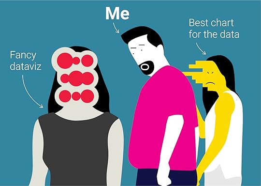
So, what did I take from the many recommendations in this book? One is his advice on how to achieve smarter and shorter meetings. In short, include reading time (study hall) & hand out a well designed short report rather than any slides. It’s an approach that Jeff Bezos implemented in Amazon. My second is the care that should also be taken in laying out textual information. Beyond just thinking of annotation in charts, consider using content-responsive typography. Plus, the simple power of lists & instructions at the point of need.
What will you gain by reading this book? I don’t know. At one extreme, if you’re an American there are important tips for navigating poor practice by the healthcare system. If you’re a scientist, there are beautiful examples of richer mixed media note-taking. Analysts & scientists will also benefit from the challenges for more scientific rigour in their work & presentation of evidence.
How will you help others see differently? In closing let me share one of my favourite quotes from this book. As so often from the work of Prophet Tufte, it is a call to our consciences as much as our minds. Analysts take note…
“A good way to have credibility with your colleagues is not to have lied to them last week… Every paragraph, every visualisation should provide reasons to believe. Presenters should provide data downlinks with a clean codebook. Fear that others may look at your data encorages getting it right in the first place”
‘Seeing with Fresh Eyes Meaning Space Data Truth’ by Edward Tufte (2020)
Okay Tufte is great but this isn't. Pretty sure David Carson did the page layout for this book. Part way through Tufte makes the argument that difficult to read layouts make the reader slow down and pay attention to the content and it seems he took that approach for the entire book. As a dyslexic person this book was incredibly hard to get through. The book also seems to be Tufte trying to tell us how smart he is. This doesn't exactly hold up to his other work.
Part of Tufte's genius is his intellectual and increasingly artistic curiosity. His diversity of interests and his affinity for waltzing into new areas of research/study with "fresh eyes" is well documented---it seems a sort of combination of brilliant "cold reader" combined with a real knack for quickly digesting the heart of the matter and pulling out the highlights. In this particular book, he seems to have let his eclectic curiosity get the better of him as it feels like he tried to jam too many ideas and concepts together. I've read all his books, attended his full-day lecture (back when he only had one book out), and have been making info- and data-graphics for the past 18 years. He has always had a penchant for recycling content in each of his books, as well as quoting/promoting his own work---I don't necessarily have a big issue with this, but Seeing with Fresh Eyes feels more like a scattershot amalgamation of his other works. My two biggest issues with the book are the organization and layout, both of which seem to work against many of the book's central messages. His prose and headings venture into poetic territory and leave one wondering in both structure and order what logic underlays them. The centered text and generous leading make many of the pages feel jumbled and uninviting. If this is your first Tufte, you'll still find many gems and a lot of useful information, but you would be better served by reading The Visual Display of Quantitative Information or Envisioning Information. This book would have benefitted from some harsher editing. --------------------------------- I'm assuming you have an interest in info/data visualization, so you might also enjoy: - Some of My Favorite Data & Infographics - Select List of Info & Data Viz Users on Twitter - Best Data Visualizations of 2020 ---------------------------------
Very different from Tufte's other works — in some respects more of an artists book than the others.
Most notably, the wide right margin that makes Tufte's earlier books instantly recognisable is replaced by a system of content-responsive organisation, where each paragraph is individual. I suspect readers will be polarized by this aspect; to me, it reflects the purpose of the book as a provocation, a challenge to see with fresh eyes. Tufte's other works focus on the reduction to the minimum useful ink, which make the books feel spare and lean; here we see a different emphasis, though not without abandoning the principle. The book feels more profuse, and occupied with ideas that spill off the page — Tufte discusses, in several different places here, illustrations and graphics that burst free of their containing frames or build scaffolds outward to extend their messages. The book felt a bit like that; I think it is also Tufte's work (so far) that most seeks to address the advantages of new technologies of computer typography, rather than recording its long list of failures. The elegance of the idea of the World Wide Web is an early subject for discussion, and perhaps an important idea for the book.
The provocative also shows through in the subject matter, again, with ideas that will divide opinion. Tufte's presentation of the stacklist, perhaps especially the stacklist sentence, will delight some, but others will likely find it confusing to confront and to implement. Surely crafting a well written stacklist sentence is going to be much harder to create than normal sentences expressing those ideas? As a hobbyist programmer, the idea of a sentence structure with implicit variables, like a Python f-string, was immediately familiar, and I could imagine times that such things could be highly effective in display.
I was on the verge of giving this two stars (OK), which partly reflects a comparison with the high regard that I have for Tufte's other works. However, I was charmed and delighted by the visual index, which made me rethink the whole experience of reading the book, and I think that Tufte's own instructions to it are right — pause, consider, review. Dwell with the illustrations and annotations, the better to see. I will be returning to this book for further provocation on future readings.
Ironically, it needed more fresh eyes on it. I know he self-publishes but did he also self-edit? Unlike ET's previous tetralogy of masterpieces it's fairly incoherent and information-poor, furthermore there are numerous typos and even two whole pages duplicated in different chapters! Much of the text is simply quoted from others and several of the images are double-dipped from previous ET books, so there's very little new here. I took away maybe one or two worthwhile tidbits from the whole book.
A lot of it is especially focused on medical research and practice, apparently the author's new obsession after some kind of heart problem? But that's been written about with much more detail and insight elsewhere and this book simply rehashes or wholesale quotes it.
The other clear focus (the rest is unclear and unfocused) is responsive typography, i.e. formatting text to match the flow of its contents, like poetry. Okay, good idea, and now I know what an enjambment is, but that's like a page's worth of material and here it doesn't even fit into one chapter. Furthermore the book itself overdoes it, by explicitly having no two paragraphs with the same formatting - which, as the patron saint of small multiples could have told you, makes it a lot harder to see an orderly structure to the work that lets you spot the most interesting standouts, something lacking in the overall content as well.
For a guy known for his expertise in visual presentation of information, his books sure are dense. This one's a bit worse than some of his previous ones he's best known for. Still worth chunking through a bit at a time. There are some great examples of how models get built on bad data and/or bad visualization and cause problems as a result. Lots of great current day and historical examples of interesting dataviz that (for me anyway) were worth the price of admission.
There's a lengthy chapter on the uneasy relationship between authors of text and those at the helm of their 'containers' (book editors/publishers; electronic platform owners) over what authorial intent should be possible, conserved, negotiated, or deemed immutable - that struck me as having many parallels with games and the platforms on which they run and/or are distributed. (I suppose true for other media as well)
Oh, and he still hates powerpoint and as usual dedicates a chapter to denouncing its use - this time with a recommendation of the Amazon-esque "use a whitepaper, everyone read it in silence, then debate".
The different chapters don't really form a whole, but are interesting ideas if viewed as a collection of interesting but unrelated ideas and challenges in the collection, use and presentation of data.
It starts in the middle of the conversation; took a while to get into the rhythm of it. I wouldn't start with this one if you're new to Tufte - his first book is the clearest introduction to his ideas (The Visual Display of Quantitative Information).
I can feel my brain expanding as I read.
I'm not done, just started today, but so far my favorite is the bit about Darwin's The Origin of Species and the millions-fold impact of the typesetting choice in the table of contents and chapter headings, smooshing all the ideas together (separated by dashes) when at the cost of a few added pages they could be listed and centered on their own lines for easy skimming.
I have taken and enjoyed Tufte’s one day course and own and have read his four main books (though it looks like I never recorded them on Good Reads). I really like many of his ideas and try to keep them in mind in real work.
Pros to this book: it has lots of good material and examples
Come to this book: - it feels quite disjointed, even haphazard in the content. - much of the book talks about breaking even simple sentences out of dense paragraph form. The book concludes with his classic rant against PowerPoint and in favor of detailed technical reports in paragraph form. These two bits can be reconciled, but as presented they are simply contradictory with no attempt to even acknowledge or discuss that fact… which seems like distinctly poor communication of the ideas and undercuts everything he communicates.
These are personal notes, not a review. Really, read the other posts instead.
Rated highly perhaps because this is my first tufte book. I found the interweaving of text and images refreshing. Some great insights: - content-responsive typography. All text is poetry, form shapes understanding, the medium is the message - stack lists as text organization to promote seeing similarities, differences, many meanings - statistical models should be annotated with strengths, weaknesses like medicine bottle that list adverse effects - show all the data. Summaries destroy nuance
I found the discussions on art the most fluffy and got nothing out of them. Chapters jumped topics and discussed issues already presented before. Would have liked better organization - form shapes understanding.
There are numerous good insights in this book, but Tufte provides absolutely zero organization, information hierarchy, or clearly articulated principles. The book is full of rants about the evils of rigid, grid-based typography and the need for thoughtful layout, but the book's own text struck me as disorganized and cramped, with the main text running together with image captions that made it difficult to follow the thread of any idea.
This book could open your mind to some important new ideas but I don't recommend it for anyone looking for the clarity of Tufte's classic works.
There are some useful ideas here. Image quilts. Content-response typography. Annotations. But the book overall lacks a unifying narrative: I can remember bits, but couldn't summarize the whole.
Sadly, the content itself is often unclear. The book is full of instruction, anecdotes, excerpts, and images—but they all blend together. There's not enough visual structure to make proper sense of it all. That seems like a huge miss given the author and subject.
Much like my appreciation for the man’s public presentations, Tufte’s latest book is a love letter to data, art, music, and the spoken word. In other words: a wholistic examination of not just information, but truth. This is as much a lifetime’s worth of insights regarding epistemology as it is conveying information and meaning as respectfully and succinctly as possible. Perhaps my favorite read of 2021 thus far.
It's a bit sloppy, for example, pages 20–21 are identical to pages 96–97!
I wish there was more deep, explanatory, well-argued content. It's basically a series of loosely connected independent paragraphs/sections, as if you're reading Tufte's twitter feed. Lots of interesting ideas with very little exploration, support, evidence.
I think Tufte must collect his favorite information-dense graphs/tables/designs, and then every few years, he publishes a new book of his favorites, in brilliant form. This one is more of the same, now with some COVID data, too. But nothing will be as amazing as my first Tufte book and the A-HA! of seeing scads of data in compact, ultradense optimization.
I purchased this book because I have learned a great deal from Tufte's earlier books and I also love their design and production. I now own five. This one is full of useful bits of information, but it is somewhat confusing does not invite reading straight through. I will turn to it in the future for specific reference.
Every idea in this book is up to Edward Tufte's usual high standards. However, it lacks focus, spanning topics ranging from statistical analysis, the purpose of style in text, and running team meetings with little connection between them.
Another outstanding book from Edward Tufte. Chapter 4, “Data Analysis When Truth Matters: On the Relationship Between Evidence and Conclusions. Remodeling Statistical Practice and Teaching” suffices to make this book essential. I’ll be keeping it within arms reach at work.