Jump to ratings and reviews
Rate this book

Atlas of the Invisible: Maps and Graphics That Will Change How You See the World

Rate this book
Discover the hidden patterns in human society as you have never seen them before - through the world of data

In Atlas of the Invisible, award-winning geographer-designer team James Cheshire and Oliver Uberti redefine what an atlas can be. Transforming enormous data sets into rich maps and cutting-edge visualizations, they uncover truths about our past, reflect on who we are today, and highlight what we face in the years ahead. With their joyfully inquisitive approach, Cheshire and Uberti explore happiness and anxiety levels around the globe; they trace the undersea cables and cell towers that connect us; they examine hidden scars of geopolitics; and illustrate how a warming planet affects everything from hurricanes to the hajj. Years in the making, Atlas of the Invisible invites readers to marvel at the promise and peril of data, and to revel in the secrets and contours of a newly visible world.

224 pages, Hardcover

First published September 2, 2021

56 people are currently reading
1733 people want to read

About the author

James Cheshire

8 books31 followers

Ratings & Reviews

What do you think?
Rate this book

Friends & Following

Create a free account to discover what your friends think of this book!

Community Reviews

5 stars
223 (40%)
4 stars
215 (39%)
3 stars
88 (16%)
2 stars
15 (2%)
1 star
3 (<1%)
Displaying 1 - 30 of 78 reviews
Profile Image for Philip.
1,771 reviews113 followers
April 18, 2022
Insanely fascinating book for any lover of maps, data and cool infographics! (I'm sure I can't be the only one…)

This gorgeously imagined and produced book contains dozens of creative reinterpretations of information converted into cartographic (or other "-graphic") form, and makes you consider some fairly complex issues and concepts from a whole new (visual) perspective.

Unfortunately, most of these large images (many of them foldouts) don't reproduce well at this size, but here's just one example: how the United States would be redrawn it we divided states based on where people lived and commuted, rather than the current often arbitrary (or at least outdated) arrangement based on...well, I don't really know what.


(I mean, just look at this: why are Manhattan and Albany - much less Buffalo - in the same state, when NYC commuters come from New Jersey and Connecticut, Albany attracts workers from Vermont and Massachusetts, and the Northern Tier sucks people in from Pennsylvania?)

Such a metropolis/commute-based reconfiguration means that among other things, these new "states" could control their own relevant infrastructure and tax bases; rather than, say, having a situation where someone like Chris Christie close some bridge into Manhattan because of…well, whatever it was that pissed him off; I don't remember.

The book is divided into four main sections: Where We've Been, Who We Are, How We're Doing, and What We Face. The final piece is obviously the most depressing, because "what we face" is frankly a future world of shit - the individual illustrations here add up to a brutal, damning and undeniable portrait of rising temperatures, increasing fires (both wild and set), melting glaciers, rising seas, falling fish populations, and so many other looming disasters that I want to go full Will Smith on every "climate change denier" that crosses my path.

Like most such books, this is best read a couple pages at a time - but I definitely recommend that it should be read.
Profile Image for David.
995 reviews167 followers
December 11, 2021
Very informative, and often disquieting, maps. The satellite view of the Rohingya camps bothered my conscience the most. How about unequal workday loads between men/women. (Sweden most balanced - India least) Evictions rampant in the sourthern USA. Lead found in drinking water. Air pollution. Ice flow/loss. World heat gradient from 1890-present. Bombshell reports (more bombs fell on Cambodia in the campaign's final months than on Japan during the second World War).

The data gathering techniques were great. Ships logs showed the whale harvest. Cell tower pings detect population movement.

More maps: holocaust survivors paths through camps; the Yamnaya with the wheel probably made stonehenge; Ocean travel routs via sail, steam, then diesel; slave trade flow w huge % going into Brazil; later Jamaica became embarkation key point; famous art graphed by increasing ages of artists; etc!

Maybe this book could have been printed larger than its current 8x10. High Schools should have students study THESE kinds of maps, not just traditional political or topo maps. Plotting this human-affecting data at this high quality indeed shows a picture is worth 1,000 words.
Profile Image for Chris.
2,082 reviews29 followers
March 3, 2022
Absolutely fascinating look into a variety of disparate subjects: unexploded ordnance in SEA, happiness, weather, climate change, misogyny, fishing, covid, lynchings, DNA - to name a few. More than maps this is about conveying information visually so it can be quickly understood. A good example was Dan Rather in 1961 drawing an outline of the Texas coastline over a radar image of an approaching hurricane. This enabled his viewers to see the size of the storm and decide to evacuate Galveston. Lives were saved.

A gorgeous book well written, engaging, and informative. Lots of jaw dropping facts. Here’s one. More sperm whales killed between 1962-1972 than 18th and 19th Centuries combined.
Profile Image for Denver Public Library.
734 reviews339 followers
February 24, 2022
Visually beautiful and thought-provoking survey of GIS advancements mapping big data to reveal "invisible patterns that shape our lives." The notes provide further clarification, warnings about the use of data and cited research that utilized the maps featured. The authors even acknowledge the map librarians at various institutions, too. This is not a one and done kind of read but a book to return to more than once.
Profile Image for JG (Introverted Reader).
1,190 reviews511 followers
February 17, 2022
3.5 Stars, rounded up to 4

In that way that libraries have, I placed holds for two different atlases several weeks apart and they both arrived for pick up on the same day. Has anyone named that law yet?

Being new books, my checkout time was short. Given that there are more holds on them, renewal wasn't an option. That wasn't a problem with the first atlas, North American Maps for Curious Minds. It does present some complex information but most of the book is easily digested in a visual format and needed little explanation. I loved that book. My reading of Atlas of the Invisible suffered a bit because I was rushed.

This book shares much more complex data in formats that are unfamiliar to me and probably many other casual readers. There was a lot more text to explain both the data presented and the format. I devoted as much time as I could to it, but an impending return date (today, in fact) limited me. That's why I'm rounding up.

There are four main parts of the book: Where We've Been, Who We Are, How We're Doing, and What We Face. The first section gives historical maps, such as where enslaved people were taken from and where they ultimately landed or a vague, conceptual map that tries to accurately portray a Holocaust survivor's muddled, traumatic memories rather than Nazi precision. These maps were sometimes disturbing but generally easy for me to understand and interesting.

The next section show current data such as distance to cities, the flight of Puerto Ricans from their island home after Hurricane Maria, and, one of my favorites, a reconfigured map of the United States showing different states based on population centers and commutes (I would live in the state of Blue Ridge if that idea ever became reality). Again, these maps were mostly easy to understand. One or two didn't interest me at all but for the most part I found them engaging.

How We're Doing can be answered with "Not well." These maps present air and water pollution, gentrification, happiness around the world, and the infamous Doomsday Clock. This is the section where my attention started flagging and I wish I'd had more time. I understood everything but it's almost all bad news. I could have used a mental break.

What We Face is a climate crisis. Fires, unbearable heat, melting glaciers, earthquakes, and a rapidly growing and aging population. This is not a section to read on a day when you're feeling anxious about the future. It is a section to show your science-denying Facebook acquaintances. It's hard to avoid depressing conclusions when data is presented in such a visual format.

It's not all doom and gloom though. These last two sections in particular also show some unique, targeted, problem-solving technology. We can change our direction if we only give scientists the tools they need and collectively make the necessary changes and decisions.

I recommend this to visual learners who have the time and attention to really devote to it. The subjects aren't always easy but they're important and hopefully spur changes in our behavior.
Profile Image for Dakota Morgan.
3,390 reviews54 followers
September 7, 2022
Atlas of the Invisible features some incredible maps and infographics, really stretching what the mind will easily comprehend. Sometimes it goes over the edge, but there's fortunately plenty of explanatory text to ground the reader. This includes the robust introductions to each section, which might have been my favorite reads since they could expand beyond the maps. Be prepared to learn so much, especially about the history of weather forecasting.

I'm not sure why the book was divided into four vague sections, though it was clear that the final section was designed to clarify how humanity is destroying the world and how the world will soon destroy us. Maybe skip those maps if you're feeling gloomy? Also interesting (and sometimes depressing) that the book was produced in time to include COVID-19 data. Certainly a big (sad) moment for maps and infographics.

Overall: a gorgeous, fascinating read that ranges widely. Splendid book to dip in and out of. I look forward to reading more works by this duo.
Profile Image for Cheryl.
476 reviews6 followers
May 26, 2025
So interesting! Loved it.
Profile Image for Michal Petrovič.
12 reviews1 follower
June 9, 2024
Very nice maps, but they didn't change the way how i perceive the world :( also, very american
Profile Image for Oksana.
68 reviews
September 5, 2021
Simply amazing ! I’ve dived deep into this book. It’s a wealth of knowledge, that I felt so much needed a fresh look, with modern and most recent data.
But most importantly - graphics and visualisation. So creative. So initiative.
I felt in love with the book.
Profile Image for Marc.
989 reviews135 followers
June 25, 2024
Fascinating collection of mostly maps with a few other data graphics sprinkled in there. Not so much unique in the visual approaches used, but special for the topics and data they chose to visualize and what these visuals reveal about humans and our world.
"You don't have to own a wearable to leave a data trail. Digital threads unspool behind us now in nearly everything we do. Even if you fled to a deserted island and hurled your phone into the sea, a satellite would soon pass overhead and record the heat signature of your campfire."
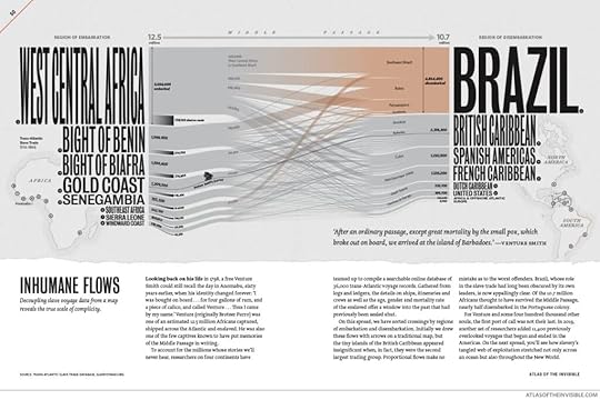
One of the most striking visuals decouples the data from a map and shows "the true scale of complicity" in the slave trade:

I was not surprised that the original 1922 United States bill to make lynching a federal crime in America did not become law, but I was floored to learn that "since 1900 there have been nearly two hundred attempts to pass anti-lynching legislation," with the most recent being in 2020, and "lynching is still not a federal crime."

The book is divided into four main sections ("Where We've Been," "Who We Are," "How We're Doing," and "What We Face") and the narrative introducing and discussing each figure is as interesting and informative as the graphics themselves.

Some suggested reading from the authors (not sure why co-author Oliver Uberti doesn't appear in this GR listing) I hope to explore:
- The History of Cartography (available on line free via the University of Chicago Press: https://press.uchicago.edu/books/HOC/...)
- The Age of Surveillance Capitalism: The Fight for a Human Future at the New Frontier of Power
- "The Mapist" by Barry Lopez
- The North American Cartographic Information Society's Initiatives: https://nacis.org/initiatives/
- David Rumsey Historical Map Collection: https://www.davidrumsey.com/
- Leventhal Map & Education Center: https://www.leventhalmap.org/

There's also a podcast interview (you can listen to or just read the transcript) with the authors here:
https://stamen.com/james-cheshire-oli...
Profile Image for Bob.
544 reviews14 followers
January 30, 2022
This could be a textbook for beginning graphic artists, but the content delivered by the maps and graphic illustrations are what's even more valuable.
The growth in technology that now allows researchers to gather data about everything — and to find it in geography as small as neighborhoods and as big as the oceans — has given us new information about our our lives, our air, water, soil and most importantly about our behaviors and the workings of the natural world.
Thanks to GPS, satellite images and DNA we can know where city workers can use more saline solution or less on icy roads, how forest fires impact and are impacted by climate change, how one community's efforts to end homelessness by banning it simply increases homelessness elsewhere, even how bike sharing efforts to decrease the use of automobiles was worked in some cities around the world but not in others.
Authors James Cheshire and Oliver Uberti deserves a pat on the back for noting how early researchers like W.E.B. Du Bois, Ida B. Wells and others used statistics to prove racial injustice and inequality and effect change, forming the foundation for social scientists today.
The colorful book has several examples, too, of our how historians are finding data in old documents. A fascinating one puts light on what happened to two actual people enslaved by Nazi Germany, how they were moved from concentration camp to concentration camp, how they were treated and how they survived.
Another shows how lynchings in the U.S. were almost exclusively in the Southern states, and how members of Congress from the South have continued to this day to refuse to approve a federal ban on lynching.
From an artistic perspective the maps and infographics are very creative; just a few take far too long to understand. The accompanying text to each is extremely reader-friendly, for the most part brief and interesting.
You'll find the information is heavily oriented to what's happening in the environment all across the globe, and Cheshire and Uberti literally beg readers not simply to absorb the information but to do something about it.
Profile Image for Dan Trefethen.
1,205 reviews75 followers
May 22, 2022
I love quantitative displays of data – they often make statistics so much clearer. This book shows a number of maps where various forms of data have been mapped to illustrate realities that are hard to grasp with mere words.

We are, after all, visual creatures, and often pay more attention to shapes than words (as good web designers know).

The book shows how real-time data from cell phones and other sources can highlight issues that cannot be calculated any other way, at least not clearly. This is the 'human calculation' part of the book. - where we go, how we act, etc. Patterns of human behavior.

The scary stuff is about nature and climate, how things are changing, irrefutably. You can believe in human causes of climate change or not, but the data clearly show that climate is changing the earth more quickly than ever before. Yes, climate and geography has changed frequently in Earth's past, with sea levels rising and falling with ice ages. But never this quickly. Make of that what you will.

My one regret is that the authors did not acknowledge the pioneering work of Edward Tufte, whose book 'The Visual Display of Quantitative Information' did so much to affect this field, especially as computer mapping of data came into vogue. Speaking of maps, they also didn't include the most famous data map in history, the 19th century map showing the size of Napoleon's army as it advanced on Moscow, then retreated. It looks like a mighty river at the start, dwindling to a trickling stream at the end. Look it up.
Profile Image for RumBelle.
2,072 reviews19 followers
March 11, 2022
This was definitely a different kind of atlas. There were maps, and descriptions of the maps, but the maps were not of land, or oceans, or cities or countries. They were of intangible things like the flight paths of planes, the emotional health of people in the world, light levels in various places and undersea cables. These are things that the average person never sees, though it is worth noting that some of the things in this book are not invisible. You can take pictures of the world and see light levels, you can also see flight paths on radar.

It was a very unique compendium of information. Written in an interesting, if times really technical, this book conveyed a lot of information about each of it's chosen subjects. At time the tone was very along the lines of we are going to put as many multisyllabic words in a sentence as we can to sound smarter. After this happened a lot, I stopped reading word for word and just skimmed the book, reading about the subjects that interested me. I don't like that tone in any book, fiction or non-fiction. It puts you off as a reader.

The graphics were amazing, and in many cases very clever. For example, for the emotional state of the world section the map had emoji's on it, showcasing how people in various places feel. A unique book.
Profile Image for Kristina.
39 reviews12 followers
March 21, 2022
Doors should be designed so that their use is intuitive. I feel the same way about infographics. Plenty of the pages in this book fall into that ‘intuitive use’ category, but many of them left me searching for the tiny print that explains how to interpret the layout. Despite that, I enjoyed the book. The graphics where visually pleasing and the information interesting, even if the authors seemed to be fixated on doom and gloom.
Profile Image for Elisa Decoupigny.
18 reviews1 follower
November 25, 2024
as a map nerd i enjoyed this book, some stories are really fascinating
i will now be able to do more 'did you know that☝️🤓' in social settings
Profile Image for David Haggett .
363 reviews1 follower
Read
December 11, 2021
While there were several maps and graphics that piqued my interest, most did not have much appeal or relevance to me.
Profile Image for Aaron.
616 reviews16 followers
January 1, 2022
Rarely, if ever, will you see a ‘maps’ book rated anything less than 5 stars by me, an unapologetic geography nerd. I can stare at maps for hours, noting lines and dots that configure our world. Sometimes, I just let the map wash over me in a 3-D Stereogram sort of way. And any book, fiction or non-, that includes a map is always more interesting. Plus, no matter how many different ways I see the world presented, it’s always important. Cheshire and Uberti have created an atlas that maps data in new ways to let you see a world that you didn’t realize was there, from lightning strikes in the Malacca Strait to flow of climate refugees from Puerto Rico to the speed at which glaciers flow. Even though this was a quick read, it contains beautiful representations of data that I will return to continuously and I look forward to more time with each page. A great way to finish the year.
Profile Image for Roger DeBlanck.
Author 7 books148 followers
February 11, 2022
With their impressive collection of data presented in the most creative and fascinating formats, these maps offer vivid graphics and images that compel you to rethink and grapple with the truth of how you see the world. A few that stood out to me compiled information on the slave trade, on inhospitality, on eviction, and on our state of mind. This is the type of book that makes you realize the complexity of the world, and yet how everything is also so incredibly interconnected.
Author 6 books9 followers
December 8, 2021
Another collection to maps similar to Terra Incognita, which I read a little earlier this year, covering many of the same topics. In fact, some of the maps are using the exact same data. The graphic treatment is different, though -- which is interesting to study -- and the overall tone is lighter. Both books provide plenty of food for thought, but this is the more fun book and the other is the more substantial book.
Profile Image for Sarah.
374 reviews40 followers
December 18, 2021
An interesting book. The maps and diagrams are beautiful but also some are quite hard to read. It does talk a fair amount about the urgency of the climate crisis which is great. However, it also definitely has a focus on Western culture (for example, in the section where the book demonstrates the different projections of maps, London and Los Angeles are the only two cities shown to help folks get their bearings).
Profile Image for Tiffany.
390 reviews31 followers
December 1, 2021
... gulp ... what have we done?

It's not all absorbingly terrible news, but the terrible bits of the past, the now, and the near future are, well, terrible. I didn't intend to necessarily read this cover to cover, but I found I could not put it down and all the small print within the various graphics was essential to the understanding of what was being presented. There are many subjects and concepts that I have never even thought about. I will think about them now.
Profile Image for Tracy.
1,960 reviews8 followers
November 15, 2022
So many different ways to present information! Loved the colors and variety, and so many different perspective changers and thought provokers. Wish the book has been larger in size (maybe atlas sized?), and sometimes I couldn’t get my mind wrapped around the information being presented, but other times a map was like an epiphany. Great work.
Profile Image for Christoph Weber.
1,468 reviews10 followers
January 14, 2023
Overrated. How did this end up with such good reviews? It's a bunch of maps, with a lot of social drama behind them, but a lot of the maps aren't that interesting or well-thought out.
Profile Image for Rob.
170 reviews1 follower
October 14, 2022
3.5 stars.

Nice concept in creating stunning visualisations with data across a plethora of topics.

My issue is, inherent within statistics, and interpretation of data, is the ability to misinform or mislead.

In general the book was thoughtful, beautiful and informative. I did have some significant concerns, including the following:

The book is heavily USA-skewed. Maybe this is where the authors are from, but in raw data terms, there’s no need for this. If we’re discussing an atlas of the invisible, then why is it so US-centric?

Unequal work – p132. This is very misleading. The graphs shows male/female work patterns (paid and unpaid) and lists an amount of additional unpaid work that females do. The reason this is really misleading is that most spouses wouldn’t begrudge one working for pay for similar hours if the other does unpaid (typically home duties). Maybe person A works 6 hours per day for pay and 2 hours unpaid, and their spouse, person B, does 3 hours paid and 5 hours unpaid. In effect they’ve both contributed equally to the household.
The authors claim Swedish women do 25% more work than men, but actually it’s 2% more (495 minutes versus 484); in India, they claim women do 560% more work than men, but it’s actually 21%. They’re being duplicitous because they know they need to differentiate between paid/unpaid work (otherwise only showing unpaid would obviously be entirely misleading), but then do a bait and switch and only consider unpaid work. Very bad.

DNA inheritance – p39. It implies that we have twice as many people each generation (2 parents, 4 grandparents etc), which over many generations isn’t true. If it were, then 10 generations ago the world would have been home to 4 trillion people. In fact, we are subject to pedigree collapse. There are little bits of inbreeding in all of us, be it distant cousins or more directly. Anyway, it’s a crucial facet to our DNA history and the over-simplification here isn’t great.

Gentrification – p128. Here’s where a little bit of knowledge is a problem. The authors are commenting on housing affordability (or lack thereof). Their point being that gentrification is top-down and aided by intentional neglect from landlords. They state that “rent stabilisation helps…” This has been fundamentally disproven by economists over and over, that rent control aids a narrow few and is harmful generally to the poor (because there’s less incentive to build new properties if government intervenes in natural pricing). The authors should know when to present the data, and when to keep their signalling to themselves.

Artists at every age – p60. My issue here is that some of the data is emerging. By representing artists who have died, with the living, you’re polluting the data. We don’t know which is an artist’s most “notable” work whilst they’re still producing. A small issue.

AI map creation – p180. The authors are just a little to earnest in their criticism of AI generating maps, such as by Facebook. I don’t think anyone suspects this is easy, or can be done without huge amounts of programming and local knowledge. They don’t give any latitude for walking before running. Facebook and others with AI will solve these problems, but of course they’ll make mistakes along the way.

Much of the book is good, and I really liked the epilogue on the different map projections. I think the failures really shaded my view of what I was reading, making me 2nd guess if their analysis was correct.
Profile Image for H.
14 reviews
January 19, 2022
I'm a sucker for maps so this definitely intrigued me. This book provides a wealth of information and I love how the data is represented in a visual and graphical way which makes it fairly straightforward to evaluate.

I have always been a keen believer in the power of data, it has certainly made my work easier and given me the basis to make sound decisions but of course provided that the data is reliable because when you have garbage in, you get garbage out. We need to realise how much we tend to underestimate the power of data and how we take it for granted, as it is indeed a valuable asset that can be used to analyse, understand and enlighten us on various topics about the world, the human behaviour, the current climate crisis, etc. One of the tradeoffs is how the things we do online can also generate data and create 'digital breadcrumbs' that can be harvested and processed, which can be controversial in its own way if we are not careful. Definitely plenty of food for thought there.
Profile Image for Sherrill Watson.
785 reviews2 followers
March 19, 2022
See David's review.

I am not a map geek, but "Maps and Graphics that will Change How You See the World" on a great cover, had me pick this one up. Well, David analyzed it for you. Yes, it could have been larger, but then it would be a coffee table book. But. It is not exactly an atlas, but uses current data including DNA, mobile phone data, fire data, flood data, etc. There are even interviews of people from the Holocaust(!). This book is slanted toward proving the negative, which it does very well. The maps are piecemeal, a hodgepodge, despite the authors' efforts to organize disparate things into topics. There is a map of the Antarctic, one of plane activity in the U.S., one of Taiwan policing, etc. Additionally, you have to turn the book this way and that and reset your brain accordingly for the next gloomy subject. My atlas gives facts only, and provides an overall world view on most pages. Sorry, which countries treat women abominably (Unequal Loads)? I already knew that, and can't do anything about it.
This one is for someone else. Not for me.
36 reviews
September 14, 2025
5/5. God I love this book so much!!! With so many of the pages I found myself being like wowoowowowowow!!! How did they make this and display the information so well while making the pages gorgeous?! Some of my favorites are unequal flows, inhumane flows, population lines, revolutionary transport, and ice flows. It's so awesome how each map is based off of objective data about the world but is so artistic and interesting to look at and understand. Visual displays like this are simply the best way to tell a lot of stories and I love when one makes you just :0000000 My friend Jackson had James as a professor and was telling me about the process of making the pages and going back and forth between code and design and I would love to learn more about how each map was made! So very excited to have this as a coffee table book. If I could have a job just making maps like this that would be 😍😍😍😍😍
860 reviews5 followers
December 25, 2022
Een heel fascinerend boek met kaarten met data over verschillende onderwerpen, leuk om te lezen , wel een eigen bedenking .... op de kaarten zijn de grenzen net meer kleuren die in elkaar overgaan die dan volgens mij een realistische werkelijkheid weergeven , .... mss wel moeilijker werkbaar en niet zo duidelijk , wel mooi realistisch (2x)
..... mss ziet AI zo de werkelijkheid een overgang van elementenenergie en kleuren ..... wat ook een correcte weergave is , maar moeilijk om met hersenen mee te werken en om te gaan , een afgelijnde start/stop is duidelijker en geeft meer rust ,.... maar is waarschijnlijk meer een afgebakende schijn van de werkelijkheid
5 sterren een leuk boek om eens op een andere manier naar grenzen te kijken van verschillende onderwerpen , aanrader !!
( december is een geluksmaand voor deze lezer qua sterren( boeken)
Profile Image for Susannah.
573 reviews6 followers
April 13, 2023
I love books that show visual representations of data. This is a fine entry in that category. The book displays a variety of ways of presenting data, and there are comprehensive notes and explanations as to how the data was acquired, and what its limitations might be. Historical context is also given as to how such data was acquired in the past, and what it was used for then.
The book is divided into 4 main sections: Where We've Been, Who We Are, How We're Doing, What We Face. There is a strong focus on data around climate change, which makes for sobering reading. My only criticism is that some of the ways chosen to visualise the data made it difficult to interpret.
Displaying 1 - 30 of 78 reviews

Can't find what you're looking for?

Get help and learn more about the design.