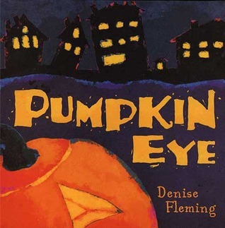
Denise Fleming has written and illustrated many children’s picture books, including In the Tall, Tall Grass, Shout! Shout It Out!, and Sleepy, Oh So Sleepy. She won a Caldecott Honor for In the Small, Small Pond. Denise creates her colorful illustrations by pouring colored paper pulp through hand-cut stencils. She lives in Toledo, Ohio.
I quite liked the slightly over-size illustrations and simple text; this book is really good for reading to a group. Our storyteller used it for laptime today.
I didn't really like this. The worst part about it was the illustrations. I didn't like them at all. They're really sloppy. Shapes were not detailed and defined, just loose and like a child drew them.
The page with the yellow moon text didn't show a moon. It showed a house and a pumpkin. A page announcing spirits showed a kid dressed in a bat mask and another as an alien. Those aren't spirits.
The rhyming wasn't great. "Piece of pie, pumpkin eye." "Down the hill, spirits spill." It just wasn't very good.
The same wording was used over and over again, and it was really redundant. "Trick or treat--pounding feet, jack o'lanterns line the street." "Trick or treat--pounding feet, eerie shadows fill the street." "Trick or treat--pounding feet, wretched witches roam the street." "Trick or treat--pounding feet, Halloween has found our street." I don't like repetitive wording like that; it feels like a cop-out, like other rhyming words couldn't be thought of.
The thing I liked the most was the colors. Since the background was dark it made the colors really stand out, especially the orange and yellows which popped and were eye-catching. I liked the blackened figures, just a black shape for the people showing their forms in the night. The skeleton and mummy costumes were bold and pleasing. Some of the rhymes and wording were enjoyable, like "candlesticks, burning wicks" and all of the trick or treat lines above. I think kids would like the rhymes because they flow easily and would be enjoyable to read aloud.
The perfect read-aloud book for Halloween! My daughter is obsessed with Halloween and pumpkins, so she picked this one out. We must have read it two dozen times or more in the past week.
Pumpkin Eye was written in simple, rhyming prose. It doesn’t so much tell a story as gives you a feel for the Halloween spirit. It is a lot of fun to read to a group of kids.
The illustrations are awesome. They are big, bright, and colorful. I love it when I find an author that also successfully illustrates their own books.
Very cute for a kids book. The illustrations are very pretty and eye catching. This would be good for kids who like to look at the art more than the actual reading itself. Each page features one line catchy sentences. I think the book over all is describing all the costumes appearing on Halloween but the intent is not really clear until the end when it all comes together.
Almost too simple to make a good read aloud, but could work with the right reader and the right audience. I'm not a fan of the illustrations, though. They are too abstract to really tell what's going on (which is not good in a book that has no real plot).
I collect childrens books,especially ones that are autumn/halloweeen centric. This is a great one, mostly for the illustrations. Apparently they were created by pouring colored cotton fiber through hand-cut stencils. Awesome!
This Halloween book has a simple rhyming theme throughout with eye-catching illustrations. It would be an excellent choice for a classroom read aloud, assuming Halloween can be celebrated and/or acknowledged.
This Halloween book has a simple rhyming theme throughout with eye-catching illustrations. It would be an excellent choice for a classroom read aloud, assuming Halloween can be celebrated and/or acknowledged.
I enjoyed the rhythm in this book. You could practically hear the spooky music playing in the background as you read it aloud to kids. The words were slightly ominous while the pictures provided a fun, interesting visual. The perfect Halloween book.
I adore the musicality of this simple prose book. Denise Fleming is probably better known for her enchanting and alluring art, but I am even more impressed with her ability to cast a kind of tranquility spell with her spare prose. Yes it rhymes and the meter is spot on, but it's more than that. Every word she chooses is right.
Reading Pumpkin Eye straight and talking with a child about what they see on each page is a fine way to approach this as a read-aloud. But I have found that it's incredibly easy to sing this book. I usually approach it like a Gregorian chant, although sometimes it comes out more like I'm ripping off Tim Burton's This is Halloween. My sons always try to hum along for those long notes. Here is a taste of 4 spreads of the prose, so you can see what I mean about how easily it flows:
Yellow moon rising soon...
Piece of pie, pumpkin eye...
candlesticks, burning wicks.
Trick or treat— pounding feet, jack-o'-lanterns line the street.
--- I review books for children from the perspective of a parent of kids with autism. The review above is part of a longer post about great picture books to read around Halloween: http://www.lineupthebooks.com/hallowe...
With the unique illustrations of Denise Fleming, this is an ideal read aloud for early elementary students around Halloween. While the amount of text is minimal, it is still very rich. Using descriptive adjectives like eerie, swooping, hissing, tattered, toothless, blood-red, wretched, etc. students are challenged to expand their vocabulary. This book is written with rhythm and rhyme that scaffolds for reading fluency for early readers. There are lots of response activities possible with this book. It might be using the illustrating style of Denise Fleming, or just describing one aspect of “spooky season” using a descriptive world like the author did in this book. You could also use this book if you are teaching about rhyming words or poetry. a. Author: Denise Fleming b. Illustrator: Denise Fleming c. Publisher: Henry Holt and Company d. Date: 2001 e. Genre: Fiction
This book is all about the things that a pumpkin can see during Halloween time. I really liked this book because of its simplicity. It was fun to see an author use point of view in a different way to give us the idea of what a pumpkin sees. It was cute! I wanted to read this book because I wanted to read a different book for each holiday. This book was such a fun book and I think that kids would love to read this one around Halloween time. I think that kids would really enjoy this book because every time they might see a pumpkin on Halloween they will be reminded of this book. I would add this book to my personal library because it will be fun to read to kids around the holiday and it was such a fun book with great illustrations. I think that kids would one day add this book to their own libraries as they can enjoy this book when the time rolls around for it. I feel that you can have so much fun with kids with this book. If, for example, you were to each it to preschool aged students, they can color a pumpkin after the book, and try to draw all the things they remember the pumpkin seeing. I think that this book is a great addition to any library whether it be the parent's or child's.
I love that picture books offer the opportunity to turn a single seasonal poem into an artpiece. This poem isn't amazing but it's an adequate springboard for an unrestrained and atmospheric Halloween extravaganza. The colors are rich, dark, almost over-saturated, and feel like they're bleeding out of the lines; the lights and jack-o'-lanterns have a vibrant contrasting orange glow. I love this best when it doesn't centralize human figures--and luckily they're often silhouetted or transformed, made part of the Halloween landscape. This doesn't have enough narrative to be memorable, but it's a delight to page through.
This book has very vivid descriptions. The illustrations are sort of whimsical and would probably be fun for children. Not sure if I'll use this for a Halloween storytime because there's not much of a story. It's more evocative of Halloween "vibes" -- colors, sounds, etc. -- than anything. But that could also be fun to add a different twist to storytime.
Just your standard quick-and-painless Halloween rhyming book. Might be fun paired with a craft. Not much substance, and the illustrations might scare some littles, but I think it's a passable holiday title.